Click to zoom
Universal Venn Keynote Charts Template - 39 Editable Slides
| Format | .pptx |
| Slides | 39 unique layouts |
| Aspect ratio | 16:9 |
| Compatibility | PowerPoint |
| Animated | No |
| Language | English |
| License | Commercial |
| File size | — |
| Version | v1.0 |
| Last updated | May 2022 |
What's inside
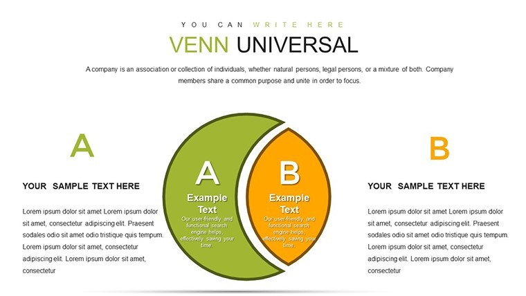
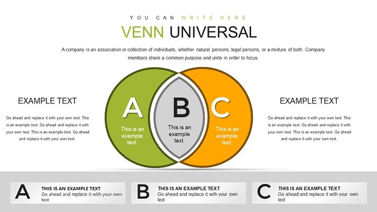
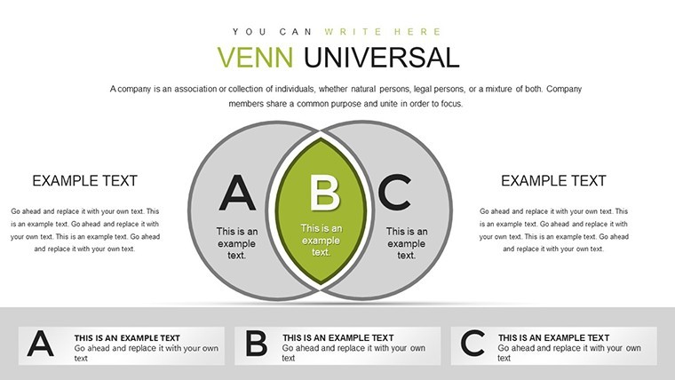
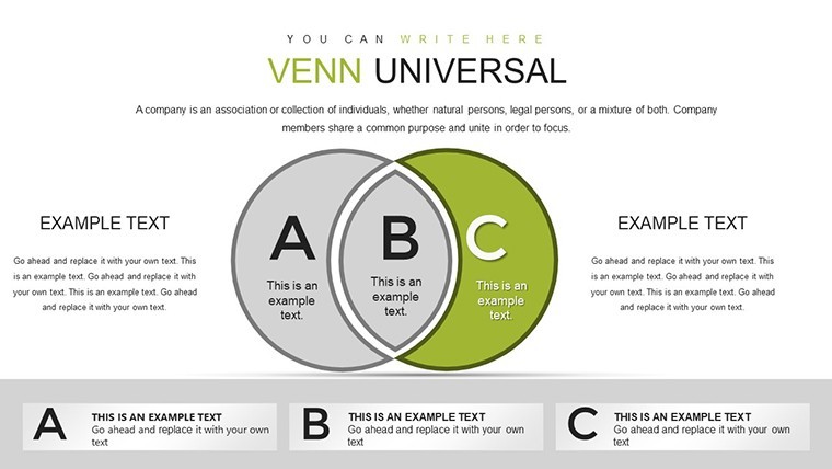
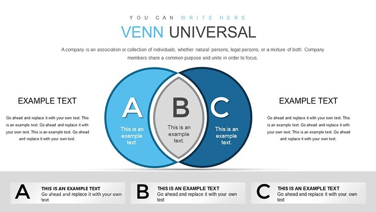
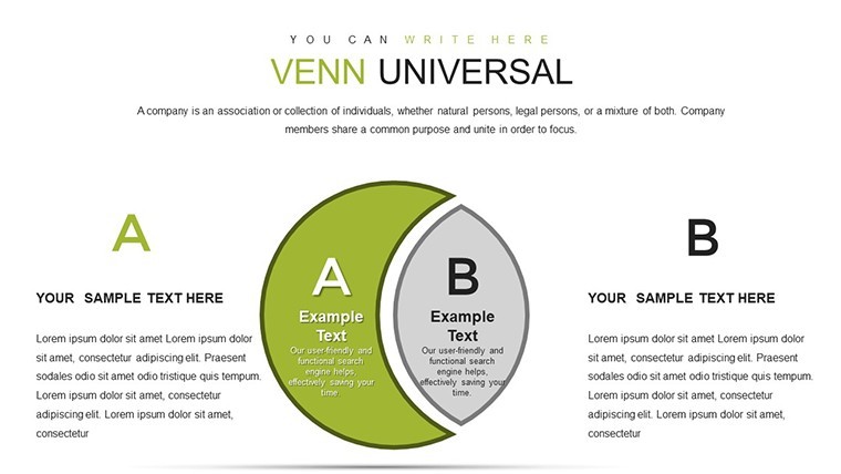
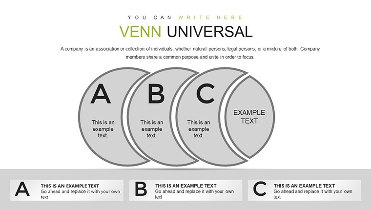
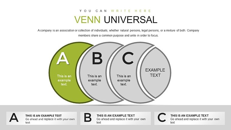
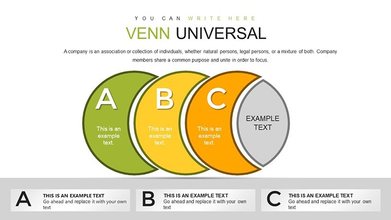
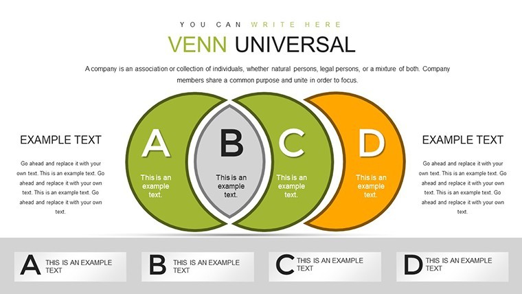
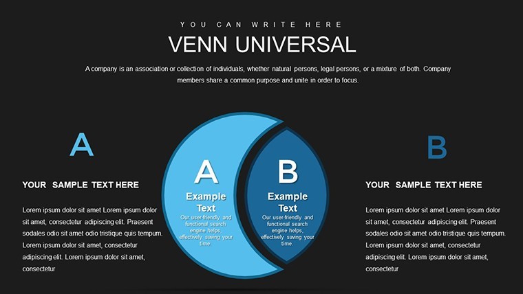
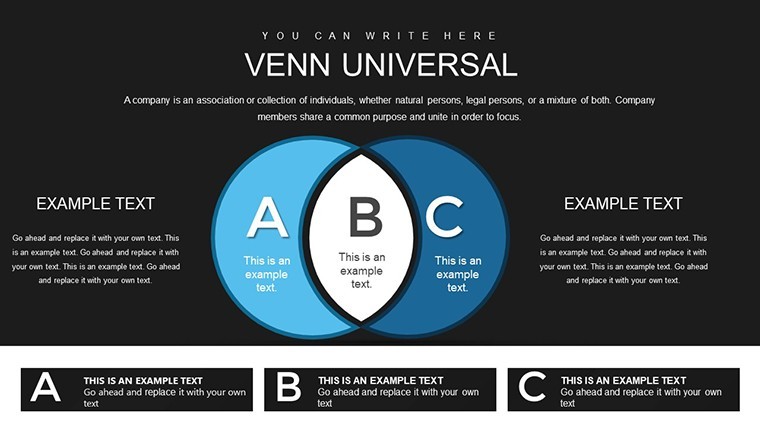
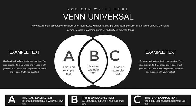
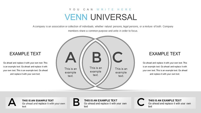
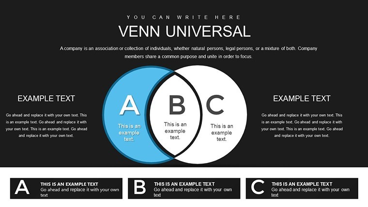
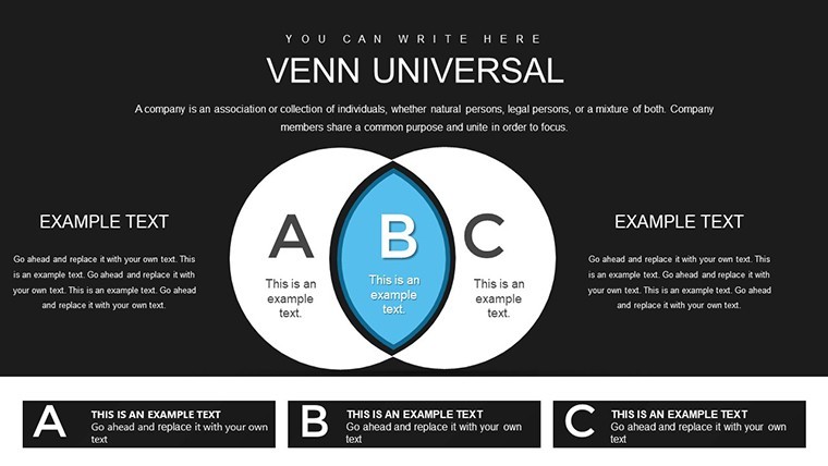
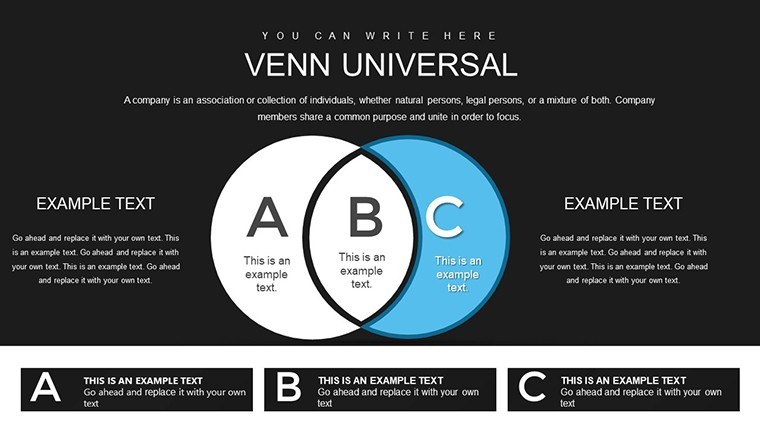
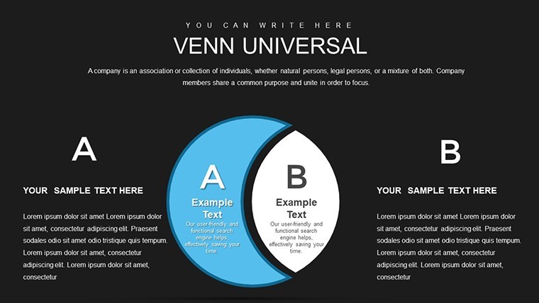
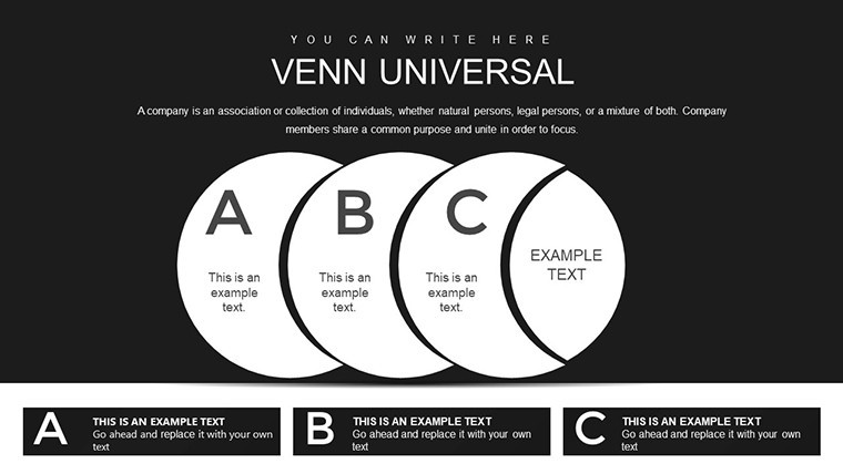
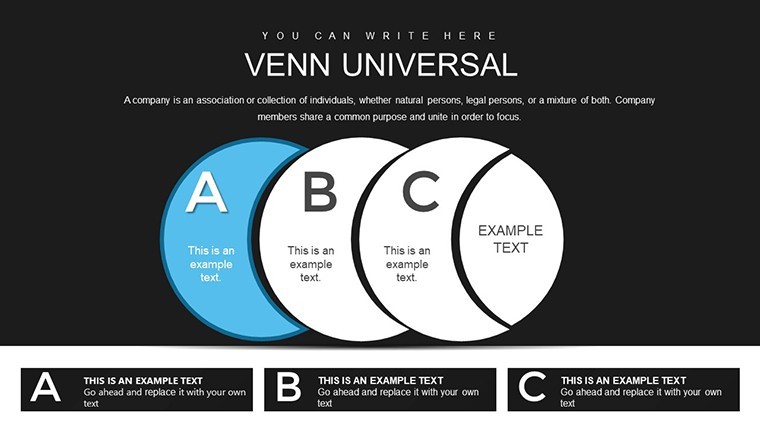
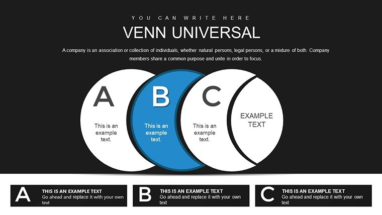
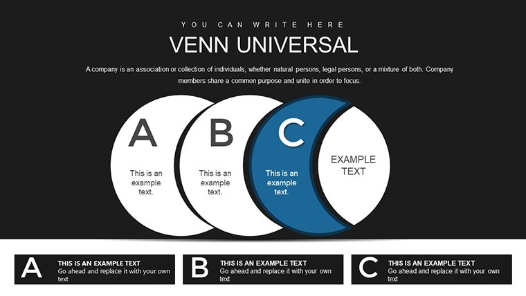
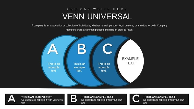
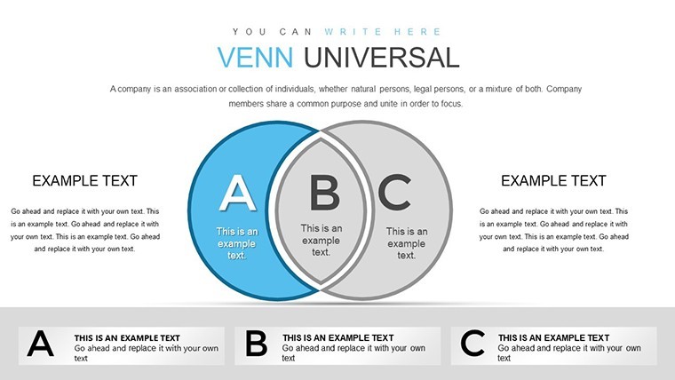
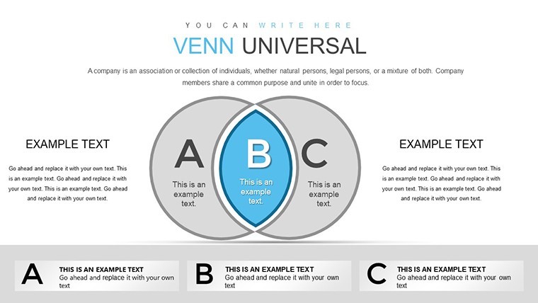
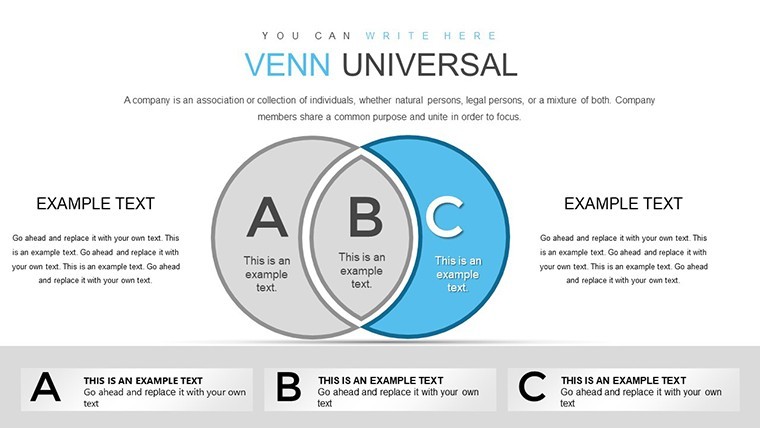
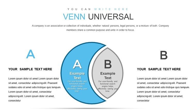
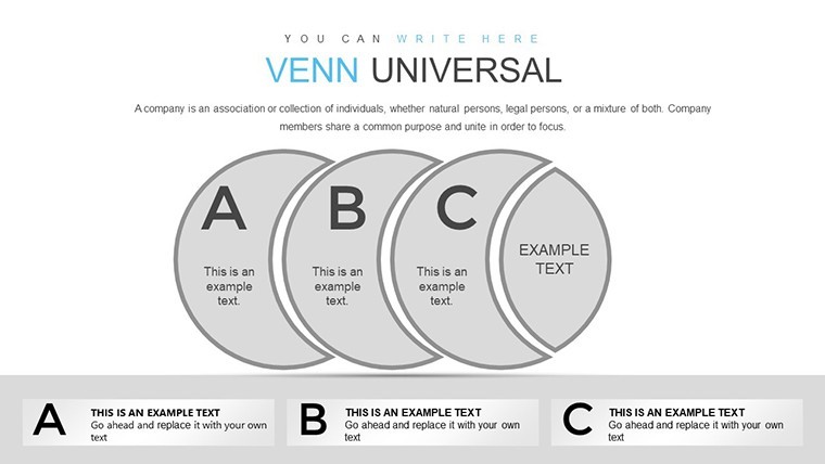
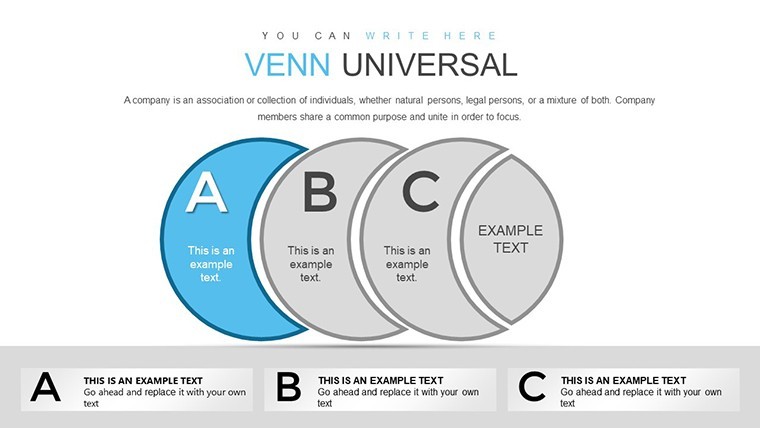
Delve into the art of intersection and distinction with our Venn Universal Keynote Charts Template, a versatile tool crafted to illuminate relationships in your data. This collection of 39 meticulously designed slides empowers analysts, strategists, and educators to visualize overlaps and unique elements with precision and style. Whether you're mapping market segments in a corporate strategy meeting, explaining set theory in a classroom, or comparing project scopes in team collaborations, these Venn diagrams transform abstract concepts into tangible insights. Rooted in mathematical principles yet infused with modern design aesthetics, the template features customizable shapes, icons, and color schemes that adapt to your narrative. Forget wrestling with default tools that limit creativity; here, you gain professionally curated elements that align with best practices from sources like Edward Tufte's data visualization theories. Compatible exclusively with Apple Keynote, it ensures smooth editing on Mac or iPad, making it a go-to for Apple ecosystem users seeking to elevate their comparative analyses.
The Power of Venn Diagrams in Modern Communication
Venn diagrams aren't just circles on a page - they're gateways to understanding complex interrelations. This template expands on John Venn's 19th-century invention by incorporating layered gradients, icons, and annotations for deeper storytelling. In business, think of overlapping circles representing shared customer demographics between product lines; in education, they clarify unions and intersections in logic puzzles. Our design draws authority from academic resources, ensuring diagrams meet standards for clarity and accuracy. Unlike generic slides that clutter visuals, these maintain whitespace for focus, boosting comprehension as per cognitive load theory. Users in fields like UX design report using them to compare user personas, while marketers overlap audience segments for targeted campaigns. This isn't thin content - it's a robust framework that integrates with your workflow, from initial brainstorming to final polish.
Standout Features for Effortless Customization
- Professionally Designed Shapes: Circular, elliptical, and multi-set Venns with scalable vectors for distortion-free resizing.
- Icon Integration: Embed thematic icons within overlaps to symbolize concepts, like gears for synergies or lightbulbs for unique ideas.
- Color-Coded Styles: Pre-set palettes that highlight intersections, easily adjustable to match brand guidelines.
- Annotation Tools: Add text labels, arrows, and callouts directly on diagrams for explanatory depth.
- Animation Ready: Build diagrams layer by layer with Keynote animations to reveal insights progressively.
These features stem from real-world feedback, ensuring the template solves common pain points like misalignment or color clashes, saving you time and frustration.
Practical Applications Across Industries
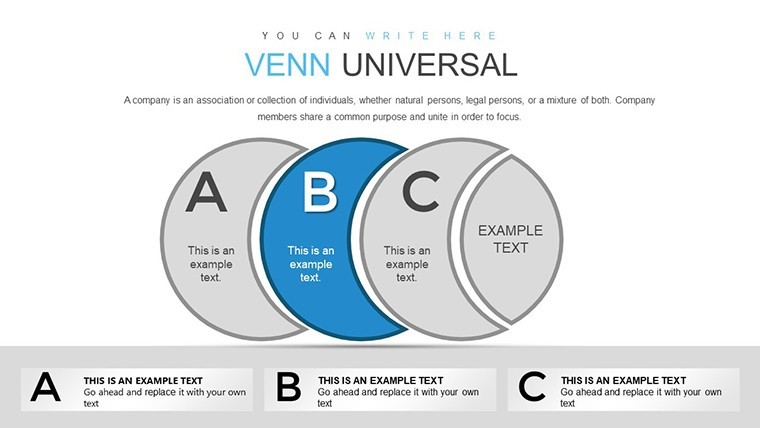
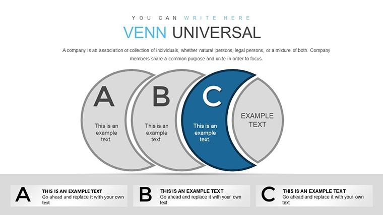
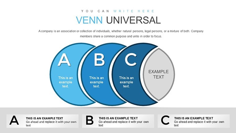
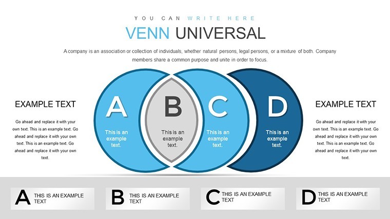
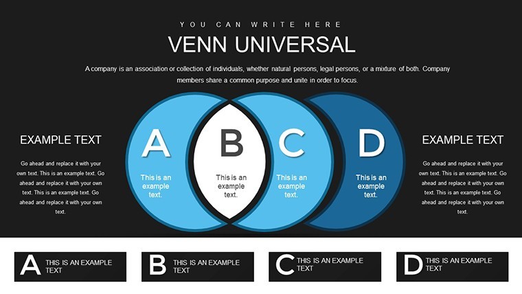
Envision a tech startup using these slides to compare feature sets of competing apps: Slide 5's three-circle Venn highlights unique selling points. In healthcare, researchers overlap symptom clusters for disease analysis, drawing from studies in journals like The Lancet. Educators might use Slide 15's four-set diagram for advanced math lessons, making abstract set theory relatable. For project managers, compare team roles and responsibilities to identify gaps, as recommended in PMI guidelines. Step beyond basics by linking to external data sources or embedding hyperlinks for interactive sessions. Compared to PowerPoint's rigid Venn tools, Keynote's fluidity here allows for more organic shapes, enhancing visual appeal and user engagement.
Step-by-Step Utilization for Optimal Results
- Import and Explore: Open in Keynote and navigate master slides to select your base Venn structure.
- Populate Data: Drag icons into sections and type labels; use smart guides for perfect alignment.
- Style to Suit: Adjust opacities for subtle overlaps or bold colors for emphasis via the format panel.
- Enhance Interactivity: Add hyperlinks or animations to make diagrams clickable during presentations.
- Review and Share: Export to video or collaborate in real-time, ensuring team input refines the final output.
This methodical approach, inspired by agile methodologies, turns static diagrams into dynamic tools that adapt to evolving discussions.
Pro Tips from Visualization Experts
To maximize impact, limit sets to four for readability, as overcrowding dilutes message - a tip from data viz gurus like Stephen Few. Use contrasting colors for accessibility, adhering to ADA standards, and pair with narratives like "Where these worlds collide, innovation thrives." In virtual meetings, leverage Keynote's rehearsal mode to time reveals. For advanced users, combine with other charts for hybrid visuals, such as Venn-pie hybrids for proportional overlaps. These insights, gleaned from conferences like Information is Beautiful, position your presentations as authoritative and engaging.
Audience Fit: Who Gains the Most?
Strategists dissecting competitive landscapes, teachers fostering critical thinking, or consultants advising on mergers - all find value here. In non-profits, overlap donor interests with program needs; in R&D, compare innovation pipelines. Trust in its design is bolstered by compatibility with Apple's ecosystem, known for reliability in creative professions.
Don't let overlaps go unnoticed - grab this Venn Universal template and clarify your comparisons today. Start visualizing smarter now.
Frequently Asked Questions
How many sets can I create in these Venn diagrams?Up to five sets comfortably, with templates optimized for 2-4 to maintain clarity and aesthetics.Is this template compatible with iPad Keynote?Yes, fully editable on iOS devices for on-the-go adjustments.Can I export to other formats?Export to PDF, images, or even PowerPoint for cross-platform sharing.Are the icons royalty-free?Absolutely, all elements are included for unlimited use post-purchase.What if I need more slides?Duplicate and modify existing ones; the master layouts make expansion seamless.Does it support data import?Manually input or copy from spreadsheets; no direct integration, but quick to adapt.Good for
- Project roadmaps and sprint plans
- Product launch timelines
- Quarterly or annual review decks
- Company history and milestone summaries
Licence
reviews
Used this for a marketing campaign performance report and the results visuals stood out beautifully during the client call.
Layouts handle both simple and complex metrics gracefully with excellent hierarchy in text sizing.
Honest mix of basic and advanced charts. The advanced ones required a short learning curve but delivered great impact.
A couple of color gradients looked slightly dated after applying my brand palette but easy to adjust.
Saved several hours on my quarterly analytics presentation. Colleagues asked where I got the designs from.
Ideal for academic conferences where precise data display is crucial. Printed versions also looked sharp.
The balance between text and visuals is well considered making slides scannable in seconds.
I wish there were dark mode variants included but the light versions are flexible enough.
FAQ
Will it work in Google Slides?
Are fonts embedded?
Can I use this for client work?
What's the refund policy?
Do you update the template after purchase?
Similar templates
See all Keynote Charts →
All 39 slides