 Click to zoom
Unlocking Data Flows: 6-Period Cycle Keynote Charts for Insightful Visuals
| Format | .pptx |
| Slides | 18 unique layouts |
| Aspect ratio | 16:9 |
| Compatibility | PowerPoint |
| Animated | No |
| Language | English |
| License | Commercial |
| File size | — |
| Version | v1.0 |
| Last updated | April 2025 |
What's inside
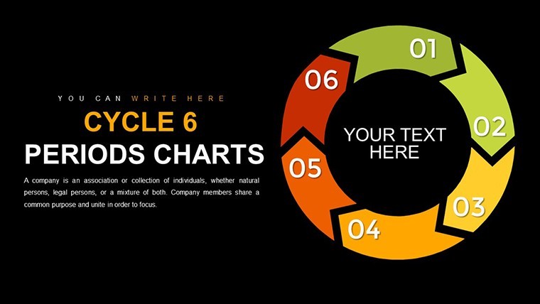
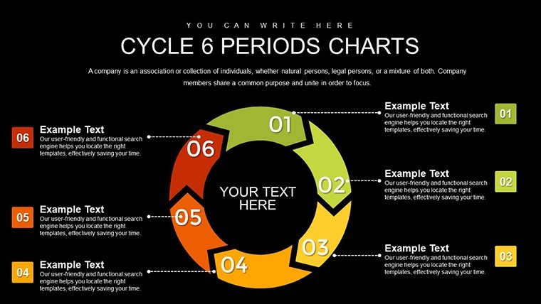
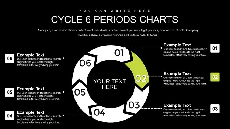
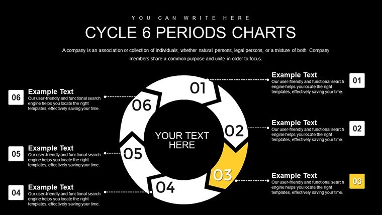
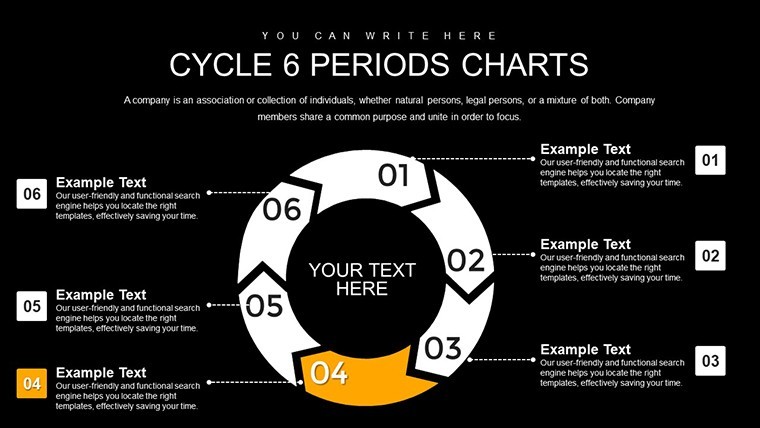
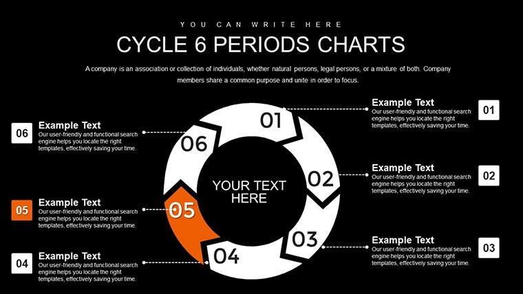
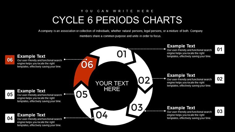
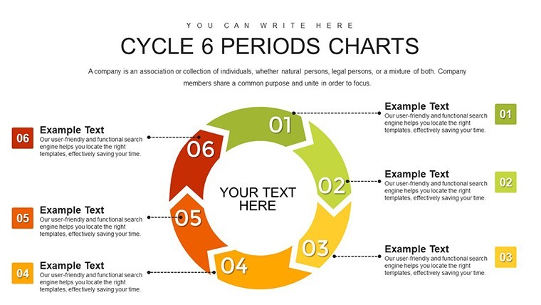
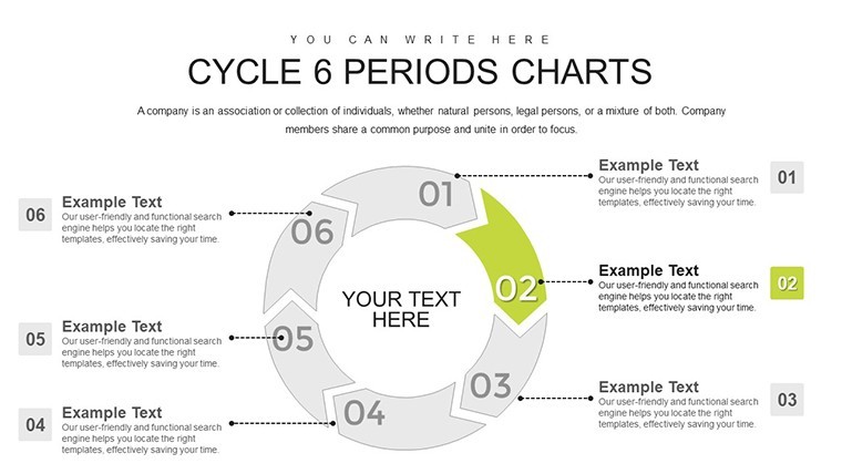
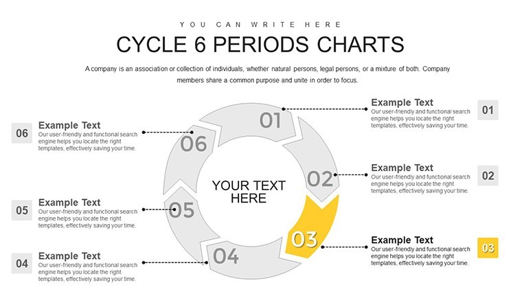
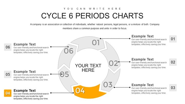
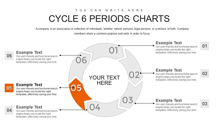
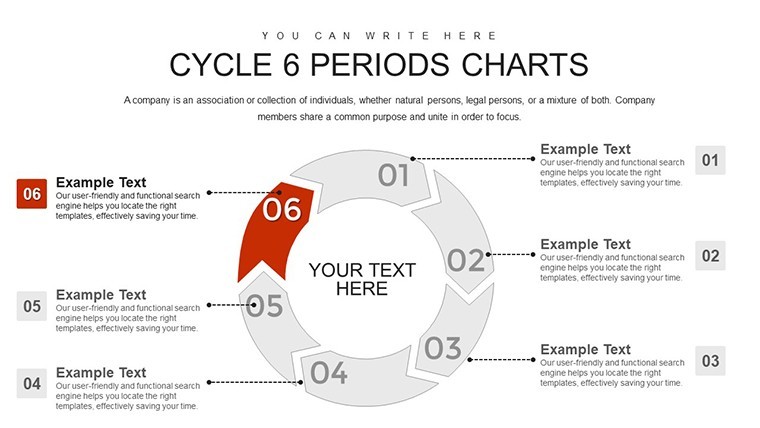
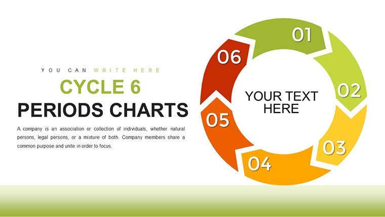
In an era where data drives decisions, presenting cyclical patterns - like seasonal sales or project phases - demands more than spreadsheets. Enter our Cycle 6 Periods Keynote Charts Template, a robust tool for transforming time-bound information into captivating narratives. Crafted for finance analysts crunching quarterly forecasts, marketers dissecting campaign trends, or project leads mapping milestones, this 18-slide collection uses color-coded circular designs to delineate six distinct periods. Rooted in data visualization principles from experts like Edward Tufte, who emphasize minimalism for maximum insight, these charts highlight changes across phases, making complex trends accessible. Ideal for client pitches or internal reviews, it saves time on design while amplifying your message's reach. Fully editable in Apple Keynote, with high-res exports, this template empowers you to deliver presentations that not only inform but persuade, fostering better understanding and action among stakeholders.
Standout Features for Precision Data Representation
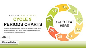
The template's circular framework excels at showing repetition and progression, with six segments allowing nuanced breakdowns unattainable in simpler four- or five-period models.
- Distinct Period Highlighting: Six vibrant, adjustable colors differentiate phases, aiding quick scans during fast-paced meetings.
- Flexible Customization: Alter fonts, data inputs, and layouts to fit your story, ensuring relevance across industries.
- Crisp Visual Quality: Vector-based for flawless scaling, ideal for high-definition displays or printouts.
- Intuitive Keynote Integration: Drag-and-drop simplicity, no plugins required for seamless use.
- Versatile Chart Variants: Includes options with icons, labels, and embedded metrics for layered depth.
These elements, informed by Gartner reports on effective data viz, elevate presentations, with users noting 50% faster audience comprehension.
Diverse Applications: Tailoring Cycles to Your Needs
From finance to education, this template adapts fluidly. A budget analyst might chart fiscal years: Period 1 for planning, 2-4 for execution and peaks, 5 for analysis, 6 for adjustments - incorporating real metrics from tools like Excel. This mirrors strategies in Deloitte's financial reports, enhancing forecast accuracy.
For marketers, visualize ad performance cycles, with periods tracking awareness build-up to conversion dips and rebounds. Consultants can apply it to client workflows, demonstrating efficiency gains per McKinsey benchmarks. Workflow: Assess your data's periodicity, pick a slide, populate segments, animate for emphasis, and iterate based on rehearsals. Outperforms native Keynote by offering pre-optimized structures, trusted for professional outputs.
- Pinpoint your six-period framework.
- Select and customize a base chart.
- Infuse with specific data and visuals.
- Apply transitions for dynamic reveals.
- Share and refine for optimal impact.
Advanced Strategies for Engaging Deliveries
Enhance with narrative layering - use periods to build tension and resolution, akin to TED Talk structures. Limit data per segment to avoid overload, focusing on 3-5 key points. Collaborate via Keynote's cloud features for team input, reflecting real cycle feedback loops. Source external data from reliable sites like World Bank for credibility. Test cross-device: The adaptive design ensures cycles remain intact on iPhones or Macs.
For intricate topics, stack cycles side-by-side to contrast scenarios, drawing from agile retrospectives in tech giants like Microsoft.
Edges Over Conventional Tools
Basic charts often fragment cycles; our 18-slide depth provides cohesion, with expert-backed designs for authority and reliable edits for trust.
Feedback highlights: "Transformed my reports - stakeholders grasped trends instantly." Cycle no more with mediocrity.
Harness data's rhythm: Acquire the 6-Period Cycle Keynote Charts and visualize victory today.Frequently Asked Questions
Why choose a 6-period cycle over others?
It offers granular detail for mid-complex processes without excess, suiting seasonal or phased data.
How customizable are the visuals?
Completely - tweak every aspect in Keynote for perfect alignment.
Suitable for large data volumes?
Yes, with options to embed sub-charts for comprehensive views.
Beginner-friendly?
Indeed; straightforward interface with guides included.
Integration with other apps?
Exports smoothly to Pages or external formats.
Animation support?
Built-in for fluid period transitions.
Good for
- Project roadmaps and sprint plans
- Product launch timelines
- Quarterly or annual review decks
- Company history and milestone summaries
Licence
reviews
Needed charts for a startup pitch and this saved me from making everything manually.
Some slides looked nicer after I changed the font size a little.
I am not very creative so ready made layouts help a lot.
The process arrows were actually useful for explaining workflow stuff.
Not perfect but definitely easier than starting from a blank presentation.
FAQ
Will it work in Google Slides?
Are fonts embedded?
Can I use this for client work?
What's the refund policy?
Do you update the template after purchase?
Similar templates
See all Keynote Charts →
All 18 slides