 Click to zoom
Social Connections and Happiness: Keynote Template for Deeper Insights
| Format | .pptx |
| Slides | 26 unique layouts |
| Aspect ratio | 16:9 |
| Compatibility | PowerPoint |
| Animated | No |
| Language | English |
| License | Commercial |
| File size | — |
| Version | v1.0 |
| Last updated | October 2021 |
What's inside
Human happiness isn't just about personal achievements - it's deeply intertwined with our social networks and the broader socio-economic environment. The Social Connections and Happiness Keynote template offers a fresh lens for analysts to examine how public policies and programs affect individual lives, moving beyond macro-economic metrics. With 26 editable slides, this tool is tailored for those in sociology, policy analysis, or human resources who want to present data on relationships, well-being, and societal influences in a visually compelling way. Picture transforming abstract concepts like community bonds or policy outcomes into relatable charts that spark meaningful discussions. This template bridges the gap between data and human stories, helping you deliver presentations that resonate on a personal level.
Unlocking the Power of Relationship-Focused Charts
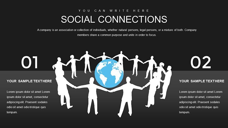
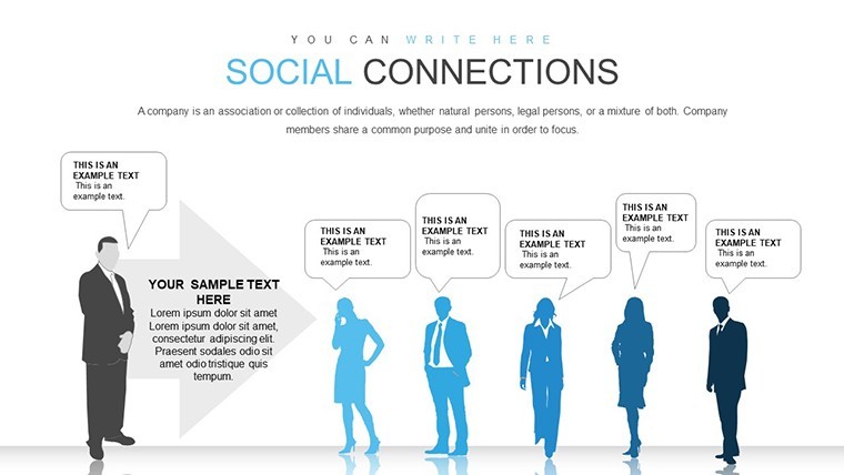
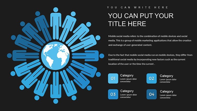
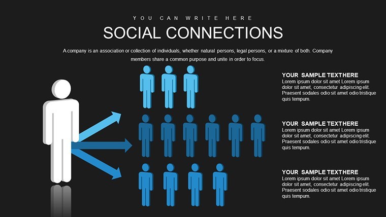
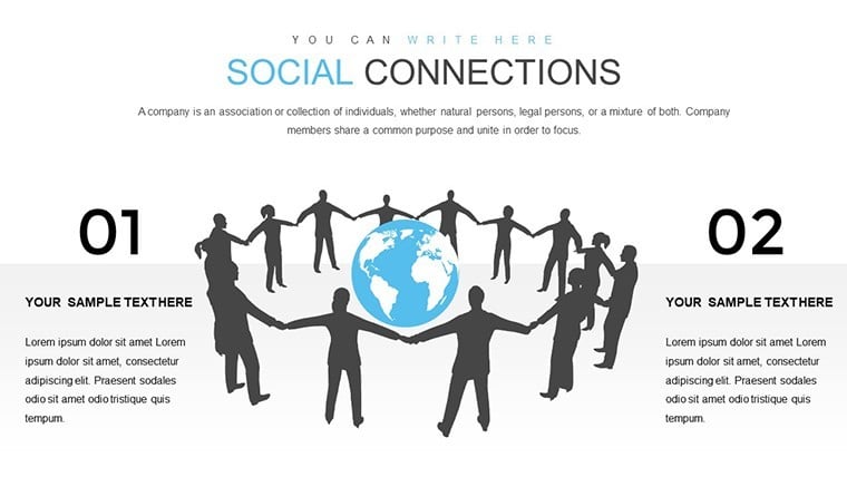
In an era where mental health and social connectivity are paramount, charts that map happiness against social factors are invaluable. This template draws from frameworks like the World Happiness Report, emphasizing individual impacts over national aggregates. Use it to illustrate how factors such as friendships, family ties, or community involvement correlate with life satisfaction. The designs incorporate silhouettes and illustrative elements to humanize data, making your slides not just informative but emotionally engaging. Avoid the pitfalls of generic bar graphs; instead, opt for nuanced visuals that highlight causal relationships and trends in socio-economic processes.
Standout Features for Analytical Precision
- Diverse Slide Set: 26 slides covering correlation maps, happiness indices, and relationship diagrams.
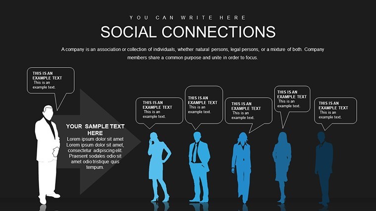
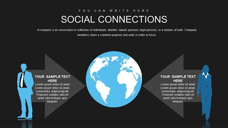
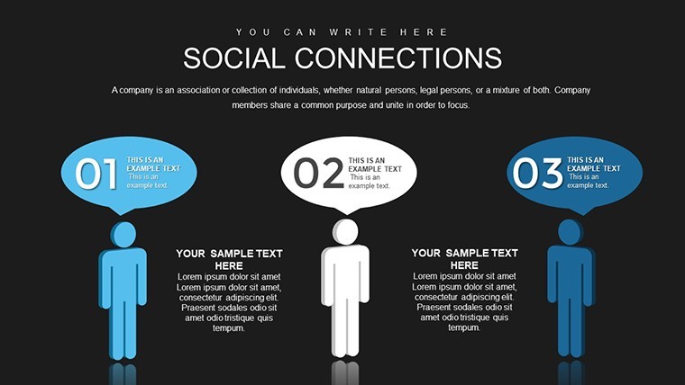
- Editable Illustrations: Silhouettes and people-focused icons that can be resized or recolored to fit your narrative.
- Flexible Layouts: From simple pairwise comparisons to complex network visualizations.
- Keynote Optimization: Smooth integration with .key format, supporting easy data import from tools like Excel.
- Thematic Consistency: Subtle color gradients evoking positivity and connection.
These elements are grounded in expert practices from fields like positive psychology, ensuring your presentations align with authoritative sources.
Practical Use Cases in Policy and Analysis
For a policy analyst evaluating a community outreach program, this template can chart pre- and post-intervention happiness levels against social engagement metrics. Visualize how initiatives reduce isolation, using real-inspired examples from studies like those by the OECD on well-being. In HR, map employee satisfaction to team dynamics, aiding in retention strategies. A researcher might use it for a conference paper on urban loneliness, layering data on demographics and connections. Unlike standard Keynote tools, which lack thematic depth, this template provides ready-made structures that accelerate preparation while enhancing credibility.
Customizing for Your Unique Analysis
- Launch the template in Keynote and select a base slide for your core theme.
- Populate charts with your dataset, adjusting axes for happiness scores versus connection variables.
- Modify illustrations to represent diverse populations, promoting inclusivity.
- Apply animations to reveal insights progressively, building suspense in your story.
- Integrate quotes or case studies from sources like Gallup polls for added authority.
- Review and export for sharing in virtual meetings or reports.
This process fits into workflows involving data from surveys or apps like Qualtrics, streamlining from analysis to presentation.
Boosting Audience Understanding with Visual Narratives
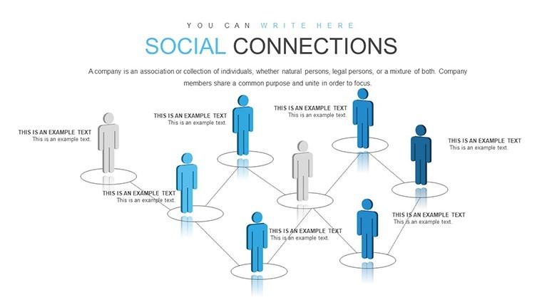
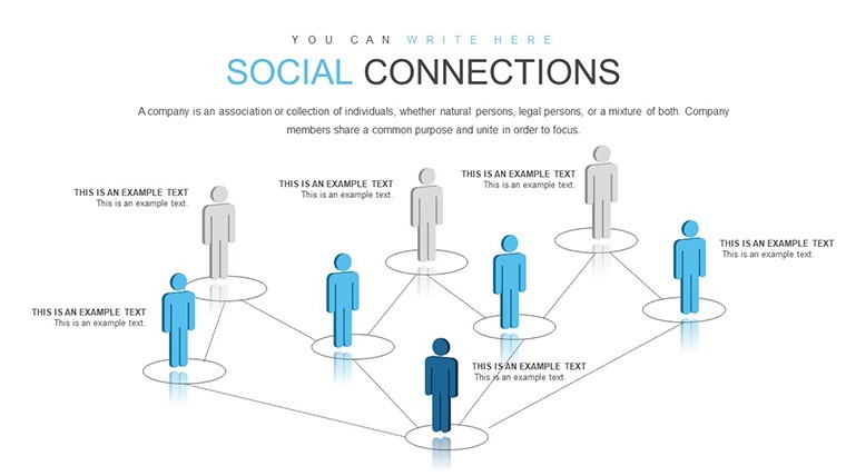
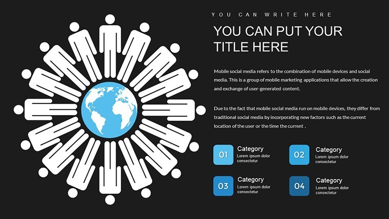
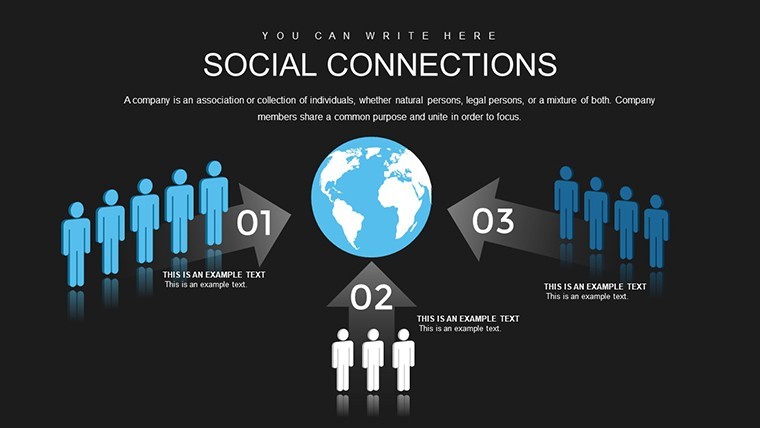
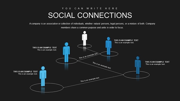
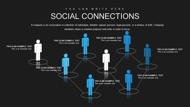
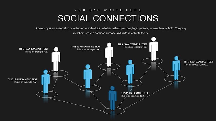
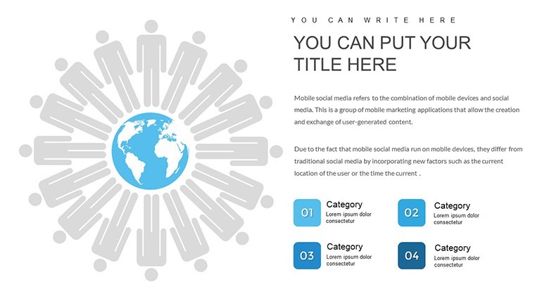
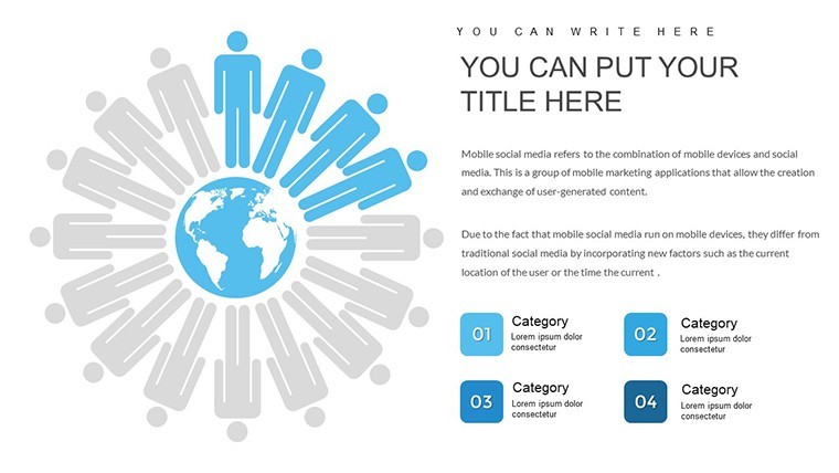
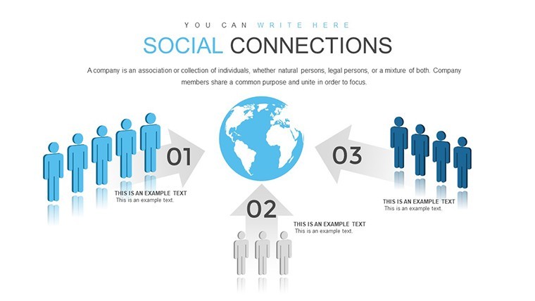
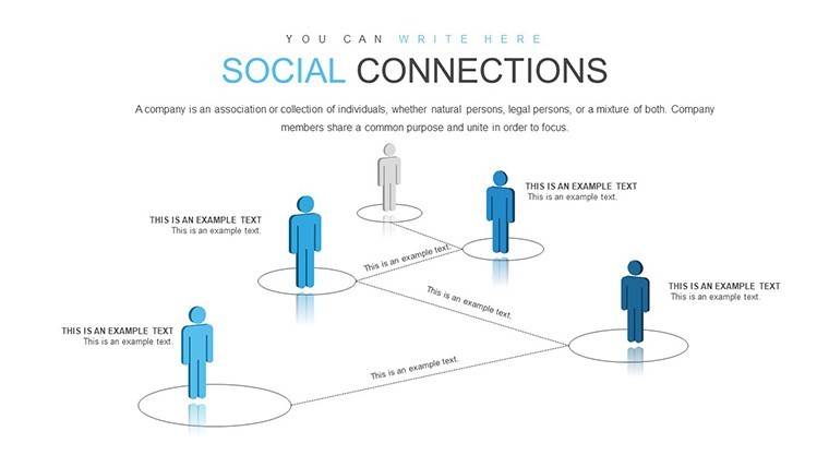
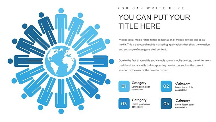
The template's strength lies in its ability to blend illustrations with data, such as using networked silhouettes to depict social webs influencing happiness. This approach addresses common challenges like data abstraction, making concepts accessible. For instance, in a workshop on mental health policies, use slides to show ripple effects of social programs, supported by evidence from journals like Social Indicators Research. The result? Higher engagement and better retention, as visuals aid comprehension in ways text alone cannot.
Expert Tips for Compelling Socio-Economic Presentations
- Balance quantitative data with qualitative anecdotes for a holistic view.
- Choose colors that evoke emotions - blues for calm connections, warms for happiness peaks.
- Incorporate interactive elements if presenting digitally.
- Cite sources inline to build trust and .
- Practice timing to ensure smooth delivery of complex ideas.
Drawn from seasoned analysts at think tanks, these strategies elevate your work.
Secure Your Template and Inspire Change
Priced at $14, this template is a smart choice for impactful analysis. Analysts have praised it for shifting focus to human-centric outcomes. Don't miss out - customize your insights today and foster deeper understanding in your field.
Frequently Asked Questions
What data types work best with this template?
Survey results on happiness and social metrics, easily imported and visualized.
Can I add my own illustrations?
Yes, Keynote allows seamless integration of custom assets.
Is it suitable for non-analysts?
Certainly, educators or HR pros can adapt it for broader use.
How do I handle large datasets?
Summarize key points; the template supports linked charts for details.
Good for
- Project roadmaps and sprint plans
- Product launch timelines
- Quarterly or annual review decks
- Company history and milestone summaries
Licence
reviews
Had to explain survey numbers and the layouts helped a lot.
Some slides looked repetitive but I only needed a few anyway.
The blue tones looked calm during the client call.
I kept the charts but replaced almost every font.
Way easier than building diagrams myself from scratch.
FAQ
Will it work in Google Slides?
Are fonts embedded?
Can I use this for client work?
What's the refund policy?
Do you update the template after purchase?
Similar templates
See all Keynote Charts →

All 26 slides