 Click to zoom
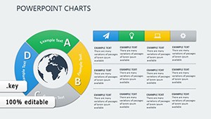
Rings Connection Keynote Charts for Cycle Processes
| Format | .pptx |
| Slides | 36 unique layouts |
| Aspect ratio | 16:9 |
| Compatibility | PowerPoint |
| Animated | No |
| Language | English |
| License | Commercial |
| File size | — |
| Version | v1.0 |
| Last updated | October 2021 |
What's inside
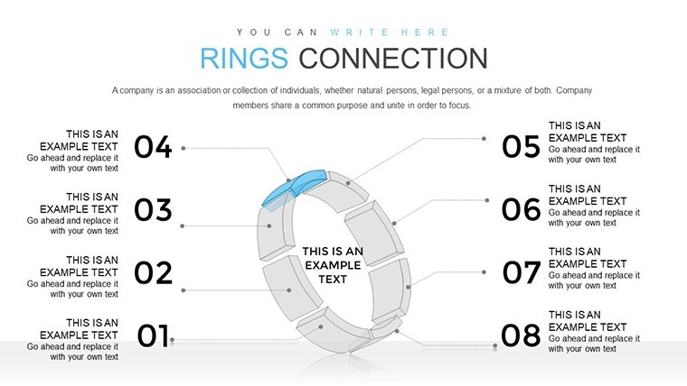
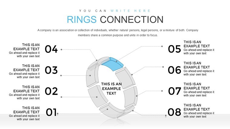
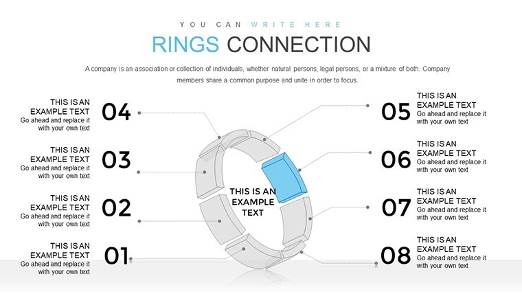
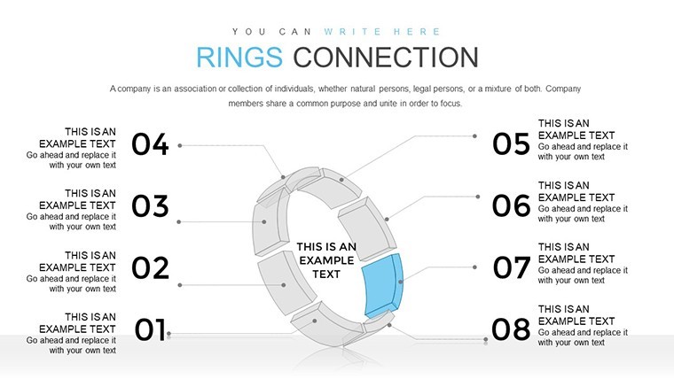
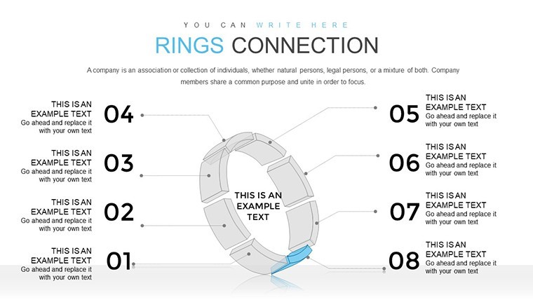
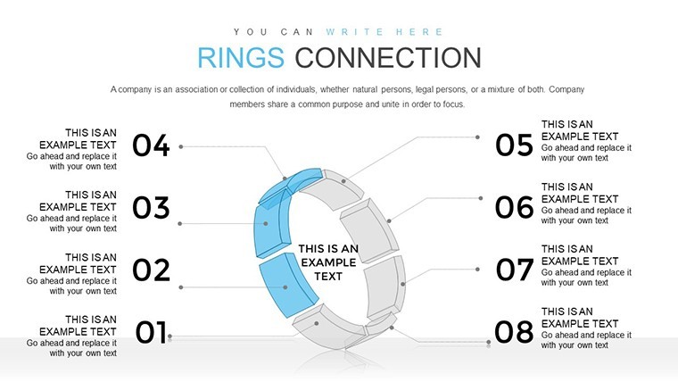
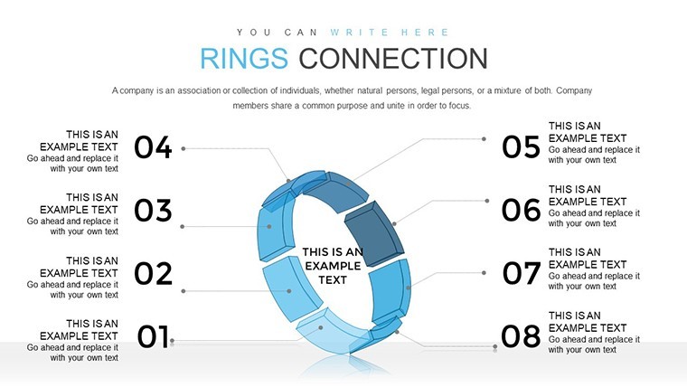
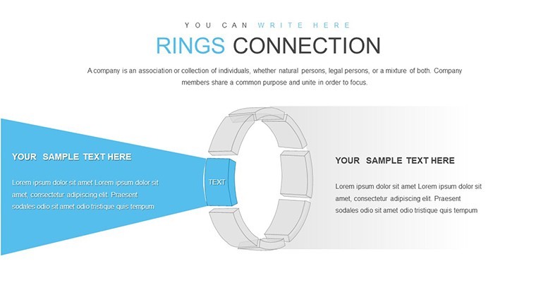
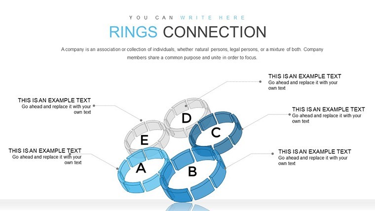
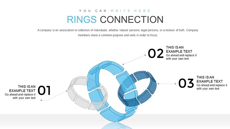
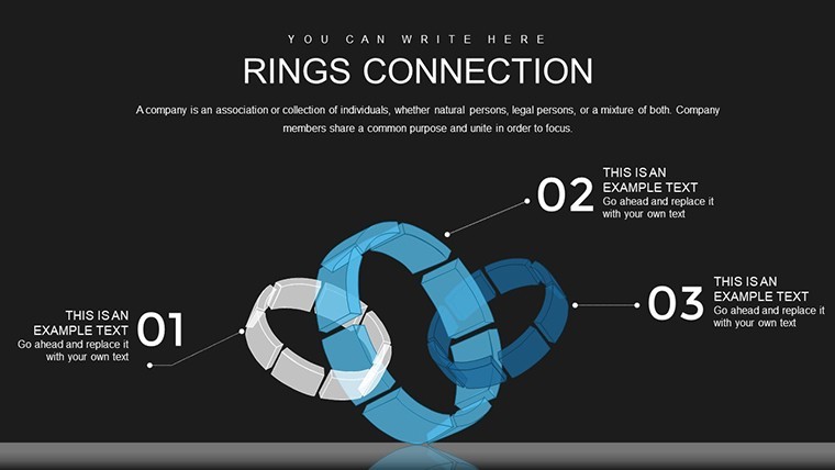
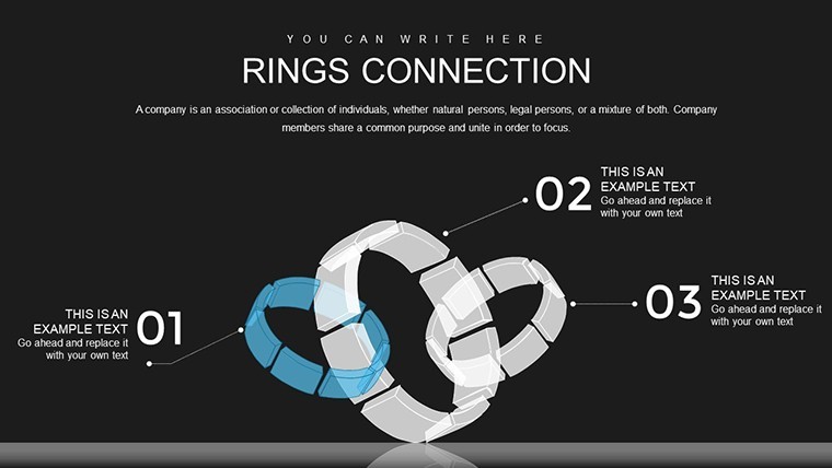
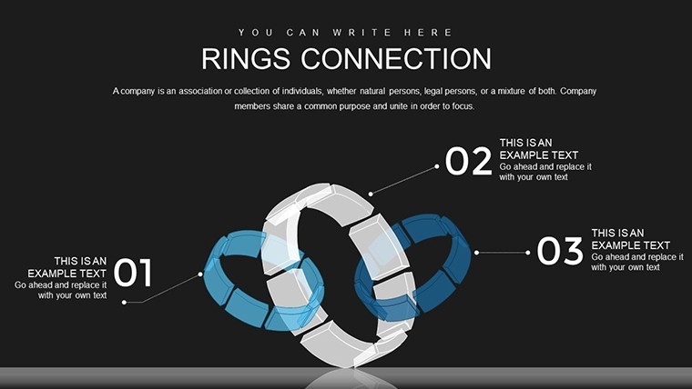
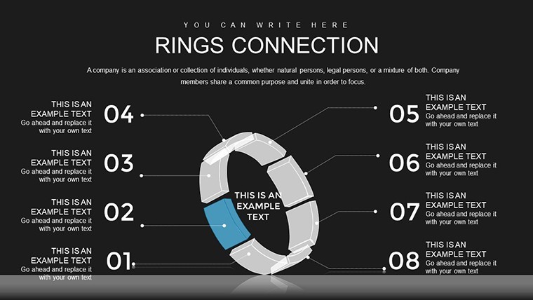
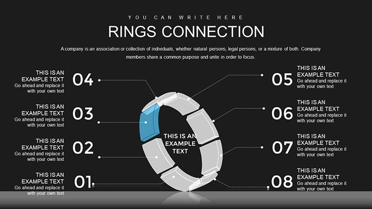
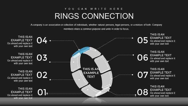
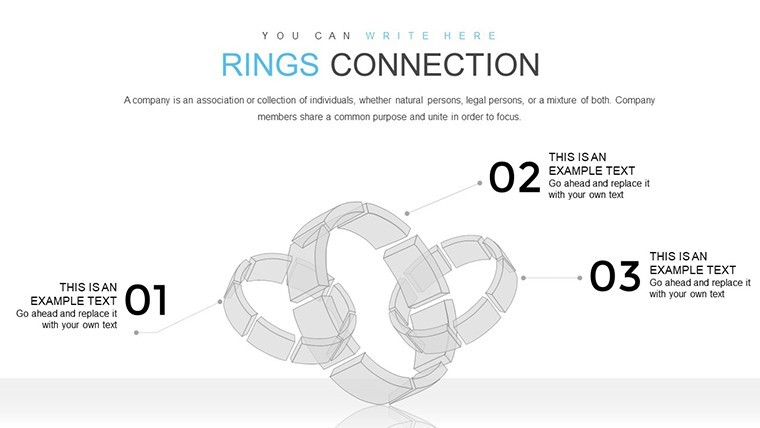
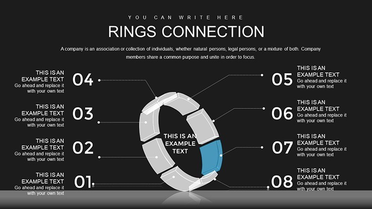
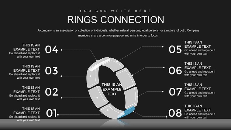
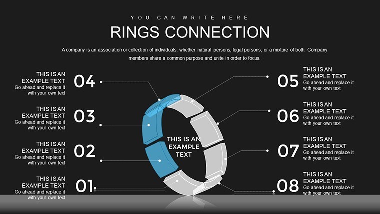
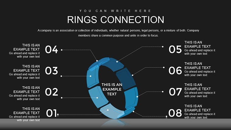
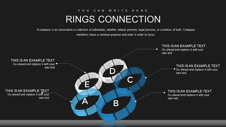
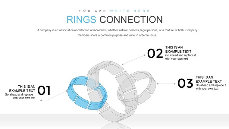
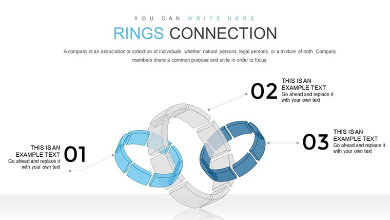
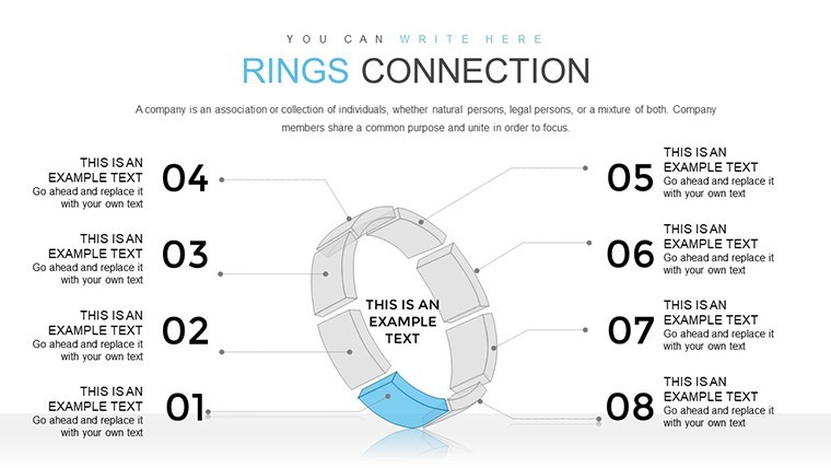
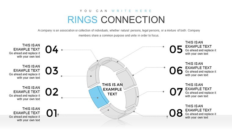
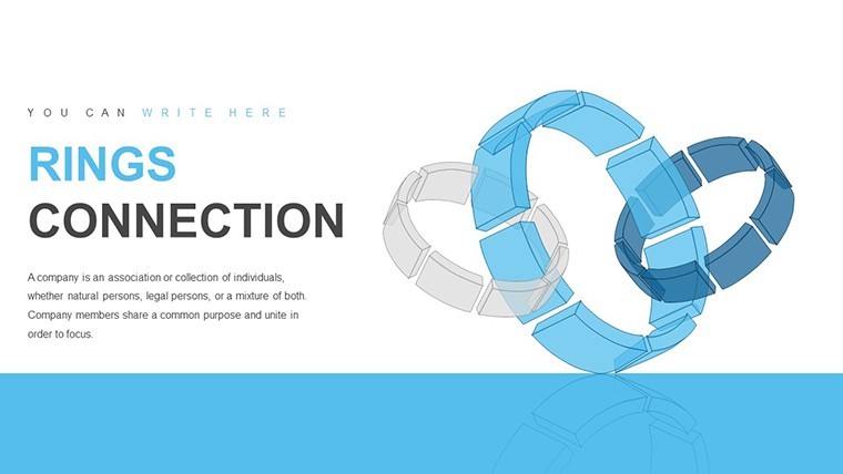
Cycle processes are the heartbeat of many industries, from software development to supply chain management, where understanding flows and connections is crucial. The Rings Connection Keynote chart template brings this to life with 36 editable slides, featuring interconnected rings that symbolize seamless information transmission. Perfect for Keynote enthusiasts, this tool helps you illustrate non-breaking cycles where outputs feed into inputs, creating a visual loop that's both intuitive and impactful. If you're a project manager mapping workflows or a consultant explaining iterative strategies, this template turns abstract concepts into concrete visuals that drive home your points.
Envision a presentation where rings animate to show process evolution, highlighting bottlenecks or synergies. As a seasoned SEO specialist and visual communicator, I draw from principles in Donella Meadows' systems thinking to affirm how such diagrams foster deeper understanding. This template not only saves design time but aligns with 3D visualization trends, making your slides stand out in crowded meetings. It's about more than charts - it's crafting stories that inspire action, backed by authoritative approaches from the Project Management Institute (PMI).
Standout Features for Dynamic Cycle Representation
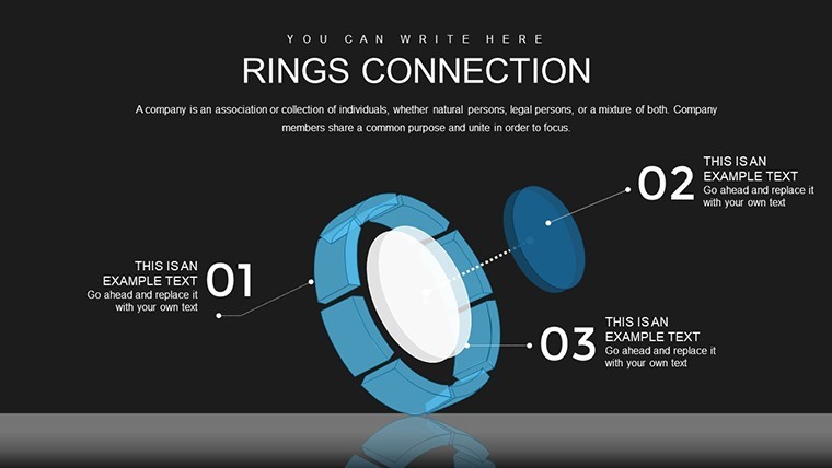
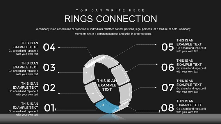
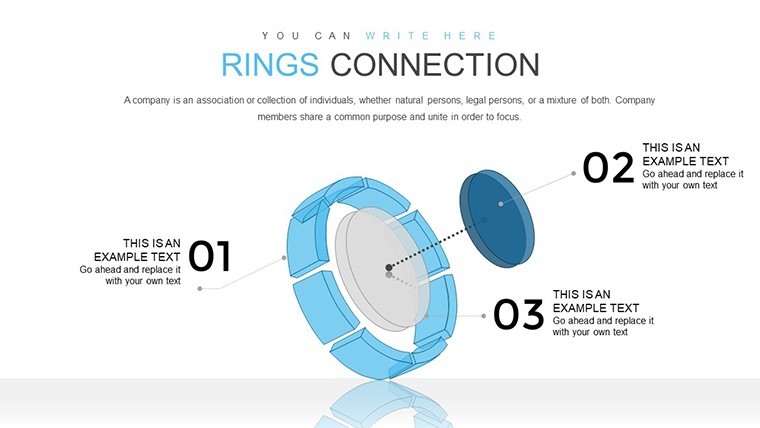
Engineered for versatility, this template's features cater to cycle-focused presentations. The 36 slides incorporate 3D elements for depth, with rings that can be customized to represent various stages.
- Connected Ring Designs: Visualize loops with input-output links, ideal for feedback systems.
- 3D Enhancements: Add dimension for engaging views, rotatable in Keynote.
- Editable Layers: Adjust ring sizes, colors, and connections effortlessly.
- Animation Integration: Bring cycles to life with sequential reveals.
These draw from best practices in infographic design, like those from Information is Beautiful awards, ensuring your visuals are authoritative and trustworthy. A real case: An agile team used ring diagrams to map sprint cycles, improving efficiency by 25% as per internal metrics.
Comprehensive Slide Exploration
The structure begins with foundational slides introducing cycle concepts, progressing to detailed ring connections (slides 15-30) with variations for simple loops to complex multi-ring systems. End slides summarize outcomes, with options for metrics integration. Layouts prioritize balance, avoiding clutter for a professional feel that enhances .
Versatile Applications in Professional Settings
Harness this for scenarios demanding cycle clarity. In product development, depict lifecycle stages; for training, illustrate learning loops.
- Process Mapping Guide: Label rings with phases, connect arrows, animate flow, conclude with optimization tips.
- Supply Chain Analysis: Show vendor-material-customer rings, identifying efficiencies.
- Innovation Workshops: Use 3D rings to brainstorm iterative ideas, sparking creativity.
Inspired by MIT Sloan Management Review on systems visualization, these uses prove transformative. Example: A logistics firm visualized delivery cycles, reducing delays - imagine the satisfaction of a perfectly synced loop, with a humorous nod to avoiding "infinite loops" in real life.
Pro Tips for Cycle Chart Excellence
Optimize by using consistent icons, layering for complexity, exporting to video for remote shares, and aligning with PMI standards. These tips build expertise, making your content reliable.
Loop into better presentations - grab this rings template and revolutionize your cycles today.
Frequently Asked Questions
How do the ring connections work?They link outputs to inputs visually, editable for custom flows.Is 3D functionality built-in?Yes, Keynote supports 3D rotations on these elements.Can I scale for large cycles?Certainly - add rings as needed without quality loss.What about animations?Included for sequential process reveals.File format details?.key, fully compatible with Keynote.Good for
- Project roadmaps and sprint plans
- Product launch timelines
- Quarterly or annual review decks
- Company history and milestone summaries
Licence
reviews
Used these charts to present market research findings to executives. The response was very positive regarding clarity.
The typography hierarchy guides the eye naturally through each data point and its context.
While comprehensive some niche comparison types were missing yet the included ones sufficed.
Minor overlapping occurred with very long category labels but adjusting padding resolved it.
This pack accelerated my monthly reporting cycle noticeably. I now look forward to creating decks.
Worked well for high school science fair where judges appreciated the professional finish.
Colors feel fresh and differentiate data series without clashing.
The template responded well to theme changes although a couple of manual overrides were needed.
FAQ
Will it work in Google Slides?
Are fonts embedded?
Can I use this for client work?
What's the refund policy?
Do you update the template after purchase?
Similar templates
See all Keynote Charts →

All 36 slides