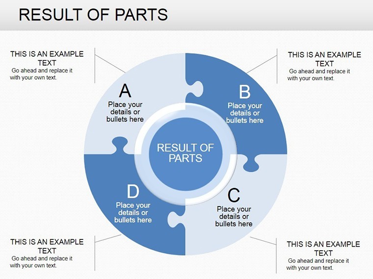
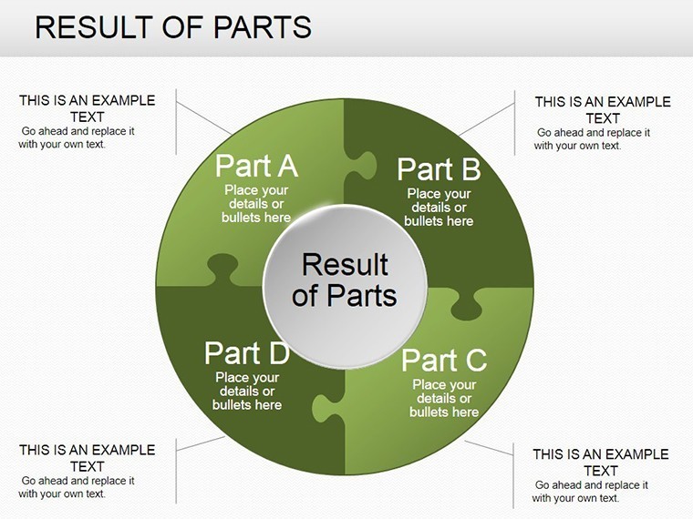
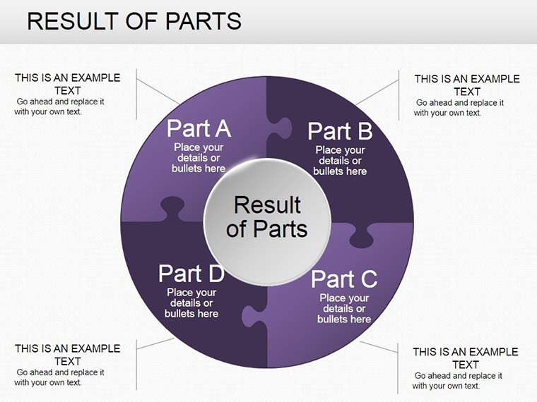
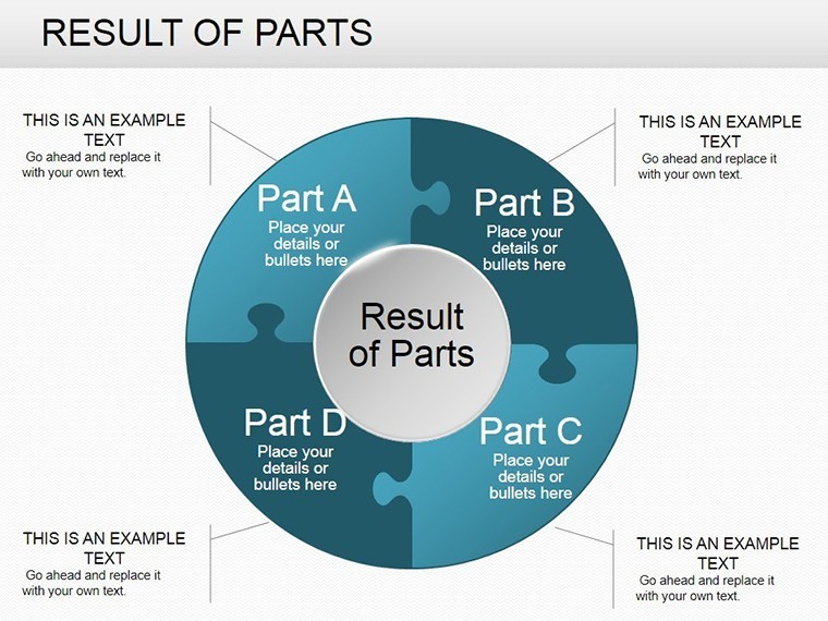
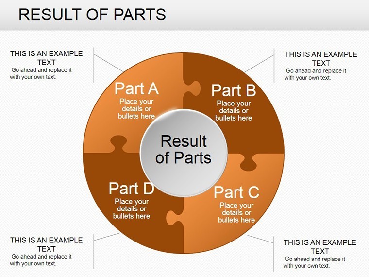
 Click to zoom
Pie Data Keynote Charts: Master Data Visualization with Precision
| Format | .pptx |
| Slides | 24 unique layouts |
| Aspect ratio | 16:9 |
| Compatibility | PowerPoint |
| Animated | No |
| Language | English |
| License | Commercial |
| File size | — |
| Version | v1.0 |
| Last updated | October 2021 |
What's inside
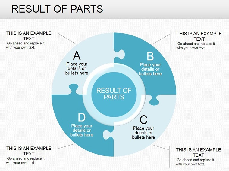
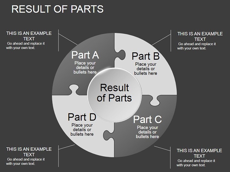
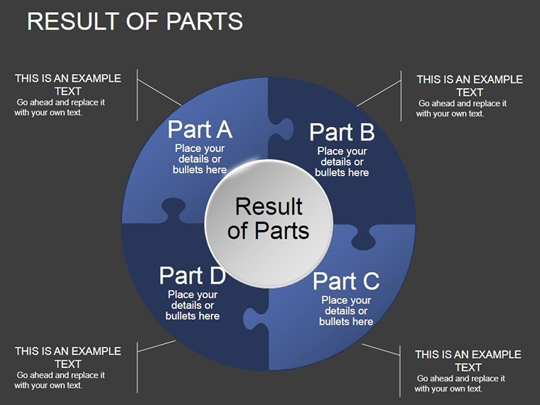
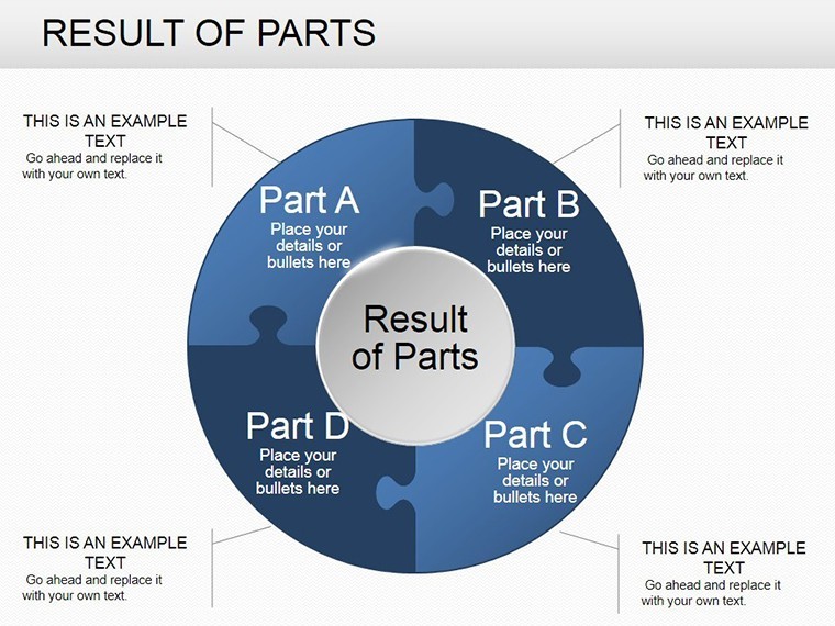
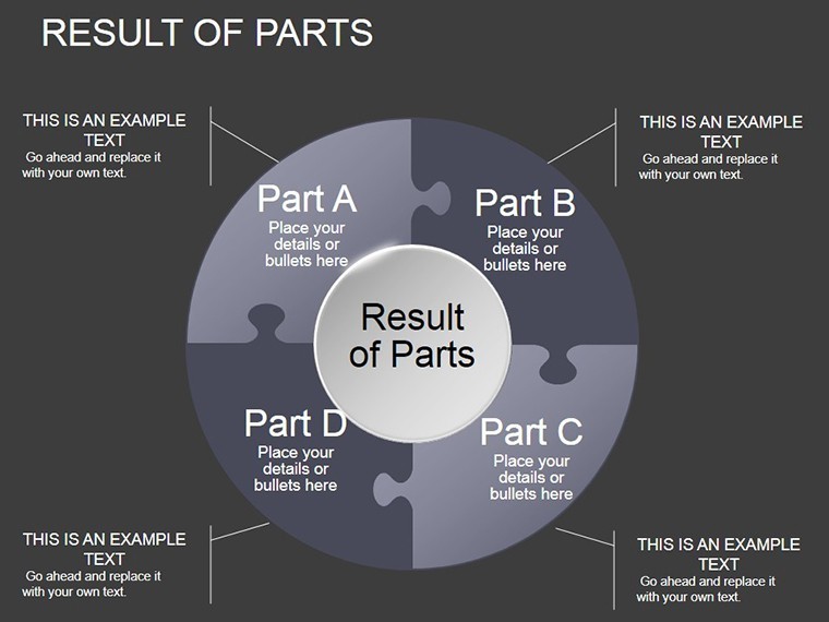
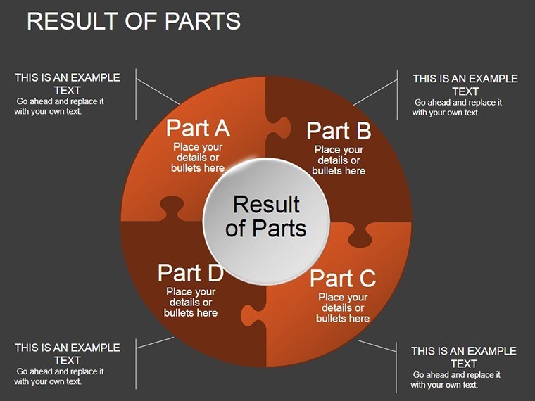
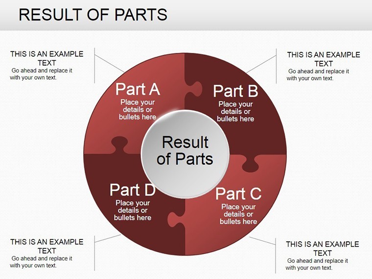
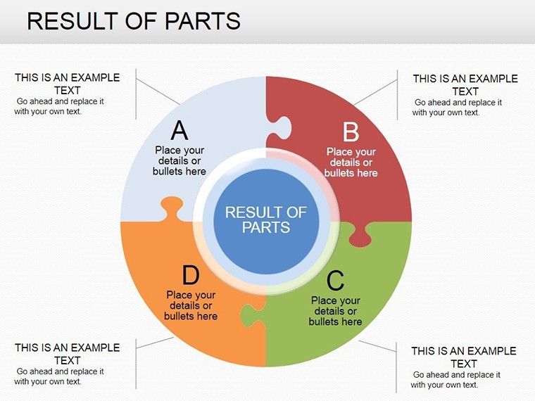
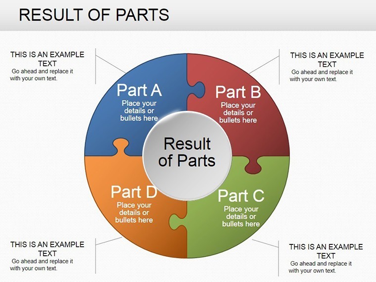
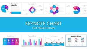
When numbers alone fail to tell the story, pie charts step in to slice through the complexity. The Pie Data Keynote Charts template offers 24 meticulously crafted, editable slides tailored for professionals who need to convey statistical insights with clarity and impact. Whether you're a data analyst prepping a quarterly report, a marketer showcasing campaign results, or an executive summarizing market shares, this template transforms raw data into digestible visuals that drive decisions.
What makes this stand out in the crowded field of presentation tools? It's the seamless integration of pie charts with spheres for a modern twist, allowing you to highlight relationships between data points effortlessly. Built for Keynote's robust ecosystem, these slides support dynamic color changes and area emphases, making it simple to spotlight critical process steps. Say goodbye to tedious manual graphing; instead, focus on the narrative that captivates your audience, backed by visuals that align with best practices from data visualization gurus like Edward Tufte.
Essential Features for Data-Driven Presentations
This template's power lies in its user-centric design, ensuring every slide is a canvas for your story. With full editability, you can tweak percentages, labels, and hues to match your brand palette. Key highlights include:
- Versatile Pie Layouts: From basic single pies to multi-segment explosions, ideal for breaking down budgets or demographics.
- Sphere Enhancements: 3D-like spheres add depth to flat data, perfect for illustrating interconnected fields like sales funnels.
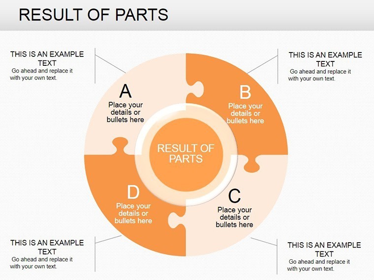
- Color Customization Tools: One-click recoloring to emphasize highs and lows, with accessibility-compliant contrasts.
- Integrated Advice Elements: Placeholder callouts for insights, turning charts into advisory tools for strategic meetings.
These features draw from real-world applications, such as using pie charts in financial dashboards to quickly identify revenue streams - a method endorsed in Forbes articles on executive reporting.
Exploring the Slides: A Layered Approach to Data
The template unfolds progressively. Opening slides (1-6) introduce simple pie structures for baseline stats, like market segmentation, with clean lines and minimal text overlays. As you advance to slides 10-15, expect exploded views that pull out key slices - great for emphasizing a 30% growth spike in user engagement metrics.
Closing with slides 20-24, you'll find comparative pies side-by-side, facilitating year-over-year analyses. For example, adapt slide 22 for a product launch: input sales data to show category dominance, complete with animated builds that reveal segments sequentially. All slides are data-linked, so updates from spreadsheets propagate instantly, streamlining your workflow.
Practical Use Cases: From Boardrooms to Brainstorms
Envision a sales team using these charts to dissect territory performance: the sphere-pie hybrid on slide 12 visualizes regional contributions, helping reps prioritize high-potential areas. In education, professors employ them for survey results, making abstract stats tangible and sparking class discussions.
A case in point: A tech startup's pitch deck, enhanced with this template, secured funding by clearly delineating user acquisition channels - mirroring success stories from TechCrunch. For non-profits, pie charts on volunteer hours allocation build transparency, fostering donor trust.
Pro Tips for Seamless Integration and Polish
Start by importing your dataset via Keynote's table tools, then apply gradients for a professional sheen. To avoid clutter, limit segments to 7-8 per pie, adhering to cognitive load principles. If collaborating, share via iCloud for real-time edits. For hybrid events, optimize for projection with high-contrast modes built into the masters.
Advanced users can layer infographics: add trend lines over pies for temporal insights, elevating basic visuals to sophisticated analytics displays.
Standing Out in a Data-Saturated World
Unlike clunky Excel exports, this Keynote-native template ensures fluid performance and aesthetic appeal. It's not just about charts; it's about context - providing the "why" behind the numbers through strategic placements. Feedback from users highlights its speed: "Cut my prep time in half while doubling wow-factor," shares a business analyst.
Investing here means gaining a reusable asset for endless reports, far surpassing one-off designs. Grab your Pie Data Keynote Charts now and turn stats into stories that stick. Customize, present, and persuade with ease.
Frequently Asked Questions
How do pie charts in this template improve data understanding?
They simplify complex stats by showing proportions visually, making relationships between fields instantly clear.
Can I change the colors of the pie segments?
Yes, with intuitive tools - select and recolor to fit your theme or highlight specifics.
What's the benefit of the sphere elements?
They add a modern, 3D dimension to pies, enhancing engagement without overwhelming the viewer.
Are animations included for revealing data?
Built-in Keynote animations allow sequential segment builds for dramatic effect.
Is this template compatible with Google Slides?
It exports well, though best results come from native Keynote use.
How many slides does it have?
24 fully editable slides, covering a range of pie and sphere variations.
Good for
- Project roadmaps and sprint plans
- Product launch timelines
- Quarterly or annual review decks
- Company history and milestone summaries
Licence
reviews
The chart colors looked okay on a projector during our office meeting.
I only used three slides from the pack but they fit my report perfectly.
Needed visual data slides for class and the pie charts were easy to update.
The template is alright although some text areas were too small.
I liked the simple graph layouts because they didn’t distract from the numbers.
FAQ
Will it work in Google Slides?
Are fonts embedded?
Can I use this for client work?
What's the refund policy?
Do you update the template after purchase?
Similar templates
See all Keynote Charts →
All 24 slides