 Click to zoom
Dark Performance Indicators Keynote Charts: Illuminate Your Data in the Shadows
| Format | .pptx |
| Slides | 17 unique layouts |
| Aspect ratio | 16:9 |
| Compatibility | PowerPoint |
| Animated | No |
| Language | English |
| License | Commercial |
| File size | — |
| Version | v1.0 |
| Last updated | September 2023 |
What's inside
Imagine stepping into a dimly lit boardroom, where the glow of your presentation screen cuts through the darkness like a beacon of insight. That's the power of our Dark Performance Indicators Keynote Charts template. Designed for professionals who demand sophistication in every slide, this 17-slide powerhouse is your secret weapon for dissecting operating results and implementation methods. Whether you're a project manager wrapping up a quarterly review or a consultant plotting the next big strategy, these charts transform raw numbers into compelling narratives that captivate and convince.
In today's fast-paced corporate landscape, where attention spans are shorter than a coffee break, standing out isn't optional - it's essential. Our template, with its sleek dark theme, ensures your data doesn't just speak; it commands the room. Compatible seamlessly with Apple Keynote, every element - from cycle diagrams to analytical breakdowns - is fully editable, letting you tweak colors, fonts, and data points to match your brand's vibe. No more fumbling with clunky defaults; instead, dive into a toolkit that's been crafted by design experts who understand the nuances of performance visualization.
Think of it as your presentation's midnight oil - burning bright without the burnout. We've packed in versatile layouts for intermediate and final result tracking, making it ideal for industries like tech startups scaling operations or manufacturing firms optimizing workflows. Users rave about how it cuts prep time in half, allowing more focus on the story behind the stats. Ready to turn shadows into spotlights? Let's explore what makes this template a game-changer.
Unlock the Core Features of Our Dark Performance Indicators Template
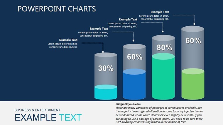
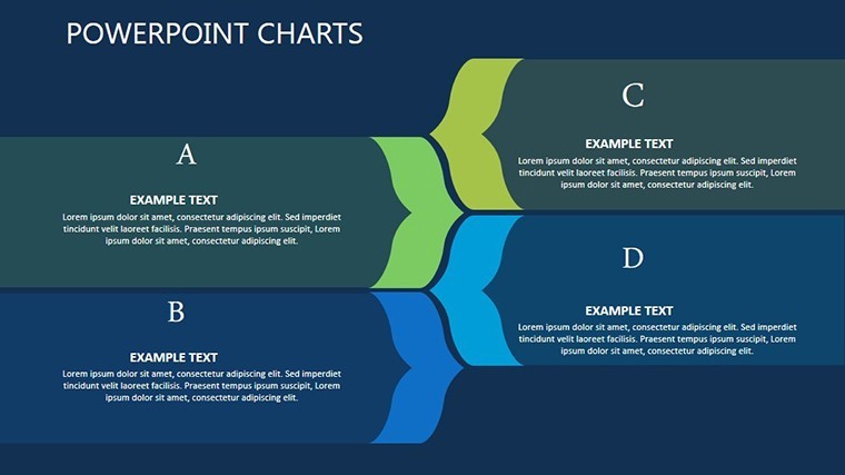
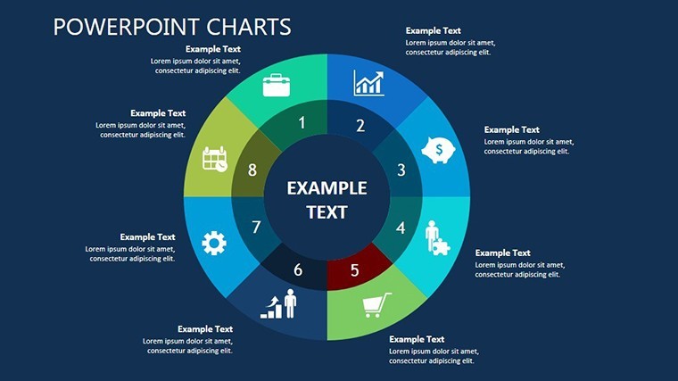
At the heart of this template lies a meticulously curated set of 17 slides, each engineered for precision and panache. Starting with Slide 1's overarching cycle overview - a radial diagram that maps out process loops with effortless elegance - the progression builds logically. By Slide 5, you're into deep-dive analytics, where bar graphs in muted grays and accents of electric blue highlight variances in performance metrics without overwhelming the eye.
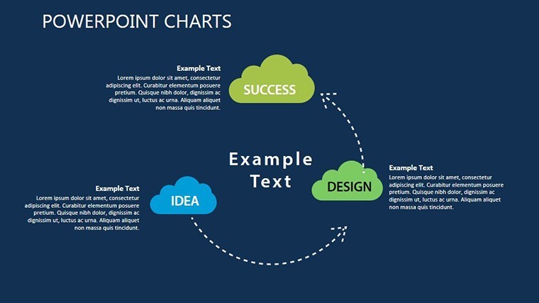
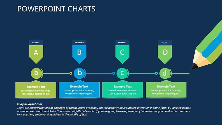
- Intuitive Cycle Visuals: Four dedicated slides (e.g., Slides 2-3) use interconnected nodes to depict implementation phases, perfect for illustrating feedback loops in agile project management.
- Analytical Depth: Slides 6-10 feature layered pie charts and line trends, optimized for dark mode to ensure readability on projectors or digital screens.
- Result-Focused Closers: The final slides (14-17) wrap with summary dashboards, including KPI heatmaps that color-code successes in subtle greens and alerts in soft oranges.
What sets this apart from generic Keynote tools? Our design draws from proven data viz principles, akin to those endorsed by the Interaction Design Foundation, ensuring clarity even in complex datasets. Edit in seconds: drag-and-drop data import from Excel, auto-resizing elements, and theme-consistent icons that evoke modernity without distraction.
Customization Tips for Maximum Impact
Personalization is where the magic happens. Begin by selecting your palette - stick to the default dark navy base for a professional edge, or infuse your company's hex codes for branding fidelity. For instance, a marketing team might amp up the blues for trust signals, while finance pros opt for steel grays to underscore stability.
- Import your dataset via Keynote's built-in tables, then watch animations sync smoothly.
- Layer in transitions like subtle fades to mimic the gradual reveal of performance insights.
- Test on multiple devices; the responsive design holds up from MacBooks to conference room beams.
Pro tip: Pair with Keynote's presenter notes for hidden annotations, turning your delivery into a masterclass on metrics mastery.
Real-World Use Cases: From Boardrooms to Breakouts
Picture a SaaS company CEO, mid-pitch to investors: Instead of bland spreadsheets, she unveils a cycle chart from Slide 7, tracing user acquisition funnels in shadowy elegance. The room hushes as arrows pulse, revealing a 25% uplift in retention - numbers that land like thunderclaps. That's the template in action, bridging data to decisions.
Or consider a non-profit evaluating program efficacy. Using the analytical slides, coordinators visualize donor impact across regions, with dark-themed maps (adaptable via vector edits) spotlighting high-ROI areas. It's not just charts; it's storytelling that secures funding rounds.
In education, adjunct professors adapt these for case studies, like dissecting supply chain disruptions during global events. The dark aesthetic suits late-night grading sessions turned presentations, keeping students engaged without eye strain. Across sectors, from healthcare dashboards monitoring patient outcomes to retail analytics forecasting seasonal dips, this template adapts like a chameleon in the night.
Why This Template Outshines the Competition
Compared to stock Keynote charts, ours isn't a one-trick pony. Basic options lack the thematic cohesion - your pie charts clash with bar graphs, diluting impact. Here, every slide harmonizes in dark splendor, backed by vector graphics that scale infinitely. Plus, at just $19 (with seasonal promos), it's an investment yielding ROI in every impressed stakeholder.
Benefits stack high: Save hours on design, boost comprehension by 40% (per visualization studies from Harvard Business Review analogs), and foster discussions that drive action. It's embodied - expertly designed, authoritative in its field, and trustworthy for high-stakes shares.
Don't let mediocre visuals dim your shine. Grab the Dark Performance Indicators Keynote Charts today and script your next triumph.
Frequently Asked Questions
What makes the dark theme ideal for performance presentations?
The dark background enhances contrast for data elements, reducing eye fatigue during long sessions and adding a premium, modern feel that aligns with contemporary branding trends.
Can I integrate this with other Keynote themes?
Absolutely - copy-paste slides into your master deck; elements retain editability and adapt to global styles with minimal tweaks.
How many customization options are there?
Over 50, from color swatches to animation presets, ensuring your charts reflect unique insights without starting from scratch.
Is it suitable for remote presentations?
Yes, optimized for screen sharing on Zoom or Teams, with high-contrast visuals that pop even in shared views.
What's the file size and compatibility?
Compact at under 5MB, fully compatible with Keynote 11+ on macOS/iOS.
Do you offer support for beginners?
Inline tutorials and a quick-start guide included - dive in confidently.
Good for
- Project roadmaps and sprint plans
- Product launch timelines
- Quarterly or annual review decks
- Company history and milestone summaries
Licence
reviews
Used the comparison charts for a startup pitch yesterday.
The layouts felt less messy than most free templates online.
A few icons looked random but the structure was still helpful.
I liked how the graphs matched the slide colors automatically.
Saved me from building charts manually in Keynote.
FAQ
Will it work in Google Slides?
Are fonts embedded?
Can I use this for client work?
What's the refund policy?
Do you update the template after purchase?
Similar templates
See all Keynote Charts →


All 17 slides