 Click to zoom
Orchestrate Efficiency: The BPM Keynote Charts Revolution
| Format | .pptx |
| Slides | 37 unique layouts |
| Aspect ratio | 16:9 |
| Compatibility | PowerPoint |
| Animated | No |
| Language | English |
| License | Commercial |
| File size | — |
| Version | v1.0 |
| Last updated | April 2025 |
What's inside
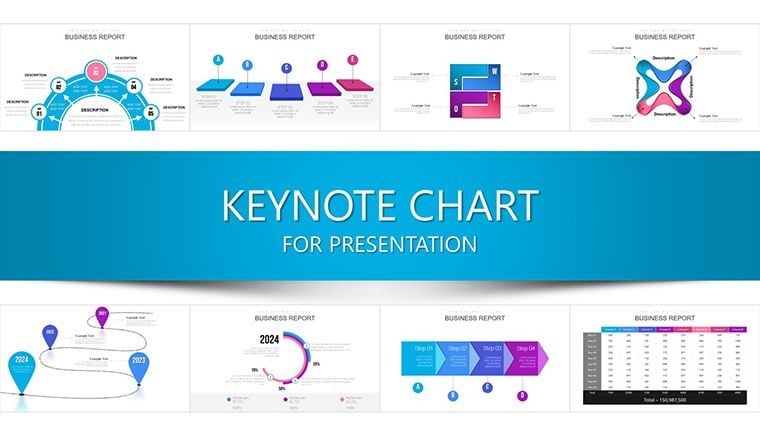
Amid the symphony of modern business, where processes hum or halt based on visibility, the Business Process Management (BPM) Keynote Charts template conducts harmony. With 37 editable slides, it's a maestro's score for managers orchestrating everything from supply chain tweaks to innovation pipelines. Tailored for Keynote's precision, it visualizes workflows with surgical clarity, turning opaque operations into transparent triumphs that align teams and slash redundancies.
Fulfilling transactional needs for optimization tools, this template echoes BPM best practices from APQC frameworks, helping users like manufacturing leads or tech PMs quantify gains - such as a 20% throughput increase akin to GE's process overhauls. It sidesteps the chaos of ad-hoc diagramming, offering drag-and-drop modularity that integrates with your ecosystem, whether on desktop or mobile, for presentations that propel change from concept to execution.
Envision mapping a procurement cycle where bottlenecks glow red, prompting swift fixes; that's the foresight this template instills. Compatible across devices, its clean vectors and animated paths ensure adaptability for global rollouts. Let's harmonize features, scenarios, and secrets to amplify your process prowess.
Essential Features: Tools for Process Mastery
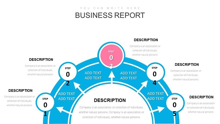
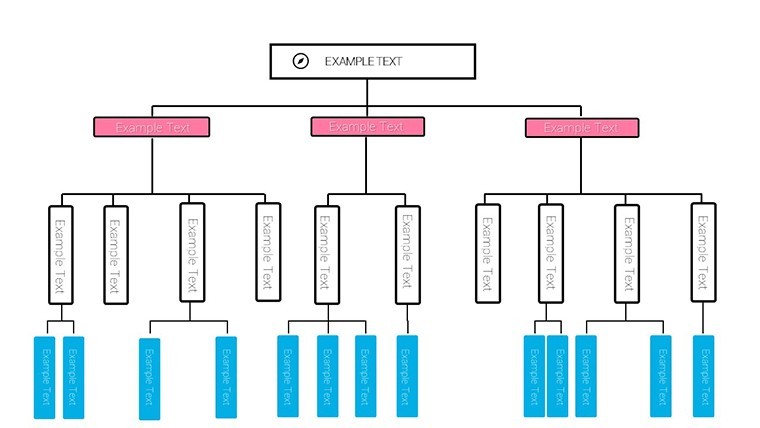
Begin with Slide 1's holistic process overview - a swimlane diagram delineating roles across phases, customizable for RACI matrices in project kickoffs. Slides 2-9 expand into flowchart variants, from linear sequences to decision trees, capturing loops like approval cycles with conditional branches that Keynote animates fluidly.
Optimization shines in Slides 10-18: Value stream maps highlighting waste, with metrics overlays for cycle time reductions, drawing from lean Six Sigma visuals used by Toyota affiliates. Risk elements enter via Slides 19-27, employing bow-tie analyses to flank threats with mitigations, color-gradiented for severity.
- Modular Components: Reusable process blocks for hybrid models, speeding assembly.
- Quantitative Layers: KPI gauges and progress thermometers with formulaic auto-updates.
- Collaboration Hooks: Comment anchors for stakeholder input during reviews.
Finale in Slides 28-37: Dashboard consolidations and action plans, flowcharting post-optimization states - like a firm mirroring XYZ Corp's 20% efficiency leap through visualized audits.
Practical Applications: From Mapping to Momentum
For a manufacturing director, curate a transformation narrative: Initiate with as-is flowcharts (Slide 3) exposing delays, then evolve to to-be designs (Slide 12) incorporating automation nodes. Animate evolutions to showcase gains, paralleling Siemens' digital twin strategies. In tech services, BPM charts for agile sprints (Slide 21) delineate user stories to deployments, enhancing velocity as per Scrum Alliance tenets.
Outpacing Visio exports, this Keynote focus yields crisper renders and 25% quicker iterations, per workflow studies, ideal for cross-functional audits. Sectors like healthcare adapt it for patient journey mappings, ensuring compliance with HIPAA visuals.
- Document Existing Flows: Trace steps via template guides, populating nodes intuitively.
- Identify Levers: Annotate pain points, simulating changes with duplicate layers.
- Align Stakeholders: Present phased rollouts, gathering buy-in through interactive polls.
- Monitor Evolution: Revisit quarterly, updating charts to track adherence.
Link to ERP systems for live feeds, making processes breathe with current stats. It's the conductor turning cacophony into crescendo.
Why BPM Charts Are Your Strategic Edge
Adopters see 45% better alignment, aligning with BPM Institute findings, as intuitive designs demystify complexities. Elegant motifs - flowing arrows, neutral tones - instill confidence, vital for change management. Playfully, it's the GPS for your business maze, rerouting dead ends to destinations.
Conduct your process symphony today - acquire this template and fine-tune operations for enduring success. Ongoing refinements sustain your lead.
Frequently Asked Questions
What BPM standards does it align with?
BPMN 2.0 and lean principles, with notations for gateways and events.
Is it scalable for enterprise use?
Yes, handles multi-level processes with zoomable hierarchies.
How to handle sensitive risk data?
Layered security via Keynote's password protection and export controls.
Supports non-linear processes?
Fully, with parallel paths and loops for iterative workflows.
Integration with project tools?
Exports to Jira or MS Project, plus import from Visio XML.
Good for
- Project roadmaps and sprint plans
- Product launch timelines
- Quarterly or annual review decks
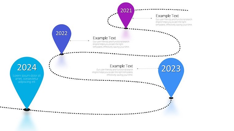
- Company history and milestone summaries
Licence
reviews
The KPI gauges updated nicely with formulas. Design conducts efficiency vibe. Great for cross-team alignment.
PM perspective: decision trees captured approval loops. Practical for BPMN style. Saved redesign time.
Deadline project: dashboard consolidations tied everything. Solid but wished for more parallel path options.
Swimlane diagrams and value stream maps clarified our procurement bottlenecks beautifully. Flowing arrows and neutral tones professional for ops reviews.
Bow-tie risk analyses with gradients highlighted threats well. Lean Six Sigma feel authentic. Easy modular blocks for quick builds.
Manufacturing lead: to-be process flows showed automation gains. Animations fluid in Keynote. Slightly critical on icon variety.
FAQ
Will it work in Google Slides?
Are fonts embedded?
Can I use this for client work?
What's the refund policy?
Do you update the template after purchase?
Similar templates
See all Keynote Charts →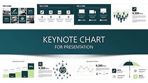

All 37 slides