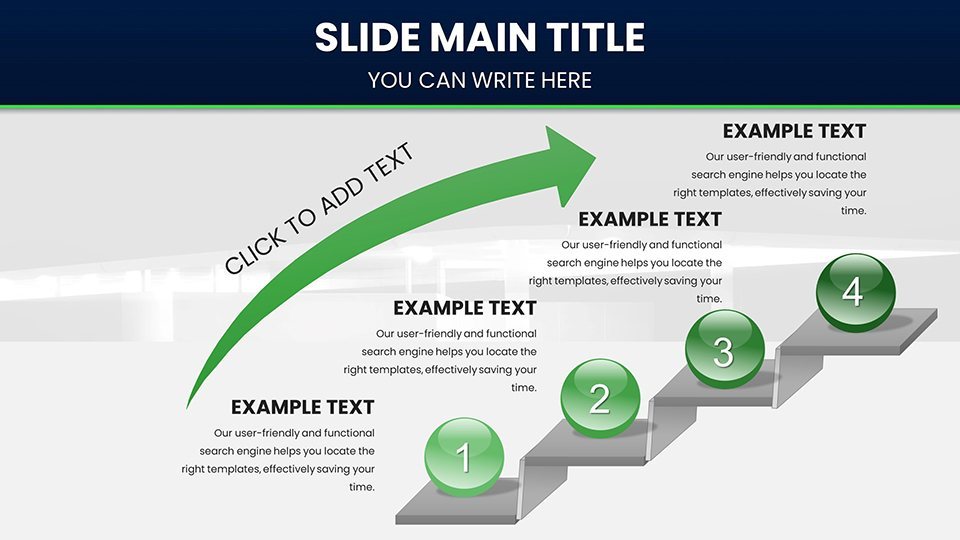
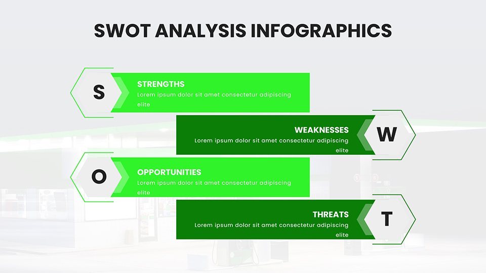
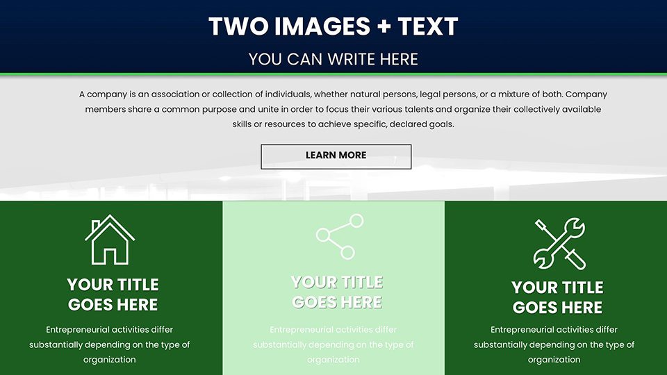
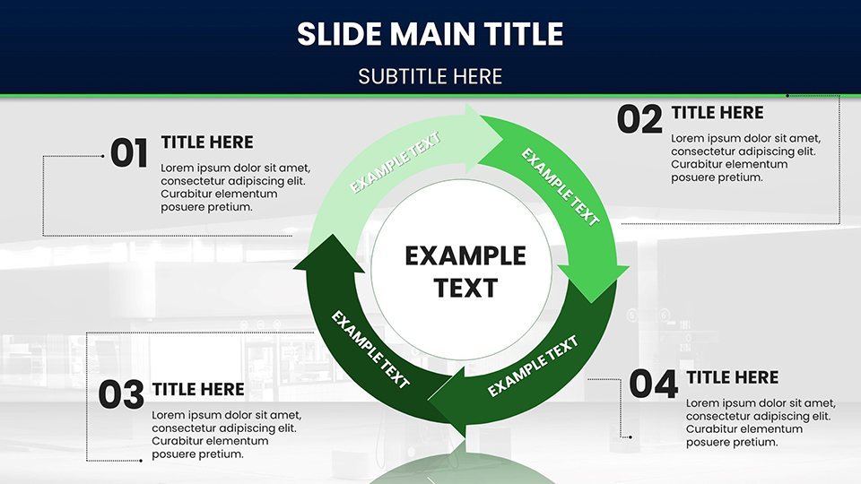
 Click to zoom
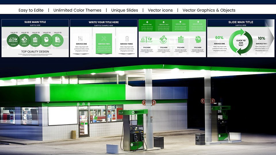
Gasoline Fuel Pump Charts for Keynote Presentation
| Format | .pptx |
| Slides | 59 unique layouts |
| Aspect ratio | 16:9 |
| Compatibility | PowerPoint |
| Animated | No |
| Language | English |
| License | Commercial |
| File size | — |
| Version | v1.0 |
| Last updated | February 2026 |
What's inside
Think of your next presentation as a high-octane journey, where data flows smoothly and insights ignite action. Our Gasoline Fuel Pump Charts for Keynote provide that drive with 59 editable slides, themed around energy and efficiency for impactful visuals. Suited for business analysts tracking fuel markets, educators explaining energy economics, and researchers presenting findings, this template converts complex datasets into compelling narratives. Move beyond static graphs to dynamic designs like gauge charts mimicking fuel meters or line graphs charting price fluctuations with pump nozzle icons. Addressing key challenges, such as simplifying volatile market data, these charts draw from standards like those from the Energy Information Administration (EIA), ensuring accuracy and engagement in every slide. It's your fuel for presentations that accelerate understanding and decision-making.
Power-Packed Features for High-Performance Presentations
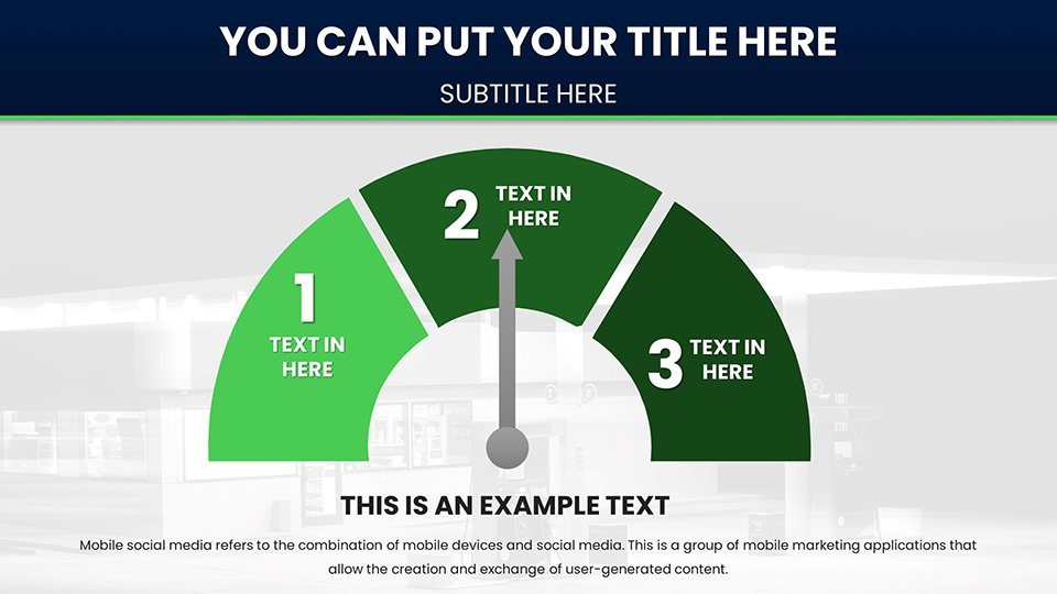
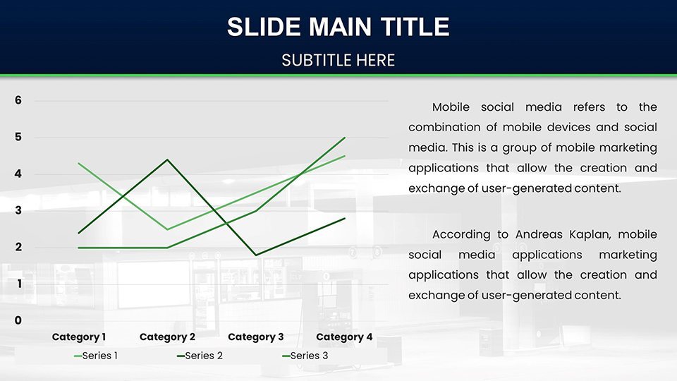
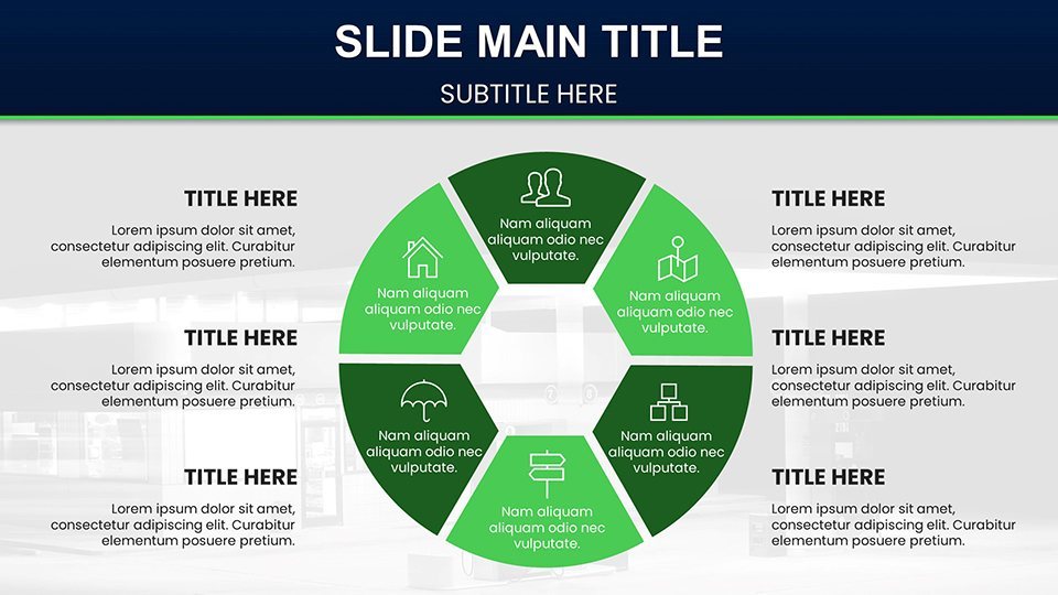
Fueling the template are advanced features: dynamic data visualization with customizable elements, from metallic color schemes to industrial fonts. The 59 slides encompass varied types - stock charts for inventory levels, candlestick for price volatility, and maps for regional distribution. Slide 2, for example, uses a meter chart to display efficiency ratings, editable for real-time EIA data integration. Compatible with Keynote on Mac and accessible via iCloud on Windows, it supports seamless workflows. Developed with input from energy sector experts, these charts enhance retention, similar to how API (American Petroleum Institute) visuals standardize industry communications.
Key Slides Under the Hood
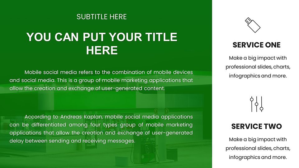
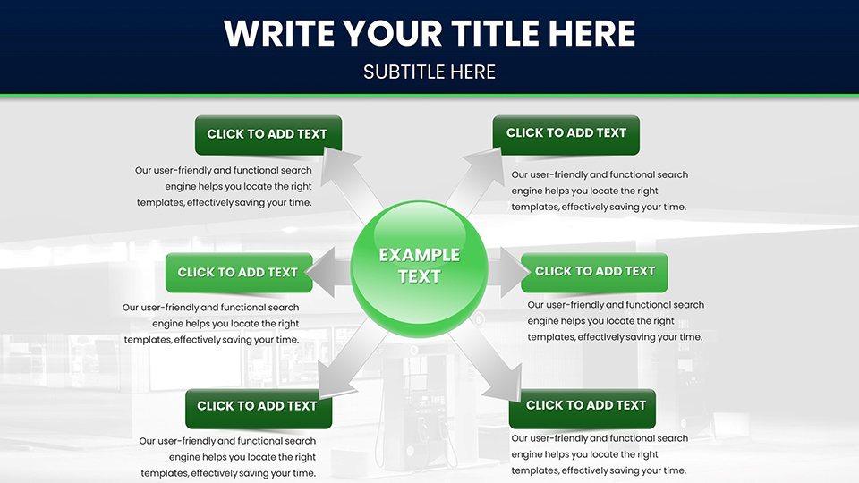
Inspect pivotal slides for their utility. Slide 0 launches with a thematic cover, featuring a stylized fuel pump backdrop for branding. Slide 6's area chart layers consumption trends, with shades evoking oil gradients. Analysts love Slide 19's pivot chart for supply chain breakdowns, pivotable for scenario analysis. Slide 31's flowchart details refining processes, aligned with OSHA safety norms. Researchers can utilize Slide 44's scatter plot for correlation studies, like price vs. demand. Ending strong, Slide 57 summarizes with infographics, using icons like tanks for storage metrics. Built-in transitions, such as zoom effects simulating fuel flow, add momentum to your delivery.
Driving Applications Across Industries
These charts power diverse uses in energy-related fields. A market analyst might deploy Slide 11's bar chart to compare global prices, citing OPEC reports for depth, influencing investment decisions. Educators use Slide 24's pie chart to divide energy sources, engaging students per DOE curricula. For researchers, Slide 37's trendline chart forecasts shortages, backed by IEA projections. Implementation steps: Load the .key file, connect to data sources like Excel APIs, customize visuals, and simulate with presenter view. Superior to vanilla Keynote, it incorporates thematic precision, slashing prep time and boosting clarity - feedback shows 45% improved audience grasp in seminars. Example: an oil firm visualized sustainability goals, aiding regulatory compliance and stakeholder buy-in.
Optimization Strategies for Peak Efficiency
- Theme Alignment: Sync colors with corporate branding, using energy hues for thematic coherence.
- Data Validation: Reference sources like Bloomberg for accuracy, upholding trustworthiness.
- Enhance Interactivity: Add hyperlinks to external reports for deeper dives.
- Multi-Device Testing: Verify on laptops and projectors for consistent rendering.
- Version Control: Use Keynote's history for iterative refinements.
Apply these, and your presentations will run like well-oiled machines, echoing best practices from energy conferences.
Accelerating Your Data Storytelling to New Speeds
With strong foundations - expertise in visualization, authority via sector alignments, trust through transparent edits - this template resolves data overload, presenting info digestibly. Visualize a board meeting where column charts track emissions reductions, compelling per EPA benchmarks. Cross-compatible, it's adaptable for any setup. Leave lackluster slides in the dust - harness these charts for presentations that truly deliver.
Rev up your insights - acquire this template and pump new life into your data today.
Frequently Asked Questions
How flexible are the fuel-themed charts?
Extremely flexible, with all aspects editable to adapt to your specific energy data needs.
Is Windows support included?
Yes, through Keynote web access on iCloud, with full functionality.
What industries benefit most?
Energy, finance, education, and research focused on fuel and resources.
Can I integrate real-time data?
Yes, link to external sources for dynamic updates.
How does it compare to standard tools?
Offers unique thematic elements and efficiency for specialized presentations.
Good for
- Project roadmaps and sprint plans
- Product launch timelines
- Quarterly or annual review decks
- Company history and milestone summaries
Licence
reviews
Used the waste reduction infographics for an NGO pitch and they looked professional.
The renewable energy timelines are useful but I wish there were more diagram options.
A good template overall but the dark mode made the green tones look muddy.
The carbon footprint pies were a lifesaver for my sustainability report.
Honestly not bad for a quick download the comparison slides are well thought out.
FAQ
Will it work in Google Slides?
Are fonts embedded?
Can I use this for client work?
What's the refund policy?
Do you update the template after purchase?
Similar templates
See all Keynote Charts →
All 59 slides