 Click to zoom
Gasoline Fuel Pump PowerPoint Presentation - Download Charts
| Format | .pptx |
| Slides | 59 unique layouts |
| Aspect ratio | 16:9 |
| Compatibility | PowerPoint |
| Animated | No |
| Language | English |
| License | Commercial |
| File size | — |
| Version | v1.0 |
| Last updated | July 2023 |
What's inside
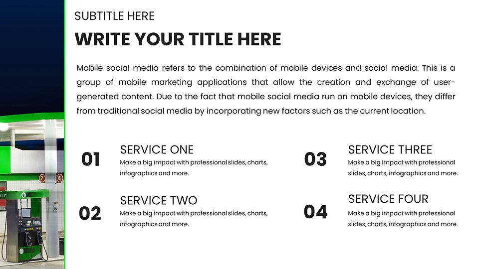
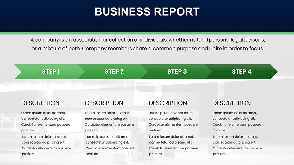
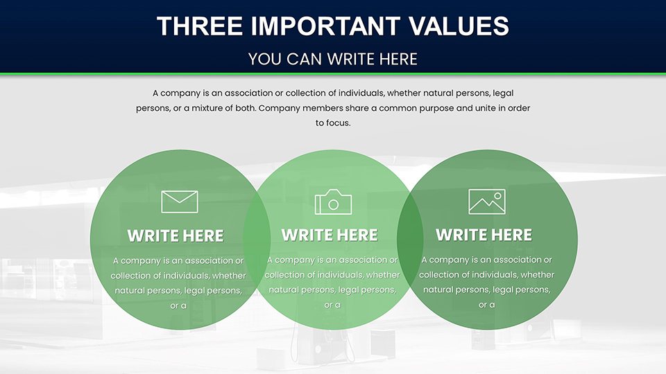
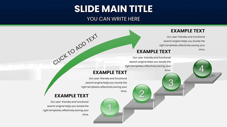
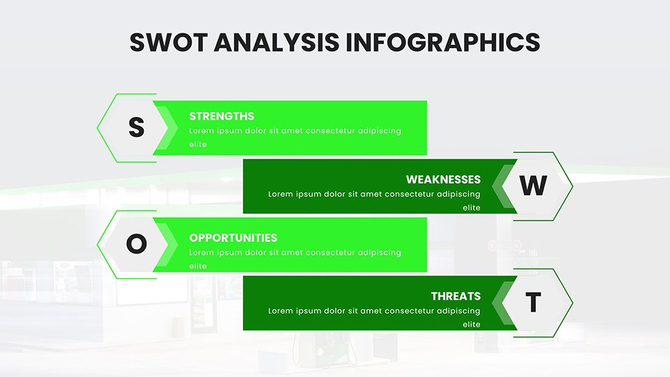
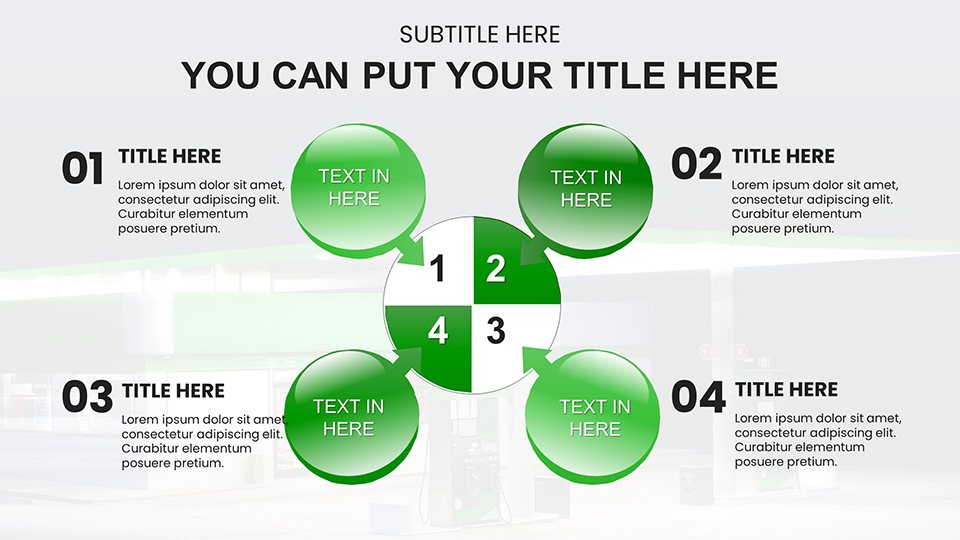
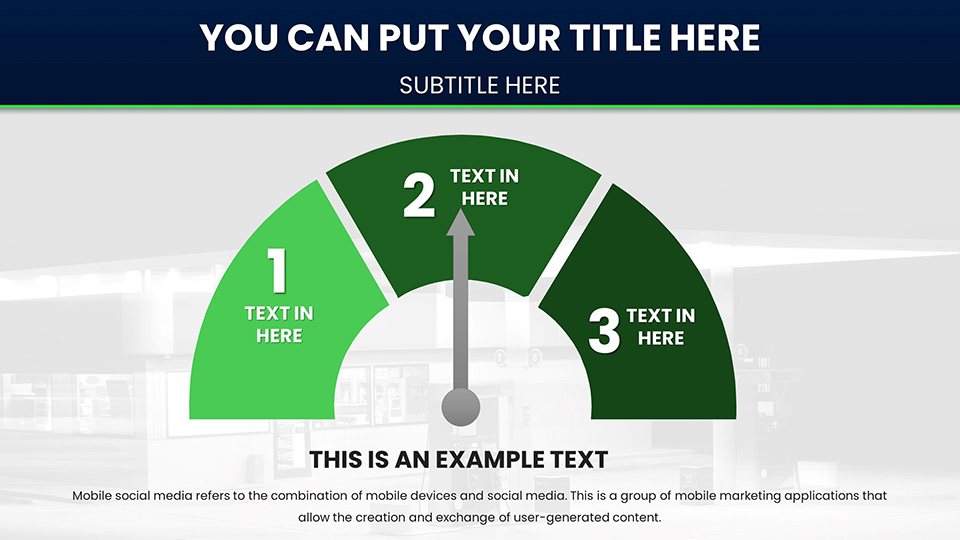
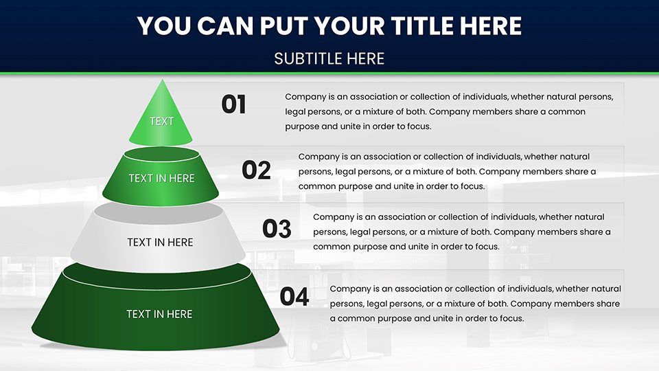
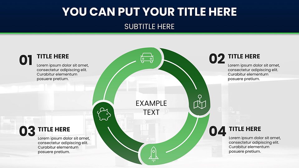
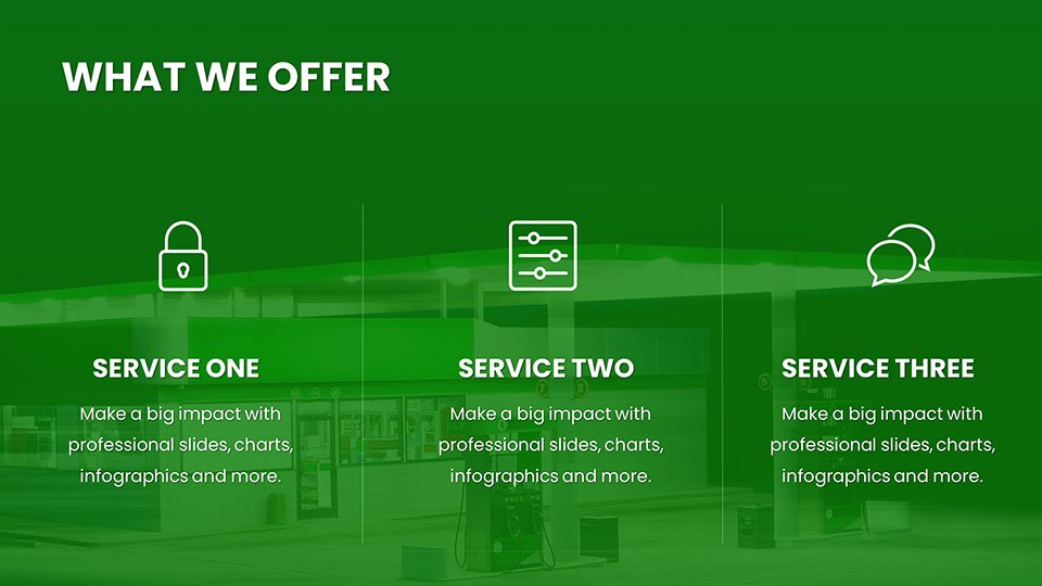
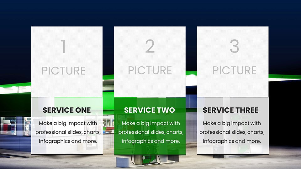
In the dynamic energy industry, where fuel prices fluctuate and market demands shift rapidly, conveying complex data through engaging visuals is key to influencing decisions and strategies. Our Gasoline Fuel Pump PowerPoint Charts template steps in as your ultimate tool, providing 59 meticulously designed, editable slides that bring fuel-related data to life. Tailored for professionals in oil and gas, this template helps illustrate everything from pump efficiency metrics to global supply chain trends, making it indispensable for business analysts, marketers, and educators alike. Picture starting your next board meeting with a striking dashboard slide that maps out regional gasoline consumption patterns, seamlessly transitioning to detailed graphs on price volatility - all while maintaining a cohesive, industry-relevant theme.
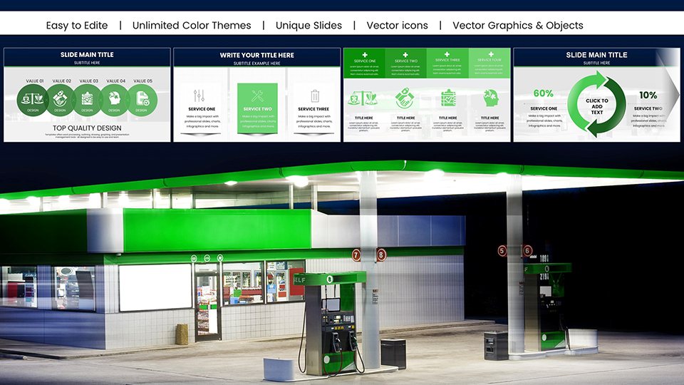
This template's strength lies in its blend of functionality and aesthetics: High-impact charts infused with fuel pump icons, pipeline diagrams, and energy-themed color schemes ensure your presentations stand out. Fully compatible with PowerPoint and Google Slides, it offers effortless collaboration and editing, whether you're preparing for a high-stakes pitch or an internal training session. By focusing on user-friendly customization, it eliminates the tedium of starting from scratch, allowing you to input data quickly and refine visuals to match your corporate branding, ultimately saving valuable time in a sector where every minute counts.
Essential Features for Energy Data Visualization
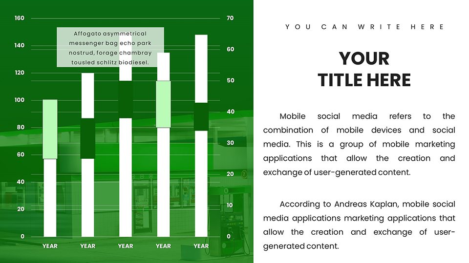
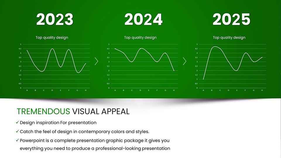
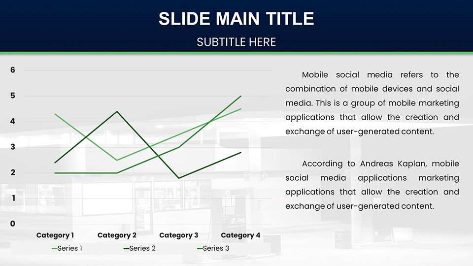
At the heart of this template are features engineered for precision and impact. The 59 slides include a variety of chart types optimized for energy data, such as line graphs for tracking fuel price trends over time or area charts for comparing consumption across different vehicle types. Each element is vector-based, ensuring scalability without quality loss, and editable via intuitive interfaces that require no advanced design skills.
- Dynamic Color Customization: Adjust palettes to reflect oil company logos or highlight data peaks, like red for high prices.
- Integrated Icons and Graphics: Fuel nozzles, storage tanks, and refinery symbols to contextualize data visually.
- Advanced Chart Options: Scatter plots for correlation analysis between fuel efficiency and emissions, or Gantt charts for project timelines in refinery upgrades.
- Animation Capabilities: Subtle effects to reveal insights progressively, enhancing audience engagement.
These tools not only beautify your slides but also amplify the clarity of complex datasets, helping stakeholders grasp key insights at a glance.
Practical Use Cases in the Fuel Industry
For marketing executives, this template shines in presenting campaign results: Use donut charts to break down market share in gasoline retail, or funnel diagrams to show customer acquisition in loyalty programs. Business professionals can employ it for sales pitches, demonstrating ROI on new fuel pump technologies through before-and-after comparison slides.
Educators benefit by simplifying concepts like supply-demand economics with interactive timelines of oil crises, making abstract ideas tangible for students. In consulting, analysts can customize slides for client reports, incorporating heat maps of global fuel distribution to advise on expansion strategies. The versatility extends to environmental reports, where bar charts could illustrate reductions in carbon footprints from efficient pumps.
Customizing for Maximum Effectiveness
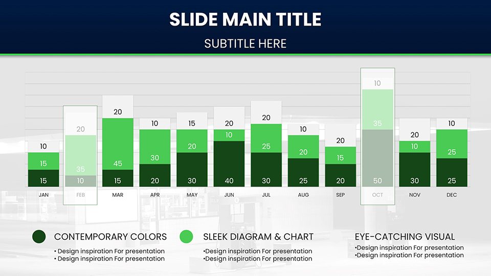
- Import the template into your preferred software and choose a relevant slide, e.g., a column chart for volume sales.
- Populate with your data using built-in editors for real-time previews.
- Tweak visuals - resize graphs, add labels, or incorporate company-specific icons.
- Apply transitions and test for flow in presentation mode.
- Share or export, confident in its professional polish.
This method streamlines preparation, turning data dumps into persuasive narratives.
Advantages Over Standard Presentation Software
Basic PowerPoint tools often yield bland outputs that fail to capture the intricacies of energy data. This template elevates your work with pre-themed elements that resonate with industry professionals, avoiding the generic feel of stock charts. It's a time-saver compared to DIY designs, offering robust customization without the learning curve of advanced software. Users in the field note enhanced audience retention, as thematic visuals make technical topics more relatable and memorable.
In a competitive landscape, standing out means delivering insights with style - this template ensures your presentations do just that, potentially influencing key business outcomes like investment decisions or policy changes.
Expert Tips for Fuel Sector Presentations
Enhance your delivery by layering data stories: Begin with macro trends using world maps, then drill down to specifics with zoomed-in charts. For virtual audiences, prioritize mobile-friendly designs with bold fonts. Integrate real-time data feeds if possible, keeping slides current in volatile markets. Always back visuals with concise narratives, and solicit feedback to iterate - perhaps adding more comparative elements for future uses.
Fuel your next presentation's success - download this template and ignite impactful discussions in the energy world.
Frequently Asked Questions
What types of charts are included? A mix including line, bar, pie, and specialized like Gantt for project management in fuel operations.
Is it compatible with older PowerPoint versions? Yes, works with recent versions, but optimal in PowerPoint 2016+ or Google Slides.
Can I add my own data sources? Absolutely, embed Excel links for dynamic updates.
Suitable for non-energy fields? Yes, editable to fit other industries by altering themes.
How do I handle large datasets? Use filtering tools within charts for focused views.
Good for
- Project roadmaps and sprint plans
- Product launch timelines
- Quarterly or annual review decks
- Company history and milestone summaries
Licence
reviews
Energy analyst using this for fuel price volatility line graphs. Gas pump icons and red-highlighted peaks convey urgency well. Editable area charts for consumption by vehicle type simplified my boardroom presentation.
The refinery symbols and pipeline diagrams add nice industry flavor. Gantt for upgrades is useful but color scheme leans too dramatic for some clients. Still, vectors scaled without issues.
Practical choice for a consultant report. Scatter plots for efficiency vs emissions worked after minor tweaks. Google Slides compatibility helped remote team input. Solid for quick prep.
Enthusiastic about the dashboard slides mapping regional patterns. Helped in a pitch where visuals drove the ROI story. Animations reveal data nicely without overload.
Student in energy course - timelines of oil crises made abstract concepts tangible. Some slides needed font adjustments for print. Overall authentic automotive/energy theme.
Mixed feelings on the thematic intensity, but bar charts for market share in retail were effective. Saved time vs building from scratch. Good for high-stakes energy meetings.**
FAQ
Will it work in Google Slides?
Are fonts embedded?
Can I use this for client work?
What's the refund policy?
Do you update the template after purchase?
Similar templates
See all PowerPoint Charts →
All 59 slides