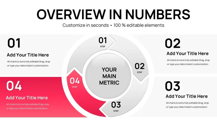
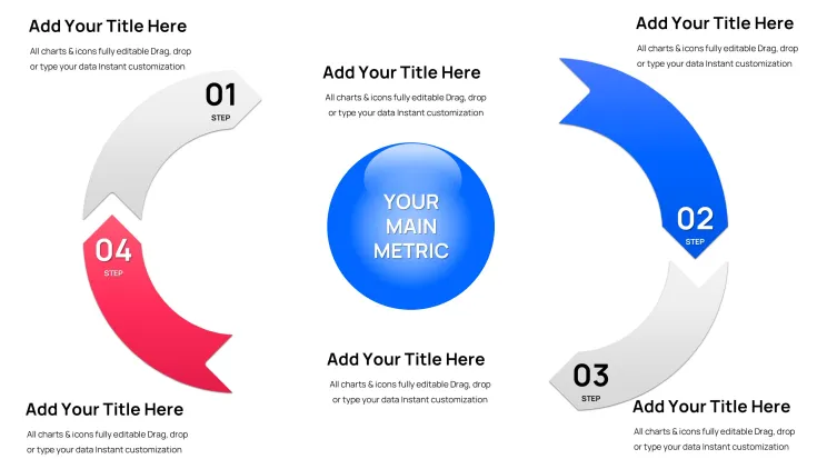
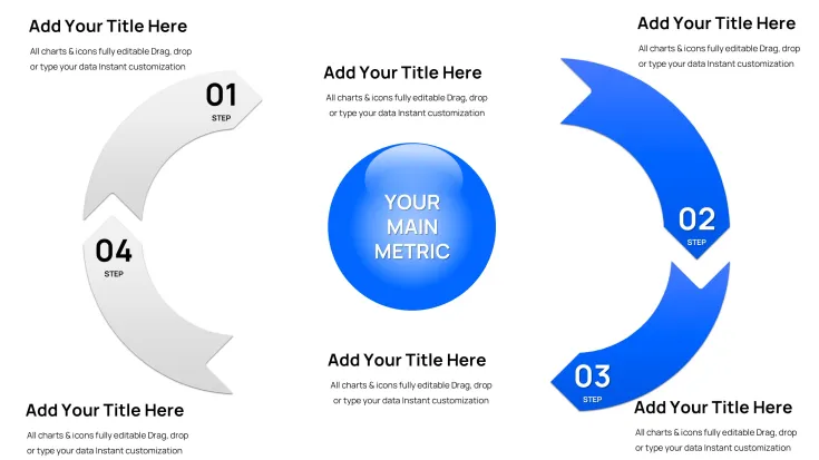
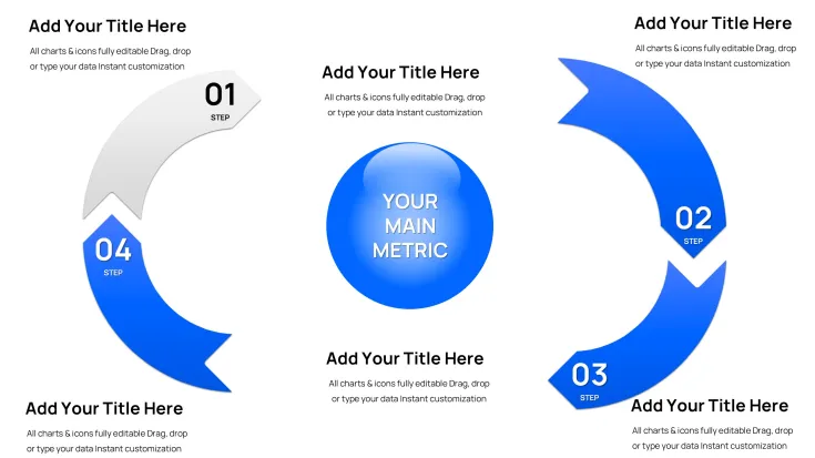
 Click to zoom
Cyclical Pie Charts Keynote Template - Fully Editable | Instant Download
| Format | .pptx |
| Slides | 34 unique layouts |
| Aspect ratio | 130/73 |
| Compatibility | PowerPoint |
| Animated | No |
| Language | English |
| License | Commercial |
| File size | — |
| Version | v1.0 |
| Last updated | February 2026 |
What's inside
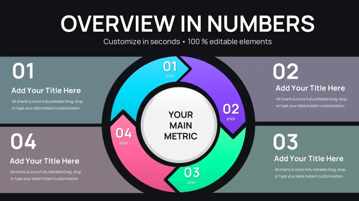
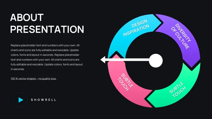
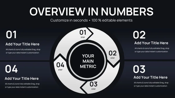
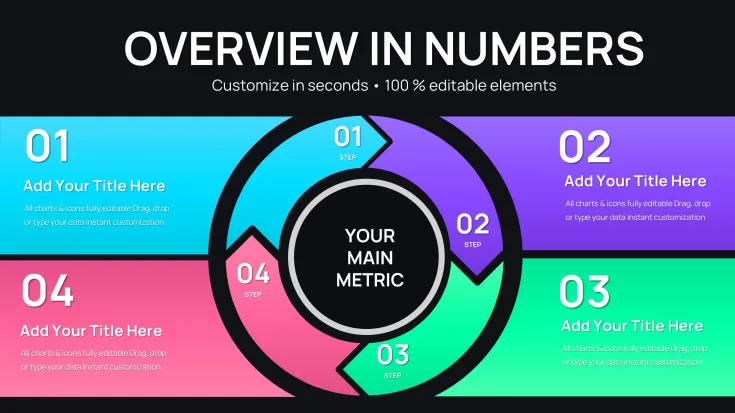
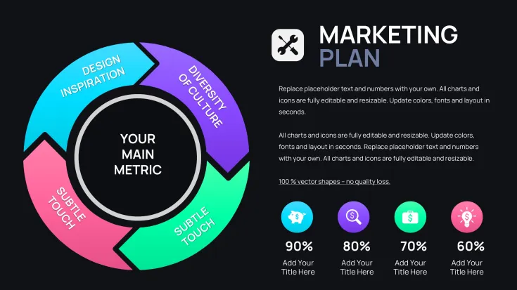
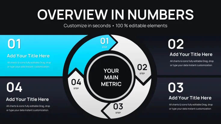
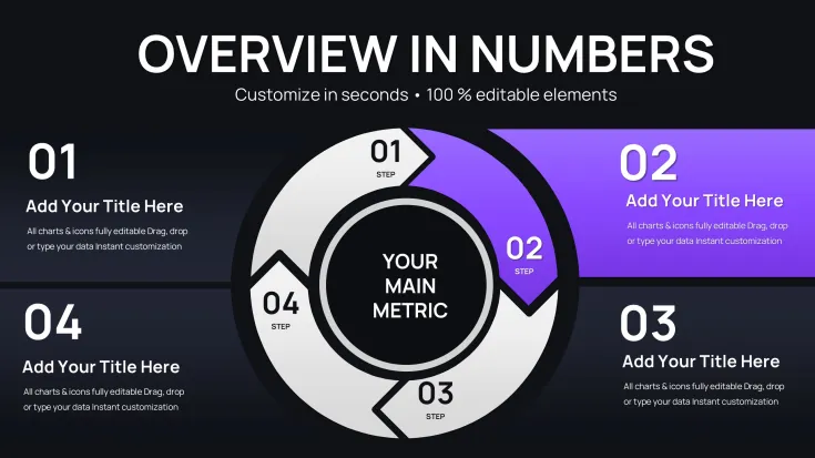
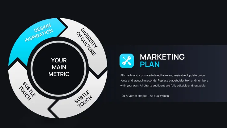
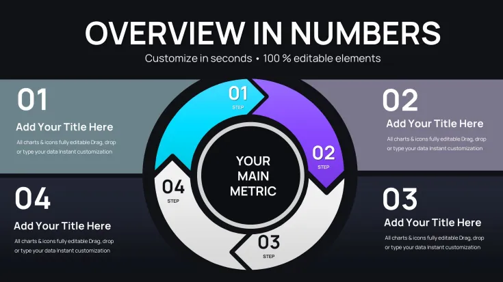
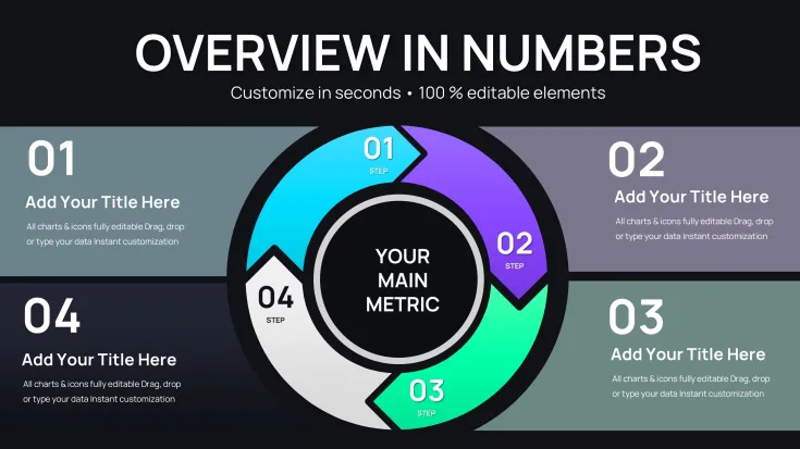
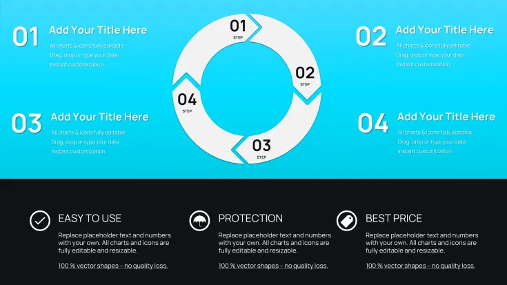
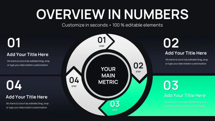
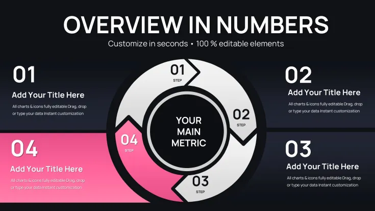
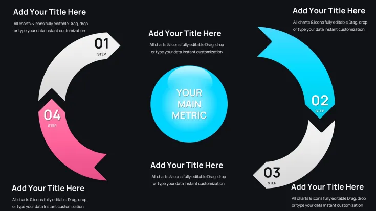
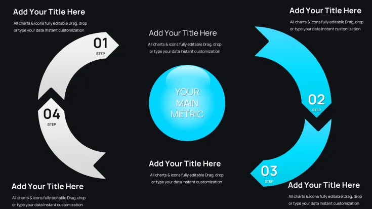
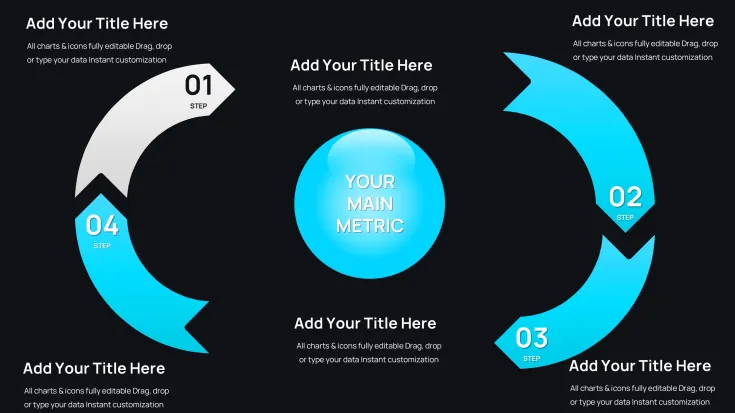
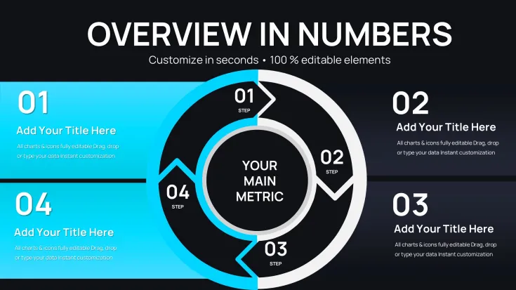
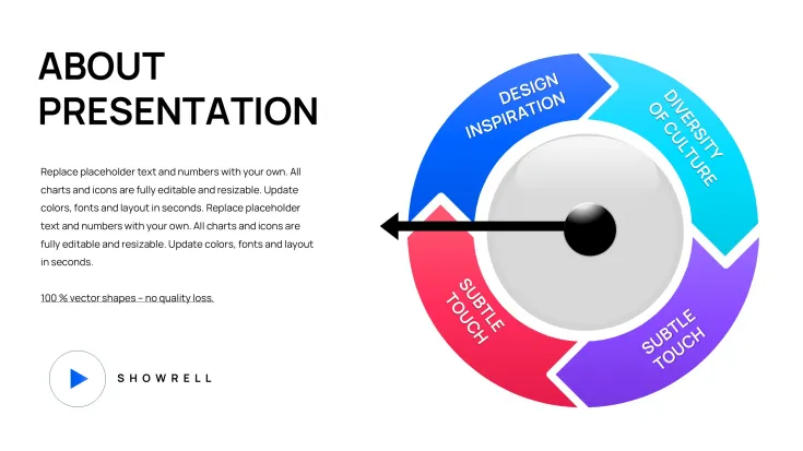
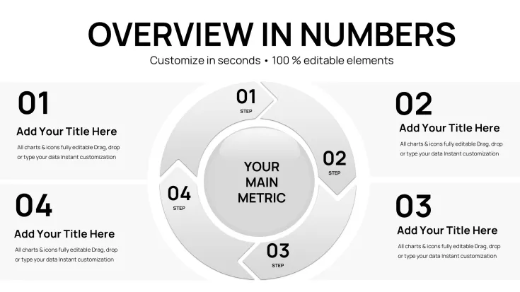
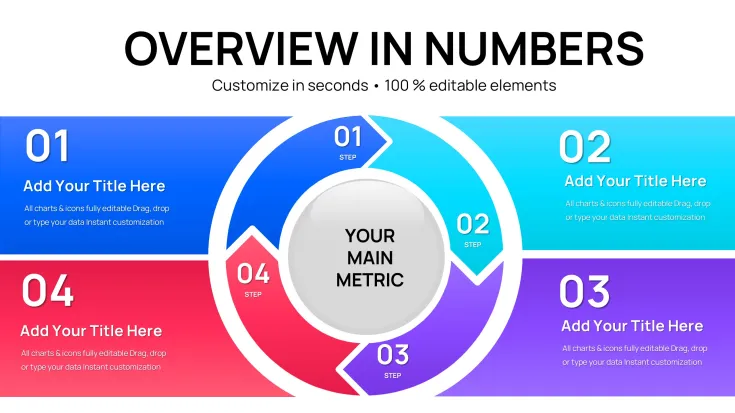
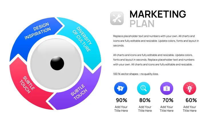
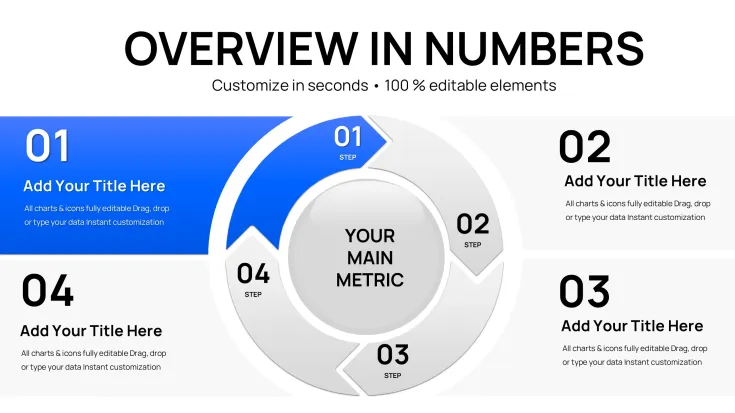
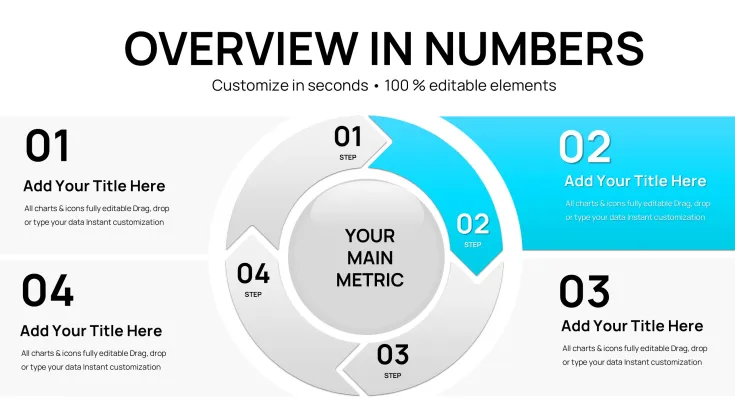
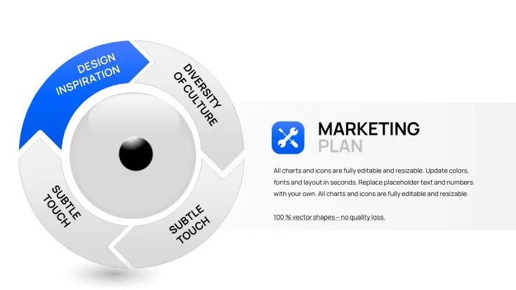
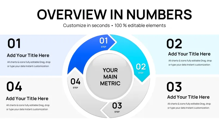
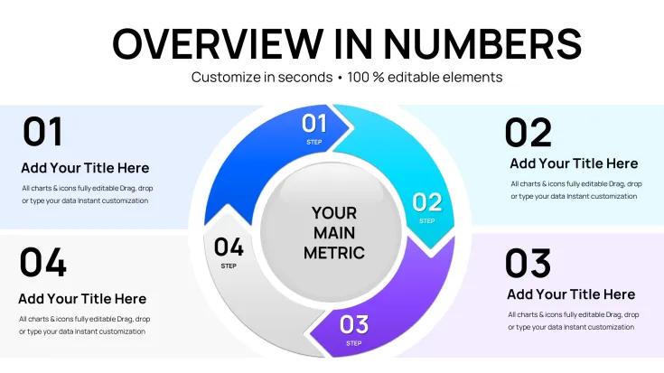
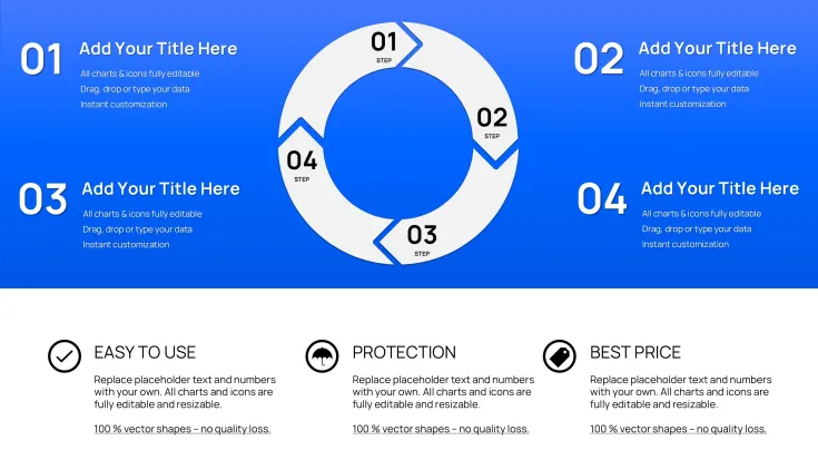
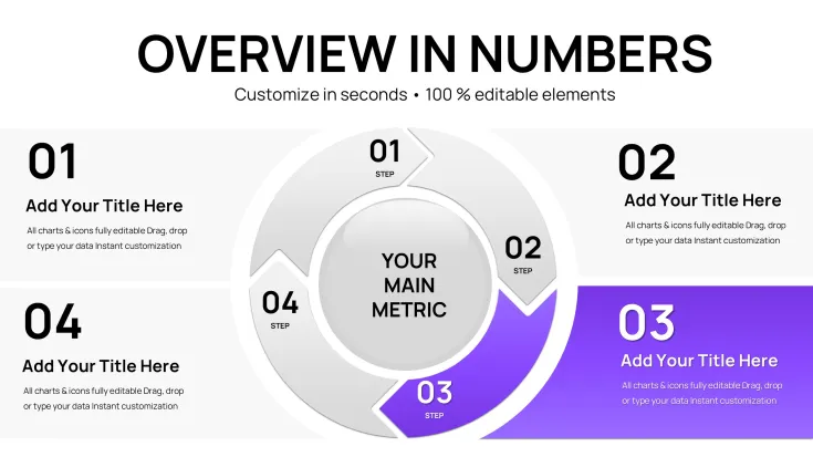
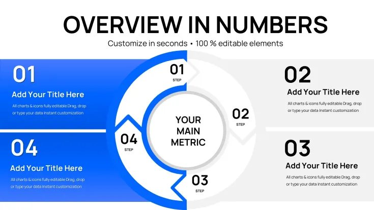
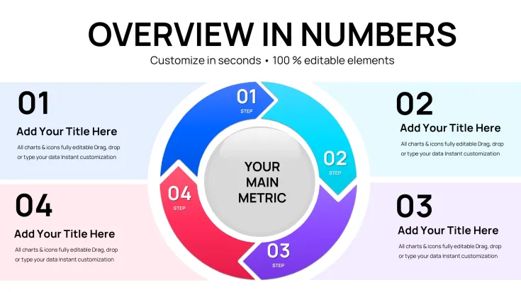
Discover the professional Cyclical Pie Charts Keynote template with 34 editable slides. Great for visualizing cycles, pie data, arrows and spheres in Apple Keynote. Instant download for immediate use in your presentations.
Enhance Your Keynote Slides with Professional Cyclical Pie Charts
Visualizing data involving cycles and percentages requires tools that clearly depict both the parts and the whole. This template offers a robust solution for creating such visuals in Keynote without starting from scratch. It enables clear communication of how elements interact within a cyclical framework.
Users facing tight deadlines benefit from ready-to-use structures that maintain a polished look while allowing full personalization. The inclusion of arrows and spheres adds visual depth to represent complex relationships.
Benefits
Clear Communication of Complex Data
The combination of pie charts and cycle designs helps audiences grasp relationships quickly. This is valuable in operations, finance, and strategy discussions where cyclical patterns are common. The visuals support better retention and understanding.
Professional Results Fast
Ideal for consultants, managers, and educators who need reliable visuals. The template ensures consistency and quality across your deck. It adapts to various content needs while keeping the focus on your message in business reports, educational materials or internal operations reviews.
How to Use
Download the .key file and open in Keynote. Update the data in the pie segments and adjust the cycle elements. The design is built to be intuitive for quick edits and integration into larger presentations.
Tailor it to specific use cases like process optimization or performance tracking. The flexibility allows for creative applications while maintaining a professional standard suitable for any team or client presentation.
Key Features
Comes with 34 editable slides in .key format covering cycle, pie, arrow and sphere variations. All graphics are ready for customization in Apple Keynote. Designed for seamless integration into your existing workflows.
Frequently Asked Questions
Is this template compatible with Keynote?Yes, it works with the latest versions of Apple Keynote.
How many slides does it contain?This version includes 34 editable slides.
Can I customize the colors and data?Yes, every element is fully customizable to fit your needs.
Is it suitable for commercial use?Yes, perfect for professional and commercial presentations.
Good for
- Project roadmaps and sprint plans
- Product launch timelines
- Quarterly or annual review decks
- Company history and milestone summaries
Licence
reviews
Cyclical pie charts with arrows and spheres added depth to process optimization talk. 34 slides versatile for finance cycles. Data updates intuitive.
Operations - relationships in cycles clear via pies. Professional results under deadline. Arrows enhance flow stories.
Some combinations crowded but customizable. Vector quality high for Keynote. Good for performance tracking.
Educator - complex data retention improved with visuals. Sphere elements nice touch. Fast integration.
Marketing - campaign cycles visualized well. Color and segment edits simple. Solid mixed category pack.
Practical for business reports. Pie-cycle hybrids unique. Minor: fewer pure pies than expected.
FAQ
Will it work in Google Slides?
Are fonts embedded?
Can I use this for client work?
What's the refund policy?
Do you update the template after purchase?
Similar templates
See all Keynote Charts →


All 34 slides