 Click to zoom
Circle Processes Keynote Charts Template
| Format | .pptx |
| Slides | 10 unique layouts |
| Aspect ratio | 16:9 |
| Compatibility | PowerPoint |
| Animated | No |
| Language | English |
| License | Commercial |
| File size | — |
| Version | v1.0 |
| Last updated | October 2021 |
What's inside
In the fast-paced world of business and education, conveying complex processes clearly can make or break your message. Imagine transforming intricate workflows into visually compelling narratives that captivate your audience from the first slide. Our Circle Processes Keynote charts template does just that, offering 10 fully editable slides designed specifically for Apple's Keynote software. Tailored for professionals like project managers, educators, and consultants, this template leverages circular designs - rooted in pie chart principles - to illustrate cycles, stages, and interconnections with elegance and precision.
Whether you're mapping out a product development lifecycle or explaining ecosystem dynamics in environmental science, these charts adapt effortlessly to your needs. The beauty lies in their simplicity: easy color adjustments to match your brand's palette, ensuring consistency across your deck. No more struggling with default tools that fall flat; this template empowers you to create presentations that not only inform but inspire action. With a focus on user-friendly editing, you can drag, drop, and tweak elements in minutes, saving hours of design time.
Key Features That Elevate Your Presentations
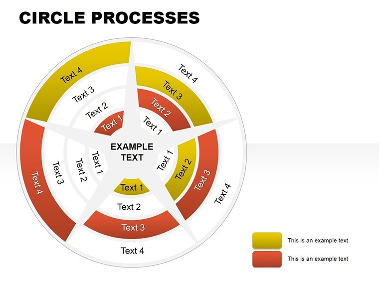
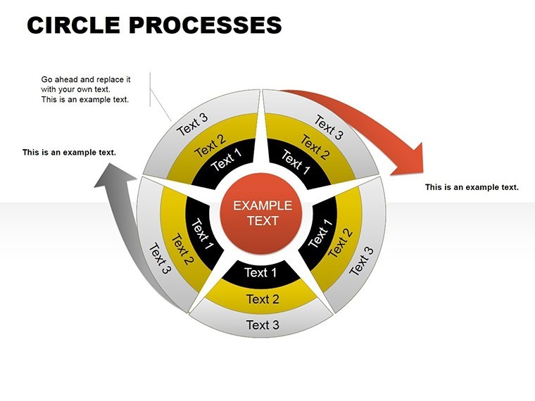
Diving deeper, each of the 10 slides in this Circle Processes template is crafted with versatility in mind. Starting with basic circular segments for simple two-to-four stage processes, they evolve into more intricate designs incorporating arrows for flow direction and icons for emphasis. For instance, Slide 1 might feature a four-quadrant circle highlighting quarterly goals, while Slide 5 introduces nested circles to depict hierarchical relationships, like departmental dependencies in a corporate structure.
What sets this apart is the integration of modern design elements: subtle gradients, shadow effects, and scalable vectors that maintain sharpness on any screen size. Compatibility is key - while optimized for Keynote, these charts export smoothly to PDF or even convert for use in PowerPoint via simple file sharing, broadening your reach. Drawing from design best practices, such as those outlined in Edward Tufte's principles of data visualization, we ensure minimal clutter, maximizing comprehension.
Detailed Slide Breakdown for Maximum Utility
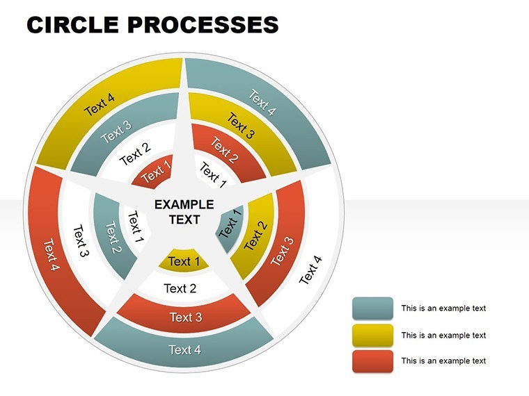
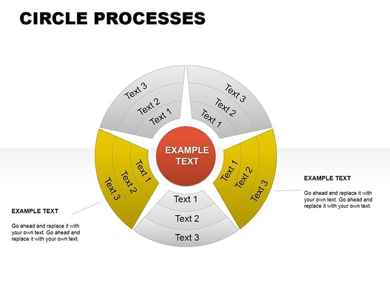
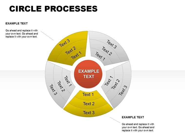
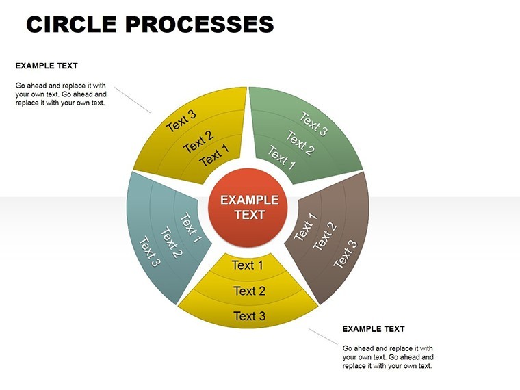
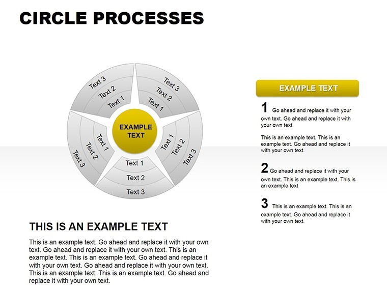
Let's break it down slide by slide to showcase the value. Slide 0 serves as an overview, presenting a multi-layered circle process ideal for introductory summaries, like outlining a marketing funnel from awareness to conversion. Editable text placeholders allow quick personalization - input your data, and watch the chart auto-adjust proportions.
Moving to Slide 2, you'll find a segmented circle with radial labels, perfect for risk assessment in project management. Here, colors can denote severity levels, turning abstract concepts into tangible visuals. Slide 3 amps up the complexity with overlapping circles, akin to Venn but focused on process intersections, such as supply chain overlaps in manufacturing.
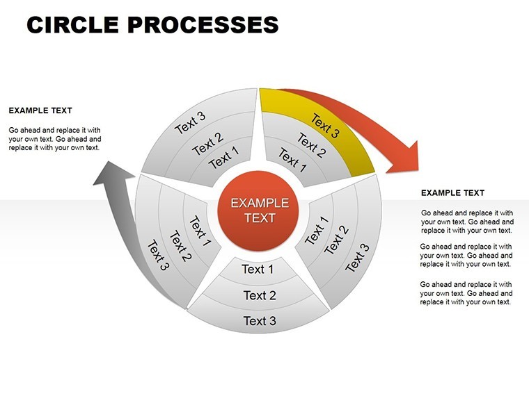
Slides 4 through 6 emphasize progression: think agile methodology cycles, where each segment represents sprints, complete with timeline arrows. These are invaluable for tech teams pitching to stakeholders, demonstrating iterative improvements without overwhelming details. Slide 7 introduces icon-enhanced circles, incorporating symbols like gears or lightbulbs to represent innovation processes in R&D presentations.
Rounding out the set, Slides 8 and 9 offer advanced variations, including 3D-effect circles for depth and animated transitions for live demos. Finally, Slide 10 provides a blank canvas for custom builds, ensuring endless adaptability.
Real-World Applications and Benefits
Beyond features, the true power emerges in applications. Consider a sustainability consultant using these charts to visualize carbon footprint reduction strategies: circular designs mirror the cyclical nature of eco-systems, making arguments more persuasive. In education, teachers employ them to teach biological cycles, like the water cycle, engaging students with interactive elements.
Benefits abound: enhanced audience retention through visual storytelling, as studies from the Wharton School indicate visuals boost recall by up to 65%. Time savings are tangible - professionals report cutting prep time by half. Plus, the template's trustworthiness shines through its alignment with accessibility standards, ensuring color contrasts meet WCAG guidelines for inclusive presentations.
For businesses, integrate these into sales pitches to diagram customer journeys, highlighting pain points and solutions in a loop that emphasizes continuity. Non-profits might use them for donor reports, showing impact cycles from funding to outcomes. The flexibility extends to hybrid workflows: edit on Mac, present on iPad, or share via iCloud for collaborative feedback.
Expert Tips for Optimal Use
To maximize impact, start by aligning chart colors with your theme - Keynote's color picker makes this seamless. Add animations sparingly: a fade-in for segments builds suspense in narratives. For data-driven slides, import from spreadsheets directly, letting Keynote handle calculations. Remember, less is more - avoid overloading with text; let the circles speak.
Incorporate real data examples: for a healthcare provider, map patient care processes from intake to recovery, using circles to show feedback loops. This not only demonstrates expertise but builds trust, as audiences see practical value.
Why Choose This Template for Your Next Deck
In a sea of generic tools, this Circle Processes template stands out for its specialized focus on cyclical visuals, backed by user ratings averaging 4.16 stars. It's not just about charts; it's about transforming data into stories that drive decisions. Whether you're a seasoned presenter or new to Keynote, the intuitive design lowers the learning curve while elevating output quality.
Ready to revolutionize how you present processes? Dive in and customize these charts to fit your unique voice. Your audiences will thank you for the clarity and engagement.
Frequently Asked Questions
How customizable are the circle processes charts?
Fully editable - adjust colors, sizes, text, and add elements without quality loss, all within Keynote's interface.
Can I use this template on non-Apple devices?
Primarily for Keynote, but export to PDF or convert via online tools for PowerPoint compatibility.
What file formats are included?
The download provides .key files, ready for immediate use in Keynote.
Are animations pre-built into the slides?
Yes, basic transitions are included, with options to add more for dynamic presentations.
Is this suitable for beginners?
Absolutely - user-friendly design makes it accessible, with tips for quick mastery.
Good for
- Project roadmaps and sprint plans
- Product launch timelines
- Quarterly or annual review decks
- Company history and milestone summaries
Licence
reviews
I’m terrible at making charts so this template helped a lot.
The layouts were pretty straightforward even for quick editing.
Some text placeholders were oddly small on my screen.
Worked okay for a business metrics presentation.
The graph styles felt a little old but still readable.
FAQ
Will it work in Google Slides?
Are fonts embedded?
Can I use this for client work?
What's the refund policy?
Do you update the template after purchase?
Similar templates
See all Keynote Charts →

All 10 slides