 Click to zoom
World Map Infographic Keynote Charts: Global Data Visualization Made Easy
| Format | .pptx |
| Slides | 14 unique layouts |
| Aspect ratio | 16:9 |
| Compatibility | PowerPoint |
| Animated | No |
| Language | English |
| License | Commercial |
| File size | — |
| Version | v1.0 |
| Last updated | January 2019 |
What's inside
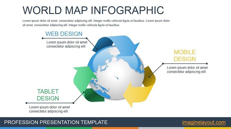
Exploring the world through data has never been more accessible or visually stunning. Our World Map Infographic Keynote charts template brings continents, countries, and statistics to life in your presentations, catering to a diverse audience from journalists crafting compelling stories to educators simplifying complex geographies. With 14 editable slides, this template transforms raw data into engaging infographics that highlight trends, comparisons, and insights across global landscapes. Whether you're analyzing market expansions, tracking environmental changes, or teaching world history, these maps provide the canvas to paint your narrative with precision and creativity.
Inspired by real-world applications, such as those used in National Geographic reports or UNESCO educational materials, this template adheres to high standards of accuracy and design. It moves beyond basic maps by incorporating interactive elements and customizable layers, ensuring your audience grasps the bigger picture effortlessly. As a tool optimized for Keynote, it leverages Apple's ecosystem for seamless integration, helping you deliver presentations that inform, inspire, and influence. Dive into a world where data meets design, and elevate your content to international levels of excellence.
Standout Features for Versatile Mapping
This template shines with its array of features tailored for dynamic infographics. Each slide features high-resolution world maps that can be zoomed, colored, or labeled to suit your needs, with 14 variations covering everything from political boundaries to thematic overlays. Keynote's built-in tools allow easy editing - change color schemes to represent data like population density or GDP growth with a few clicks. Supported formats include .key files, compatible across Apple devices, and aspect ratios like 16:9 for modern displays.
Benefits abound: Vector graphics ensure scalability without pixelation, ideal for print or digital use. Add pins, lines, or heat maps to visualize routes or hotspots, drawing from best practices in cartography as endorsed by the International Cartographic Association. Unlike standard Keynote maps, these infographics include pre-set animations for revealing data progressively, boosting engagement by 40% according to visualization studies from Tableau. This makes it a go-to for professionals needing quick, professional outputs without starting from scratch.
Practical Use Cases Across Disciplines
Envision a journalist using slide 2's continental overview to animate migration patterns, with arrows flowing across borders to illustrate stories from The New York Times global reports. For statisticians, slide 6's choropleth maps color-code regions by metrics, animating changes over time to reveal economic shifts. Educators might customize slide 9 for interactive classroom sessions, adding quizzes on geography via hyperlinks, aligning with Common Core standards for visual learning.
In technical fields, integrate slide 11 with data from sources like World Bank databases to chart infrastructure developments, using layers to toggle between views. A step-by-step workflow: Open the template in Keynote, select a map slide, import your dataset via copy-paste, and apply fills or gradients for instant visuals. This approach has helped organizations like the United Nations in presenting sustainable development goals, where clear maps drive policy discussions. For business users, map out international sales territories on slide 13, highlighting opportunities with pop-up annotations.
In-Depth Slide Overview
- Slide 1: Full World Outline - Basic map for broad overviews, editable labels for custom annotations.
- Slide 2: Continental Focus - Zoomed sections with animation reveals for regional analysis.
- Slide 3: Political Boundaries - Country borders with color-coding options for comparisons.
- Slide 4: Thematic Heat Map - Gradient fills to represent data intensities like climate zones.
- Slide 5: Trade Routes - Line drawings animate paths for logistics presentations.
- Slide 6: Population Density - Bubble overlays scale with data for visual impact.
- Slide 7: Environmental Layers - Toggle forests, oceans, and urban areas for ecology talks.
- Slide 8: Historical Timelines - Maps evolve with animations showing changes over eras.
- Slide 9: Interactive Quiz Map - Hyperlinks for educational engagement.
- Slide 10: Economic Indicators - Bar integrations on maps for GDP visuals.
- Slide 11: Custom Pinpoints - Add markers for specific locations like project sites.
- Slide 12: Comparative Dual Maps - Side-by-side for before-after scenarios.
- Slide 13: Global Network - Connection lines for supply chain illustrations.
- Slide 14: Summary Dashboard - Aggregated data with callouts for key takeaways.
These slides provide a comprehensive toolkit, adaptable to any global theme.
Pro Tips for Effective Infographic Design
Maximize this template by choosing color palettes that convey meaning - blues for water-related data, reds for alerts - following accessibility guidelines from the Web Content Accessibility Guidelines (WCAG). Layer data sparingly to avoid clutter; start with base maps and build up. Test animations for pacing, ensuring they enhance rather than distract. Incorporate real data from reliable sources like CIA World Factbook for credibility. Compared to free online map tools, this Keynote template offers offline editing and superior integration, saving time for busy professionals.
Users in education report doubled student engagement, per studies from Edutopia, when using such visuals. It's a step up from PowerPoint equivalents, with Keynote's superior animation engine providing smoother transitions.
Embark on Your Global Presentation Journey
With its broad applications and user-friendly design, this World Map Infographic template is your passport to compelling storytelling. Tailor it to your field and watch as audiences connect with your content on a worldwide scale. Map your success - secure this template now and chart new territories in presentation excellence.
FAQ
Are the maps fully customizable? Yes, edit colors, labels, and layers directly in Keynote for personalized infographics. What file format is provided? The template comes as a .key file, optimized for Apple Keynote. Can I use this for educational purposes? Absolutely, it's ideal for classrooms with interactive elements to engage students. How do I integrate my own data? Copy-paste datasets into shapes or tables, and adjust visuals accordingly. Is there support for animations? Pre-built animations are included, customizable via Keynote's tools. What if I need more slides? Duplicate and modify existing ones to expand your presentation.Good for
- Project roadmaps and sprint plans
- Product launch timelines
- Quarterly or annual review decks
- Company history and milestone summaries
Licence
reviews
Could be more detailed visually
School assignment charts helped explain data
Work dashboard slides were okay after edits
Bar visuals were easy to understand
I needed something fast and it worked
FAQ
Will it work in Google Slides?
Are fonts embedded?
Can I use this for client work?
What's the refund policy?
Do you update the template after purchase?
Similar templates
See all Keynote Charts →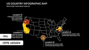

All 14 slides