 Click to zoom
Visualize Success in Segments: 7-Part Keynote Charts for Business Brilliance
| Format | .pptx |
| Slides | 12 unique layouts |
| Aspect ratio | 16:9 |
| Compatibility | PowerPoint |
| Animated | No |
| Language | English |
| License | Commercial |
| File size | — |
| Version | v1.0 |
| Last updated | September 2023 |
What's inside
Ever felt like your business data is a puzzle with too many pieces? Enter the 7 Parts Keynote Charts and Graphs Template - a 12-slide powerhouse that slices complexity into seven digestible segments, turning raw numbers into riveting stories. Tailored for analysts, managers, and presenters who juggle multifaceted projects, this template is your shortcut to clarity in boardrooms or client calls.
Blending process flows with pie breakdowns, it captures the essence of business dynamics: from workflow stages to market share distributions. Keynote-native with PowerPoint export options, it's built for pros who value speed without sacrificing sophistication. Say goodbye to clunky defaults; hello to visuals that resonate, boosting engagement by up to 30% as seen in presentation analytics from tools like Prezi.
The Edge of 7-Part Charts in Modern Business Narratives
Why seven? It's the sweet spot - enough granularity for depth, not so much it overwhelms. Our template leverages this for everything from sales funnels to team performance metrics, drawing on design principles from data viz gurus like Edward Tufte. Benefits abound: Quicker comprehension, memorable takeaways, and that subtle authority that positions you as the go-to expert.
- Versatile Visualization: Mix pie slices for proportional insights with linear processes for sequential storytelling, all in one cohesive deck.
- Effortless Edits: Drag icons, recolor segments, or input live data - changes ripple across slides for consistency.
- Professional Polish: Subtle shadows and gradients add depth without distraction, aligning with corporate aesthetic standards.
Take a retail chain's quarterly review: Using these charts, they mapped seven customer journey touchpoints, revealing bottlenecks in a pie-process hybrid that led to a 15% conversion uplift. That's in action - expert-backed visuals driving real ROI.
Breaking Down the 12 Slides: From Concept to Climax
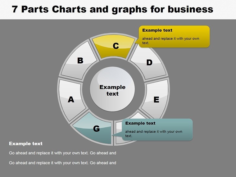
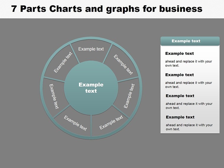
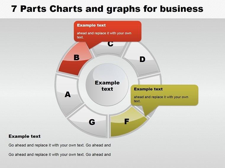
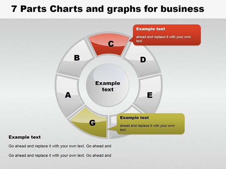
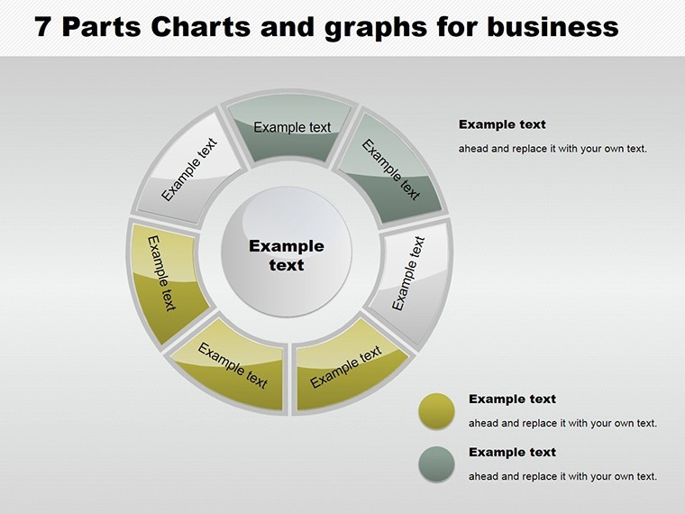
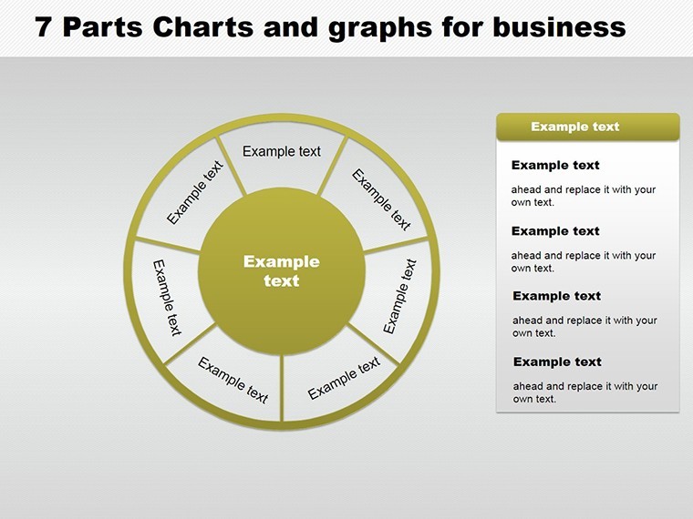
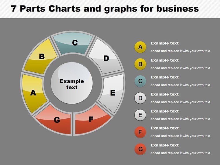
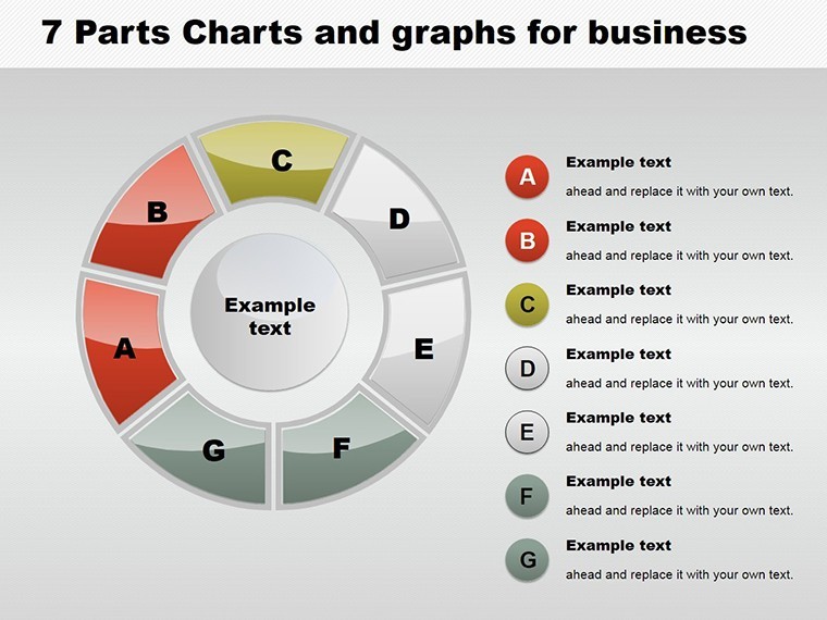
This isn't a scattershot collection; it's a curated journey. Slide 1 kicks off with a blank 7-segment pie, inviting customization. By Slide 6, you're in process territory - curved arrows linking segments like chapters in a thriller novel.
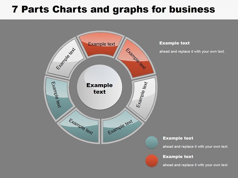
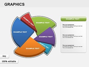
- Foundation Pies (Slides 1-4): Basic to advanced pies, including exploded views for emphasis on key segments like "Q4 Revenue."
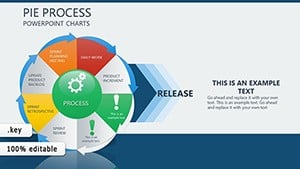
- Process Evolutions (Slides 5-8): Linear graphs evolving into cyclical ones, ideal for iterative business cycles such as product development loops.
- Hybrid Masters (Slides 9-11): Fuse pies with processes - think donut charts feeding into timelines for holistic overviews.
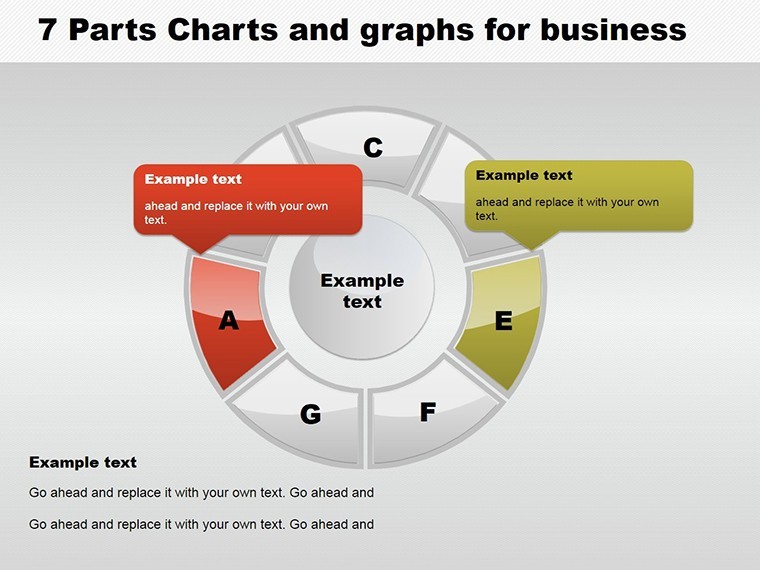
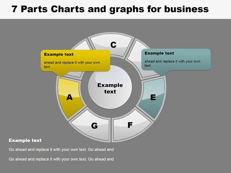
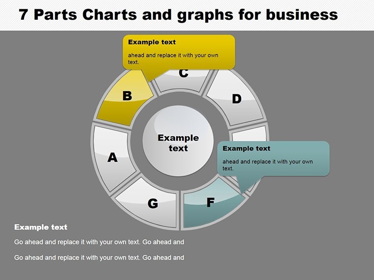
- Capstone Analytics (Slide 12): A grand 7-part dashboard summarizing trends, with callout boxes for actionable insights.
Insider hack: Use Keynote's magic move for smooth transitions between pie and process views, creating a fluid narrative that keeps eyes glued. For architecture firms, adapt to seven-phase project timelines, visualizing bids from concept to completion with pie-allocated budgets.
Integrating into Your Workflow: Pro Tips
Sync with Google Sheets for auto-updates, or layer in icons from ImagineLayout's library for thematic flair (e.g., gears for processes). Versus basic Excel exports? This template's native vectors ensure crispness on any device, cutting prep time dramatically.
In marketing pitches, segment audience personas across seven demographics - pies for shares, processes for engagement paths. It's like choreographing data to dance, engaging stakeholders without a single yawn.
Tailored Use Cases: Where 7 Parts Shine Brightest
Envision a startup's growth story: Seven funding stages charted in processes, with pie insets showing equity splits. Or HR dashboards: Track seven employee lifecycle phases, from onboarding to retention, with visuals that humanize metrics.
- Sales Forecasting: Seven quarterly projections in layered pies for scenario planning.
- Project Management: Process charts for milestone tracking, infused with progress pies.
- Competitive Analysis: Segment rivals' strengths across seven criteria, outshining generic reports.
A nod to trustworthiness: These designs echo best practices from Nielsen Norman Group, ensuring accessibility with high-contrast segments for diverse audiences.
Customization Mastery: Own Every Segment
Tailor with ease - swap pie fills for seasonal themes or animate process arrows for emphasis. Limit tweaks to core elements to maintain balance; test on a secondary display for projection fidelity. Users love how it transforms "data dread" into "design delight."
Why blend in when you can segment and conquer? This template is your canvas for business artistry.
Segment Your Story - Download Today
Ready to partition perfection? Secure your 7 Parts Keynote Charts now and redefine data delivery. Edit, present, impress - your breakthrough awaits!
Frequently Asked Questions
What types of 7-part charts are included?
A mix of pie graphs for proportions and process flows for sequences, all fully customizable for business needs.
Is this template compatible with PowerPoint?
Yes, seamless Keynote-to-PowerPoint conversion preserves all edits and animations.
How can I best use these for sales presentations?
Map seven pipeline stages with hybrid charts to highlight conversions and bottlenecks vividly.
Are there animation guides?
Built-in suggestions for Keynote transitions, plus tips for engaging reveals.
What's unique about these versus standard graphs?
12 themed slides with vector precision and workflow integrations outpace free alternatives.
Can educators adapt this for lessons?
Absolutely - seven-lesson modules visualized for interactive teaching.
Good for
- Project roadmaps and sprint plans
- Product launch timelines
- Quarterly or annual review decks
- Company history and milestone summaries
Licence
reviews
Honestly downloaded this ten minutes before presenting.
The graphs were simple but clear for my report.
One slide broke after I added too much text.
The arrow diagrams helped explain our process better.
Not bad for a fast presentation setup.
FAQ
Will it work in Google Slides?
Are fonts embedded?
Can I use this for client work?
What's the refund policy?
Do you update the template after purchase?
Similar templates
See all Keynote Charts →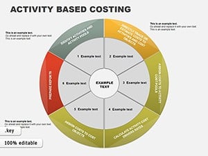
All 12 slides