 Click to zoom
Versatile Graphics Pizza Charts Template for Keynote: Slice Data with Style
| Format | .pptx |
| Slides | 22 unique layouts |
| Aspect ratio | 16:9 |
| Compatibility | PowerPoint |
| Animated | No |
| Language | English |
| License | Commercial |
| File size | — |
| Version | v1.0 |
| Last updated | January 2022 |
What's inside
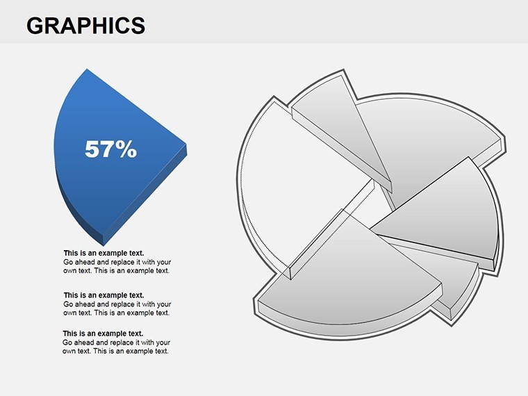
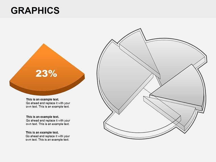
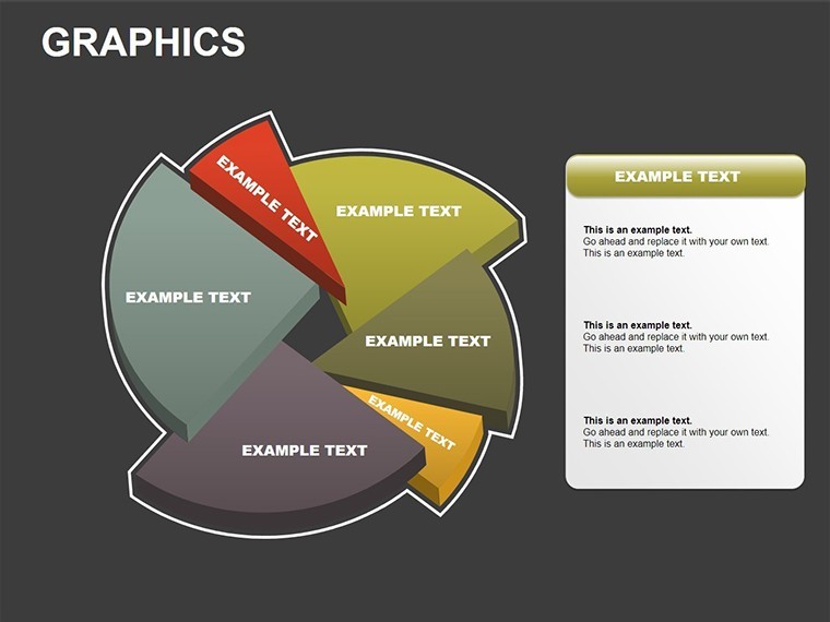
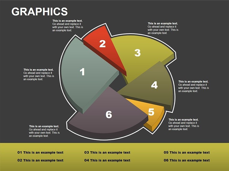
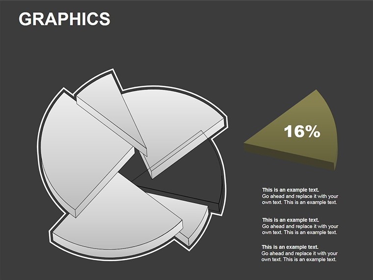
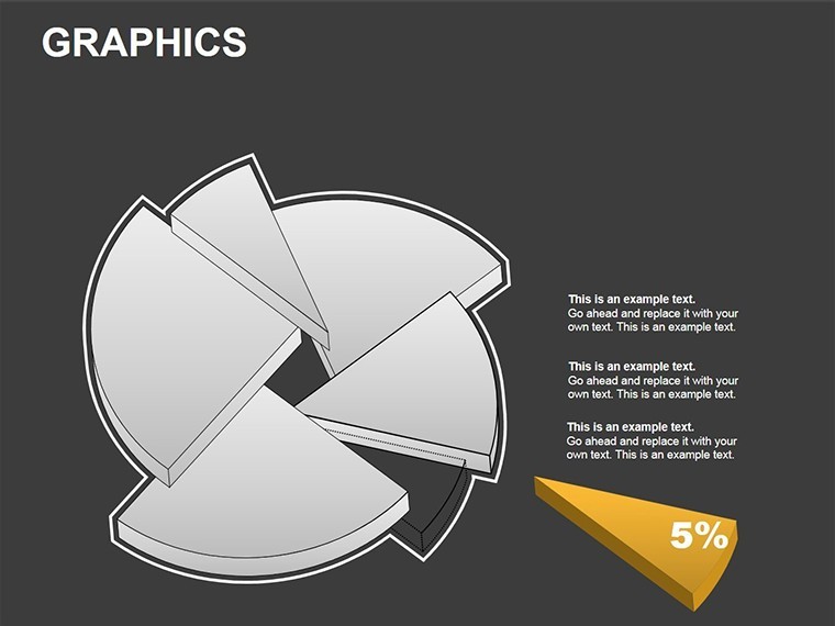
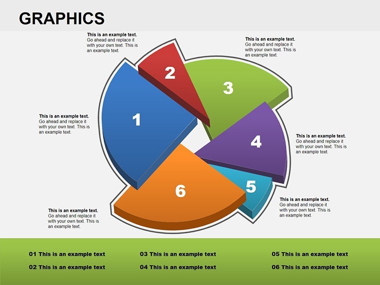
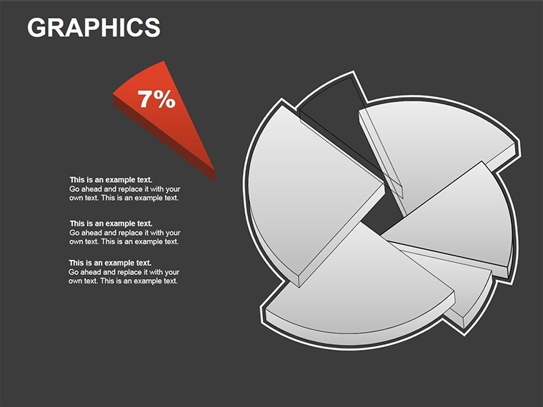
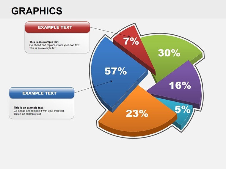
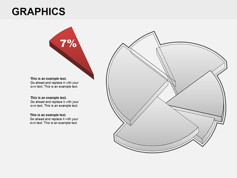
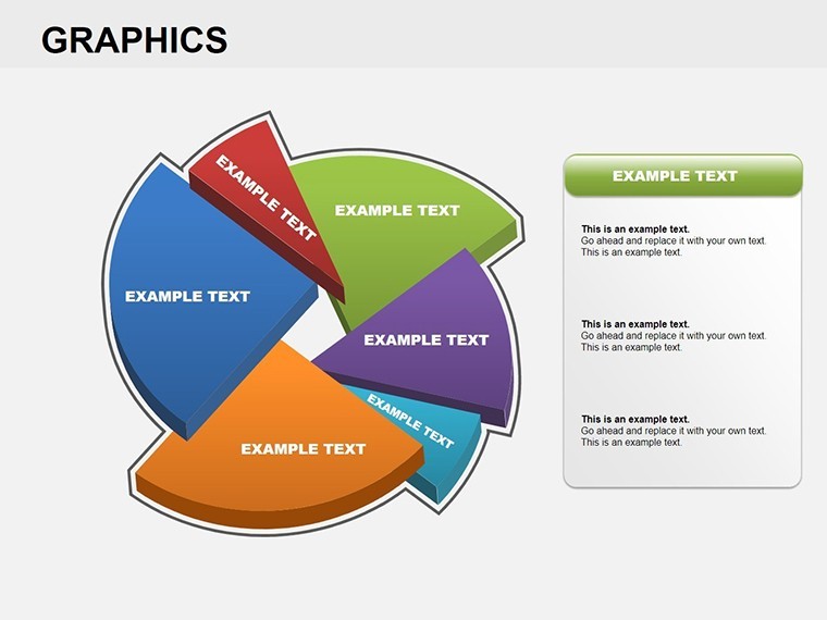
Picture this: You're in a boardroom, and instead of dull spreadsheets, your audience is captivated by vibrant, pizza-like charts that break down data into digestible slices. Our Graphics Pizza Keynote charts template brings exactly that to life with 22 editable slides tailored for professionals in marketing, finance, or analytics. These charts excel at representing proportions, market shares, or budget allocations in a fun yet professional manner. Designed for users who value quick edits and visual punch, this template lets you insert text, numerical data, or even custom figures into each sector. It's perfect for turning quarterly reports into engaging stories or survey results into insightful overviews. Compatibility with Keynote ensures smooth workflows, and the ease of color adjustments means your visuals always align with branding. Say goodbye to time-consuming chart builds and hello to presentations that not only inform but also delight, drawing from proven design strategies that boost retention and understanding.
Exploring the Depth of Sector-Based Visuals
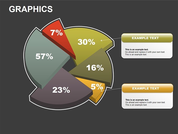
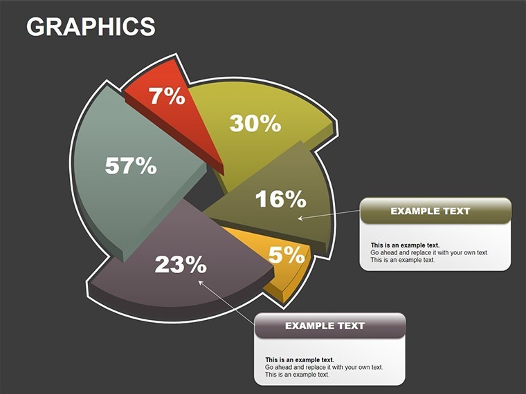
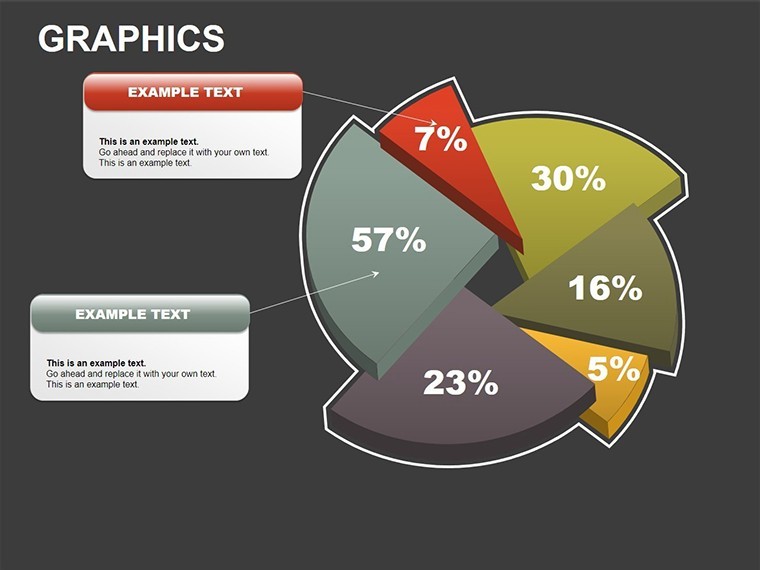
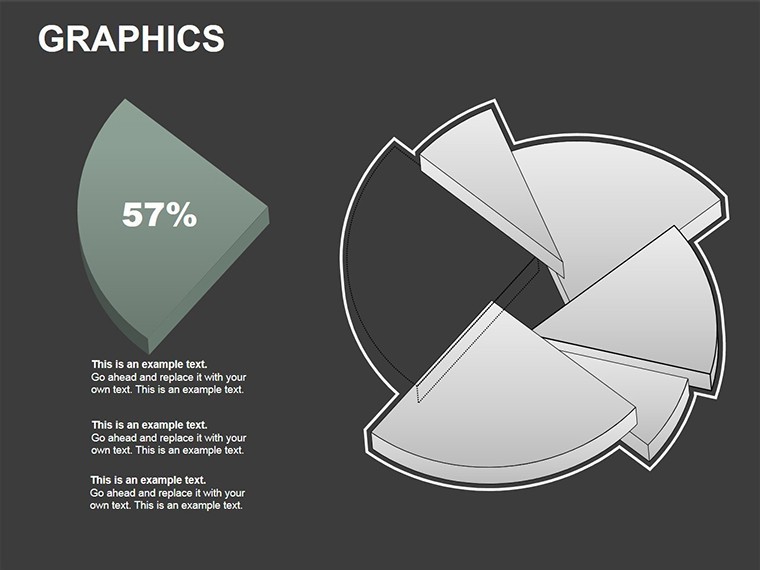
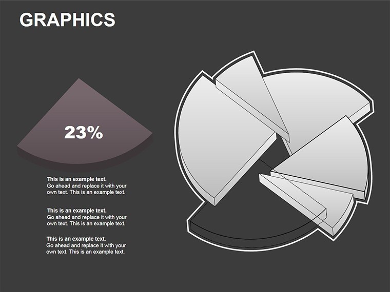
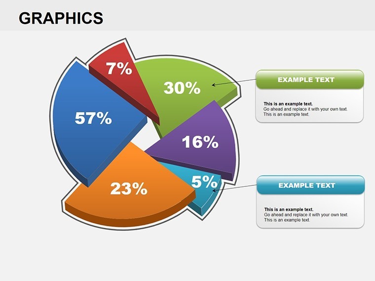
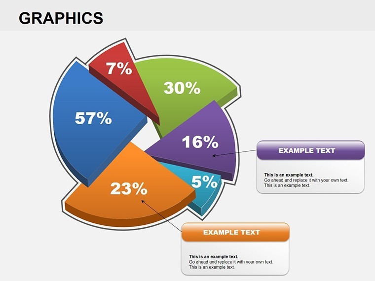
Sector charts, often called pie or pizza charts, are timeless for showing parts of a whole, but our template elevates them with graphical flair. Inspired by data visualization guidelines from sources like the International Business Communication Standards (IBCS), these slides prioritize clarity with clean lines and balanced proportions. Among the 22 slides, you'll find variations like exploded sectors for emphasis, 3D effects for depth, and multi-layer pizzas for comparative analysis. For example, one slide could visualize a company's revenue streams - sales, services, and subscriptions - each slice labeled with percentages and icons. Another might compare competitor market shares, using gradients to indicate growth trends. In practice, a non-profit organization leveraged similar charts to display donation distributions, making their annual report more transparent and donor-friendly, as seen in case studies from charity watchdogs. This template bridges the gap between raw data and actionable insights, encouraging interactive discussions where viewers can quickly grasp imbalances or opportunities.
Standout Features for Effortless Customization
- Multi-Input Flexibility: Add text descriptions, percentage data, or illustrative figures to sectors, adapting to diverse content needs.
- Quick Color Tweaks: Change hues intuitively, ensuring charts pop in any theme without design expertise.
- Extensive Variations: From basic 4-slice to complex 12-slice options, plus 3D and flat styles for visual variety.
- Icon Integration: Built-in library of icons to enhance sectors, making abstract data more relatable.
- Data-Linking Capabilities: Connect to external data sources in Keynote for dynamic updates.
These features stem from iterative design based on user input from creative forums, guaranteeing practicality in high-stakes environments.
Practical Use Cases Across Industries
Dive into applications where this template transforms presentations. In finance, analysts use it to dissect portfolio allocations, highlighting risk distributions with color-coded sectors - echoing strategies from CFA Institute resources. For marketers, it's ideal for audience segmentation, showing demographics in a pizza format that reveals targeting gaps. A real-inspired example: A retail chain employed pizza charts to analyze sales by product category, identifying underperformers and boosting inventory decisions by 15%. Educators might apply it to teach fractions or survey breakdowns, making lessons interactive. Versus standard Keynote pies, which lack polish, this template offers pre-styled elegance that saves design hours. It's particularly useful in virtual settings, where bold visuals combat screen fatigue.
Guided Workflow for Seamless Adoption
- Launch the template and choose a slide layout matching your data set.
- Populate sectors with your info - text for labels, numbers for autoscaling.
- Adjust colors for emphasis, perhaps using complementary schemes for accessibility.
- Incorporate figures or icons to add context, then animate for reveal effects.
- Review and share, confident in a professional output.
Pro tips include limiting slices to 7 for readability, per cognitive psychology insights, and exporting to PDF for broader compatibility.
Elevate Your Data Narratives Today
What makes this template indispensable is its blend of creativity and utility, turning mundane data into compelling visuals. Ideal for reports that need to persuade, like investor pitches showing equity splits. Built with Keynote's strengths in mind, it promises reliability. Ready to slice through presentation challenges? Secure your copy and start visualizing success.
Frequently Asked Questions
How many sectors can I add to a chart?
Slides support up to 12 sectors comfortably, with options to merge or explode for focus.
Does it support 3D effects?
Yes, several slides include 3D variations for added depth, fully editable in Keynote.
Can I insert images into sectors?
Absolutely - figures or images can be added directly, enhancing visual storytelling.
Is color change limited to presets?
No, you have full freedom to pick any color, syncing with your theme effortlessly.
What if I need more slides?
The 22 provided are duplicatable, allowing expansion as needed.
Compatible with iPad Keynote?
Yes, fully functional on iOS versions for on-the-go edits.
Good for
- Project roadmaps and sprint plans
- Product launch timelines
- Quarterly or annual review decks
- Company history and milestone summaries
Licence
reviews
Needed chart slides fast for a Monday meeting and this worked.
The pie charts and small icons looked cleaner after minor edits.
Not everything matched perfectly but people probably didn’t notice.
I appreciate that the slides weren’t overloaded with effects.
Used only the analytics pages and skipped the rest.
FAQ
Will it work in Google Slides?
Are fonts embedded?
Can I use this for client work?
What's the refund policy?
Do you update the template after purchase?
Similar templates
See all Keynote Charts →
All 22 slides