 Click to zoom
3D Clustered Column Charts Keynote - Editable | ImagineLayout
| Format | .pptx |
| Slides | 46 unique layouts |
| Aspect ratio | 130/73 |
| Compatibility | PowerPoint |
| Animated | No |
| Language | English |
| License | Commercial |
| File size | — |
| Version | v1.0 |
| Last updated | March 2026 |
What's inside
Files and Formats Included
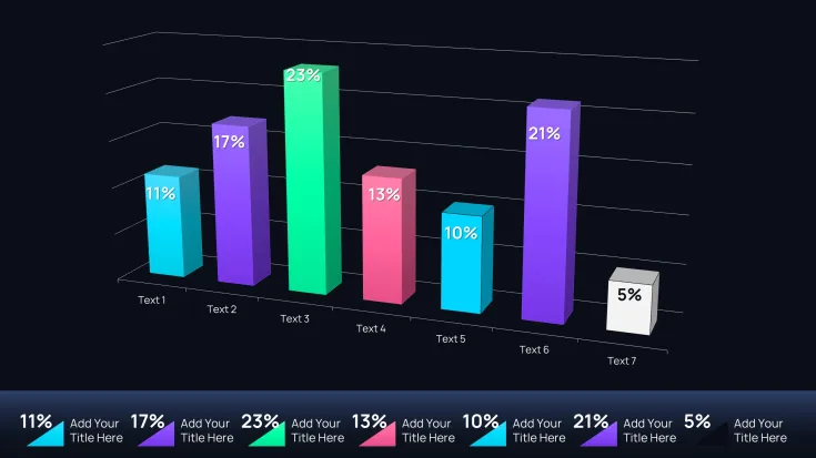
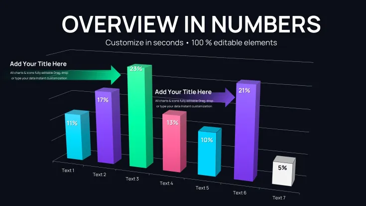
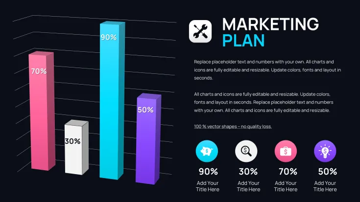
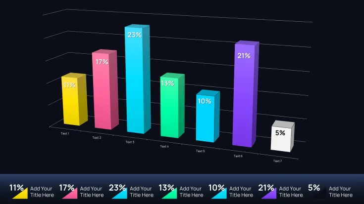
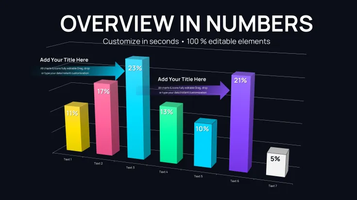
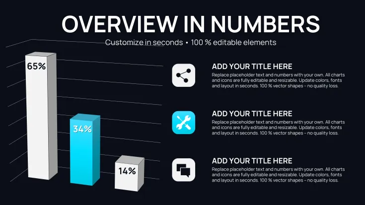
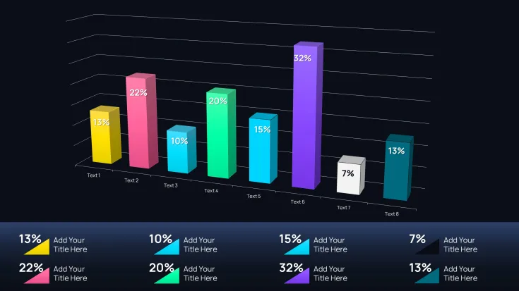
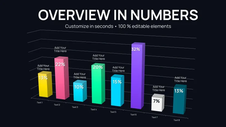
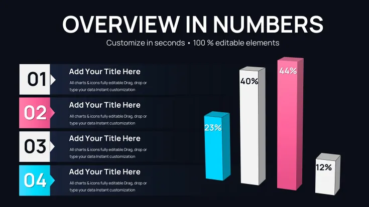
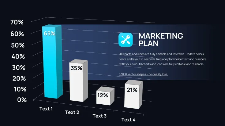
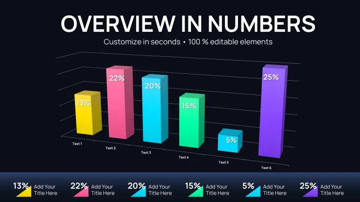
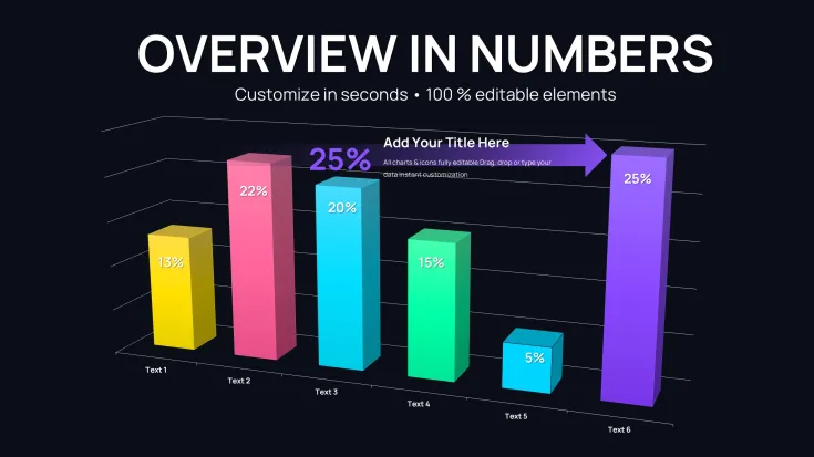
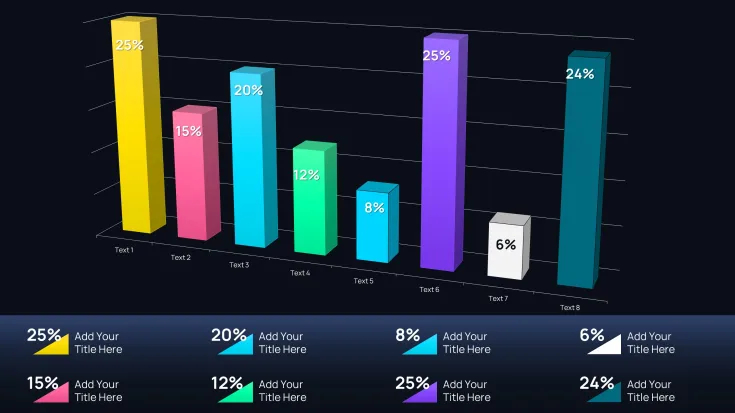
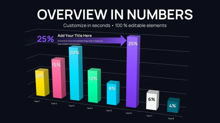
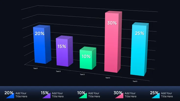
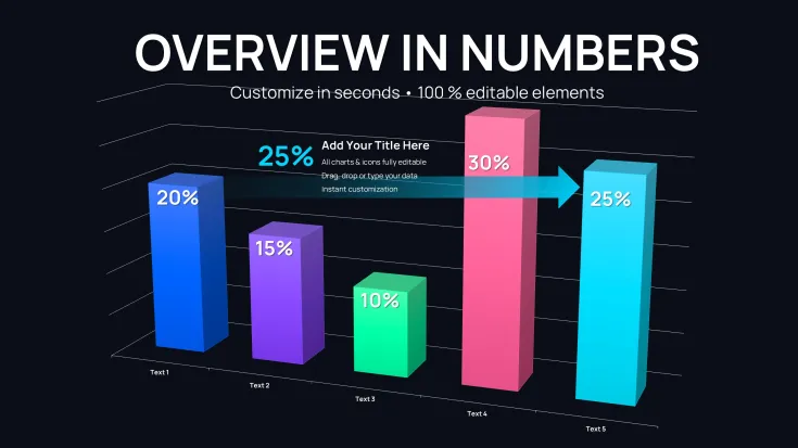
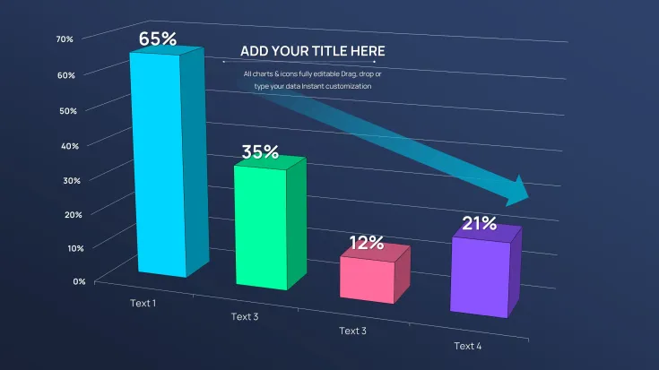
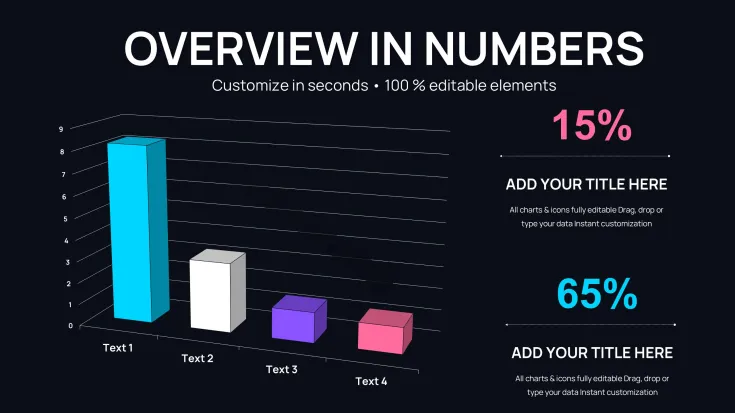
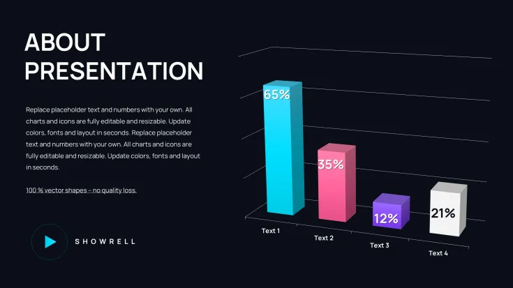
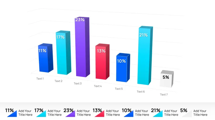
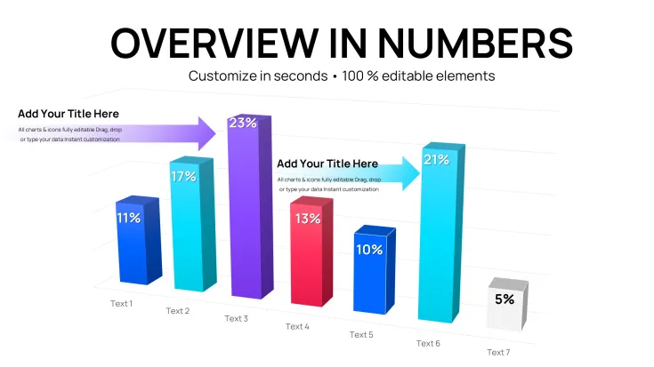
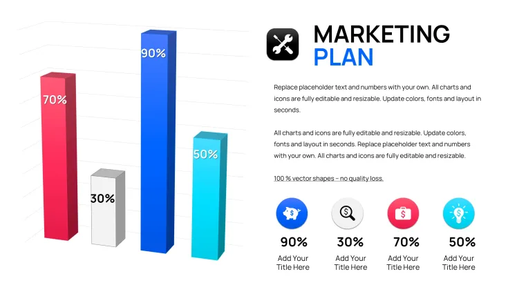
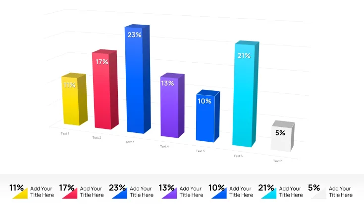
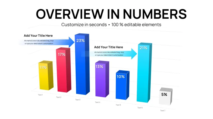
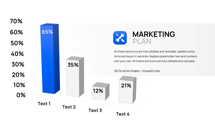
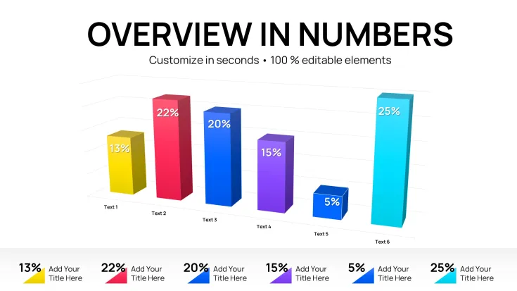
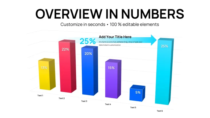
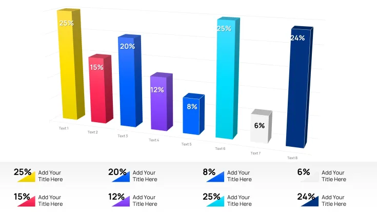
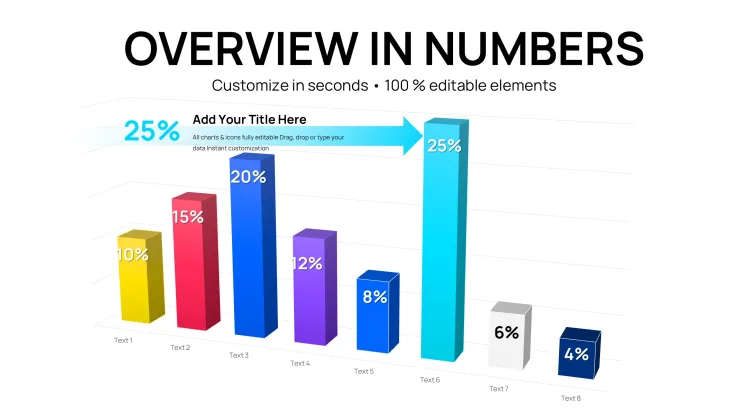
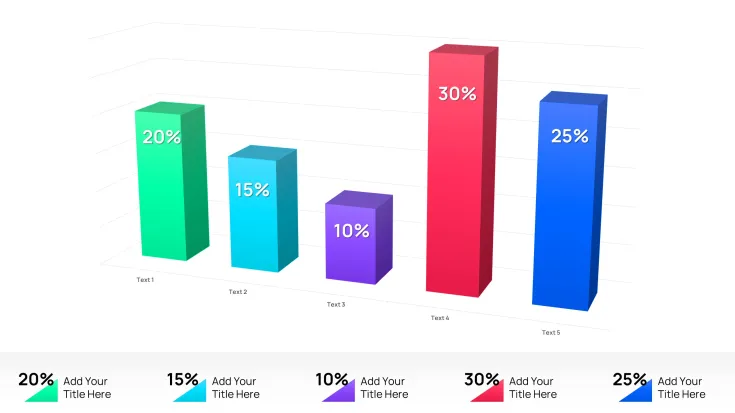
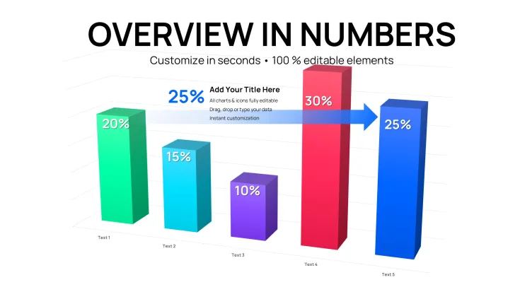
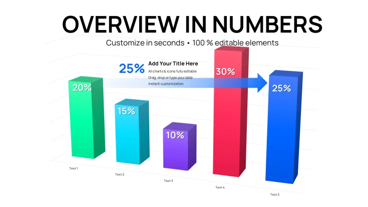
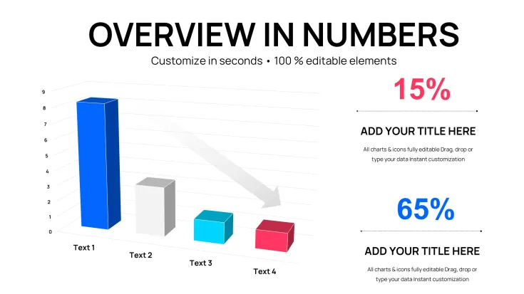
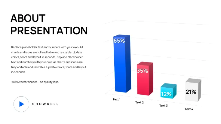
46 editable slides deliver 3D clustered column charts ready for financial reports.
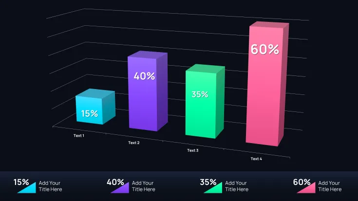
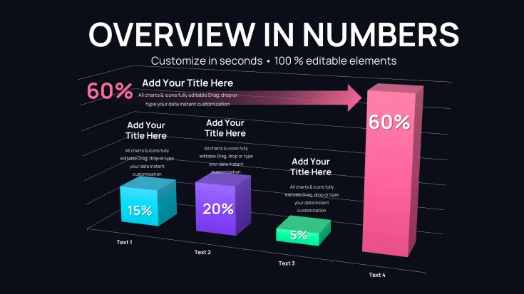
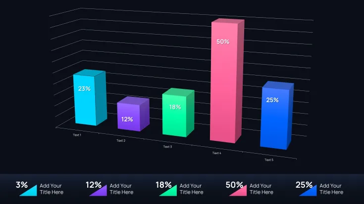
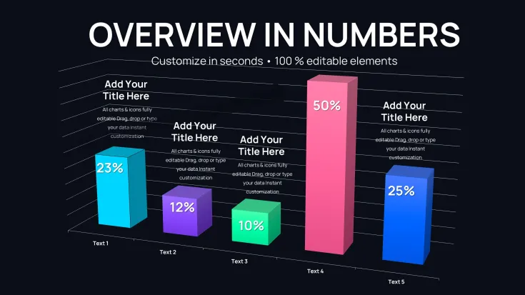
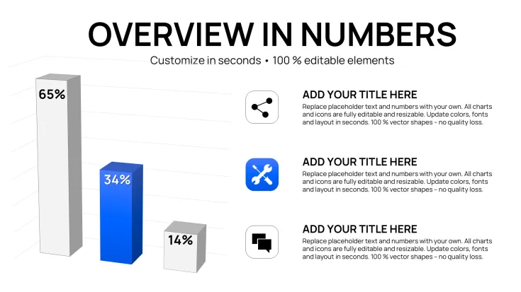
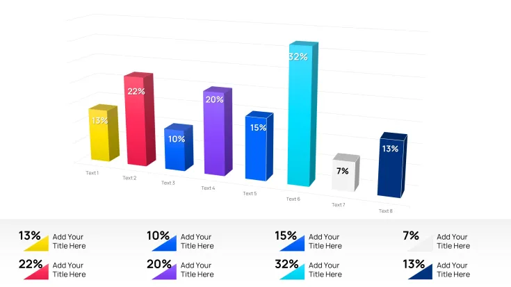
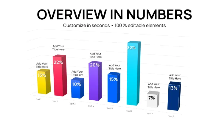
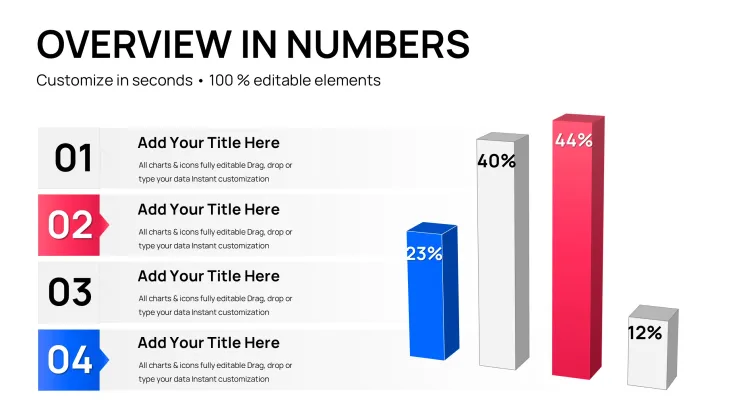
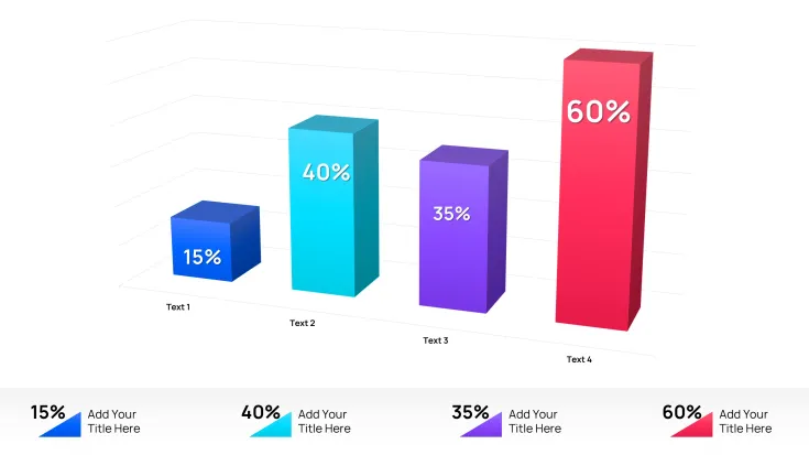
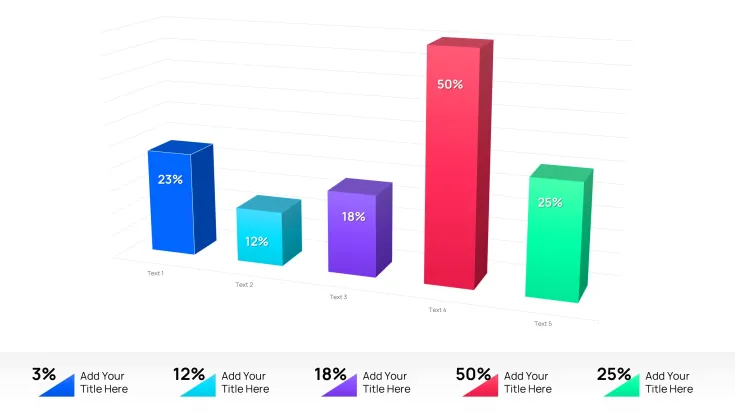
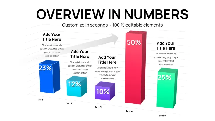
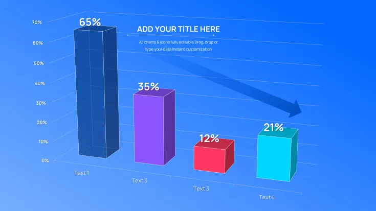
Each slide focuses on clustered columns with three-dimensional depth to compare multiple series such as revenue streams or expense categories side by side. The structure supports up to five data groups per chart while maintaining clear visual hierarchy through color contrast and flow direction.
Compared to flatter column layouts this collection prioritizes 3D depth where higher-value series stand out immediately in complex data sets.
- .key format for direct Keynote editing
- 46 slides with clustered column variations
- Fully editable 3D elements and labels
What is a 3D clustered column chart template? A Keynote chart template featuring editable three-dimensional clustered columns designed for comparing multiple data series in financial reports. It allows quick customization of colors, labels, and values directly in Apple Keynote.
Key Specifications At a Glance
FeatureDetailsSlides included46 editable 3D clustered column chartsDiagram categoriesClustered column with 3D extrusion for multi-series comparisonEditable elementsColumn segments resize and recolor independentlyAspect ratioStandard 16:9 for modern presentationsKeynote compatibilityKeynote 12 or later on macOSColor theme adjustmentsCompatible with Keynote slide master paletteExport options.key for editing, PDF for distributionFor the full range of Keynote charts templates explore additional graph layouts that match different data needs.
Real Scenarios
Before: 4 hours building 3D clustered columns from scratch in Keynote with inconsistent alignment across series. After: 35 minutes, all charts consistent across six client decks.
A financial analyst at a mid-size investment firm reused the same template file across 11 quarterly briefings over eight months. Each time data labels swapped and color schemes adjusted to match the report theme.
Download and start editing immediately
Customization in 5 Steps
Editing difficulty: Moderate. Familiarity with Keynote chart tools speeds the process.
- Open the .key file in Keynote 12 or later (1 minute).
- Double-click any chart to access the data table and replace values (3 minutes).
- Select columns and adjust 3D depth or rotation via the Format panel (2 minutes).
- Update text placeholders for titles and labels through the slide master for global consistency (4 minutes).
- Export as PDF or keep in .key for live presentation (1 minute).
How do you update chart data in this Keynote file? Double-click the chart element to open the data editor directly.
- Select the chart on the slide.
- Click Edit Data in the top menu.
- Replace numbers in the spreadsheet view.
- Close the editor to see live 3D updates.
- Adjust labels if needed for clarity.
If you prefer standard clustered column charts without depth check clustered column chart options.
Why This Template, Not a Blank Slide
Building equivalent 3D clustered column charts from scratch requires 3-4 hours per deck and advanced Keynote skills to align columns perfectly. This template reduces that to under 20 minutes even for moderate users.
Common issues when starting from zero include misaligned clusters that distort comparisons and missing depth perspective that hides data magnitude.
- Time required drops dramatically
- No need for custom 3D modeling
- Consistent layout across slides
The 3D perspective in clustered columns communicates data volume at a glance. The extruded depth makes higher-value series stand out pre-attentively before readers reach the labels which matters in fast-paced financial briefings where executives scan multiple data series simultaneously.
For other 3D data visualizations see volume-based chart sets.
Download and start editing immediately
What Keynote version is required for this template?The template works with Keynote 12 or later on macOS. Earlier versions may not support all 3D effects or chart formatting options fully. Open the .key file and check the slide master for any warnings. If issues arise update to the latest Keynote for optimal performance and full compatibility with the clustered column depth.
How do you change the color scheme via slide master?Access the slide master by selecting View then Edit Master Slides. Modify the color palette there to update all 46 charts globally in seconds. Individual slides allow overrides for specific series. This approach prevents repetitive manual adjustments across the deck and keeps every 3D clustered column consistent.
What does the license allow for this Keynote chart template?The license permits use in both internal reports and paid client work. You may modify and present the charts in commercial decks. Redistribution of the original .key file or resale as a template is not allowed. Contact the seller for team license details if multiple users need access.
What is the difference between free and paid versions?The paid version at $14 includes the complete 46 editable slides in .key format with all 3D clustered column variations. Free previews may show sample slides but lack the full set. Purchase unlocks immediate download and unrestricted editing rights. Check the product page for any current promotions on tiers.
What is the refund policy if the template does not meet expectations?Refunds are available within 14 days of purchase if the file fails to open or edit as described. Contact support with your order details to initiate the process. The policy ensures buyer satisfaction for all chart templates. Note that custom modifications after download may affect eligibility.
How do you update chart data and edit labels?Double-click the specific 3D clustered column chart to launch the data editor. Replace the numbers and labels directly in the table view. The 3D visualization updates automatically upon closing the editor. This feature supports rapid adaptation for quarterly reviews without rebuilding the layout.
How do you export the charts for different destinations?Use File then Export to PDF for high-resolution distribution to stakeholders. The .key format remains fully editable for further Keynote sessions. For web sharing convert to image slides if needed. All exports preserve the original color contrast and visual hierarchy.
Good for
- Project roadmaps and sprint plans
- Product launch timelines
- Quarterly or annual review decks
- Company history and milestone summaries
Licence
reviews
3D clustered columns with depth made revenue comparisons pop in financial report. 46 slides, data editor updates live. Consistent across series for client decks.
The extruded 3D effect highlights magnitude at glance. 35 minutes customization vs 4 hours manual. Great for quarterly briefings.
Financial analyst - multiple series side-by-side clear. Rotation adjustments in Format panel easy. Visual hierarchy strong.
Used for expense categories. Aspect 16:9 modern. Master palette global changes fast. Practical 3D without complexity.
Moderate user: columns resize independently, labels update smoothly. Good for multi-data sets. Recommend for investment firms.
The clustered variations supported fast-paced exec scans. Color contrast good on projection. Time-saver under deadline.
FAQ
Will it work in Google Slides?
Are fonts embedded?
Can I use this for client work?
What's the refund policy?
Do you update the template after purchase?
Similar templates
See all Keynote Charts →
All 46 slides