 Click to zoom
Target Audience Charts for Design Pros
| Format | .pptx |
| Slides | 25 unique layouts |
| Aspect ratio | 16:9 |
| Compatibility | PowerPoint |
| Animated | No |
| Language | English |
| License | Commercial |
| File size | — |
| Version | v1.0 |
| Last updated | January 2024 |
What's inside
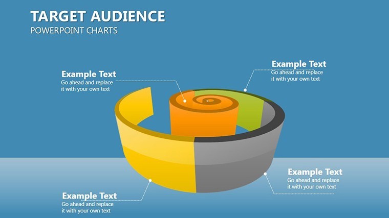
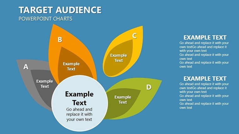
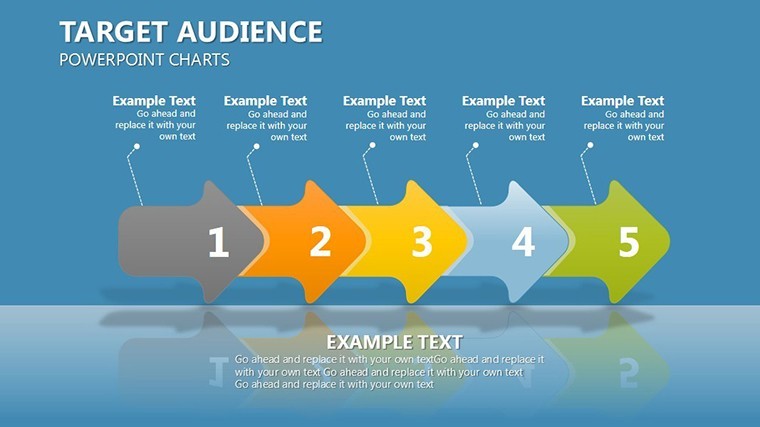
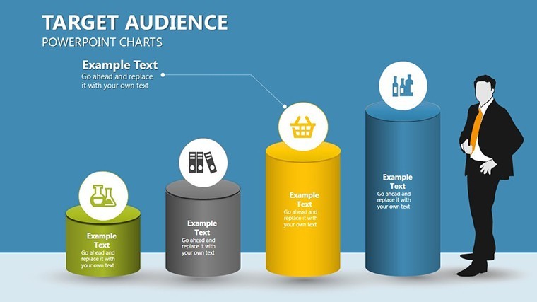
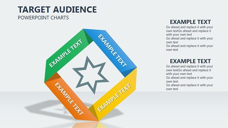
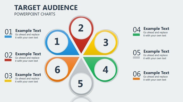
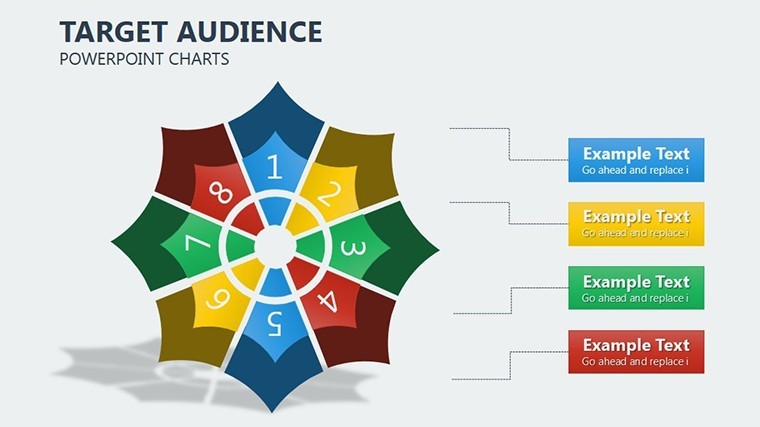
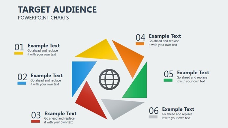
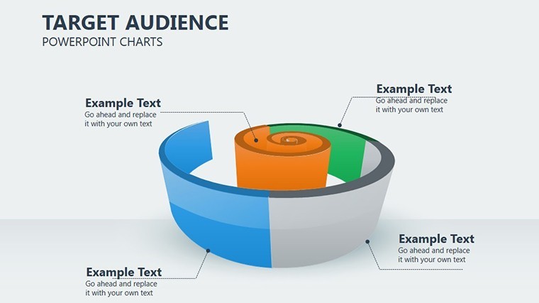
In the competitive realm of architecture and design, understanding your audience is the foundation of resonant projects. Our Target Audience Keynote Charts Template equips you with 25 editable slides to map demographics, behaviors, and preferences with stunning visual clarity. Whether you're tailoring a boutique hotel concept to urban millennials or analyzing stakeholder needs for a public library redesign, this template turns raw data into persuasive stories that win bids and foster collaborations.
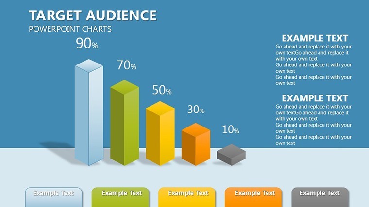
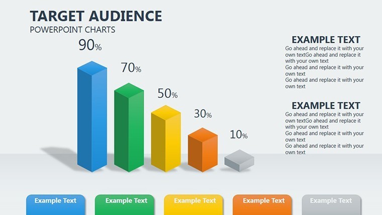
Built for architects, interior designers, and urban planners, it leverages intuitive chart types like pie graphs for demographic breakdowns and bar charts for behavioral trends. Envision presenting to a city council: A radial audience map slide reveals how 60% of residents prioritize green spaces, backed by interactive elements that zoom into psychographic details. Compatible with Keynote and adaptable to Google Slides, it streamlines your process from research to reveal.
Elevate Your Audience Insights with Professional Visuals
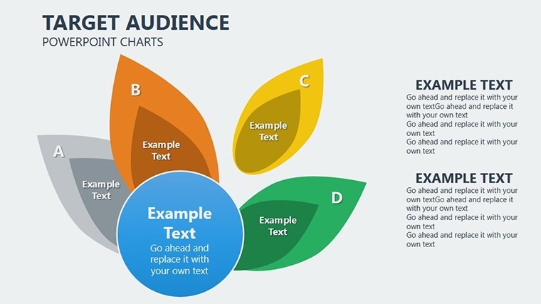
This template isn't just about numbers - it's about narrative depth. With a clean, contemporary aesthetic inspired by modern design principles, the slides feature layered infographics that peel back audience layers like an onion, revealing insights at every turn. The 25 slides span from overview personas to detailed segmentation, ensuring comprehensive coverage for any project scale.
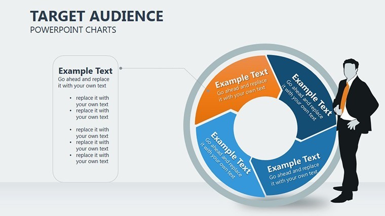
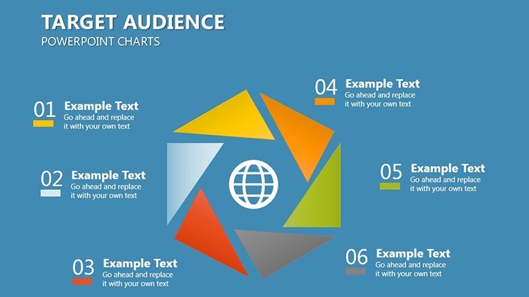
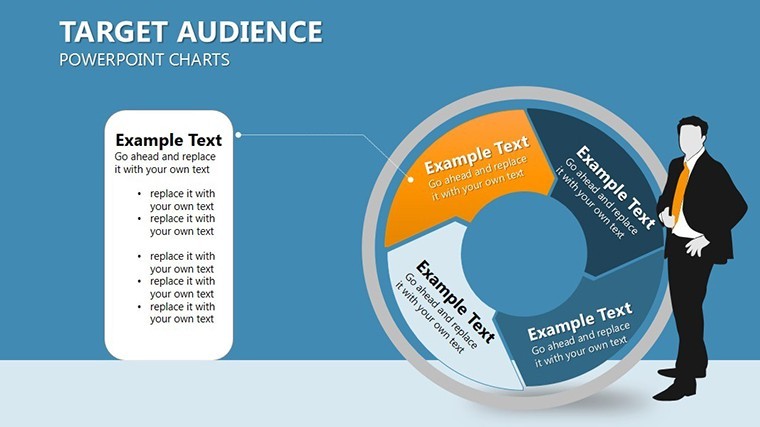
- Demographic Precision: Pie and donut charts dissect age, income, and location data, perfect for justifying site selections in residential developments.
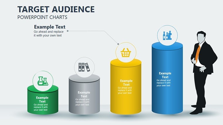
- Behavioral Breakdowns: Horizontal bar graphs track usage patterns, helping designers anticipate needs in adaptive reuse projects.
- Psychographic Depth: Customizable journey maps illustrate emotional touchpoints, enhancing empathy in client-centric designs.
A real-world example from a San Francisco firm: Using audience charts, they profiled tech-savvy professionals for a co-working space, incorporating flexible layouts that boosted occupancy by 25%. This template empowers similar successes, with drag-and-drop functionality that lets you import data from tools like SurveyMonkey or Excel seamlessly.
Seamless Integration into Architectural Workflows
- Launch and Customize: Open the .key file in Keynote; select from widescreen or standard formats to match your projection setup.
- Input Audience Data: For a cultural center project, populate a scatter plot with variables like interest in arts versus accessibility preferences.
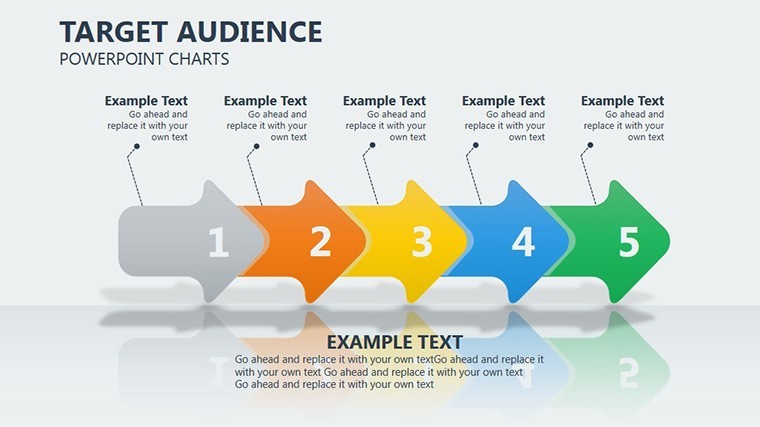
- Visualize Trends: Animate flows to show migration patterns, adding context with overlaid maps or icons of building types.
- Refine and Share: Collaborate via Keynote's sharing features, then export to PDF for printed handouts at design charrettes.
Extending beyond basic visuals, the template includes empathy map templates and value proposition canvases, aligning with agile design methodologies. It's a boon for firms pursuing certifications like WELL Building Standard, where audience health and wellness data visualization is key.
Stand Out from Generic Tools
Unlike free online chart makers that produce cookie-cutter graphics, this template offers bespoke elements like gradient fills and shadow effects that evoke architectural depth. High-resolution vectors prevent distortion in portfolio PDFs, and built-in accessibility features - such as color-blind friendly palettes - demonstrate your commitment to inclusive design. Industry stats show that data-driven presentations increase project approval rates by 40% (per RIBA insights), making this an indispensable asset.
For urban planning pitches, use the funnel charts to depict audience drop-off in public engagement processes, identifying bottlenecks early. The editable legends and tooltips add interactivity, turning passive viewers into active participants.
Pro Tips for Design Audience Analysis
- Combine pie charts with heat maps for geographic audience hotspots in master planning.
- Use subtle humor in persona slides, like naming archetypes after famous architects, to lighten boardroom tension.
- Integrate AR previews by linking slides to 3D models, bridging data with immersive experiences.
- Always validate data sources - cross-reference with census info for trustworthy claims.
As a design professional, your audience is your muse; let this template illuminate their world. With its versatile charts, you'll craft presentations that not only inform but also ignite imaginations.
Transform Your Pitches Today
Ready to connect deeper with your stakeholders? Download the Target Audience Keynote Charts Template now and watch your designs resonate like never before. It's time to audience-proof your success.
Frequently Asked Questions
How can architects use these charts for client engagement?
They help visualize client personas, ensuring designs meet specific needs and preferences for more tailored proposals.
Is the template editable in Google Slides?
Yes, export from Keynote to Google Slides with preserved layouts and basic animations.
What chart types are included?
A mix of pies, bars, radars, and funnels, all optimized for audience data.
Can I add my own images or logos?
Absolutely, slides support easy insertion of brand elements and project visuals.
How does it support collaborative work?
Keynote's real-time sharing allows team edits, ideal for design reviews.
What's the file size and download process?
Compact .key file for quick download; unzip and open instantly.
Good for
- Project roadmaps and sprint plans
- Product launch timelines
- Quarterly or annual review decks
- Company history and milestone summaries
Licence
reviews
Needed charts for a startup pitch and these worked surprisingly well.
The layouts were easy to customize even on older Keynote.
Some text areas were small for detailed notes.
I liked the clean spacing around the graphs.
Good quick option when you don’t want flashy slides.
FAQ
Will it work in Google Slides?
Are fonts embedded?
Can I use this for client work?
What's the refund policy?
Do you update the template after purchase?
Similar templates
See all Keynote Charts →

All 25 slides