 Click to zoom
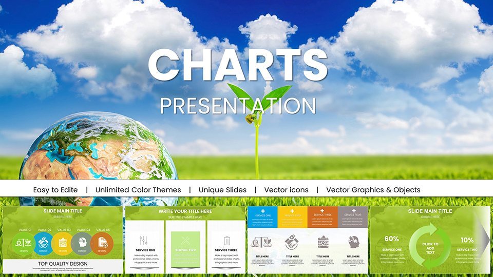
Stunning Eco Planet Charts Keynote Template
| Format | .pptx |
| Slides | 59 unique layouts |
| Aspect ratio | 16:9 |
| Compatibility | PowerPoint |
| Animated | No |
| Language | English |
| License | Commercial |
| File size | — |
| Version | v1.0 |
| Last updated | May 2025 |
What's inside
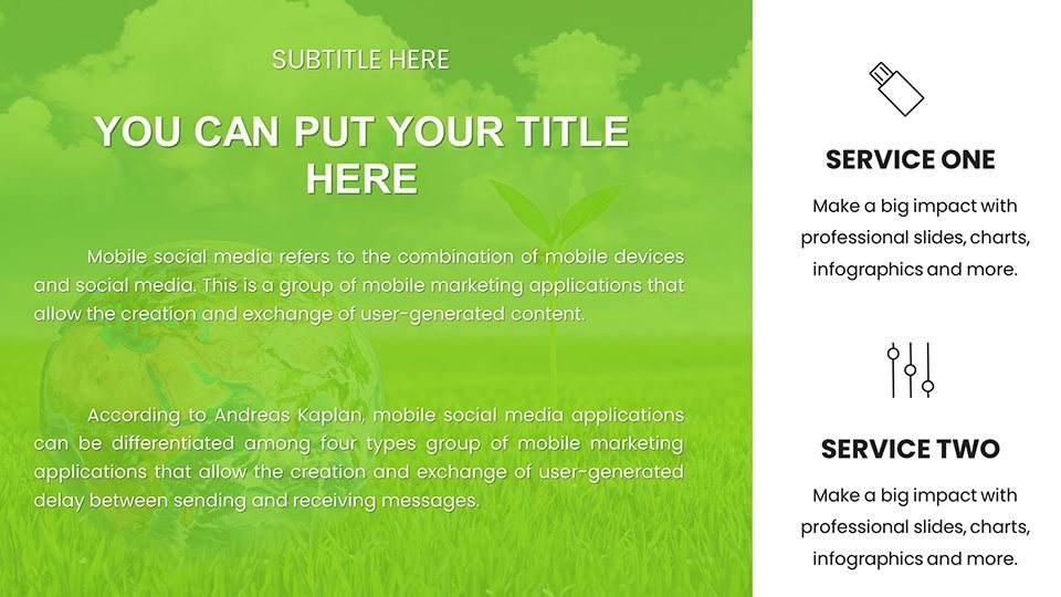
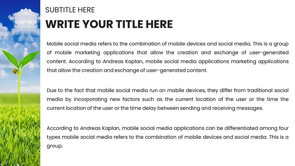
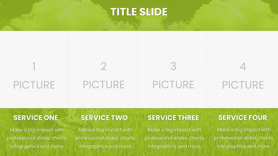
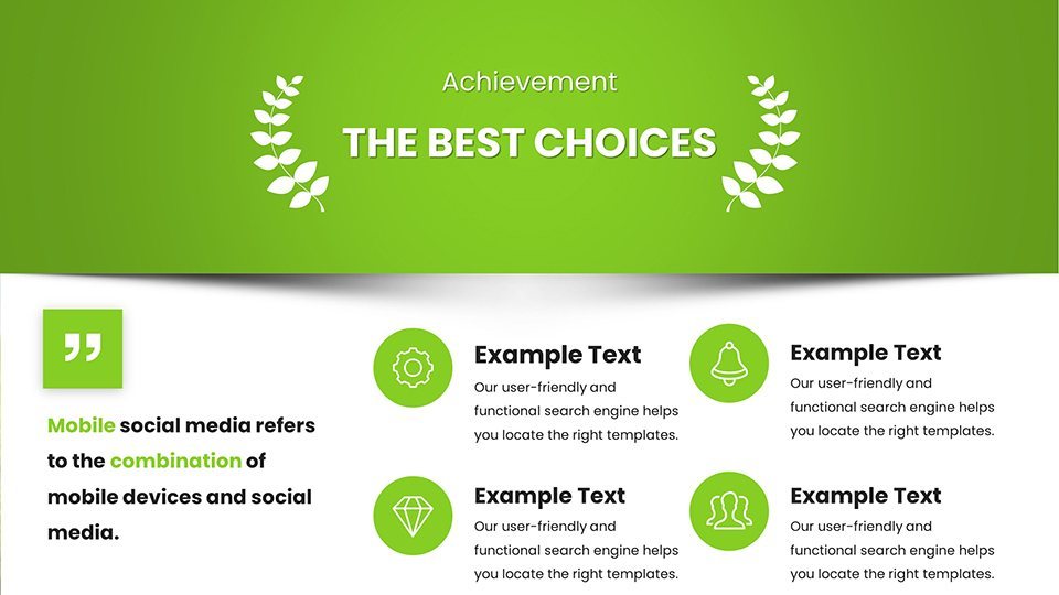
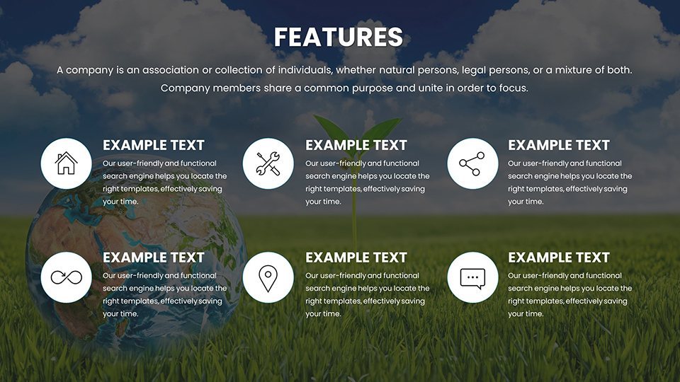
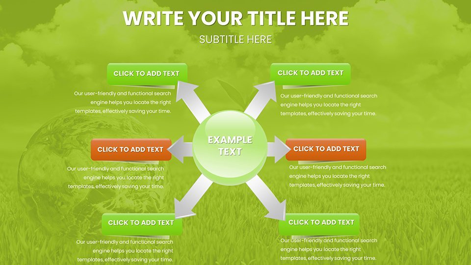
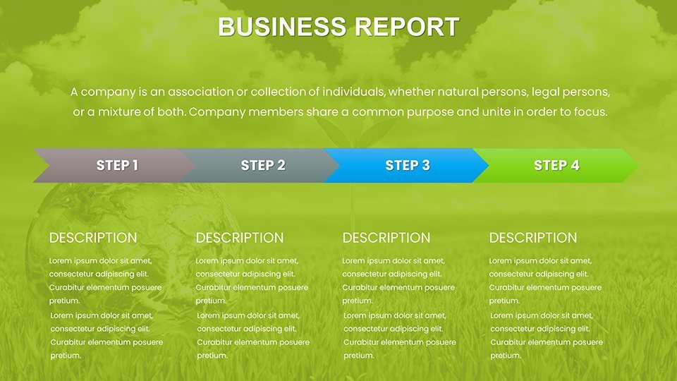
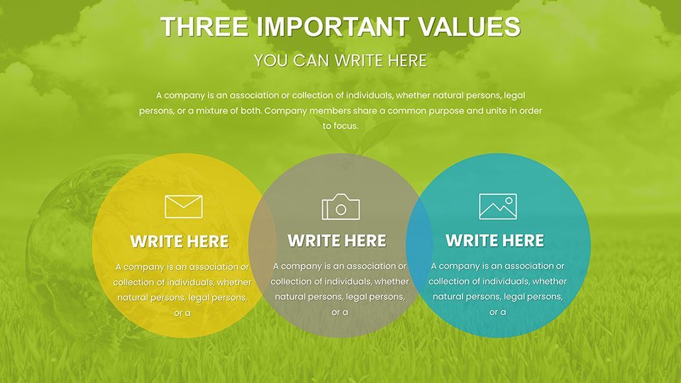
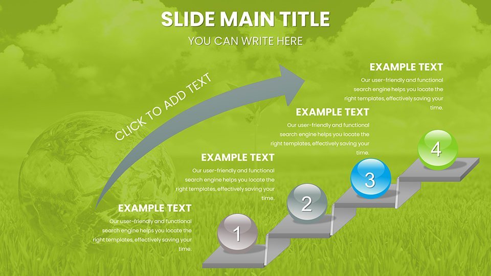
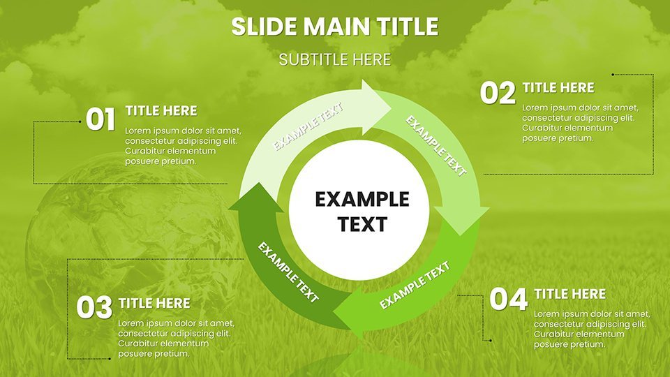
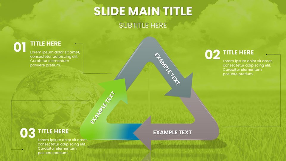
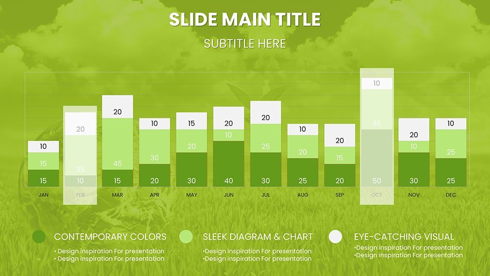
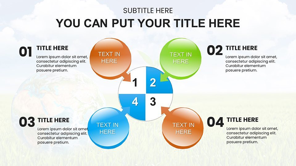
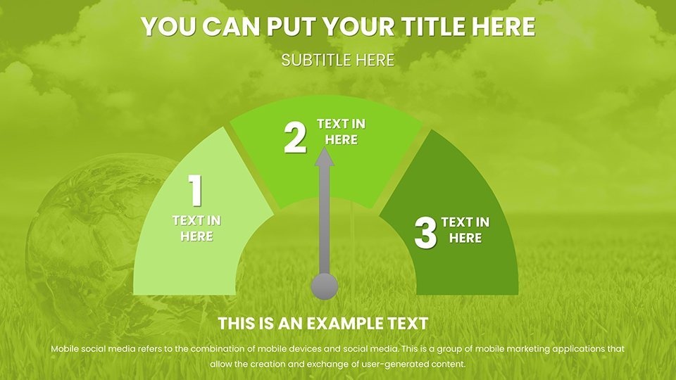
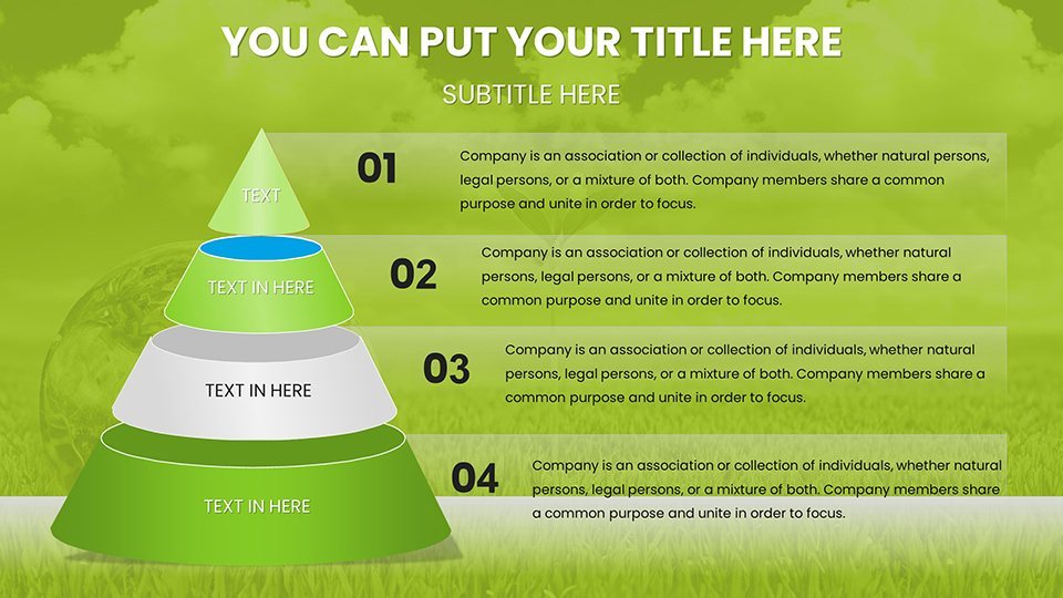
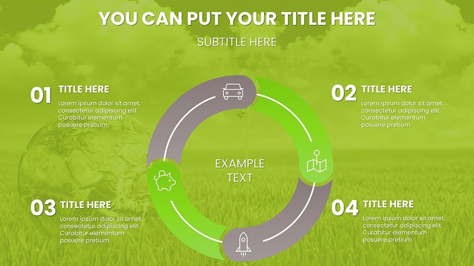
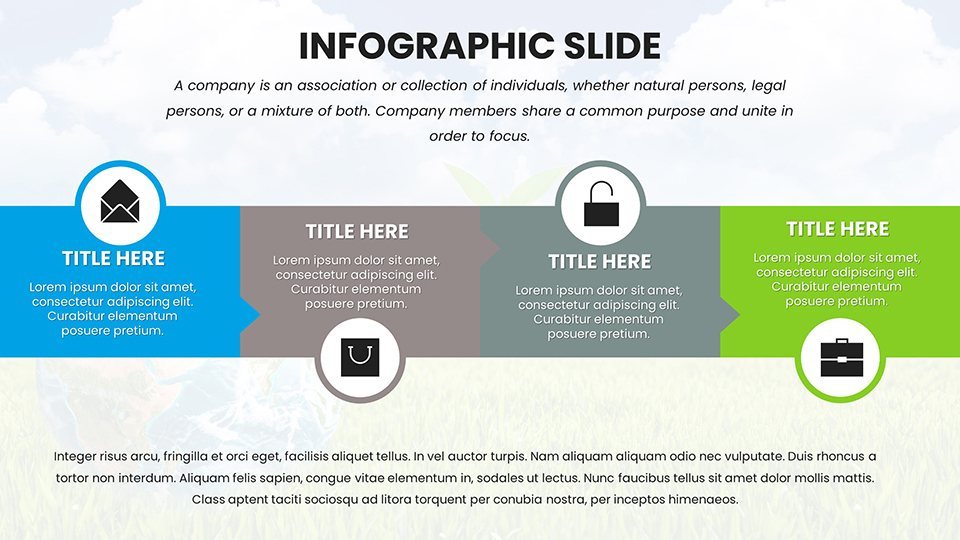
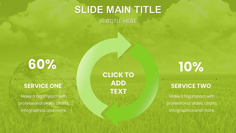
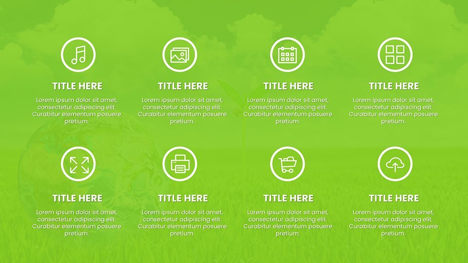
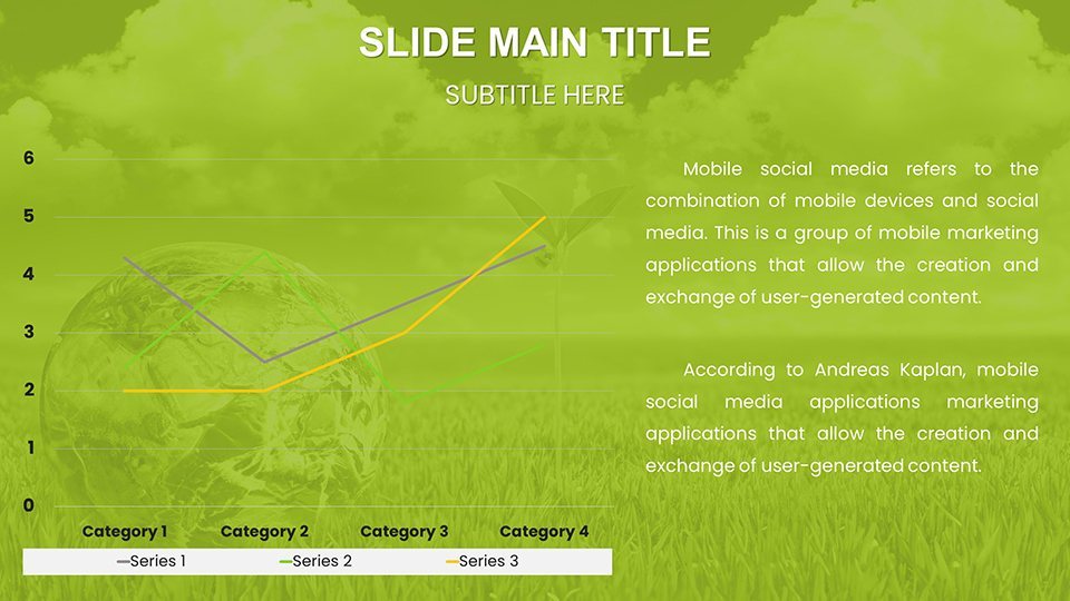
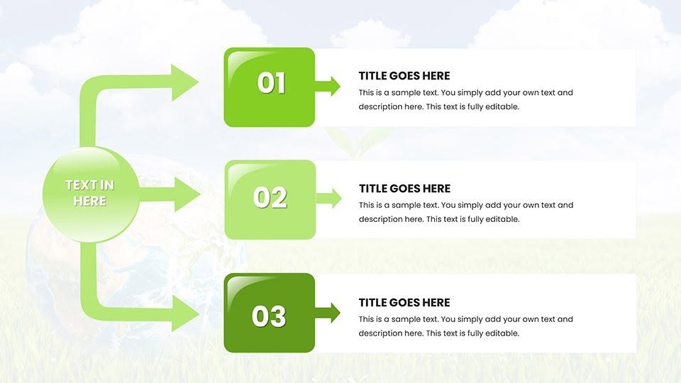
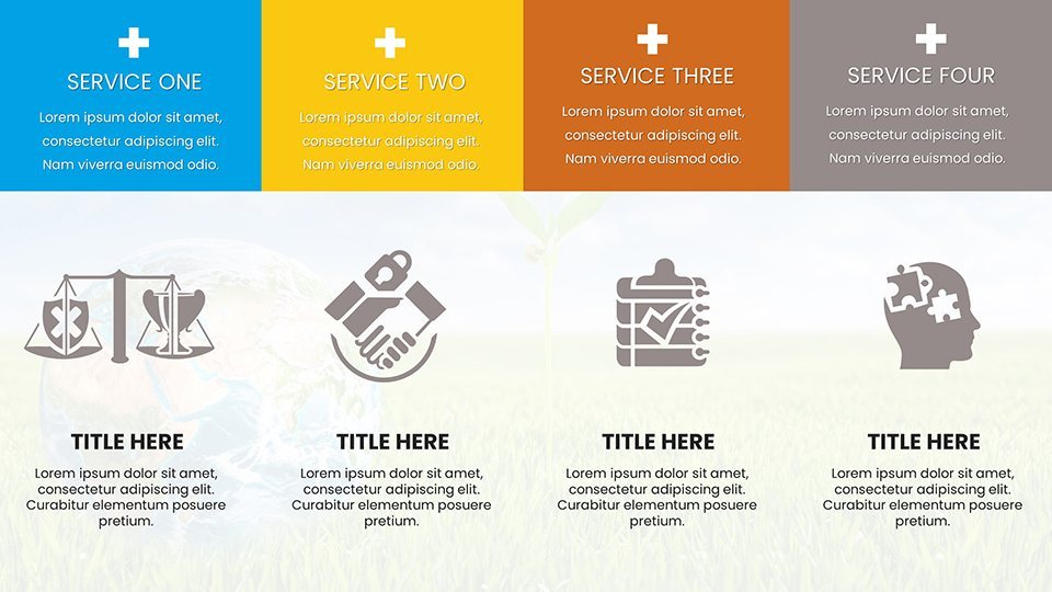
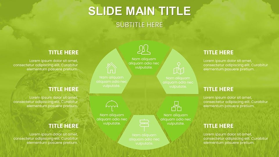
As the world grapples with climate challenges, communicating environmental data effectively has never been more crucial. Our Stunning Eco Planet Charts Keynote Template equips activists, educators, and corporate sustainability officers with 59 editable slides to craft narratives that drive change. Focused on planet-friendly themes, it features vibrant visuals like Earth icons and green landscapes, helping you illustrate topics from renewable energy trends to biodiversity loss. Envision captivating a conference audience with dynamic pie charts showing carbon footprint reductions or timelines depicting sustainability milestones - all in a design that embodies eco-conscious elegance.
Inspired by reports from bodies like the IPCC, this template promotes trustworthy communication, emphasizing data integrity and visual appeal. It's ideal for those seeking to align presentations with global standards like the UN Sustainable Development Goals, turning raw stats into stories that motivate action. Users in fields like environmental consulting have found it transformative, enabling quicker assembly of reports that resonate with stakeholders.
Essential Features for Green Presentations
The template's strength lies in its thoughtful design, blending functionality with aesthetic harmony.
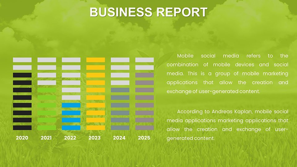
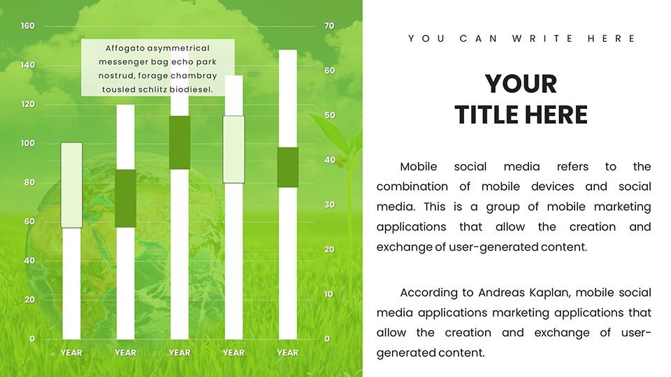
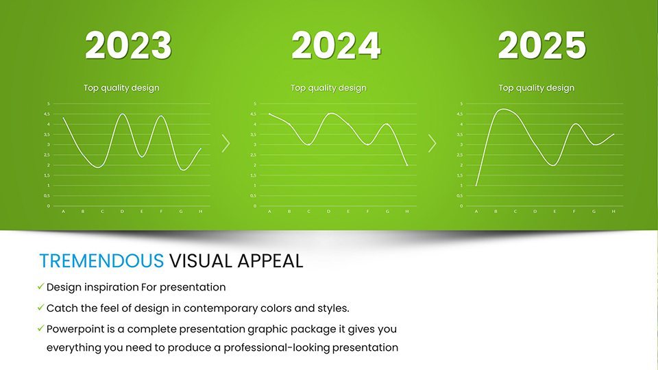
- Customizable Charts: Edit bar, line, and area graphs to display eco-metrics like emission levels or recycling rates.
- Eco-Themed Visuals: Incorporate icons of trees, solar panels, and recycling symbols for thematic depth.
- Light and Dark Modes: Switch themes for day or night presentations, enhancing accessibility.
- Vector-Based Elements: Scale without loss of quality, ensuring professional output.
Surpassing standard templates, it offers unique layouts for SWOT analyses tailored to green initiatives, fostering deeper insights. Real-user stories highlight its role in successful NGO campaigns, where visualized data boosted donor engagement.
Diverse Applications in Sustainability Efforts
Apply it broadly: In corporate settings, use for CSR reports detailing waste reduction strategies with infographics. Educators can break down climate science for students, using maps to show deforestation impacts.
For advocacy, create compelling pitches to policymakers with comparison slides on policy effects. A case from an environmental nonprofit shows how such visuals aided in securing grants for reforestation projects, underscoring the template's practical value. This builds on expert knowledge from sources like the World Resources Institute.
In workshops, facilitate discussions with team profile slides adapted for eco-project collaborators, promoting teamwork in green innovations.
Easy Customization Process
- Download and open in Keynote to explore the slide library.
- Input data: Update charts with your environmental statistics.
- Refine aesthetics: Choose colors from eco-palettes like greens and blues.
- Add interactivity: Include hyperlinks to sources for credibility.
- Present: Share via iCloud or export for wider reach.
Pair with apps like Canva for extra graphics or Google Earth for integrated maps, amplifying your eco-message.
Pro Tips for Impactful Eco Storytelling
Enhance with strategies: Use color psychology - greens for growth - to evoke positive responses. Cite reliable sources like EPA data within slides for trustworthiness. Keep designs minimalistic, aligning with principles from "Storytelling with Data" by Cole Nussbaumer Knaflic.
For virtual events, the template's adaptability ensures seamless Zoom integration. Enthusiasts note increased audience interaction, as vivid charts make abstract issues relatable. Step into a greener future with presentations that not only inform but inspire.
Elevate your eco-visions - customize and download now to spark change.
Frequently Asked Questions
How do the eco-themes enhance presentations?
They provide visual consistency, making sustainability topics more engaging and memorable.
Can charts handle complex environmental data?
Yes, fully editable for multi-variable datasets like climate models.
Is it compatible with older Keynote versions?
It works best with recent versions but is backward-compatible with minor adjustments.
What makes it different from free templates?
Premium quality, unique eco-elements, and professional layouts set it apart.
Can I resell modified versions?
No, it's for personal use; commercial redistribution requires permission.
Good for
- Project roadmaps and sprint plans
- Product launch timelines
- Quarterly or annual review decks
- Company history and milestone summaries
Licence
reviews
The eco planet template came in clutch for my sustainability report 59 slides is a lot.
Love the earth icons and green palettes but the dark mode option is hit or miss on projectors.
Good for NGOs I guess but the tree symbols felt a little on the nose for our corporate deck.
Customized the bar charts for emission levels and it was easy enough with Keynote.
Some of the diagrams are overly complex for basic metrics but the vector quality is solid.
The icon set in this one is really clean and the color schemes switch easily. Used it for a consulting deck and the outline-based icons kept the slides uncluttered. Free tier gives you a few masters to try which is nice.
Paid tier unlocks the diagram library and it is worth it if you need structured data layouts. The cycle diagrams for feedback loops and pipeline narratives worked well for a product roadmap. The .kth format imported right into my existing presentation.
The lightbulb-tree motif is broad enough to work for both consulting and energy topics. The 28 diagrams cover flowcharts and tree structures for organizational breakdowns. Color changes at master level update everything in under two minutes.
Honestly the free download was enough to brand a short presentation with a consistent visual style. The outline-based style is better than filled icons because the data stays dominant. Used it for a digital transformation roadmap.
The master slide color controls are straightforward. Go to edit master slides change the theme colors and close and all 28 diagrams update immediately. The paid tier at $20 is reasonable for the full diagram set.
FAQ
Will it work in Google Slides?
Are fonts embedded?
Can I use this for client work?
What's the refund policy?
Do you update the template after purchase?
Similar templates
See all Keynote Charts →

All 59 slides