 Click to zoom
Stunning Circular Ring Charts: PowerPoint Mastery for Architects
| Format | .pptx |
| Slides | 20 unique layouts |
| Aspect ratio | 16:9 |
| Compatibility | PowerPoint |
| Animated | No |
| Language | English |
| License | Commercial |
| File size | — |
| Version | v1.0 |
| Last updated | February 2023 |
What's inside
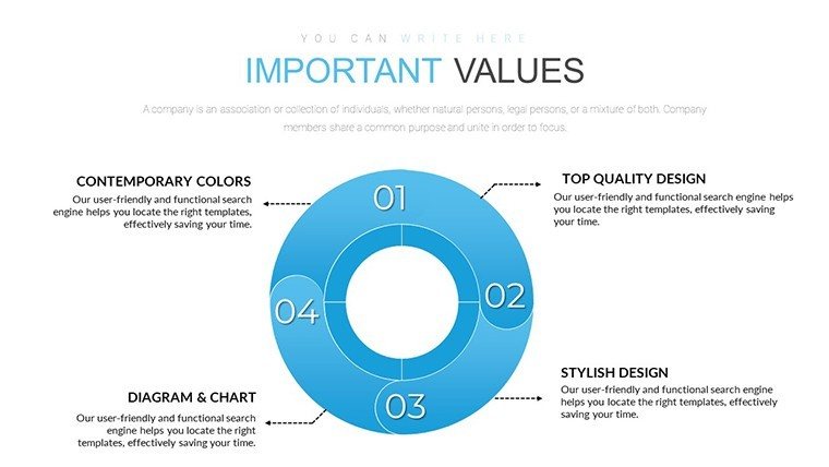
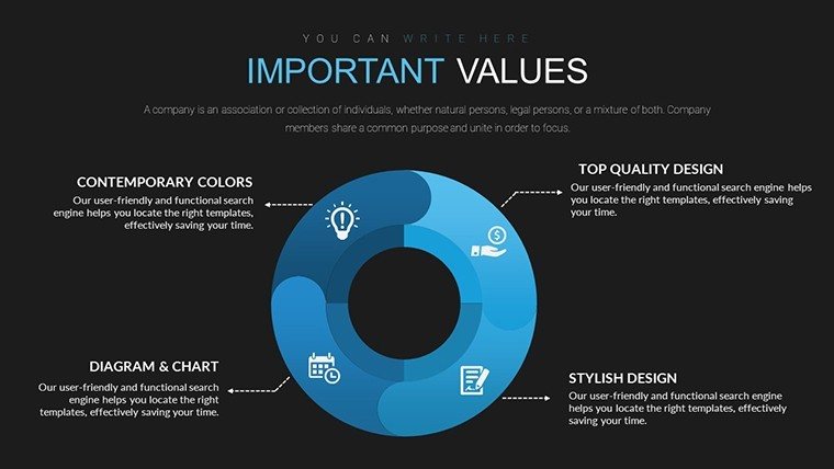
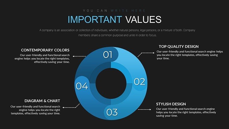
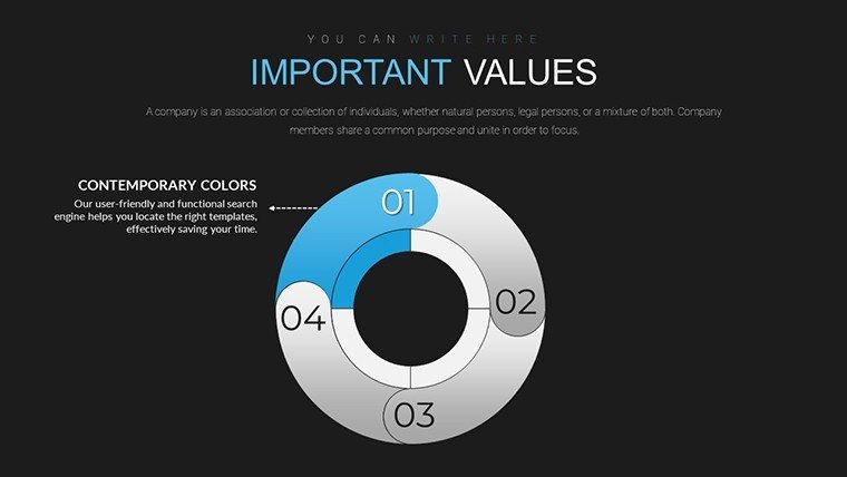
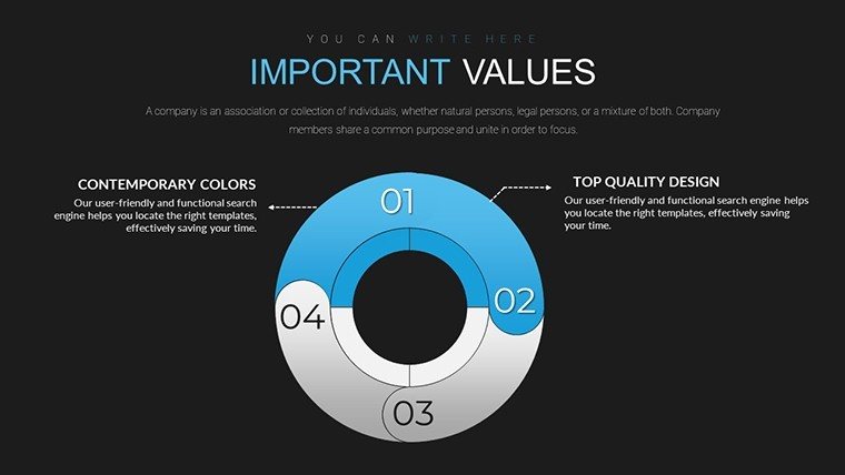
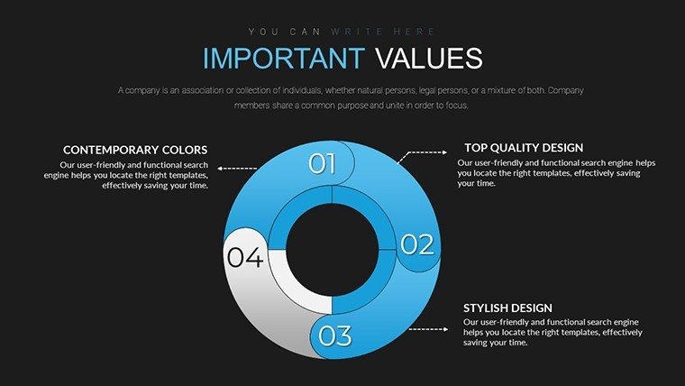
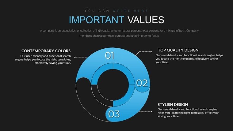
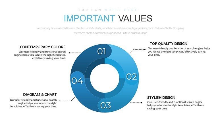
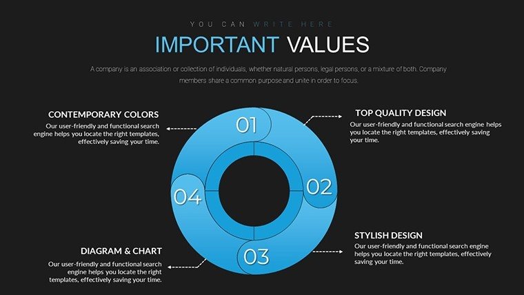
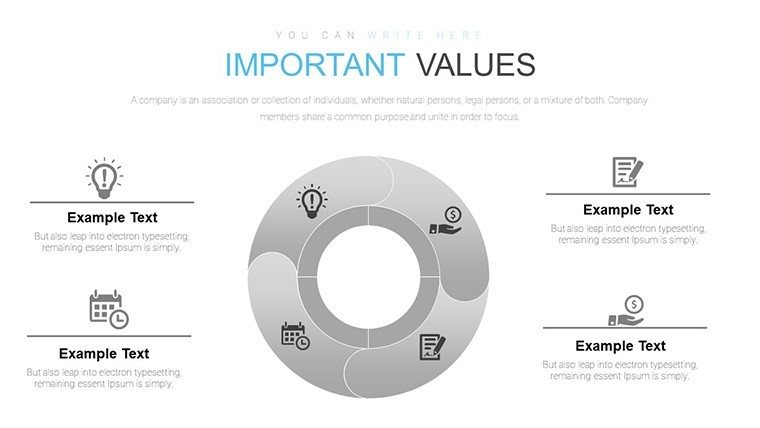
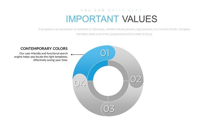
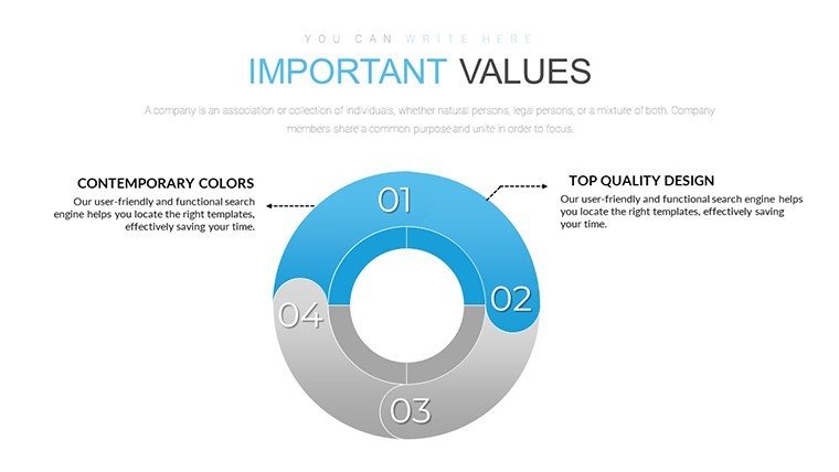
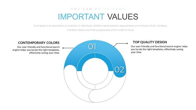
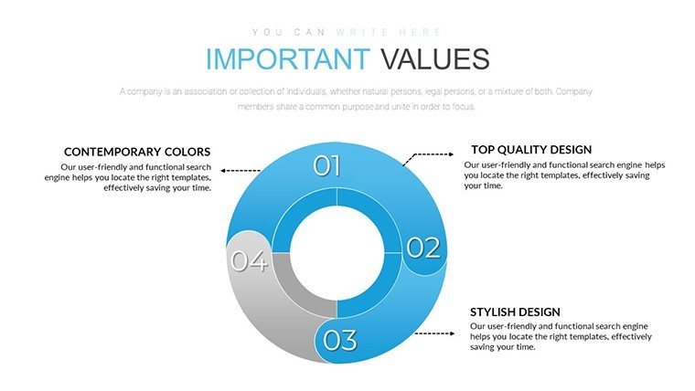
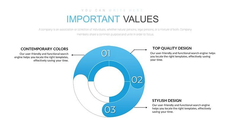
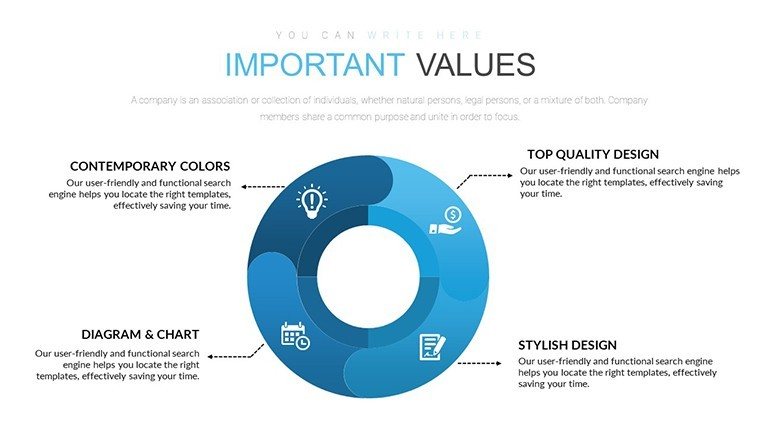
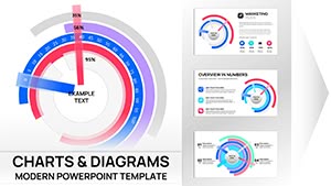
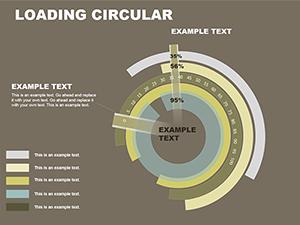
Step into a realm where data dances in circles, illuminating the core of your architectural visions. Our Circular Ring PowerPoint Charts Template, boasting 20 editable slides, is tailored for architects who crave precision in presenting proportional data. From divvying up project budgets to showcasing sustainability metrics in green designs, these ring charts - elegant evolutions of pie charts - offer a modern twist with hollow centers for added text or icons. Compatible with PowerPoint and Google Slides, they integrate seamlessly into your workflow, adhering to AIA's emphasis on clear visual communication. Forget flat pies; embrace rings that highlight hierarchies, like outer rings for overall costs and inner for breakdowns. This template addresses the architect's dilemma of conveying multifaceted data without overwhelming slides, turning presentations into persuasive masterpieces that secure approvals and accolades.
Delve into the Elegance of Circular Ring Visuals
Circular rings excel at depicting parts-to-whole relationships, ideal for architecture's layered complexities. Use them to illustrate how 40% of a budget goes to materials, 30% to labor, and the rest to contingencies, with vibrant segments that pop against minimalist backgrounds. The hollow center allows embedding key stats or logos, enhancing branding in firm overviews.
Customization shines here: Scale rings for emphasis, apply gradients for depth mimicking 3D models, and layer multiple rings for comparative analysis, such as pre- vs. post-renovation efficiencies. Animations spin segments into view, mirroring the rotational dynamics of architectural concepts like spiral staircases.
Essential Features for Dynamic Data Display
- Multi-Layer Rings: Stack rings to compare datasets, like project phases across years.
- Color Customization: Palette tools aligned with architectural trends, from neutral tones to bold accents.
- Label Flexibility: Auto-adjusting labels with percentages, values, or custom text for precise messaging.
- Icon Integration: Embed symbols like hard hats or blueprints in ring centers for thematic relevance.
- Export Options: High-res outputs for print or digital sharing, maintaining quality.
These perks transform basic data into strategic assets, fostering deeper audience engagement.
Practical Scenarios in Architectural Practice
For a site analysis pitch, deploy a ring chart to segment land use: residential, commercial, green space - visually proving balanced design. In sustainability reports, rings can show energy savings distributions, aligning with LEED points. Compare to vanilla PowerPoint pies, which lack layering and often clutter; our template ensures elegance.
Inspired by firms like Foster + Partners, who use sophisticated visuals for mega-projects, integrate this into your pipeline: Pull data from BIM software, populate rings, tweak for narrative flow. Tips: Avoid overcrowding with more than 8 segments, use legends sparingly, and pair with narratives like "This ring reveals untapped efficiencies in your facade design."
Mastering the Art: Customization Workflow
- Open the template and select a ring slide for your data theme.
- Input values via the intuitive data editor, watching rings auto-resize.
- Choose colors to evoke project moods - cool blues for waterfront builds.
- Add central text or icons to anchor the visual story.
- Animate for reveal effects, testing in preview mode.
- Finalize and incorporate into your full deck for cohesive impact.
This efficient flow minimizes design time, maximizing your focus on innovative architecture.
Amplify Your Narrative with Proportional Precision
Our 20-slide arsenal provides variety for every presentation need, from quick sketches to detailed proposals. Benefits encompass visual appeal that boosts recall, scalability for complex data, and trustworthiness through accurate representations. Organically blend terms like proportional graphics, donut charts, and metric breakdowns.
For AIA presentations, leverage rings to demonstrate compliance ratios. Wrap up with a composite slide merging multiple rings, calling to "Visualize success - adopt these charts for your next blueprint breakthrough."
Frequently Asked Questions
What makes ring charts better than traditional pies?
Rings offer a central space for additional info, reducing clutter and enhancing focus in architecture data.
Can I layer multiple rings on one slide?
Yes, the template supports stacking for comparative views, like budget vs. actuals.
Are animations customizable?
Fully - adjust speed and sequence to fit your presentation pace.
How do I handle small percentages?
Use callouts or zoom features to highlight tiny segments without distortion.
Is this ideal for virtual presentations?
Absolutely, with responsive designs that shine on screens of all sizes.
Can I import data from other tools?
Yes, seamless integration with Excel or CSV for quick updates.
Good for
- Project roadmaps and sprint plans
- Product launch timelines
- Quarterly or annual review decks
- Company history and milestone summaries
Licence
reviews
Office report was easier to build with these chart layouts
The icons and shapes make data easier to follow
I do not really think about design but this was fine
Some slides feel repetitive after a while
I used it for a class task and it made my graphs look clean
FAQ
Will it work in Google Slides?
Are fonts embedded?
Can I use this for client work?
What's the refund policy?
Do you update the template after purchase?
Similar templates
See all PowerPoint Charts →
All 20 slides