 Click to zoom
Ripple Effects PowerPoint Charts Template
| Format | .pptx |
| Slides | 26 unique layouts |
| Aspect ratio | 130/73 |
| Compatibility | PowerPoint |
| Animated | No |
| Language | English |
| License | Commercial |
| File size | — |
| Version | v1.0 |
| Last updated | December 2025 |
What's inside
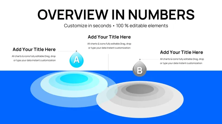
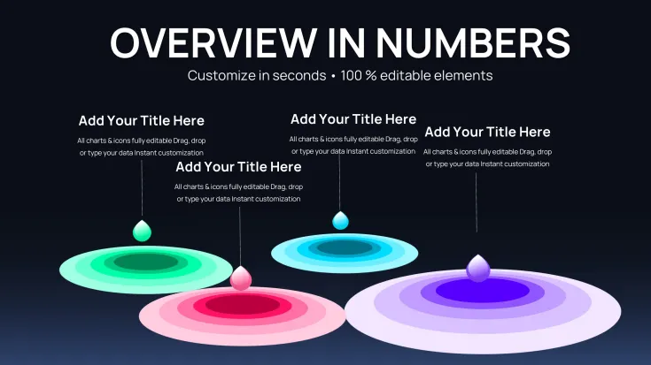
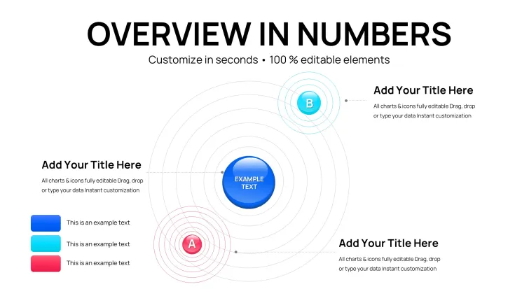
From my years consulting on presentation strategies for global enterprises and policy think tanks, I've seen how standard visuals often fall short in conveying the chain reactions behind data. This ripple effects chart template addresses that head-on, using layered expansions to illustrate how actions propagate through systems. It's the go-to for scenarios where you need to show cause-and-effect without dense text overload.
Picture a slide where a central metric sends waves across interconnected elements, instantly clarifying dependencies. This approach not only captivates but accelerates comprehension in tight timelines. As someone who refines decks for weekly executive briefings, I value how it elevates routine reports into strategic tools.
In-Depth Look at Chart Components
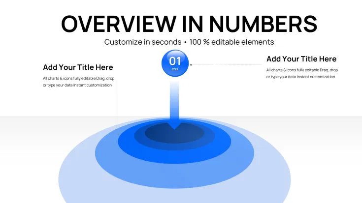
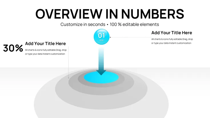
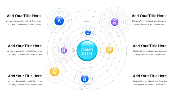
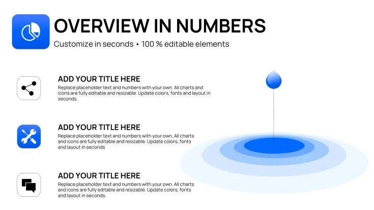
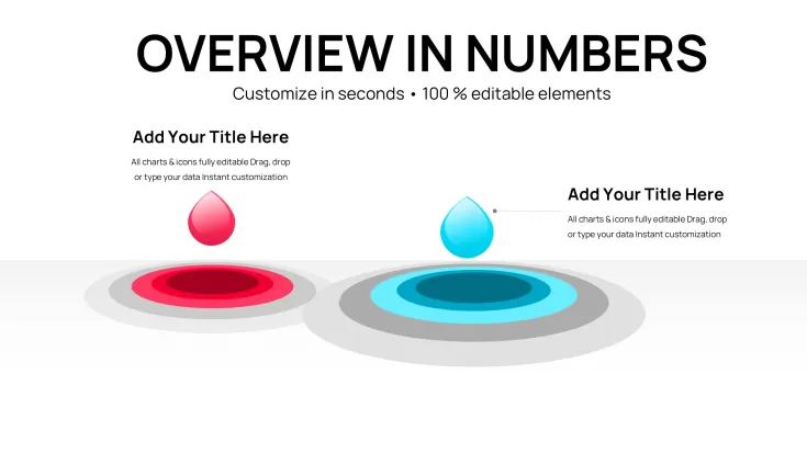
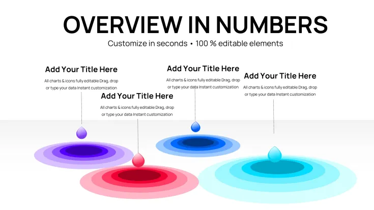
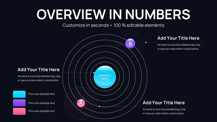
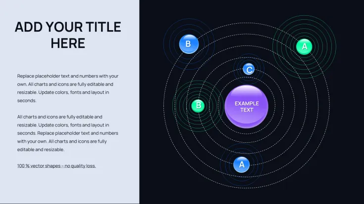
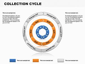
With 26 slides, the template provides extensive options, starting with cycle configurations in the first 9 slides for looping sequences like supply chain flows. These feature expanding waves from key nodes, with slots for timelines, KPIs, and annotations to build narrative flow.
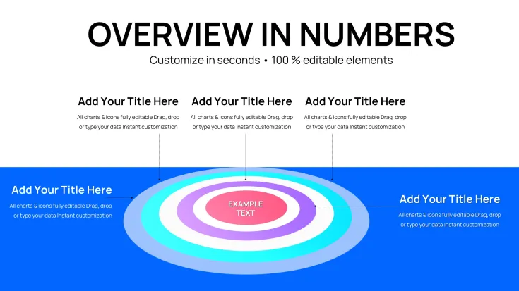
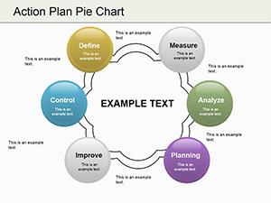
Slides 10 to 18 explore pie chart adaptations, where ripples emanate from slices to denote proportional influences, such as budget ripples in fiscal planning. Edit hues, wave intensities, and data labels to tailor emphasis precisely.
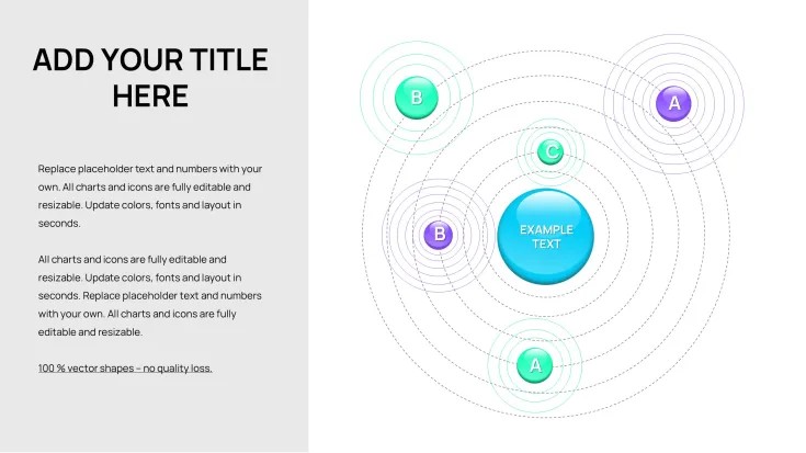
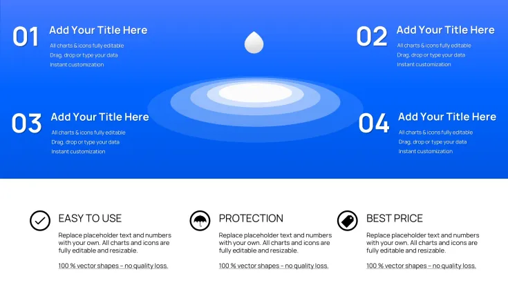
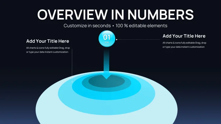
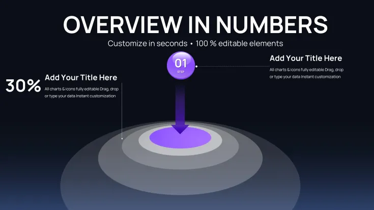
The final slides, 19 to 26, emphasize sphere layouts for volumetric representations, like innovation diffusion in teams. Add depth with wave overlays, integrating text, icons, and metrics for a rounded view.
Contexts for Expert Deployment
Business leaders integrate these in quarterly earnings calls, using cycle ripples to trace revenue streams. Investors appreciate pie wave visuals for risk assessment spreads. In academia, professors employ sphere waves to diagram scientific phenomena, aiding conceptual grasp.
Consulting firms use them in advisory sessions to model organizational changes. Government analysts map policy implementations with propagating effects. The template's robustness supports high-level discourse across sectors.
Fitting into Established Design Routines
Compatible across PowerPoint 2016+, Keynote, and Google Slides, it enhances workflows by allowing direct data imports and effect tweaks. Begin with your dataset, apply wave parameters to suit the story, and refine via previews - all in a fraction of typical design time.
Editing involves simple selections for wave radius or opacity, ensuring brand consistency. Ideal for iterative reviews, it supports version control in shared environments. Instant download means you're presenting professionally sooner.
Practical Examples from Field Experience
A strategy advisor might use cycle waves to outline merger integrations, highlighting phased synergies. Team leads visualize project milestones with pie ripples for progress tracking. Trainers in corporate programs adapt spheres to show skill development cascades.
Entrepreneurs diagram business model evolutions for partner meetings. Data specialists layer waves on reports for trend forecasting. These instances underscore its real-world efficacy.
Comparative Edge in Chart Creation
FeatureThis TemplateStandard Software DefaultsCustom-Built DesignsCompeting OptionsDynamic VisualizationBuilt-in wave propagationsStatic elements onlyRequires advanced skillsLimited motion simulationEase of EditsInstant wave adjustmentsManual layering neededProlonged developmentClunky interfaces oftenAudience EngagementHigh with effect chainsMinimal drawVaries by creatorAverage without wavesValue PropositionLifetime access, no subsNo extra cost but blandHigh time investmentFrequent recurring feesTailored Applications by Sector
Finance experts use wave pies for economic forecast spreads. IT departments map network impacts with cycle waves. Medical teams illustrate therapy progressions via spheres. Marketing groups track viral content ripples.
Advisory services model client outcome chains. Academic researchers depict study implications. Its flexibility ensures relevance in specialized fields.
Enhance your next deck with these ripple dynamics - grab the template and see the difference in delivery.
Frequently Asked Questions
How can I adjust wave intensities in the charts?
Access the format options, select the wave layer, and modify opacity or spread via sliders. Data integrates seamlessly, updating visuals in real-time for accurate representations.
Does it work well in Keynote for Mac-based teams?
Fully supported in Keynote, with waves preserving their dynamics during import. Collaborate effortlessly across platforms.
Suitable for government reporting requirements?
Yes, its clear propagation visuals meet standards for transparent data sharing in official documents.
How to handle large datasets in these slides?
Aggregate data first, then apply waves to key aggregates; the template handles complexity without performance lags.
Can I add custom icons to the ripple elements?
Insert icons directly into nodes, with waves adapting around them for enhanced storytelling.
What about animation support for ripples?
Built-in compatibility for adding entrance animations, making waves expand on click for dramatic reveals.
Good for
- Project roadmaps and sprint plans
- Product launch timelines
- Quarterly or annual review decks
- Company history and milestone summaries
Licence
reviews
Ripple effects template with expanding waves from central nodes worked great for my policy impact presentation. Layered cycle and pie adaptations showed propagations beautifully. Soft color gradients added depth without clutter. Practical for cause-effect stories.
The sphere layouts with wave overlays gave nice volumetric feel for innovation diffusion talk. 26 slides offered good variety. Some wave intensities needed tweaking for clarity, but overall engaging. Good value.
Student using for group project on economic forecasts. Pie wave visuals highlighted proportional influences clearly. Design is dynamic and modern. A bit abstract at first but audience got it fast.
Under pressure for exec briefing, the ripple cycles traced revenue streams effectively. Clean and not overwhelming. Compatibility with Google Slides was seamless. Slightly fewer options than expected but high quality.
The propagating effects visuals made my risk assessment spread memorable. Professional tones and editable opacities helped. Mixed on sphere vs pie preference but versatile. Saved hours.
As analyst, wave intensities on pies illustrated budget ripples perfectly. Template feels premium. Some slides repetitive, but core designs shine for dynamic presentations.
FAQ
Will it work in Google Slides?
Are fonts embedded?
Can I use this for client work?
What's the refund policy?
Do you update the template after purchase?
Similar templates
See all PowerPoint Charts →
All 26 slides