 Click to zoom
Action Plan Pie PowerPoint Charts Template
| Format | .pptx |
| Slides | 19 unique layouts |
| Aspect ratio | 16:9 |
| Compatibility | PowerPoint |
| Animated | No |
| Language | English |
| License | Commercial |
| File size | — |
| Version | v1.0 |
| Last updated | June 2024 |
What's inside
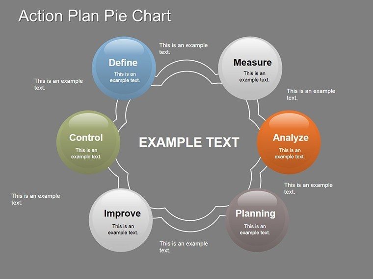
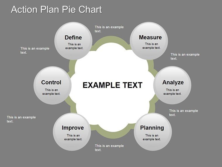
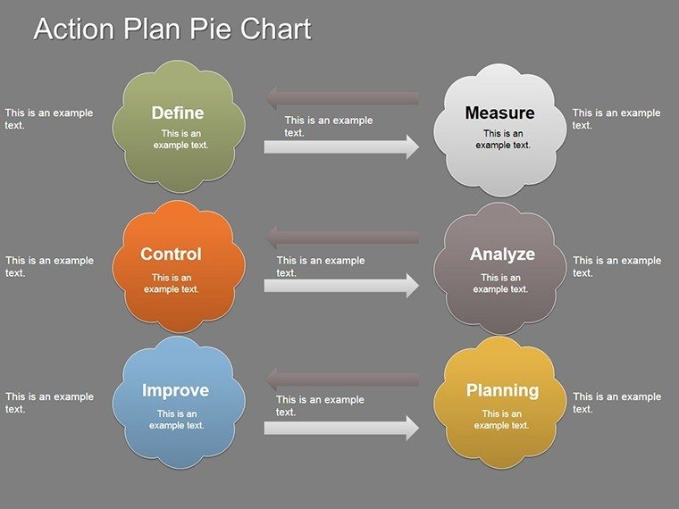
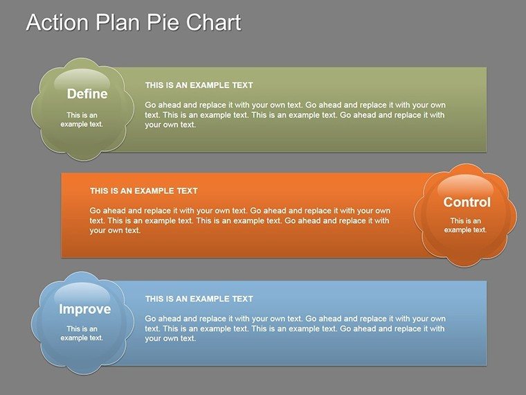
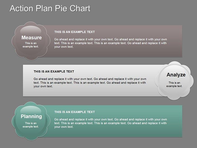
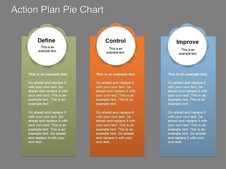
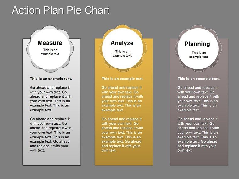
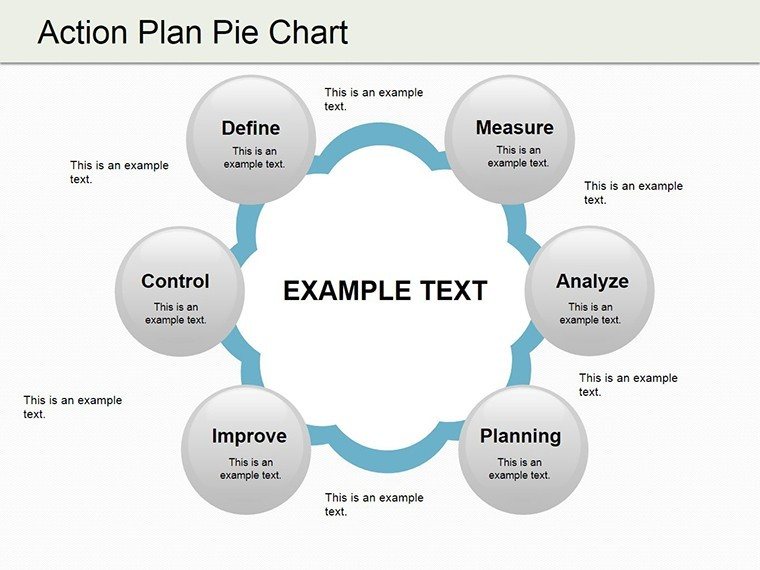
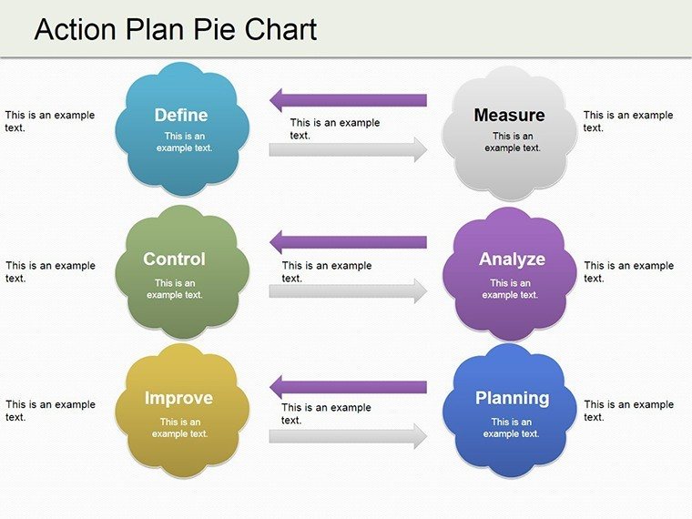
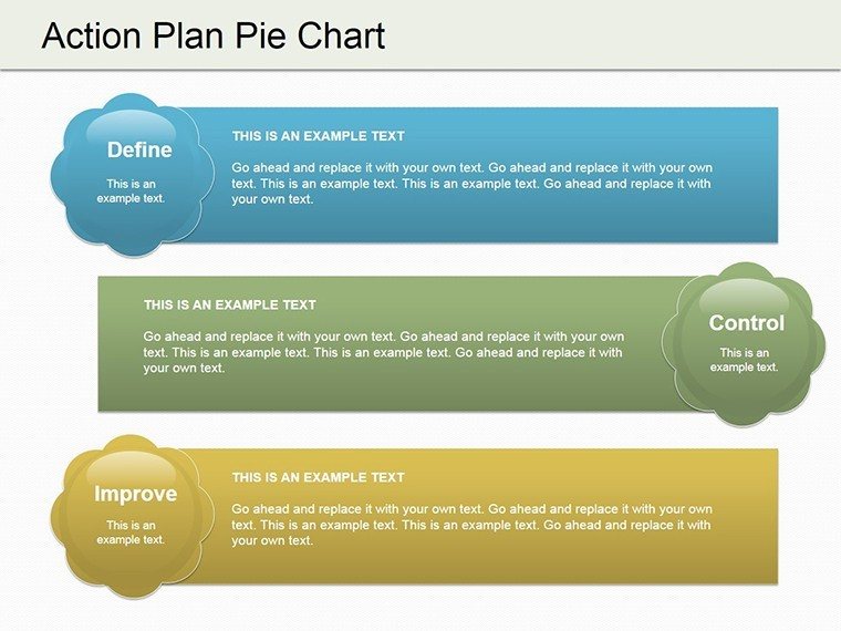
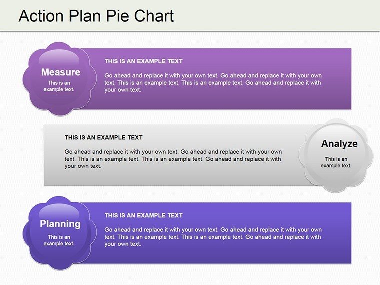
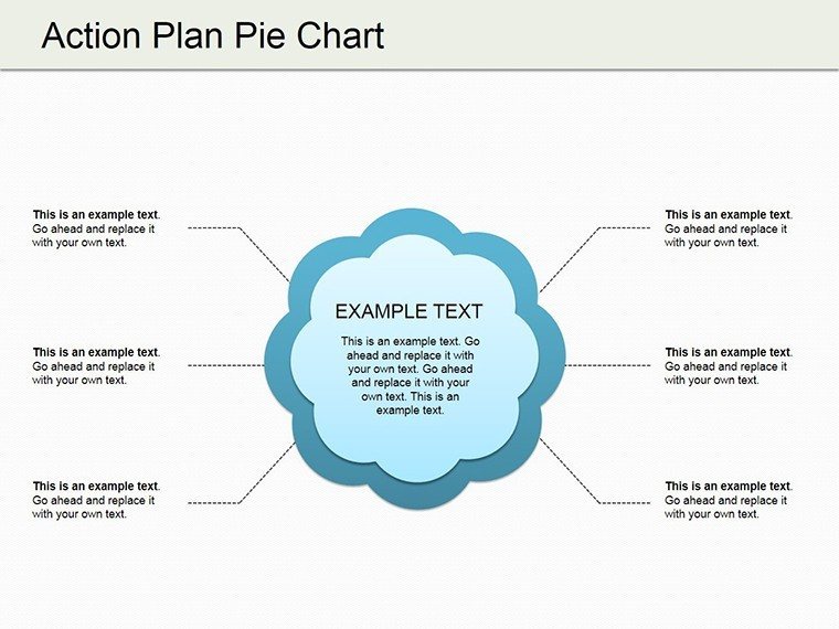
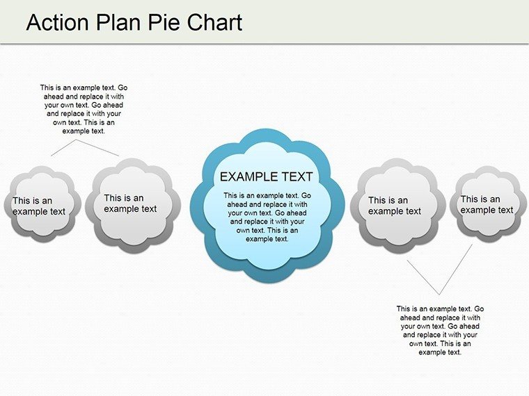
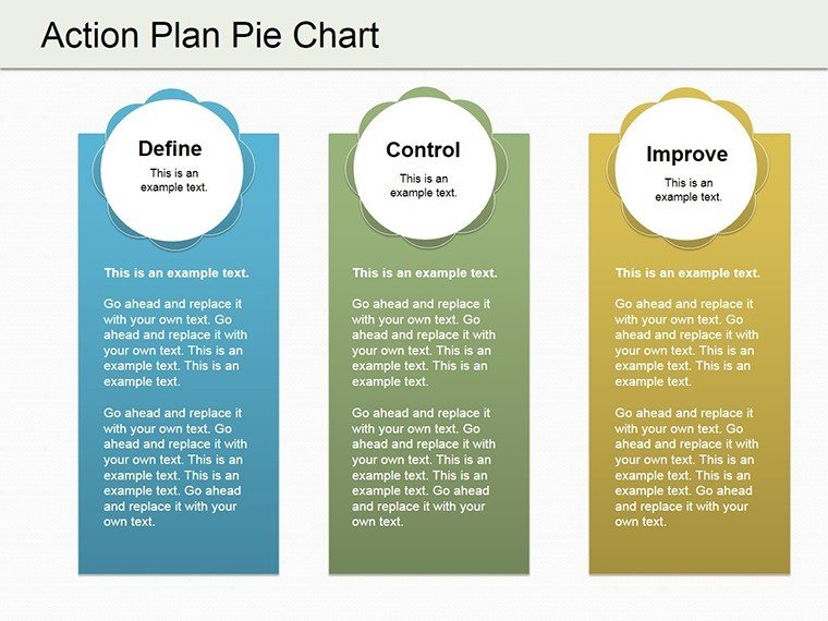
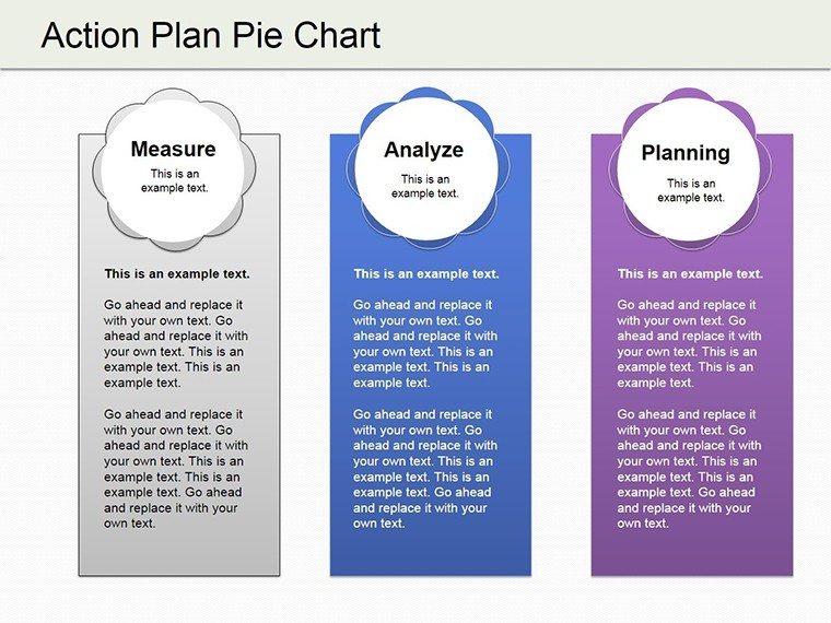
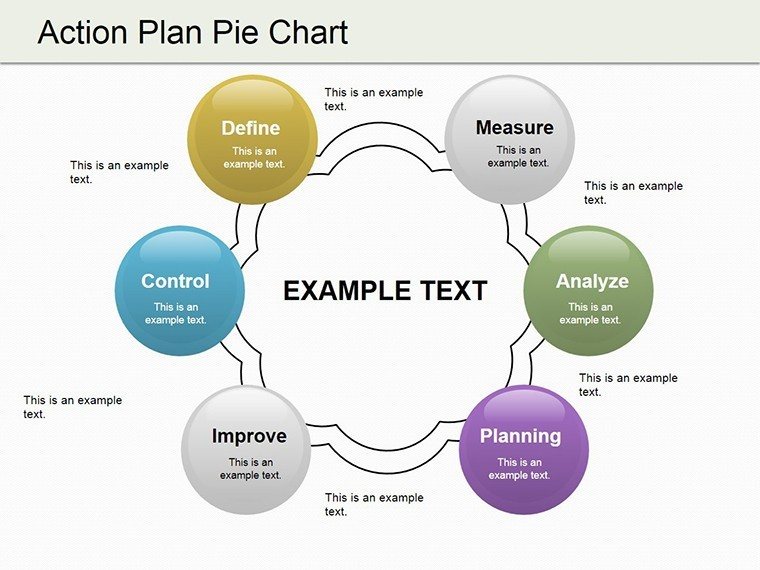
Picture slicing through the complexity of your action plans like a pie chart divides a whole into meaningful segments. The Action Plan Pie PowerPoint Charts Template does exactly that, offering 19 editable slides centered on pie charts to break down strategies, phases, and allocations. Tailored for project managers juggling timelines or financial analysts parsing budgets, this template turns data overload into digestible insights. With spheres adding a 3D flair to traditional pies, your presentations gain depth and appeal. Fully compatible with PowerPoint, it's a breeze to tweak colors, labels, and sizes, ensuring your charts reflect your unique vision. Whether in a boardroom or classroom, these visuals clarify objectives, fostering better understanding and collaboration among teams.
Mastering Segmentation for Strategic Clarity
Pie charts excel at showing proportions, and this template amplifies that with action-plan specifics. Each slice can represent a project phase's weight, like 40% for planning in an urban development pitch, aligning with real-world applications in architecture per AIA guidelines. The inclusion of cycle elements allows for depicting iterative processes, such as feedback loops in product development. Benefits abound: audiences retain proportional data better, as noted in cognitive studies from the Journal of Visual Communication, leading to quicker consensus. Our template's spheres add a modern twist, making flat pies pop with shadow and gradient effects for enhanced visual interest.
Essential Features for Effortless Customization
- Versatile Pie Layouts: From simple divided circles to multi-layered spheres, choose designs that match your data's complexity.
- Intuitive Editing Tools: Drag-and-drop labels and auto-adjust percentages for seamless updates.
- Brand Alignment Options: Customize palettes to corporate colors, ensuring consistency across presentations.
- Data Integration: Link to Excel for dynamic charts that update with new inputs.
- High-Quality Graphics: Resolution-ready for large screens, preventing distortion in key meetings.
These tools address common frustrations like mismatched visuals or time-consuming tweaks, letting you focus on strategy over setup.
Practical Use Cases with Impactful Examples
In project management, visualize resource allocation - say, 30% to R&D in a tech rollout, mirroring case studies from PMI where such charts reduced miscommunication by 35%. For financial analysis, slice revenue streams, helping stakeholders spot growth areas instantly. Educators can break down curriculum phases, engaging students visually as per educational research. In consulting, demonstrate market shares in strategy sessions, building trust through clear, authoritative visuals. Even in architecture, use pies for budget breakdowns in proposals, ensuring compliance with standards like LEED for sustainable segments. Each scenario showcases the template's adaptability, delivering value by simplifying decisions and amplifying messages.
Workflow Integration: A Step-by-Step Approach
- Open the template in PowerPoint and select a pie chart slide.
- Input your data percentages and labels via the chart editor.
- Apply sphere effects for 3D enhancement if desired.
- Customize colors and add legends for clarity.
- Test in slideshow mode to ensure smooth transitions.
- Export or share, ready for your next presentation.
This integration fits into tools like Microsoft Teams, enhancing collaborative planning without steep learning curves.
Surpassing Standard Pie Charts in PowerPoint
Basic PowerPoint pies often look dated and static. This template elevates them with sphere integrations and cycle flows, offering more than just slices - think interconnected segments for holistic views. Users save up to 50% in design time compared to from-scratch builds, per user testimonials. It outperforms free alternatives by including professional gradients and animations, subtly weaving in LSI like "proportional data representation" for better discoverability.
Pro Tips to Enhance Your Pie Presentations
Limit slices to 5-7 for readability, using contrasting hues for distinction. Incorporate tooltips for detailed data on hover. In financial contexts, reference GAAP standards for accuracy. For virtual settings, ensure legibility on small screens by bolding labels. Draw from design gurus like Stephen Few, emphasizing minimalism to let data shine.
With these insights, your action plans won't just be presented - they'll be propelled forward. Seize the opportunity to segment success; download the Action Plan Pie template and chart your course to compelling communications.
Frequently Asked Questions
How do I update data in the pie charts?
Simply click on the chart, enter new values in the data sheet, and the pie adjusts automatically.
Can this template handle complex datasets?
Yes, with multi-level pies and spheres, it's suited for detailed breakdowns.
Is it suitable for non-business uses?
Absolutely, educators and non-profits can adapt it for various proportional visualizations.
What if I need more slides?
You can duplicate existing ones and customize as needed.
Does it support animations?
Yes, add entrance effects to slices for dynamic reveals.
Good for
- Project roadmaps and sprint plans
- Product launch timelines
- Quarterly or annual review decks
- Company history and milestone summaries
Licence
reviews
Used these charts for an operations meeting.
The template didn’t crash or break formatting which already impressed me.
A few graphs looked repetitive.
I liked the spacing between titles and chart areas.
Pretty solid for quick business presentations.
FAQ
Will it work in Google Slides?
Are fonts embedded?
Can I use this for client work?
What's the refund policy?
Do you update the template after purchase?
Similar templates
See all PowerPoint Charts →
All 19 slides