 Click to zoom
Professional Gauge Charts PowerPoint Template
| Format | .pptx |
| Slides | 25 unique layouts |
| Aspect ratio | 130/73 |
| Compatibility | PowerPoint |
| Animated | No |
| Language | English |
| License | Commercial |
| File size | — |
| Version | v1.0 |
| Last updated | January 2026 |
What's inside
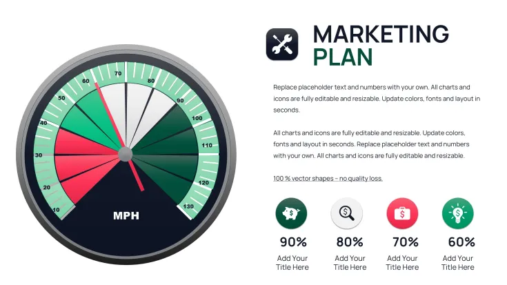
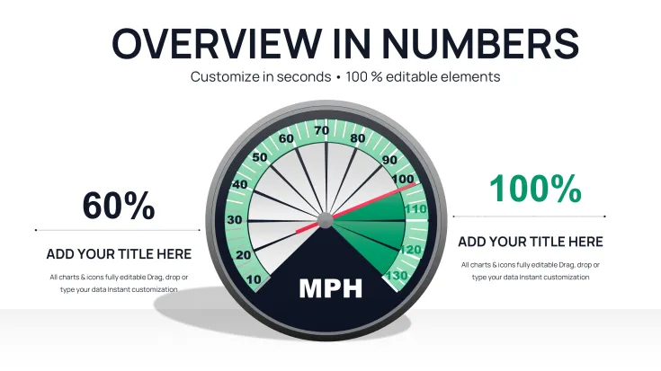
When presenting performance indicators to leadership, nothing communicates status faster than a well-designed gauge chart. As a senior designer building investor and executive decks weekly, I turn to gauge layouts to convey target achievement, capacity levels, and risk thresholds instantly. This professional gauge chart PowerPoint template delivers specialized slides that transform single-value metrics into intuitive, speedometer-style visuals that resonate in high-pressure settings.
The focused designs emphasize immediate readability, making them ideal for dashboard summaries, progress updates, and operational reviews where quick comprehension drives decisions.
Dynamic Gauge Designs for Instant Metric Communication
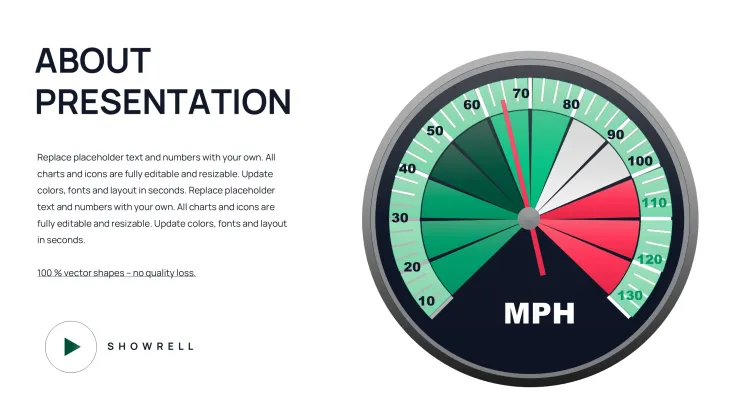
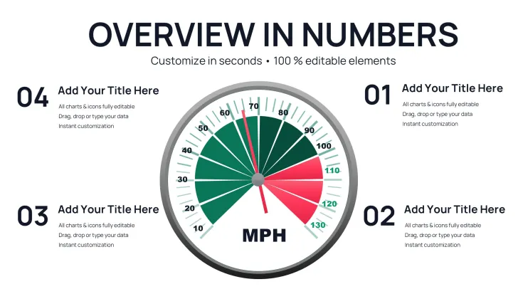
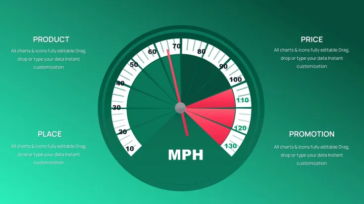
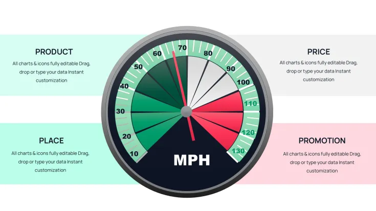
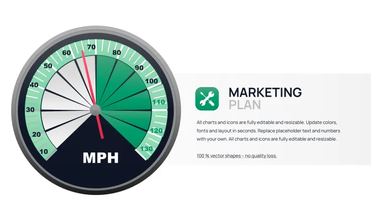
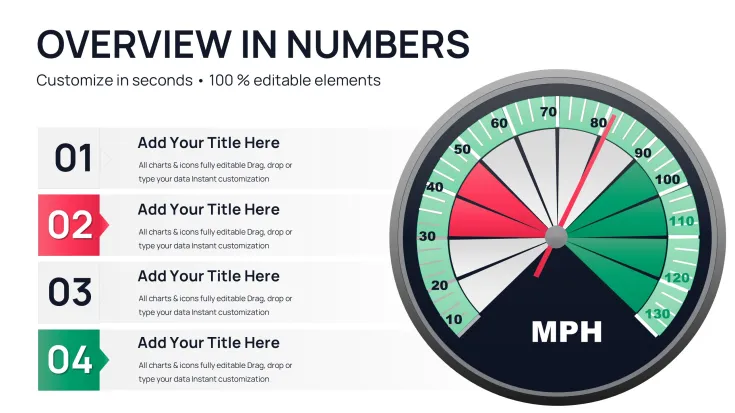
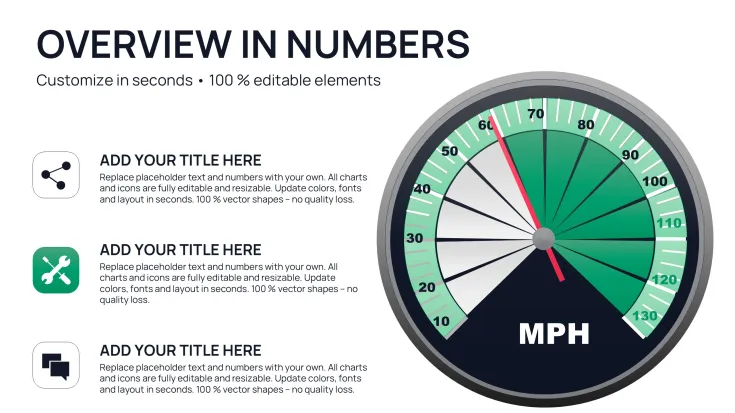
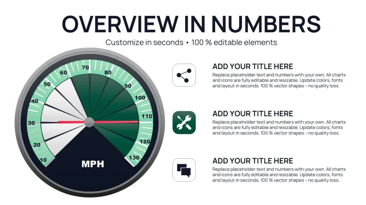
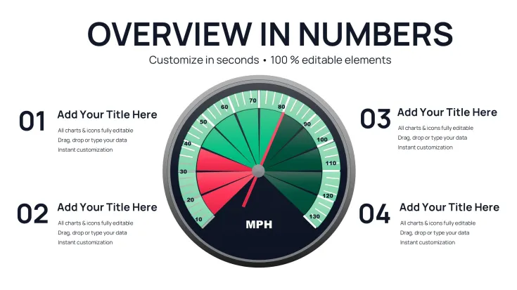
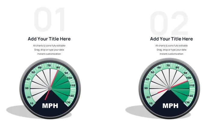
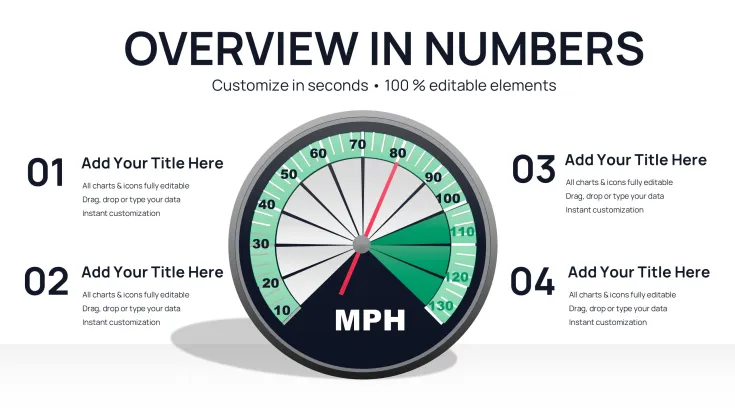
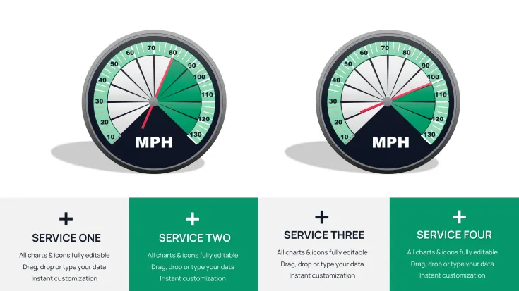
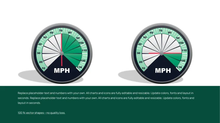
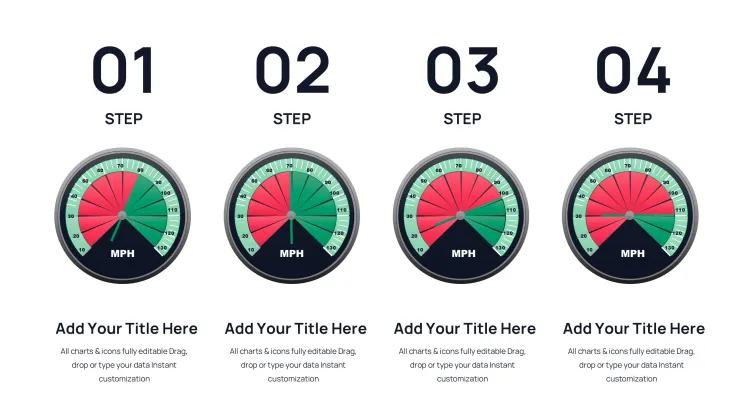
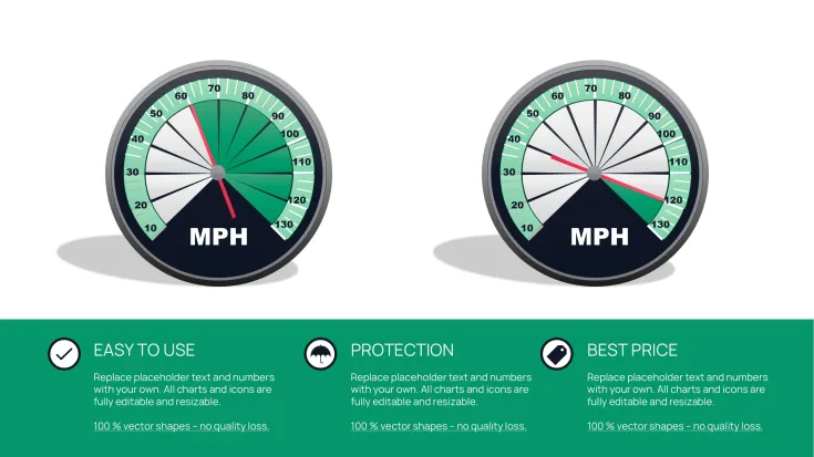
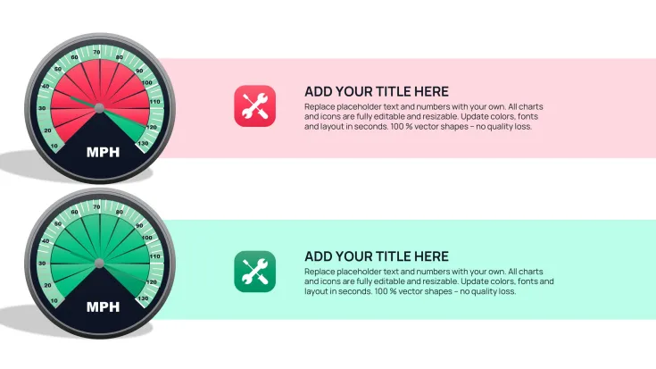
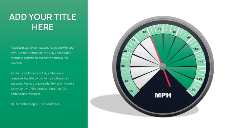
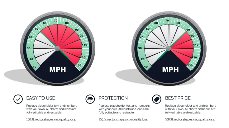
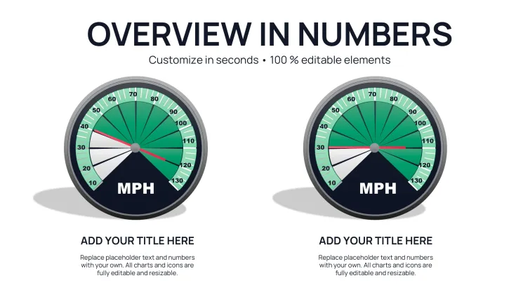
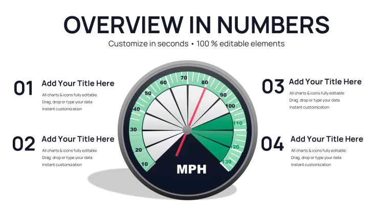
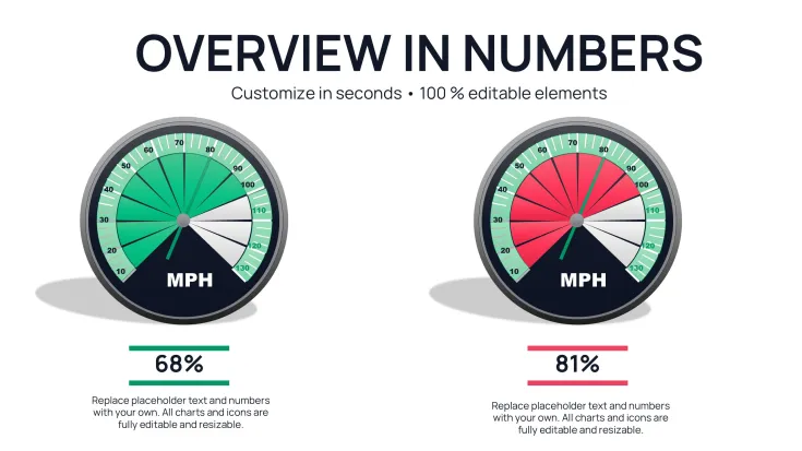
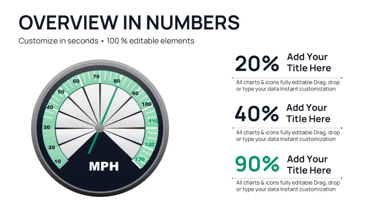
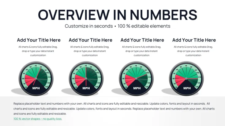
The template features a range of gauge configurations: single prominent gauges for primary KPIs, multi-gauge panels for comparative tracking, and combined layouts with supporting text or icons. Each gauge includes customizable arcs, needle positions, color-coded zones (green for on-target, yellow for caution, red for concern), and clear value labels.
Layouts incorporate threshold markers and percentage indicators, allowing precise representation of progress toward goals or utilization rates. Supporting elements like title placeholders and explanatory notes ensure context without overwhelming the core visual.
Practical Editing and Enhancement Options
- Fully adjustable color zones and needle angles via simple PowerPoint shapes
- Multiple gauge styles from classic speedometer to modern semi-circle
- Optional animated needle movement for engaging reveals
- Easy value updates through direct text or data point editing
Strategic Deployment in Performance-Focused Briefings
Sales directors use prominent gauge slides to display quota attainment during revenue meetings, instantly showing team standings. Risk management teams present exposure levels with color-coded gauges that highlight areas needing attention.
Operations managers track capacity utilization in real-time reviews, while HR leaders visualize employee engagement scores for leadership discussions.
Effortless Incorporation into Existing Processes
Built for PowerPoint 2016 and newer versions with excellent compatibility for Keynote and Google Slides imports, the template requires no specialized skills. Adjust gauge ranges, input current values, and align colors to branding quickly.
The straightforward design ensures rapid deployment even under tight timelines.
Actual Client Applications That Delivered Results
In a manufacturing client’s monthly review, multi-gauge panels monitored production targets across lines, enabling immediate resource reallocation discussions. For a healthcare network, patient satisfaction gauges provided leadership with clear service quality snapshots.
Startups presenting to investors have used single-gauge highlights to emphasize key milestones like user acquisition targets achieved.
Clear Benefits Over Basic Alternatives
ElementThis Gauge TemplateStandard PowerPoint GaugesManual CreationVisual AccuracyPrecise arc and needle calibrationRough approximationsTime-intensive alignmentStatus CommunicationIntuitive color zones and markersLimited visual cuesInconsistent indicatorsProfessional FinishClean, modern styling ready for executivesBasic appearanceVariable qualityEditing SpeedDirect value changes with instant resultsLaborious adjustmentsExtensive rebuildingSector-Specific Gauge Implementations
- Finance: Credit risk levels, compliance adherence rates, liquidity ratios
- Technology: Server load capacity, deployment success rates, security posture
- Healthcare: Bed occupancy, treatment efficacy measures, staff workload
- Sales: Pipeline health, quota attainment, customer retention scores
- Operations: Equipment efficiency, inventory turnover, safety incident rates
Enhance your metric presentations with gauge charts that communicate status instantly and professionally.
Frequently Asked Questions
How do I adjust the gauge value and range?
Select the needle or value text, then edit directly or modify the underlying shape properties to set new minimum, maximum, and current levels.
Can I change the color zones on the gauges?
Yes, each zone is a separate editable shape - simply recolor to match your desired thresholds or branding guidelines.
Are animated needle movements included?
Optional animations are pre-configured for smooth needle sweeps during presentations, fully adjustable or removable.
Can multiple gauges fit on one slide?
Dedicated multi-gauge layouts are included, perfectly balanced for comparative KPI tracking on a single view.
Will the gauges display correctly in Google Slides?
The core shapes import accurately, with static gauges working perfectly and animations requiring minor recreation if needed.
Good for
- Project roadmaps and sprint plans
- Product launch timelines
- Quarterly or annual review decks
- Company history and milestone summaries
Licence
reviews
Gauge charts with color-coded zones (green/yellow/red) and needle positions are perfect for KPI dashboards. Multi-gauge panels worked great for team performance reviews. Clean, executive-ready styling.
Senior designer perspective: semi-circle modern gauges with threshold markers communicate status instantly. Animations optional and smooth. Compatible across tools, big time-saver.
Operations user: capacity utilization gauges with supporting notes helped in monthly ops meetings. Easy value edits. Professional but could use more varied arc styles.
The template's single prominent gauges shine for quota attainment slides. Adjustable colors match branding perfectly. Used in investor updates - audience got it immediately.
Practical for risk management: exposure level visuals with clear labels. 25 slides offer good options. Editing needle angles is straightforward in PowerPoint.
Student project: multi-gauge comparative tracking made data compelling. Light/dark backgrounds useful. Slightly pricey but quality justifies it.
FAQ
Will it work in Google Slides?
Are fonts embedded?
Can I use this for client work?
What's the refund policy?
Do you update the template after purchase?
Similar templates
See all PowerPoint Charts →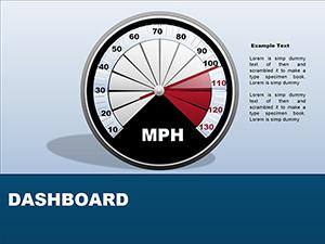
All 25 slides