 Click to zoom
PowerPoint Revenue and Expense Dynamics - Editable PPTX | ImagineLayout
| Format | .pptx |
| Slides | 42 unique layouts |
| Aspect ratio | 130/73 |
| Compatibility | PowerPoint |
| Animated | No |
| Language | English |
| License | Commercial |
| File size | — |
| Version | v1.0 |
| Last updated | April 2026 |
What's inside
Revenue & Expense Dynamics - 5-Year Financial Performance
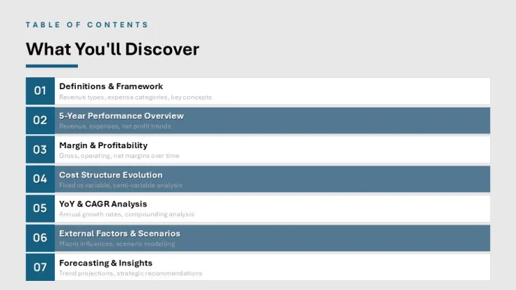
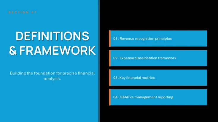
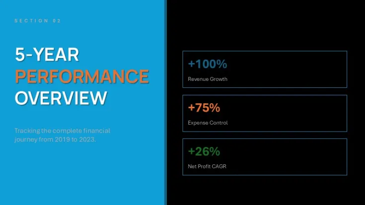
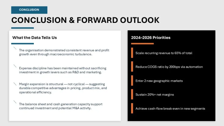
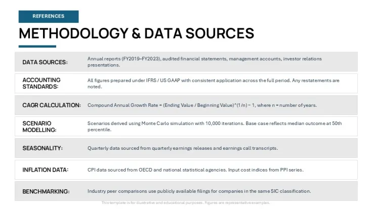
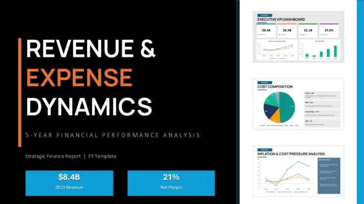
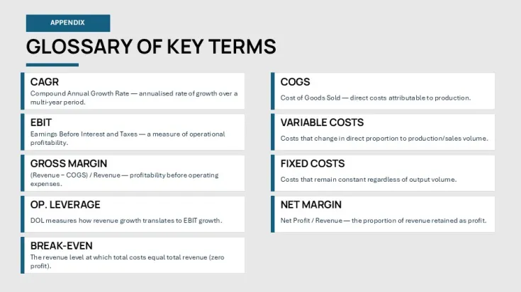
If you have ever had to build a 5-year strategic review from scratch, you know how much it sucks to align all those tiny margin boxes. This deck is basically a pre-built structure for that specific headache. It focuses on the bridge between top-line revenue and net profit, covering everything from GAAP vs management reporting to complex cost structures. Honestly, I just opened it, changed the colors to a darker slate, and it looked fine. Took maybe five minutes to get it ready for a meeting.
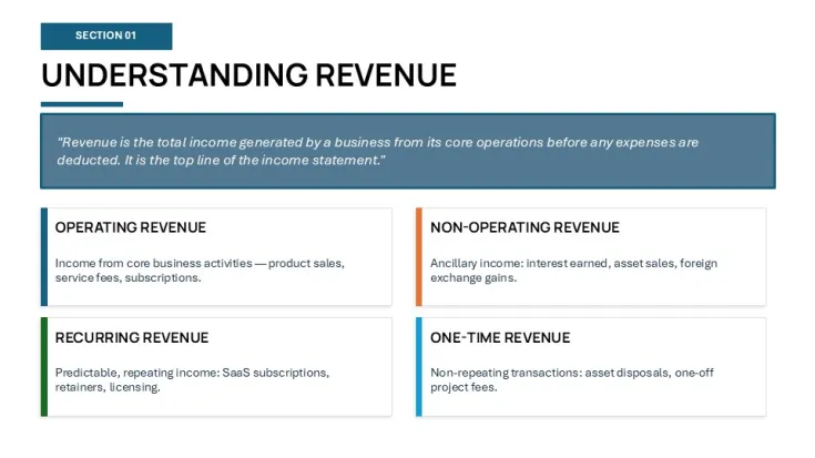
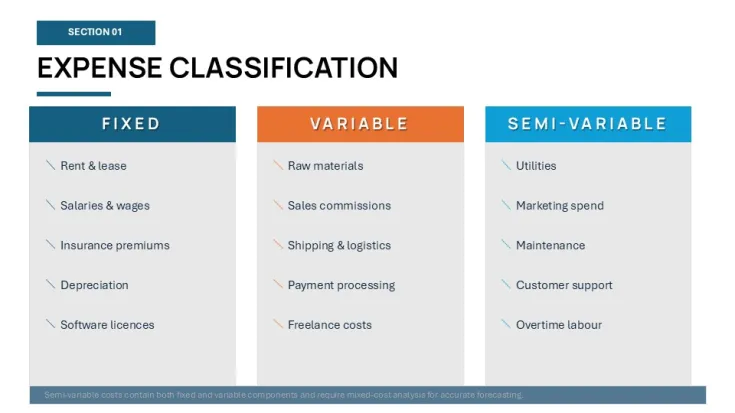
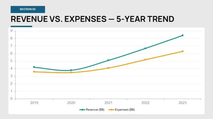
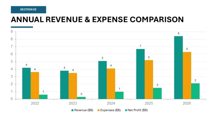
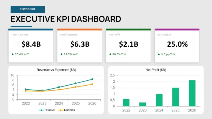
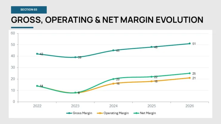
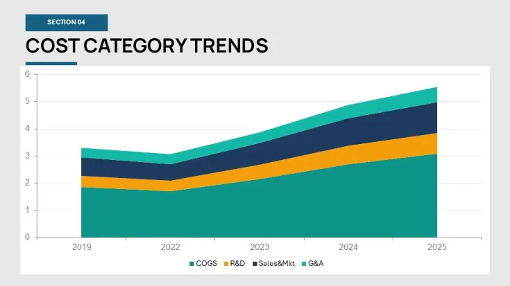
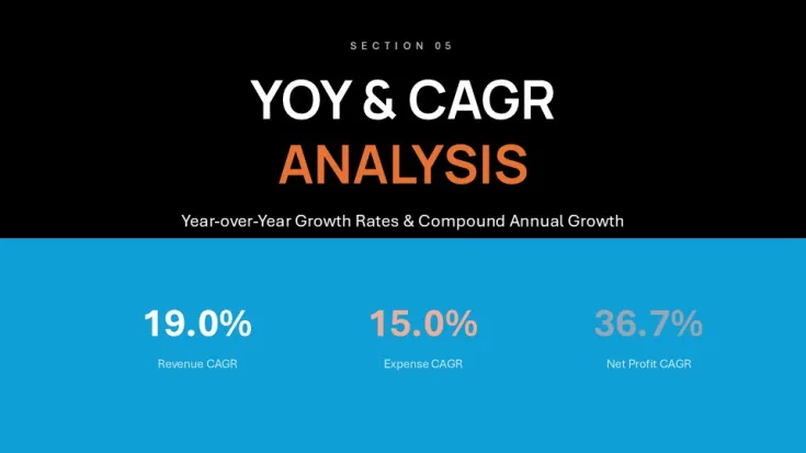
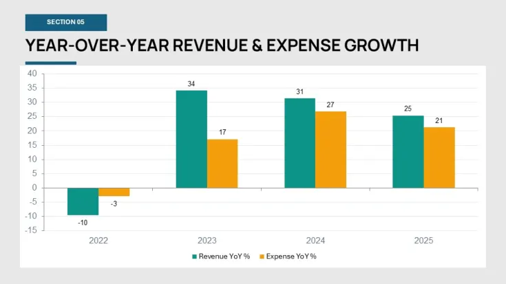
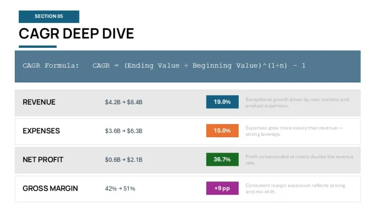
The file comes with 20 slides that handle the heavy lifting of financial storytelling. You get specific layouts for revenue recognition principles, expense classification, and those YoY CAGR charts that everyone asks for. One thing I noticed - the diagrams don't feel crowded even when you add more text than you probably should. The horizontal flow layouts are genuinely well-structured; each step connects without crowding the slide. Oh, and the aspect ratio is 16:9 by default.
Download and start editing immediately
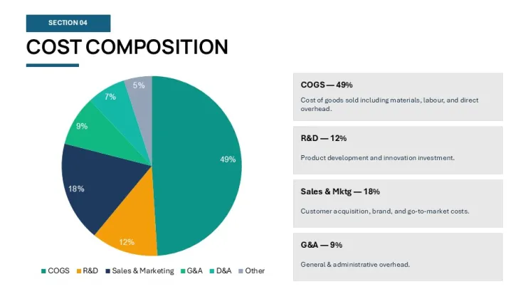
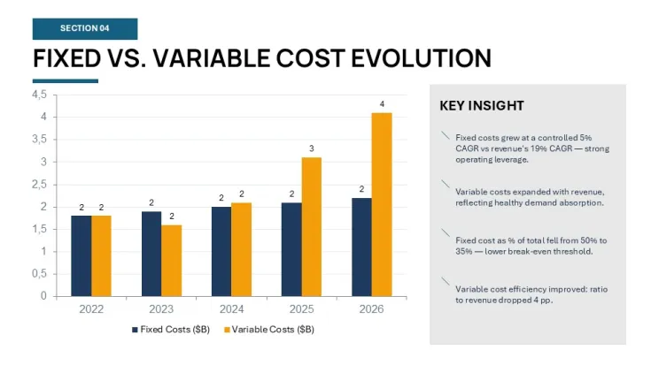
For anyone who presents quarterly reviews or stakeholder updates, this gives you a solid starting point that doesn't look generic. It is a .pptx file, so it works in PowerPoint 2016 or newer. I mostly liked how the cost structure slide breaks down fixed and variable costs. Most templates just give you a pie chart, but this uses a cleaner geometry that actually makes sense for an analyst. It works best when you already have your numbers in a spreadsheet and just need to visualize the trend.
But in a real project, this kind of layout is a must because it keeps the font sizes consistent across the whole 5-year period. The color system is one of the better-built parts - one change in the master and the whole deck updates. That alone saves real time. The color switching is slightly confusing the first time you try to do it, but once you find the slide master it takes under a minute. It is not ideal if you need charts with actual live data links to a SQL server, though. For process flows? Yeah, it works.
You know that situation when the deck is due tomorrow and you are still staring at a blank white slide? This is exactly when you grab something like this. It is basically for CFOs, senior analysts, or project leads who need to show how the business is actually doing over a long timeline. No extras, just the slides you actually need for a financial report. The teal and grey theme is okay, but I always change the colors in the master first before filling in any data.
Technical Specifications
FeatureDetailsSlides/diagrams20 slides including CAGR, YoY, and Margin analysisFile format.pptx (PowerPoint)Software versionPowerPoint 2016+ or Microsoft 365Color schemesSingle primary theme; change via Design > VariantsEditable elementsAll shapes, icons, and text boxes resize independentlyAspect ratio16:9 WidescreenFree vs PaidPaid version includes the full 20-slide analytical sequenceMasters/Backgrounds2 master slide layouts for consistent brandingFrequently Asked Questions
How do I change the main colors?So basically, you want to head over to the View tab and click on Slide Master. From there, you can change the theme colors or just manually pick a new fill for the main shapes on the primary master slide. This will push the update to every slide in the deck so you don't have to do it manually. It saves a lot of time.
Can I use this for client presentations?It's the same license most marketplaces use - one buyer, one project, commercial use is fine. You can use it for your own company or for a client project without needing a separate license for every single meeting. As long as you aren't reselling the template itself as a digital file, you're good. That's basically it.
What is the difference between free and paid?The short answer is the slide count and the depth of the analysis. The paid version gives you the full 20-slide set with the advanced forecasting and CAGR layouts, whereas free versions usually just give you a title and a basic list slide. You get the whole strategy framework here. Oh, and the icons are usually higher quality in the premium version.
What if I am not happy with the file?Honestly, because these are digital downloads, refunds are usually a no-go in most cases. If there is a technical glitch where the file won't open at all, support usually helps out, but for change of mind it depends a bit on the platform policy. I'd suggest double-checking the slide previews before you hit buy.
Will this work on my Mac?Usually yes, but it works best if you have the actual PowerPoint app installed rather than using Keynote to open it. It opens in Keynote, but sometimes the fonts or the specific chart formatting might look a bit weird - actually, the easiest way is just to stay within the Office ecosystem if you can. Works fine on most modern macOS versions. Also works for internal team updates, not just client decks.
Good for
- Project roadmaps and sprint plans
- Product launch timelines
- Quarterly or annual review decks
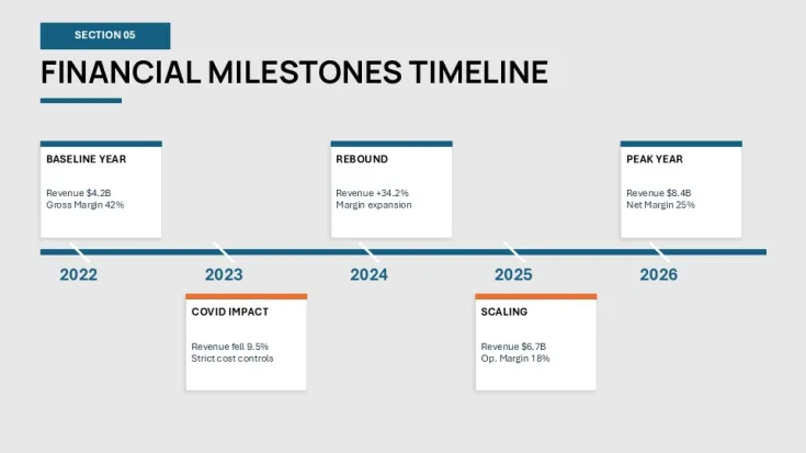
- Company history and milestone summaries
Licence
reviews
Put together a 5-year strategic review last week and this deck handled the heavy lifting. The cost structure slide broke down fixed and variable costs way better than a generic pie chart.
Colors are a bit teal and grey for my taste but changing them in the slide master took under a minute. The CAGR charts and YoY stuff were already formatted so I just plugged in my numbers.
It's okay but if you need live data links from a SQL server this isn't it. For process flows and static financial storytelling though the horizontal layouts are well-structured.
Honestly I just opened it changed the colors to slate and it looked fine for my stakeholder update. Took maybe five minutes to get it ready for the meeting.
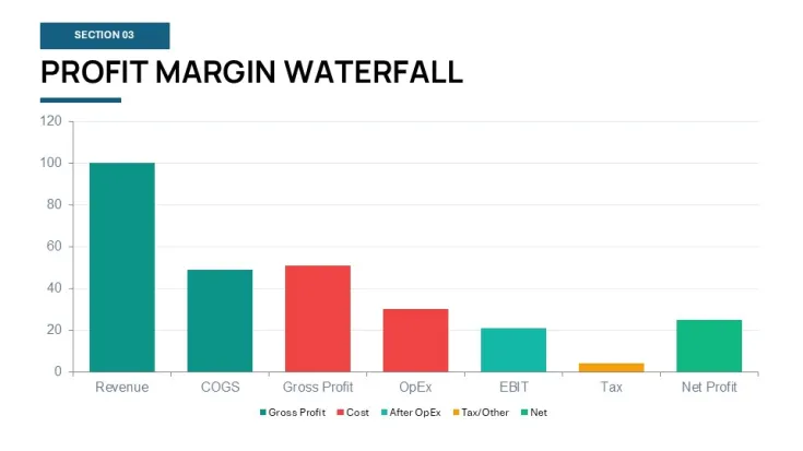
The geometry on the margin bridge slide is cleaner than most templates I've tried. Doesn't feel crowded even when you add more text than you probably should. Saved me from staring at a blank slide.
FAQ
Will it work in Google Slides?
Are fonts embedded?
Can I use this for client work?
What's the refund policy?
Do you update the template after purchase?
Similar templates
See all PowerPoint Charts →
All 42 slides