 Click to zoom
Porter's Diamond Charts PPT Template - 38 editable slides
| Format | .pptx |
| Slides | 38 unique layouts |
| Aspect ratio | 130/73 |
| Compatibility | PowerPoint |
| Animated | No |
| Language | English |
| License | Commercial |
| File size | — |
| Version | v1.0 |
| Last updated | March 2026 |
What's inside
From my years building presentation decks for venture capital reviews and corporate planning retreats, I've seen how Porter's Diamond can turn vague strategy talks into focused action plans. This chart-heavy template with 38 slides addresses that by providing layered visuals for dissecting industry edges, saving you from piecing together mismatched graphics. It's designed for analysts who need depth without design headaches, ensuring your points on rivalry and demand hit home every time.
The strength lies in its chart variety - bar, line, and matrix options that adapt to quantitative data, like measuring firm structures across sectors. I've relied on comparable tools for investor briefings on market dynamics, where clear charts sealed deals. Strategy leads will find it indispensable for turning theory into practical slides.
Comprehensive Slide Analysis and Layouts
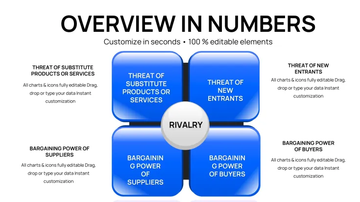
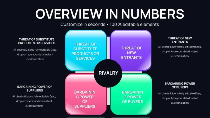
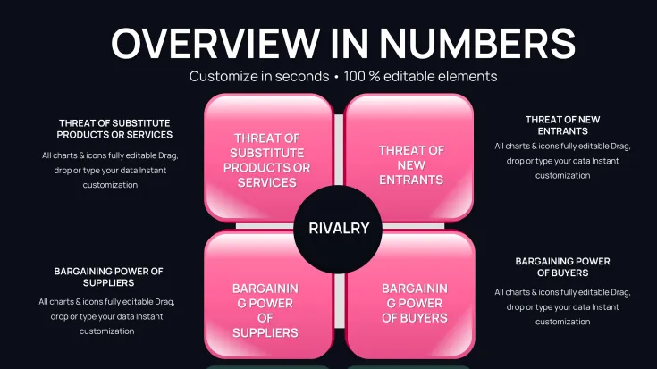
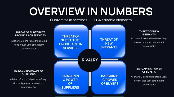
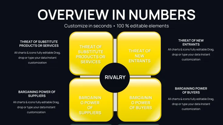
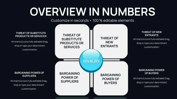
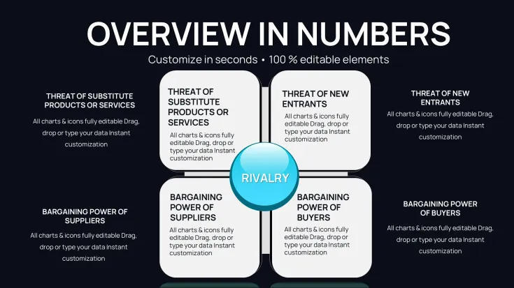
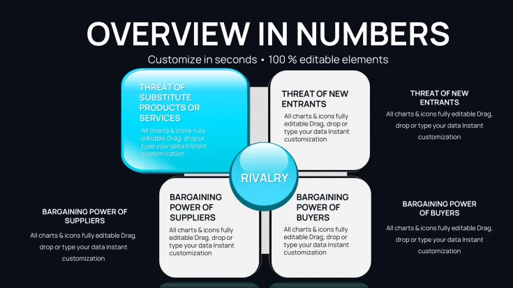
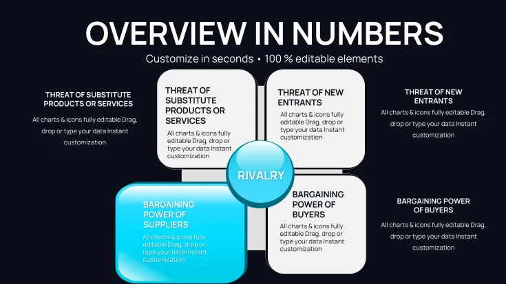
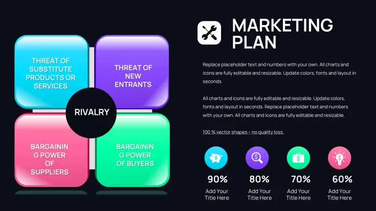
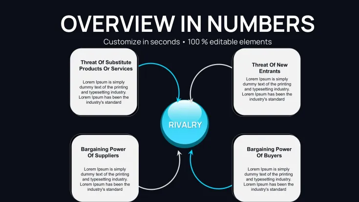
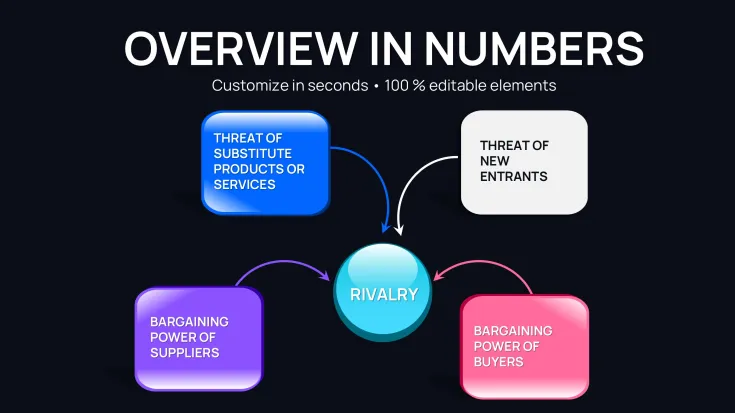
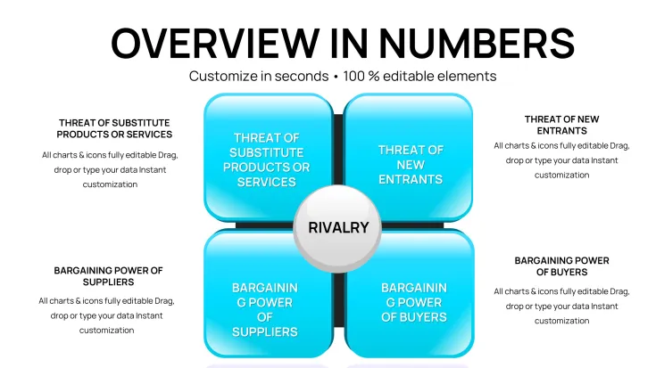
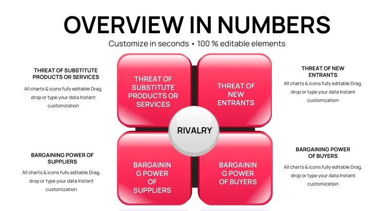
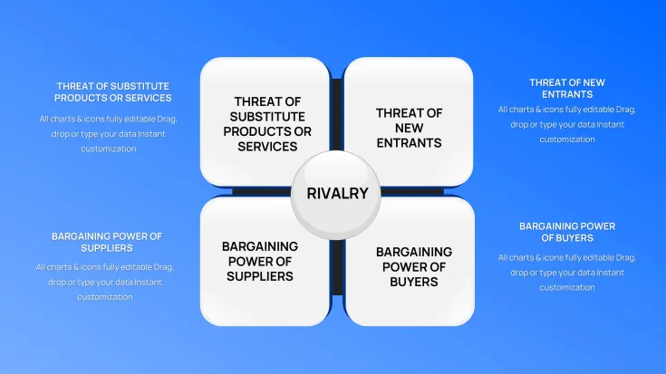
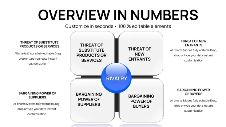
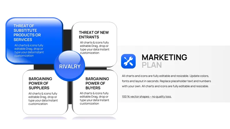
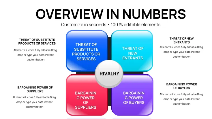
The 38 slides in this template offer extensive coverage of Porter's Diamond. The introductory slide presents a master chart outlining the core four pillars plus externalities, with placeholders for executive summaries.
Slides 3-10 focus on factor conditions, featuring stacked bars for resource allocation and scatter plots for innovation metrics. Input your datasets to compare natural endowments in agriculture, adjusting axes for precision.
For demand conditions, slides 11-18 include area charts tracking market evolution and bubble diagrams for buyer segmentation. Tailor these to industries like consumer electronics, where size represents segment value.
Related industries get slides 19-25, with Sankey diagrams illustrating value chains and heat maps for collaboration intensity. Customize flows to depict logistics networks in e-commerce.
Firm strategy sections in slides 26-32 use Gantt charts for evolution timelines and polar areas for rivalry benchmarks. Adapt to show management shifts in pharmaceuticals.
Slides 33-36 cover government and chance, with step charts for policy timelines and risk matrices for uncertainties. These aid in forecasting scenarios like trade disruptions.
Concluding slides 37-38 provide integrated dashboards, aggregating data for holistic views that support decision-making.
Strategic Deployment in Professional Settings
During investor pitches, this excels at outlining startup advantages in crowded fields, like fintech innovations driven by local regulations. I've used it to convince panels on scalability potential.
In training sessions, it facilitates deep dives into economic models for corporate learners, with charts clarifying abstract concepts. Government advisors apply it for regional development plans.
Enterprise teams use it in annual reviews to assess portfolio competitiveness.
Embedding in Presentation Processes
It integrates smoothly with PowerPoint 2016+, Keynote, and Google Slides, allowing direct data linking from spreadsheets. Download and open in your preferred app, then populate charts with a few clicks.
Editing involves simple drag-and-drop for elements, with theme switches for visual refresh. This approach halves build time for rushed reports, prioritizing content over formatting.
Lifetime license means no ongoing costs, ideal for frequent use in ongoing strategy cycles.
Practical Examples From Field Work
For a tech startup review, I charted rivalry metrics to highlight differentiation, aiding partnership negotiations. Team leads in energy sectors use it for update meetings on regulatory impacts.
Conference speakers adapt it for talks on globalization, using data visuals to underscore points. Entrepreneurs customize for business plans, emphasizing demand drivers to attract mentors.
Data specialists in NGOs apply it to advocacy reports on sustainable development.
Evaluating Against Other Approaches
FeatureThis Chart TemplateStock PowerPoint FeaturesCustom CreationStandard SubstitutesChart DiversityAdvanced types like Sankey and polarLimited to basicsFlexible but laboriousRepetitive optionsPrep EfficiencyRapid data mappingAverage, manual tweaksExtensive effortSomewhat streamlinedDepth of Coverage38 slides for thorough explorationNone inherentVariable qualityShallower focusAnalytics SupportLinked for live updatesStatic entriesBuilt-in if codedMinimalAudience EngagementData-driven storytellingPlain displaysPotentially strongAverage appealElevate your chart-based analyses - download this template for immediate professional upgrades.
Tailored Uses Across Sectors
Finance analysts chart investment landscapes, incorporating chance factors for risk assessments. In tech, it maps innovation hubs for product roadmaps.
Healthcare strategists use it for facility planning, factoring in supplier networks. Academic instructors integrate it into syllabi for case analyses.
Marketing pros apply it to consumer trend reports. Advisory firms customize for operational audits.
Secure this resource now to refine your strategic visuals.
Frequently Asked Questions
What's the best way to input complex data into charts?
Use the data editor tool in PowerPoint to paste from spreadsheets, then fine-tune scales for accuracy in depicting elements like demand curves.
Does it support Mac-based editing?
Fully compatible with Keynote on Mac, alongside PowerPoint, for cross-platform workflow without loss of functionality.
Suitable for beginner presenters?
Yes, with intuitive layouts that guide content placement, helping novices create pro-level strategy overviews.
How to expand for multi-country comparisons?
Clone chart slides and label for each nation, maintaining design unity for cohesive international analyses.
Tips for virtual presentation delivery?
Leverage zoom features on charts during shares, narrating key insights to maintain remote audience focus.
Good for
- Project roadmaps and sprint plans
- Product launch timelines
- Quarterly or annual review decks
- Company history and milestone summaries
Licence
reviews
Porter's Diamond with Sankey, bubble, heat maps for industry analysis. Factor conditions stacked bars detailed. Great for VC reviews.
Strategy lead: demand conditions area charts track evolution. 38 slides thorough. Data linking from Excel handy.
The rivalry polar areas and government step charts insightful. Cross-platform solid. Helps turn theory practical.
Analyst: integrated dashboards holistic. Customization drag-drop. Variety in chart types strong.
Practical: value chain Sankey for e-commerce. Scenario forecasting useful. Prep efficiency high.
Student: beginner-friendly for economic models. Depth supports case analyses well.
FAQ
Will it work in Google Slides?
Are fonts embedded?
Can I use this for client work?
What's the refund policy?
Do you update the template after purchase?
Similar templates
See all PowerPoint Charts →
All 38 slides