 Click to zoom
Pie Indicator World Economy PowerPoint Charts
| Format | .pptx |
| Slides | 18 unique layouts |
| Aspect ratio | 16:9 |
| Compatibility | PowerPoint |
| Animated | No |
| Language | English |
| License | Commercial |
| File size | — |
| Version | v1.0 |
| Last updated | July 2023 |
What's inside
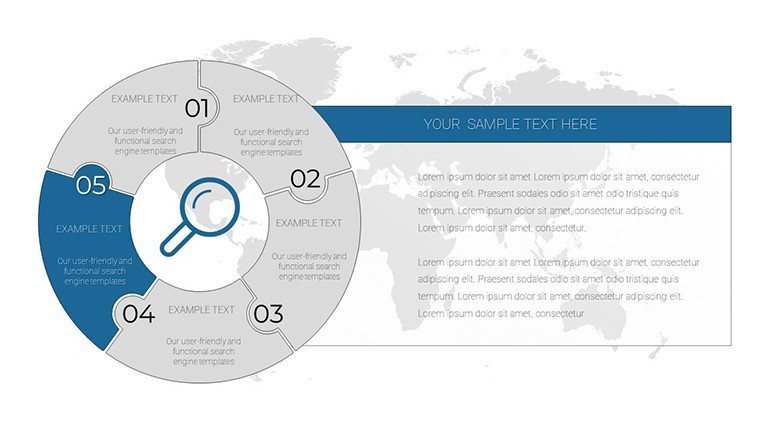
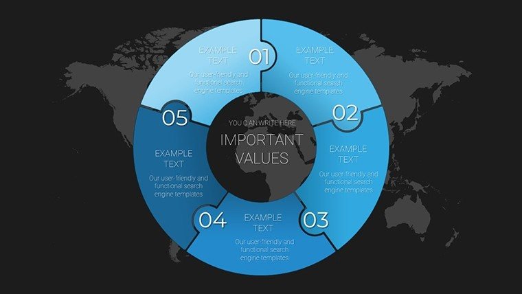
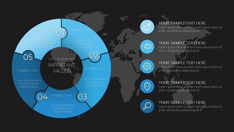
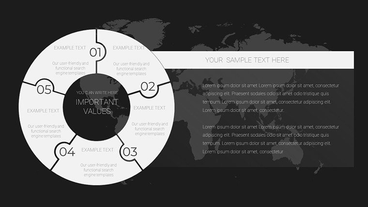
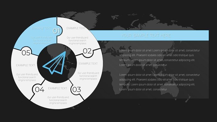
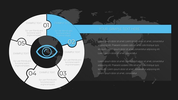
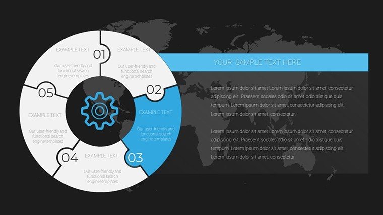
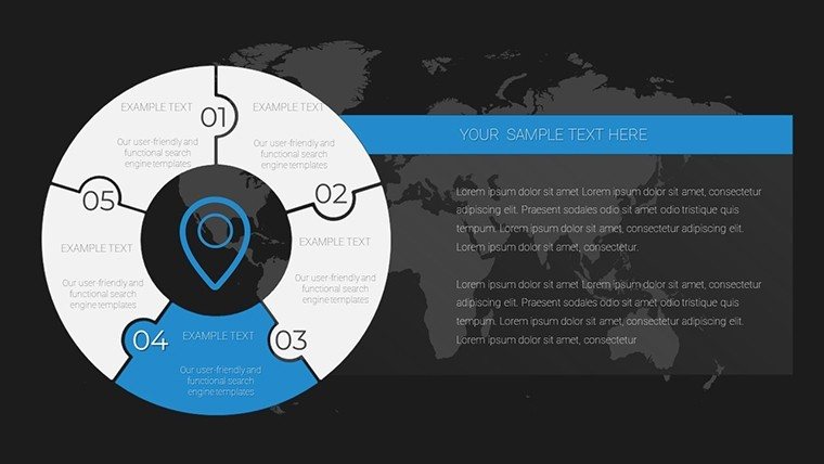
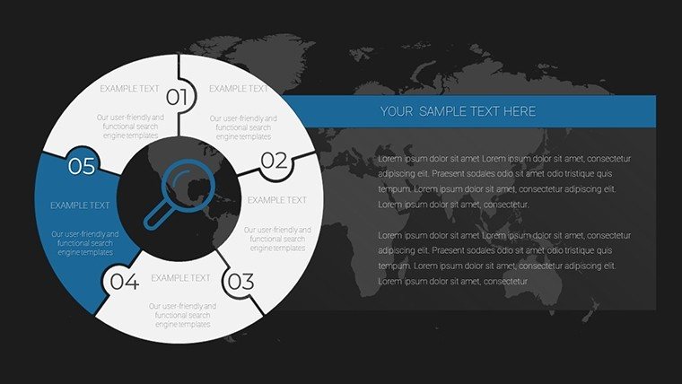
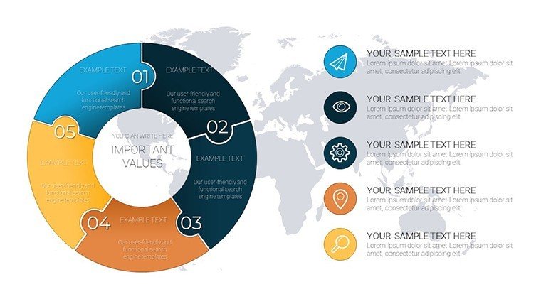
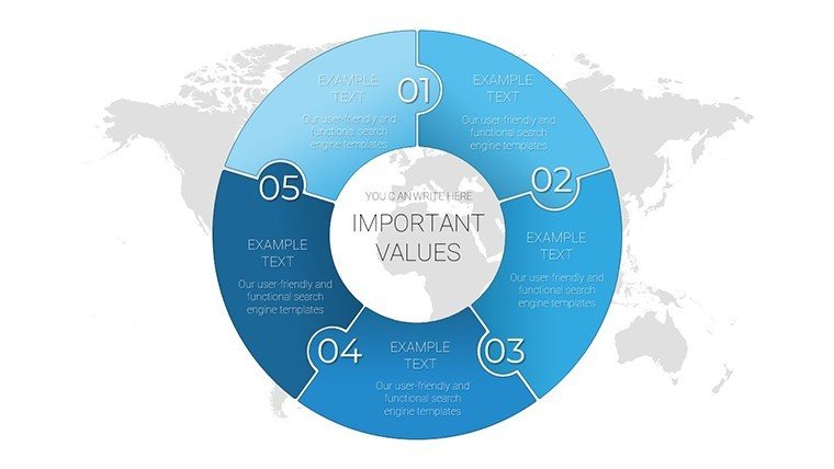
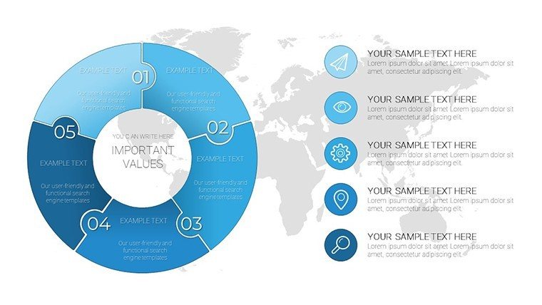
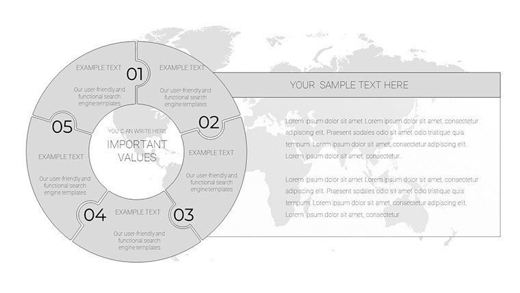
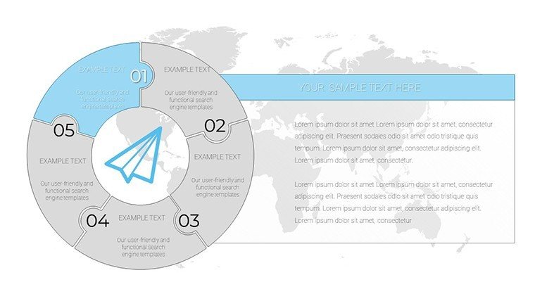
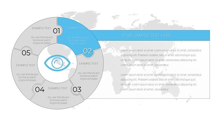
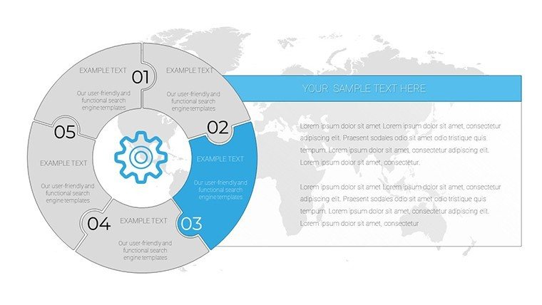
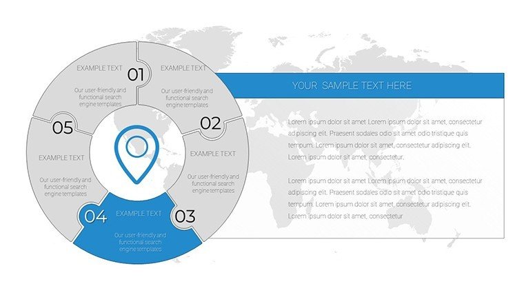
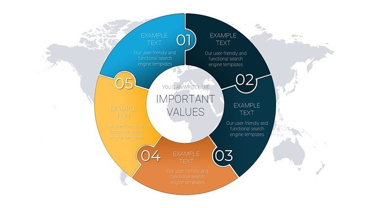
Dive into the global economic landscape with visuals that simplify the complex. Our Pie Indicator World Economy PowerPoint Charts template brings clarity to worldwide data trends, using intuitive pie charts to slice through statistics effortlessly. With 18 meticulously designed slides, this resource is a boon for anyone tasked with presenting economic indicators - be it GDP breakdowns, trade balances, or market shares. Aimed at business leaders navigating fiscal strategies, educators demystifying macroeconomics, and consultants advising on global shifts, it turns raw numbers into compelling stories. Say goodbye to dense spreadsheets that confuse; hello to colorful, segmented visuals that engage and inform. Fully compatible with PowerPoint and Google Slides, customization is a breeze, allowing you to tailor every aspect to your narrative. Whether forecasting trends or analyzing impacts, this template equips you to deliver presentations that resonate and drive decisions.
Mastering Economic Data Visualization
The world economy is a vast puzzle, and pie charts are the perfect tool to piece it together visually. Each slide in this template focuses on key indicators, from inflation rates to employment figures, presented in circular formats that highlight proportions at a glance. Drawing from authoritative sources like the World Bank and IMF reports, these designs adhere to best practices in data representation, ensuring accuracy and appeal. For business leaders, imagine showcasing regional contributions to global GDP during an international conference - the pie's slices vividly illustrating dominance or opportunities. This approach not only boosts understanding but also retention, as per cognitive science principles from experts like Stephen Few, who advocate for minimalist yet informative graphics. Customize shades to reflect economic health - greens for growth, reds for risks - and integrate your datasets seamlessly. The result? Presentations that position you as a thought leader in economic discourse.
Essential Features for Economic Presentations
- Visually Appealing Pie Charts: Tailored for world economy indicators, with labels and legends for instant comprehension.
- Customizable Options: Alter colors, fonts, and styles to brand alignment, enhancing professional polish.
- User-Friendly Interface: Edit with ease, no advanced skills needed, saving time for analysis over design.
- High-Quality Graphics: Crisp elements that scale perfectly for large screens or prints.
- Compatibility: Works with PowerPoint (PPTX) and Google Slides for cross-platform use.
- Easy Download and Print: Instant access and printable formats for handouts.
These features outshine basic PowerPoint tools by offering pre-built economic themes, reducing setup time while elevating output quality.
Practical Use Cases Across Industries
In finance, use these charts to dissect investment portfolios by global regions, aiding strategic allocations. Educators can break down trade deficits in lectures, making abstract concepts concrete for students. Consultants might employ them in reports for clients, highlighting market shares to recommend expansions. A real-world example: During a economic forum, similar visuals helped a analyst convey post-pandemic recovery patterns, leading to informed policy discussions. Workflow integration: Import data from Excel, populate pies in slides 1-5 for overviews, detail in 6-12, compare in 13-15, and summarize in 16-18. This solves issues like data overload, focusing attention on key insights.
Customization Workflow for Optimal Results
- Download and open in your preferred software.
- Input economic data into pie chart placeholders.
- Modify colors to denote categories - e.g., blue for developed economies.
- Add tooltips or animations for interactive elements.
- Incorporate icons representing currencies or globes.
- Review for accuracy against sources like OECD data.
- Export and present with confidence.
Versus generic charts, these provide context-specific labels, fostering deeper economic analysis.
Expert Tips for Economic Storytelling
Pair with narratives: Don't just show a pie; explain what the largest slice means for future trends. For trustworthiness, cite sources in footnotes. In volatile markets, update regularly - this template's editability shines here. Inspired by IMF visualization guidelines, keep slices to 5-7 max for clarity. With these, your presentations become authoritative resources.
Transform your economic narratives - download the Pie Indicator World Economy PowerPoint Charts now.
Frequently Asked Questions
How do I update the pie chart data?
Simply click on the chart and edit the linked data sheet.
Is it suitable for non-economic topics?
Yes, adaptable for any proportional data visualization.
Does it support animations?
Yes, built-in options for slice reveals.
Can I add more indicators?
Duplicate slides and customize as needed.
What file formats are available?
PPTX for PowerPoint and compatible with Google Slides.
Good for
- Project roadmaps and sprint plans
- Product launch timelines
- Quarterly or annual review decks
- Company history and milestone summaries
Licence
reviews
Needed presentation slides late at night and this saved me.
The infographic layouts looked clean after adding my numbers.
A few pages were too busy visually.
Easy to change colors and text.
Worked well for my team meeting.
FAQ
Will it work in Google Slides?
Are fonts embedded?
Can I use this for client work?
What's the refund policy?
Do you update the template after purchase?
Similar templates
See all PowerPoint Charts →
All 18 slides