 Click to zoom
Refuel a Car PowerPoint Charts - Download Editable Presentation Template
| Format | .pptx |
| Slides | 59 unique layouts |
| Aspect ratio | 16:9 |
| Compatibility | PowerPoint |
| Animated | No |
| Language | English |
| License | Commercial |
| File size | — |
| Version | v1.0 |
| Last updated | July 2023 |
What's inside
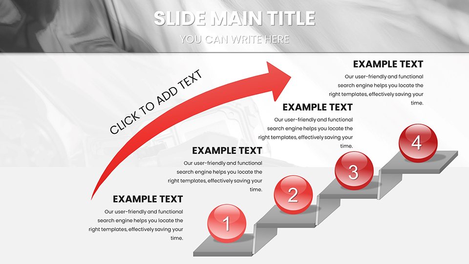
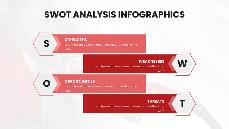
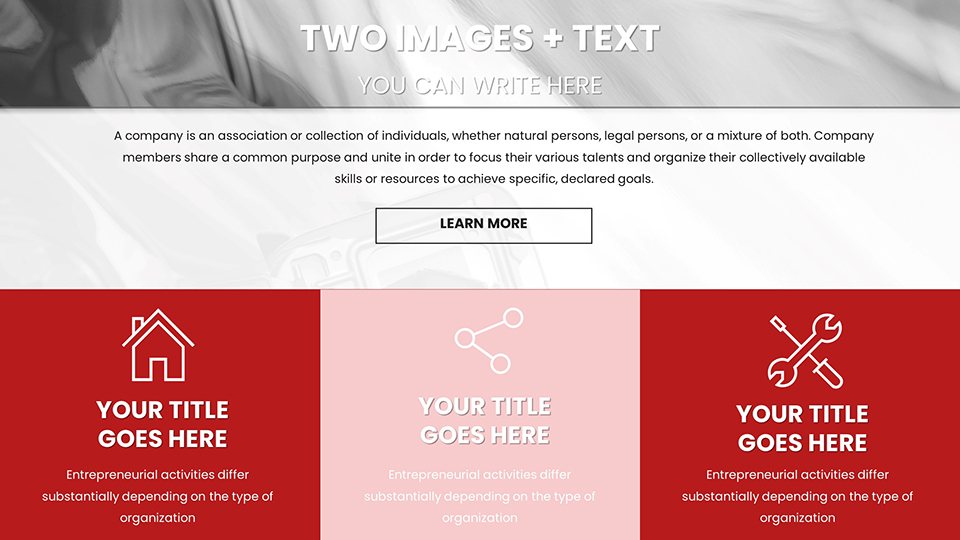
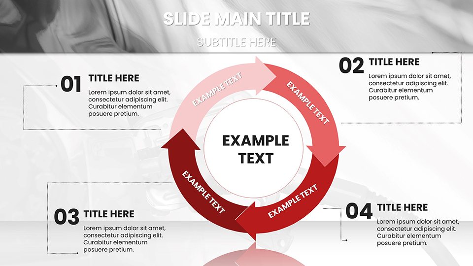
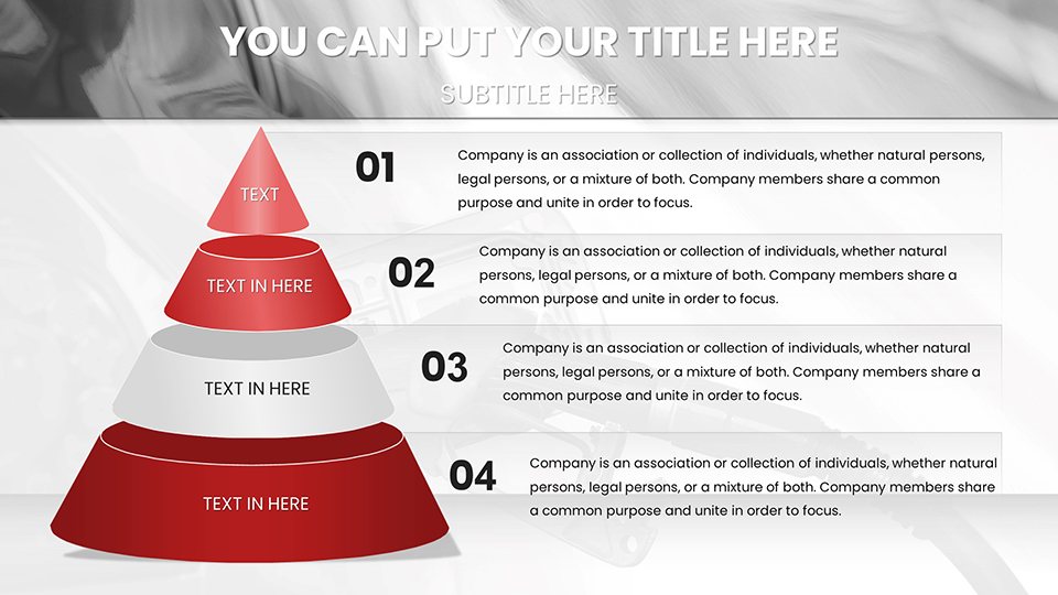
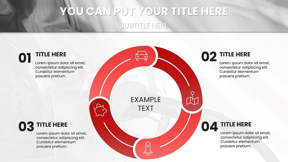
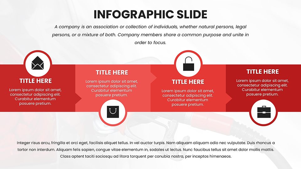
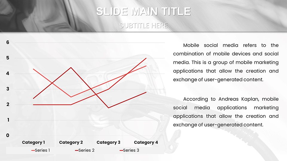
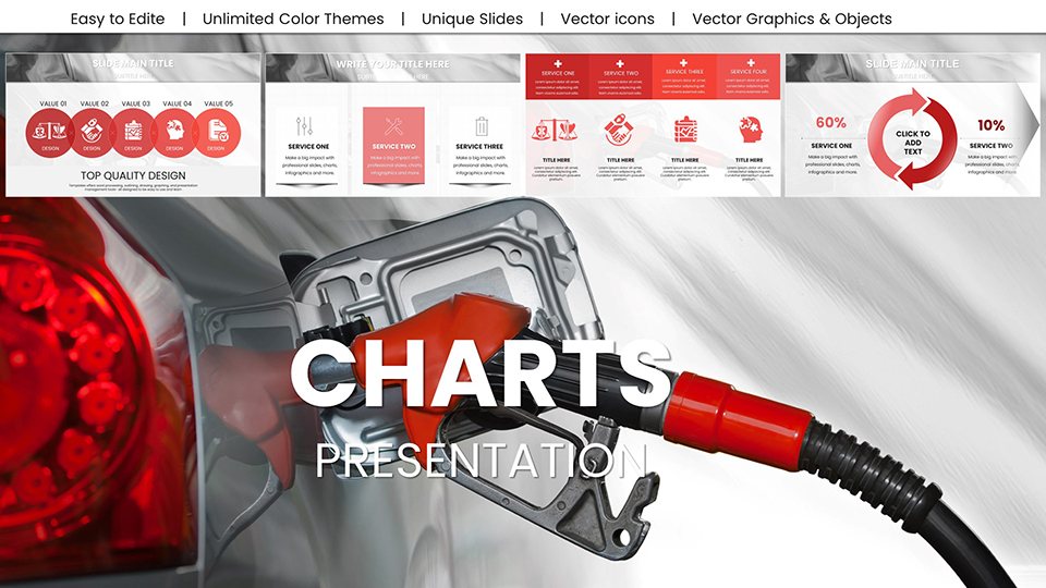
Navigating the automotive world requires sharp visuals to communicate everything from fuel efficiency stats to market penetration strategies. The Refuel a Car PowerPoint Charts template is your go-to resource, featuring 59 editable slides that infuse energy into your data presentations. Crafted for executives charting vehicle performance or marketers analyzing refueling trends, it turns mundane numbers into dynamic narratives. Imagine kicking off a sales meeting with a vivid slide showing fuel consumption curves, then delving into comparative analyses that spotlight your product's edge - all with an automotive flair that keeps viewers hooked.
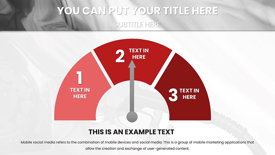
The template excels in versatility, offering high-quality diagrams with car-themed elements like dashboards and gas pumps, fully customizable to fit your vision. Downloadable in .pptx format, it's ready for PowerPoint use and adaptable for other tools, facilitating smooth integrations in fast-paced environments. This approach not only boosts efficiency but also ensures your slides convey trustworthiness and innovation, crucial in an industry driven by precision and progress.
Core Features Enhancing Automotive Insights
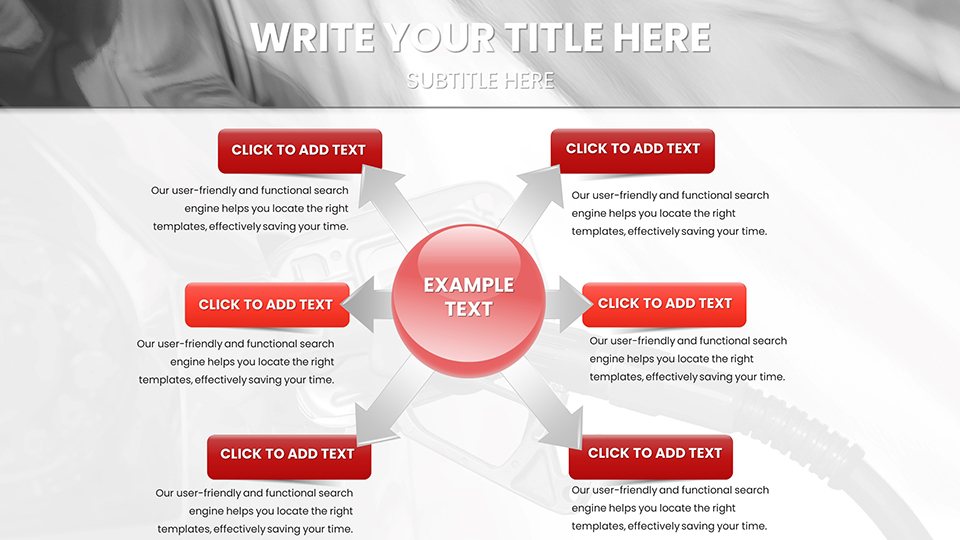
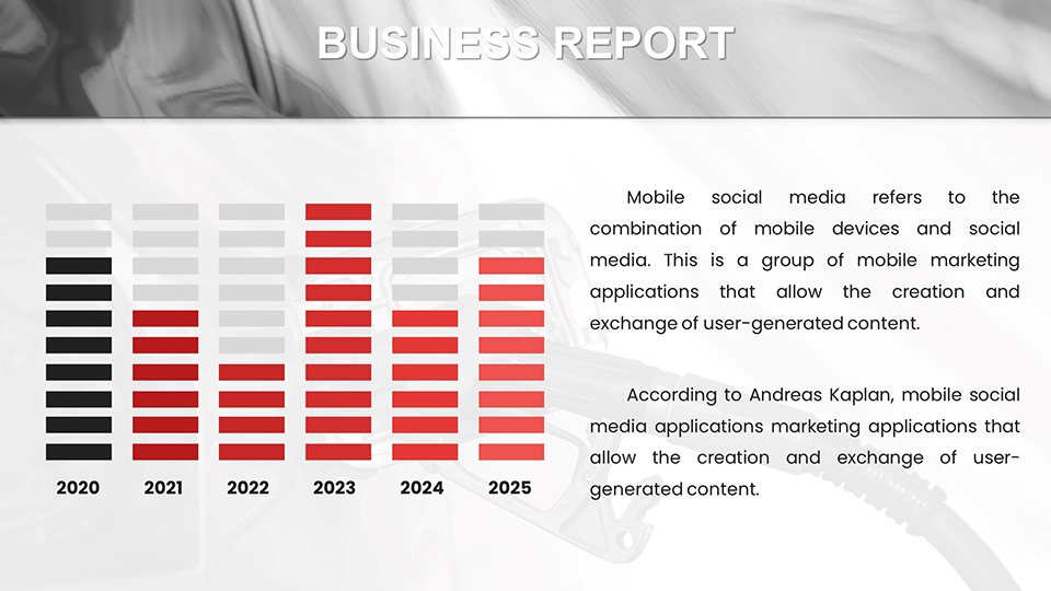
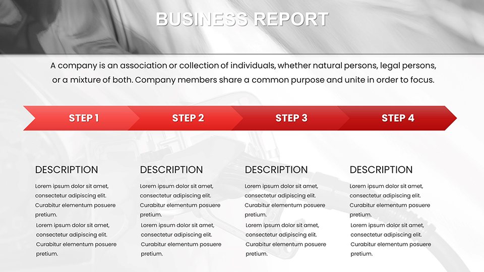
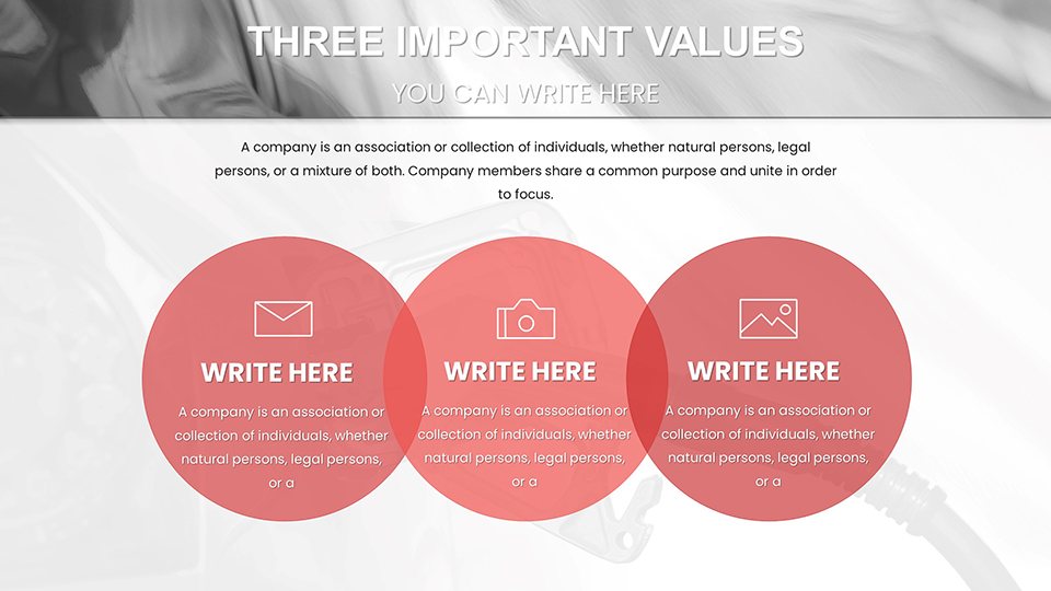
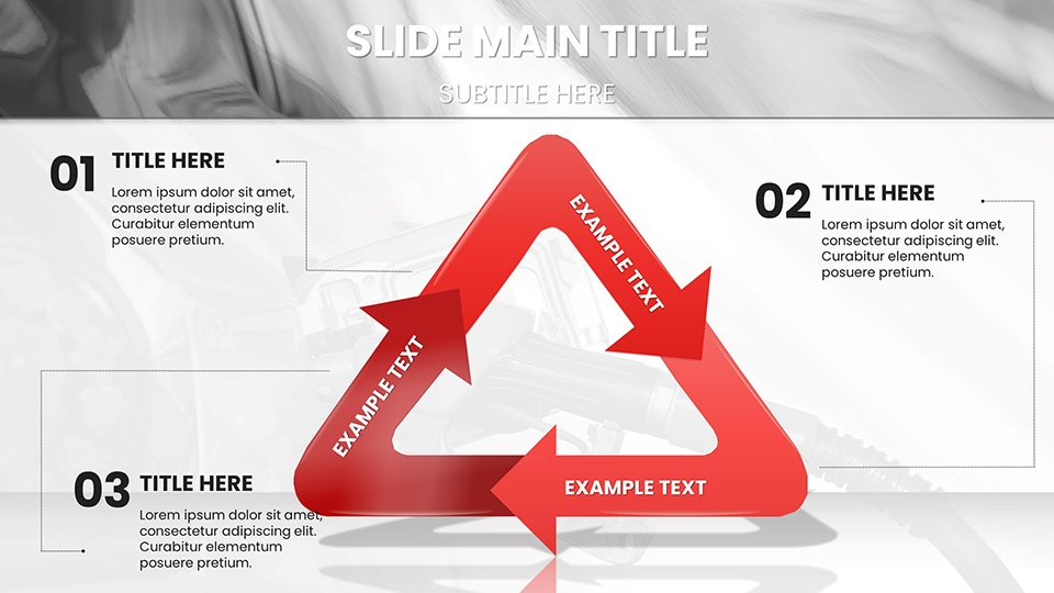
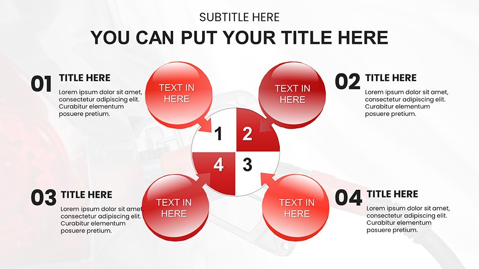
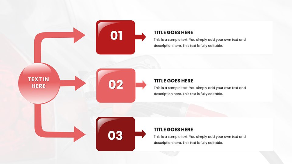
Explore the robust features that define this template. With slides encompassing flowcharts for refueling processes to bubble charts for cost-benefit analyses, it's equipped for diverse needs. Editable components allow seamless data insertion and style adjustments, supported by an easy-to-navigate structure.
- Multimedia Integration: Embed videos or images of car models for enriched context.
- Font and Color Flexibility: Align with brand guidelines, using metallic tones for a sleek auto look.
- Diagram Diversity: From Venn diagrams for overlap in fuel types to histograms for mileage distributions.
- User-Friendly Edits: Quick changes via placeholders, ideal for on-the-fly updates.
These elements combine to create presentations that are both informative and visually arresting, aiding in clearer communication of complex automotive data.
Targeted Use Cases for Professionals
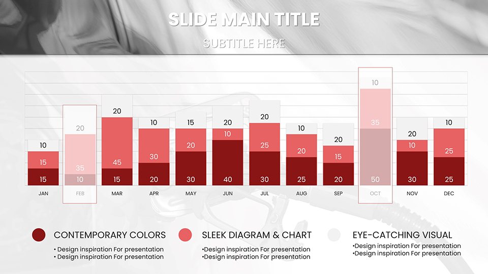
Executives can harness it for financial overviews, using stacked charts to depict revenue from refueling services. In marketing, craft compelling pitches with journey maps tracing customer experiences at gas stations.
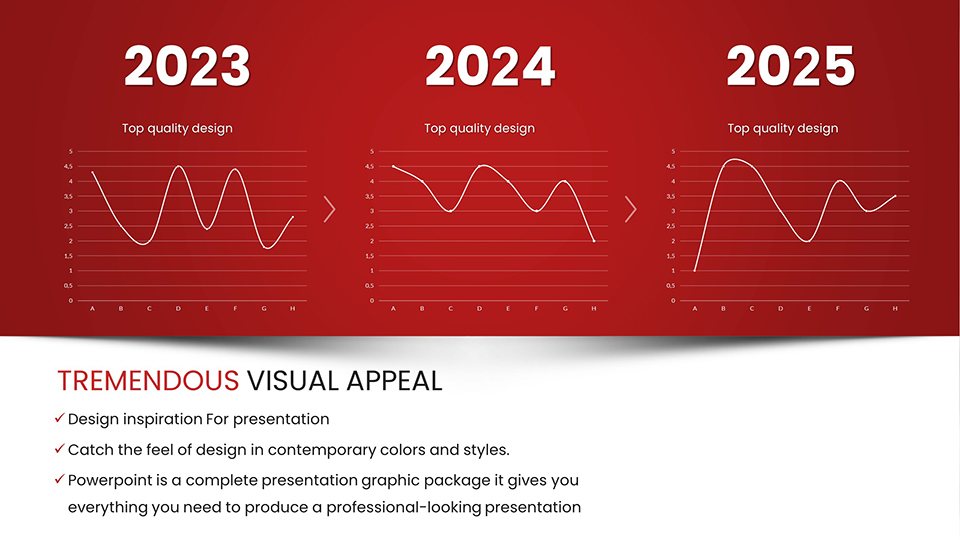
Educators find value in simplifying topics like hybrid vehicle efficiencies through step-by-step infographics. Consultants use it for strategy decks, incorporating matrix charts to evaluate supplier options. For broader applications, adapt for environmental impact reports, with line graphs tracking emissions reductions in modern cars.
Streamlined Customization Process
- Launch the file and pick a slide template.
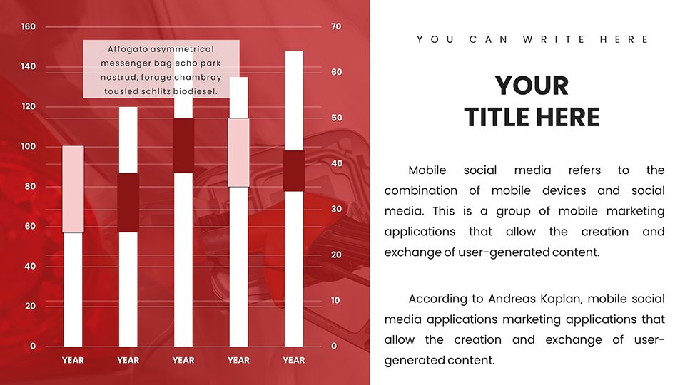
- Input specifics, like data for fuel economy bars.
- Personalize - alter schemes, add annotations.
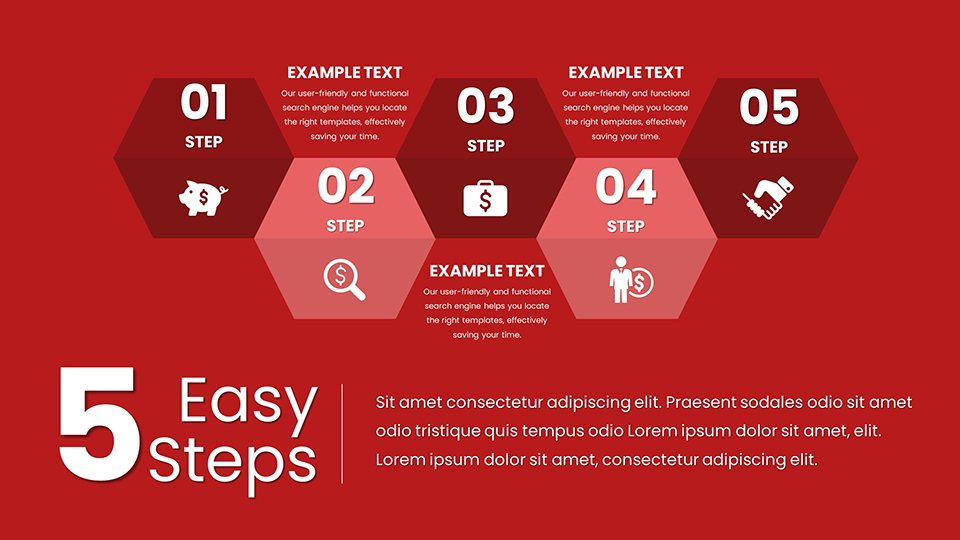
- Enhance with extras, such as icons or transitions.
- Finalize and present with confidence.
This workflow democratizes design, making pro results accessible to all skill levels.
Edge Over Conventional Tools
Outshining basic software, this template provides thematic depth that generic charts can't match, resonating with automotive audiences. It circumvents the pitfalls of low-quality freebies by delivering premium, editable assets that scale with your ambitions. Professionals praise its role in elevating pitch success rates, as tailored visuals foster deeper engagement and retention.
Ultimately, it's a catalyst for better outcomes, from securing funding to educating teams.
Insights for Optimal Automotive Presentations
Craft narratives around data, like evolving refuel habits in electric eras. Use high-contrast for clarity in dim rooms. Link to external tools for live updates on fuel prices. Refine based on analytics, perhaps emphasizing interactive elements for workshops.
Accelerate your storytelling - grab this template and refuel your presentation prowess today.
Frequently Asked Questions
Are the diagrams fully customizable? Yes, every chart and graph can be edited for data, style, and structure.
Compatible with Mac or PC? Works on both, primarily via PowerPoint.
Can I incorporate videos? Yes, seamless multimedia embedding supported.
Suited for large audiences? High-res designs ensure clarity in big venues.
How to handle updates? Re-edit anytime; no version locks.
Good for
- Project roadmaps and sprint plans
- Product launch timelines
- Quarterly or annual review decks
- Company history and milestone summaries
Licence
reviews
Automotive marketer loved the fuel consumption curves and gas pump visuals. Bubble charts for cost-benefit felt premium. Custom metallic tones matched our branding perfectly for the sales deck.
Refueling process flowcharts are clear for training. As a busy exec, placeholders sped up data entry. High-res on projector but some car icons looked generic up close.
Used Venn diagrams for fuel types comparison successfully. Timeline slides for customer journeys at stations are practical. Google Slides edits were seamless during travel.
Deadline pressure before a meeting - dashboard elements helped visualize efficiency stats fast. Sleek auto look but needed to tone down animations for conservative audience.
Student project on hybrids benefited from histograms for mileage. Editable and vector-based, easy integration of my photos. Professional results quickly.
The template's comparative slides spotlighted product edges well. Minor layout adjustments needed but thematic consistency boosted credibility in client pitches.**
FAQ
Will it work in Google Slides?
Are fonts embedded?
Can I use this for client work?
What's the refund policy?
Do you update the template after purchase?
Similar templates
See all PowerPoint Charts →
All 59 slides