 Click to zoom
Model of Meaning PowerPoint Charts Template: Add Depth to Data
| Format | .pptx |
| Slides | 18 unique layouts |
| Aspect ratio | 16:9 |
| Compatibility | PowerPoint |
| Animated | No |
| Language | English |
| License | Commercial |
| File size | — |
| Version | v1.0 |
| Last updated | August 2023 |
What's inside
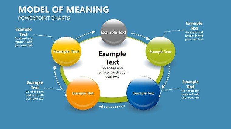
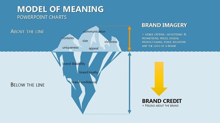
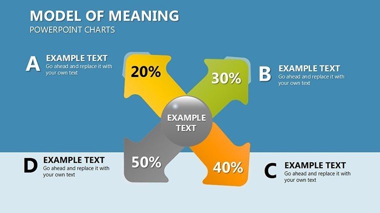
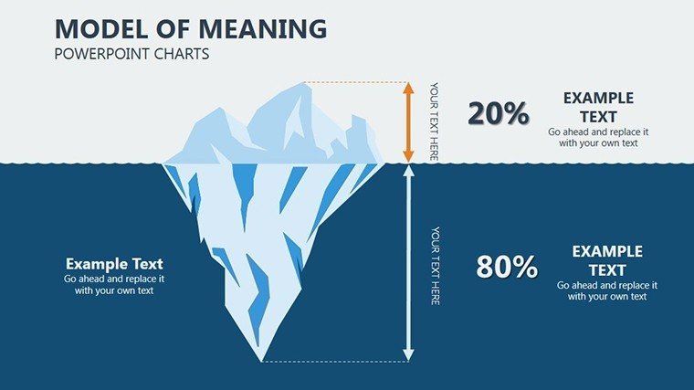
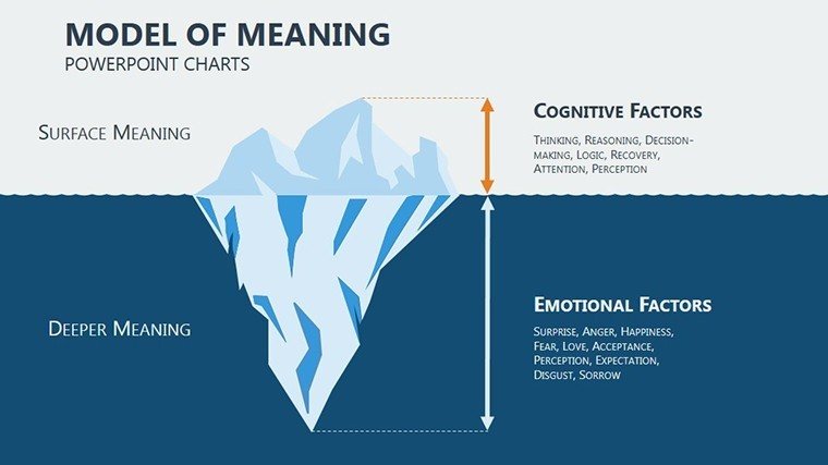
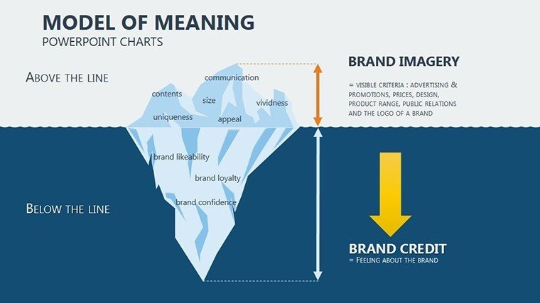
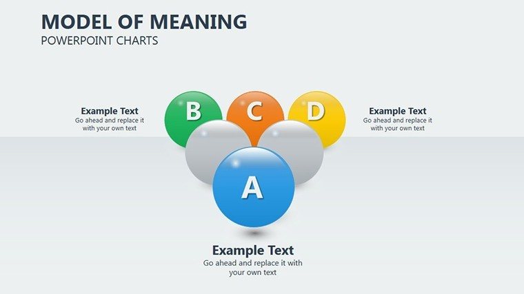
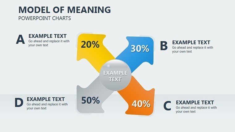
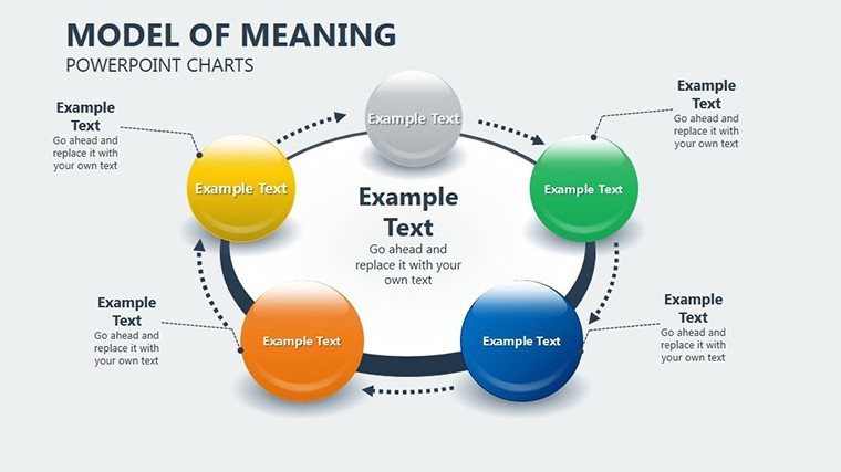
Unlocking the essence of data requires more than numbers - it demands context and narrative. Our Model of Meaning PowerPoint Charts Template, boasting 18 editable slides, embodies this by focusing on spherical representations that layer meaning onto business models. Ideal for consultants delivering insights, educators simplifying theories, marketers analyzing trends, and leaders driving decisions, this PPTX tool transforms raw information into profound visuals. Using spheres to depict interconnected meanings, it helps audiences grasp nuances, like how customer behaviors interlink with product values. Envision a consulting pitch where spherical charts reveal hidden patterns in market data, drawing from frameworks like those in Peter Senge's learning organizations.
This template's strength lies in its ability to infuse depth, setting it apart from flat charts by encouraging multi-dimensional thinking, aligned with expert methodologies from MIT Sloan Management Review.
Key Features Enhancing Interpretations
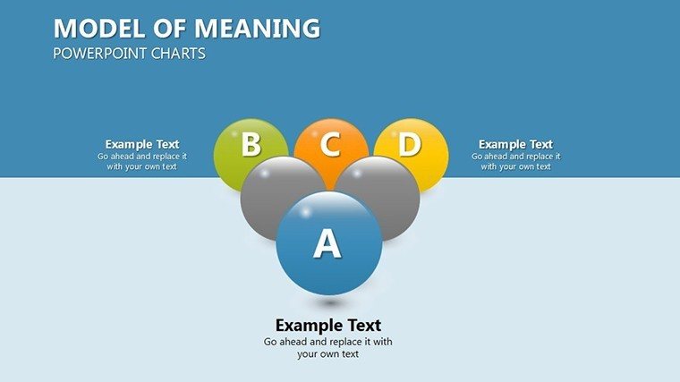
- Spherical Diagrams: Multi-layered visuals for representing complex meanings and relationships.
- Customization Flexibility: Tailor charts with branding elements for professional coherence.
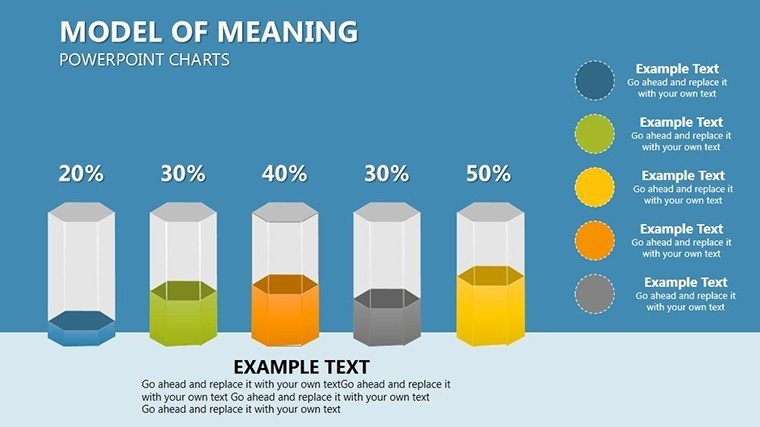
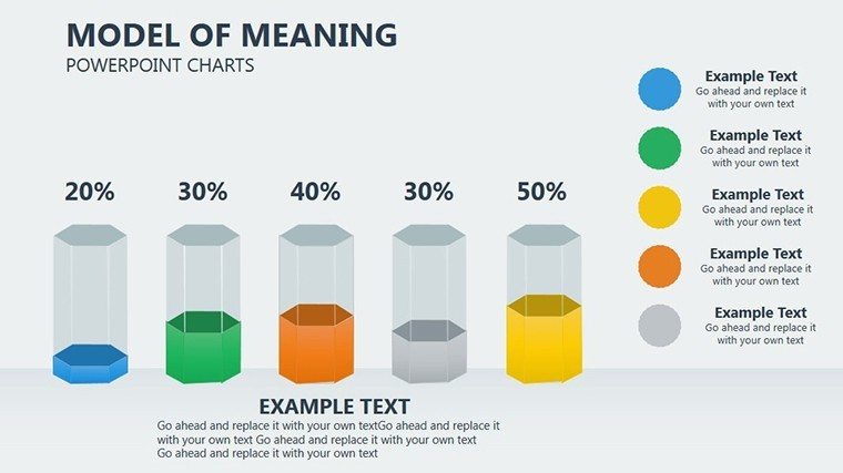
- Varied Chart Types: Bar graphs, pie charts, and more for comprehensive data display.
- Intuitive Interface: Easy edits, no design expertise needed.
- Meaningful Icons: Built-in elements to enrich context and understanding.
Leverage these for presentations that not only show data but explain its significance, with tips on layering for progressive revelation.
Targeted Applications and Expert Tips
Consultants can use spherical slides to map client challenges, integrating case studies from Deloitte reports on meaning-driven strategies. Educators simplify abstract concepts, like semiotics in communication, with buildable layers. Marketers visualize campaign impacts, showing how meaning influences consumer loyalty, per Nielsen studies.
Leaders present board updates with depth, comparing to basic slides where our template adds interpretive layers for better decisions. Integrate with CRM data for real-time insights, addressing issues like data overload. According to Gartner, visual context boosts comprehension by 70%.
Guide to Infusing Meaning in Slides
- Open and select a spherical base chart.
- Add data layers, labeling for clarity.
- Customize aesthetics to emphasize key meanings.
- Incorporate narratives or examples.
- Test for audience resonance.
Seize this opportunity to make your presentations meaningful - download and start today.
Frequently Asked Questions
- What is the Model of Meaning? A framework adding context to data for deeper insights.
- How editable are the spheres? Completely customizable in shape, color, and content.
- Compatible with other tools? Yes, PowerPoint and Google Slides friendly.
- Ideal for which industries? Consulting, education, marketing, and leadership.
- Any built-in examples? Yes, sample data to inspire your use.
- File format details? .PPTX for easy access.
Good for
- Project roadmaps and sprint plans
- Product launch timelines
- Quarterly or annual review decks
- Company history and milestone summaries
Licence
reviews
This worked for my internship report because the charts were already structured.
I didn’t even edit half the slides because they looked okay as they were.
Some shapes moved around after downloading but not a huge issue.
The pie chart layouts were easier to read than the ones I made myself.
Good option if you just need something functional fast.
FAQ
Will it work in Google Slides?
Are fonts embedded?
Can I use this for client work?
What's the refund policy?
Do you update the template after purchase?
Similar templates
See all PowerPoint Charts →
All 18 slides