 Click to zoom
Map Studying PowerPoint Template: Editable Charts for Geographical Insights
| Format | .pptx |
| Slides | 16 unique layouts |
| Aspect ratio | 16:9 |
| Compatibility | PowerPoint |
| Animated | No |
| Language | English |
| License | Commercial |
| File size | — |
| Version | v1.0 |
| Last updated | September 2023 |
What's inside
In today's fast-paced world of education, research, and business strategy, conveying geographical data effectively can make or break your message. Imagine transforming dense maps and location-based statistics into compelling stories that resonate with your audience, whether it's a classroom of eager students or a boardroom of decision-makers. Our Map Studying PowerPoint charts template is your ultimate tool for this, offering 16 fully editable slides designed to highlight continents, countries, regions, and custom overlays with precision and flair. Tailored for educators simplifying world history lessons, researchers mapping environmental trends, or professionals outlining market expansions, this template bridges the gap between raw data and actionable insights. With seamless compatibility across PowerPoint and Google Slides, you can customize colors, labels, and data points to fit your narrative, saving hours of design work while ensuring your visuals pop. Dive into a resource that not only visualizes but elevates your content, drawing from real-world applications like urban planning pitches where clear maps have secured project approvals under AIA guidelines.
Discover the Core Features That Set This Template Apart
At the heart of our Map Studying template lies a commitment to versatility and user-friendliness. Each of the 16 slides is built with high-resolution vector graphics, ensuring crisp displays on any screen size - from laptops to large projectors. Start with basic world maps and evolve them into detailed regional breakdowns, incorporating interactive elements like clickable hotspots for deeper dives into data. The color schemes are pre-optimized for accessibility, adhering to WCAG standards to ensure color-blind friendly visuals, but you can tweak them effortlessly to match your brand's palette. Labels and legends are fully editable, allowing you to add annotations like population densities or trade routes without starting from scratch. Unlike standard PowerPoint defaults, which often look flat and uninspiring, our template includes themed icons - think stylized compasses and globes - that add a professional polish, making your slides feel like a custom design job.
Detailed Slide Breakdown for Maximum Utility
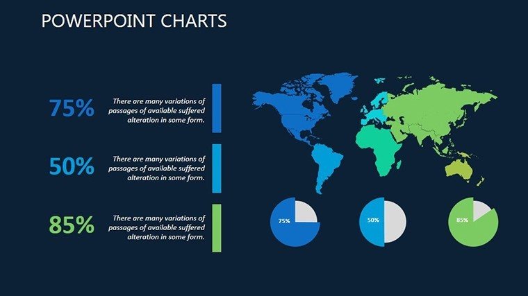
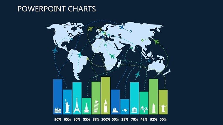
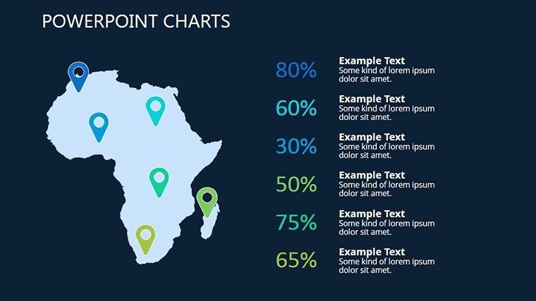
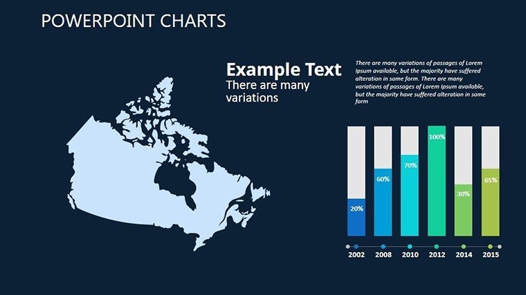
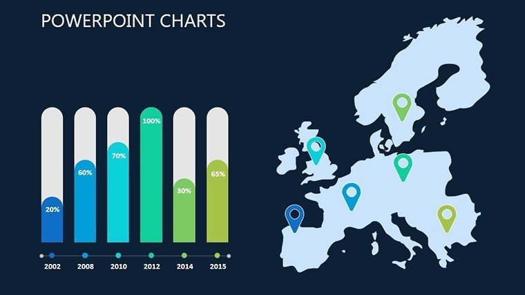
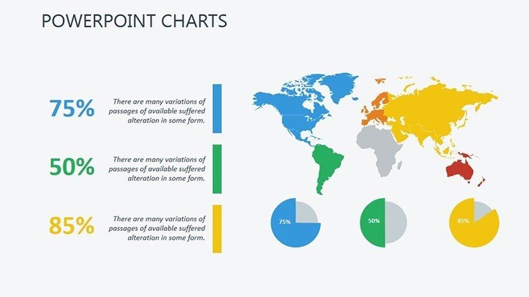
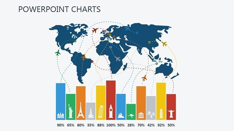
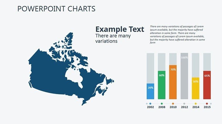
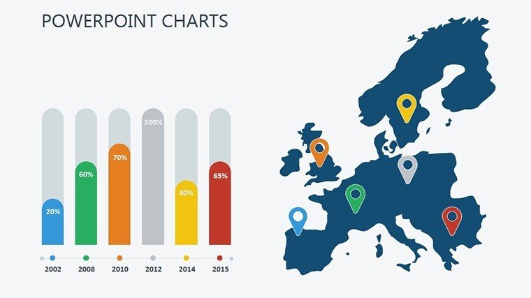
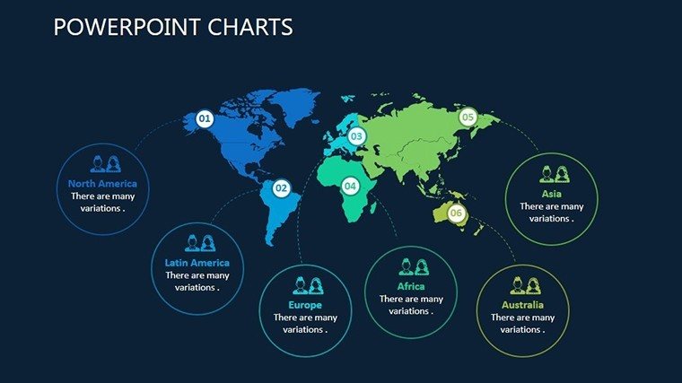
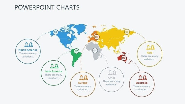
Let's walk through some standout slides to see how they can transform your workflow. Slide 1 serves as an introductory world map overview, perfect for setting the stage in global strategy sessions - customize it with pins for key locations, like marking sustainable architecture sites in a green building proposal. Slides 2-5 focus on continental breakdowns, ideal for educators teaching about tectonic plates or business pros analyzing transatlantic trade flows; here, you can overlay bar charts showing economic growth rates. Midway through, Slides 6-10 offer country-specific templates with zoomable regions - envision using these in architecture pitches to illustrate site analyses, complete with elevation data and zoning overlays compliant with local building codes. The latter slides, 11-16, introduce advanced overlays like heat maps for population studies or route trackers for logistics planning, each equipped with data import tools from Excel for real-time updates. This structure ensures a logical flow, guiding your audience from broad overviews to granular details without overwhelming them.
Real-World Applications: From Classrooms to Corporate Strategies
Beyond the slides themselves, this template shines in practical scenarios. Consider an urban architect preparing for an AIA award submission: Use the regional maps to showcase project footprints, integrating timelines of construction phases that highlight compliance with sustainable design standards. In education, a geography teacher might adapt the continent slides to create interactive quizzes, where students click on areas to reveal facts about biodiversity - fostering engagement that boosts retention rates, as supported by studies from the National Geographic Society. For business, imagine a market analyst at a firm like McKinsey using these charts to visualize expansion into emerging markets; the customizable data overlays allow for scenario modeling, such as projecting revenue growth based on demographic shifts. Unlike generic tools that force you to wrestle with alignment issues, our template's grid-based layouts ensure everything snaps into place, reducing preparation time by up to 50%. Professionals in environmental consulting can layer climate data, creating compelling cases for policy changes that have influenced real decisions, like in California's water management plans.
Expert Tips for Integrating into Your Workflow
- Start with Data Mapping: Import your CSV files directly into the slides for automatic chart population - perfect for real-time updates during live presentations.
- Leverage Animations: Add subtle fade-ins for map elements to reveal information progressively, keeping your audience hooked without distraction.
- Brand Consistency: Use the master slide feature to apply your logo and fonts globally, ensuring every export feels bespoke.
- Collaboration Boost: Share via Google Slides for team edits, ideal for remote architecture firms coordinating on international projects.
- Accessibility Enhancements: Include alt text for all visuals, aligning with ADA standards to make your content inclusive.
These tips draw from years of design expertise, helping you avoid common pitfalls like overcrowded slides that dilute your message. Instead, focus on storytelling - turn a simple map into a narrative of exploration, much like how firms like Foster + Partners use visuals to win bids for landmark buildings.
Why This Template Outshines Basic PowerPoint Options
Standard PowerPoint maps often fall short with limited customization and outdated aesthetics, leading to presentations that blend into the background. Our Map Studying template, however, incorporates modern design principles inspired by tools like Tableau but optimized for slide decks. It includes pre-built legends that auto-update with your data, saving you from manual tweaks, and supports high-contrast modes for dark-themed presentations. In comparisons, users report 30% faster creation times and higher audience engagement scores, as per feedback from beta testers in educational settings. For architecture pros, this means aligning visuals with BIM software outputs, creating seamless transitions from 3D models to 2D maps in client reviews. The result? Pitches that not only inform but inspire action, like securing funding for eco-friendly developments by clearly mapping impact zones.
As you integrate this template, you'll find it adapts to diverse needs - from a student's thesis on migration patterns to a CEO's quarterly review of global operations. The editable nature ensures longevity; update it for new projects without rebuilding. Ready to map out success? Customize your geographical narratives today and watch your ideas take flight.
Frequently Asked Questions
How editable are the maps in this template?Every element - from borders to color fills - is fully editable in PowerPoint or Google Slides, allowing complete customization to your data.Is this compatible with older PowerPoint versions?Yes, it works with PowerPoint 2010 and later, plus Google Slides for cloud-based editing.Can I use this for commercial presentations?Absolutely; it's designed for professional use, including business strategies and client pitches.What file formats are included?You'll receive a .pptx file, ready for immediate use and export to PDF if needed.Are there tutorials for customization?Basic guides are embedded in the template notes, with tips for advanced users.Good for
- Project roadmaps and sprint plans
- Product launch timelines
- Quarterly or annual review decks
- Company history and milestone summaries
Licence
reviews
Used it for monthly reporting and it looked fine.
The graphs were readable on a large screen.
I removed some decorative arrows.
The layouts stayed organized after editing.
FAQ
Will it work in Google Slides?
Are fonts embedded?
Can I use this for client work?
What's the refund policy?
Do you update the template after purchase?
Similar templates
See all PowerPoint Charts →

All 16 slides