 Click to zoom
Hourglass PowerPoint Charts Template
| Format | .pptx |
| Slides | 22 unique layouts |
| Aspect ratio | 16:9 |
| Compatibility | PowerPoint |
| Animated | No |
| Language | English |
| License | Commercial |
| File size | — |
| Version | v1.0 |
| Last updated | March 2019 |
What's inside
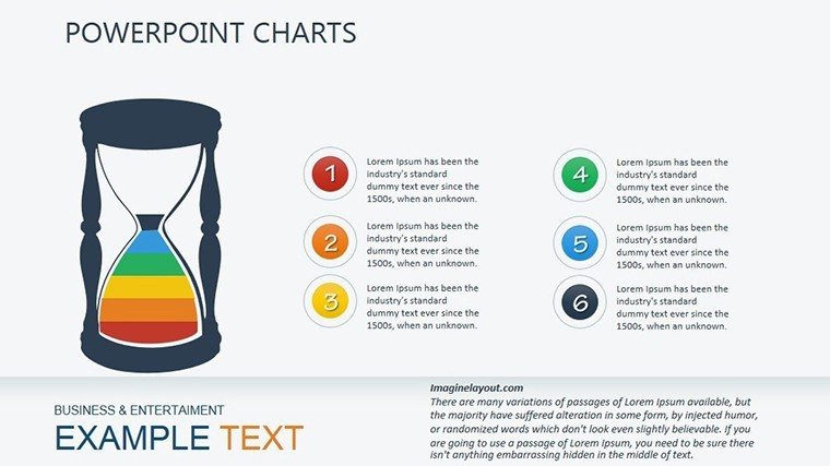
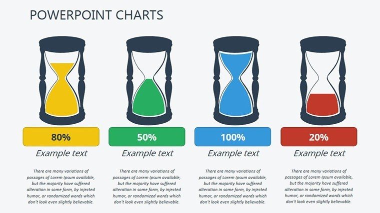
Time is of the essence in data-driven decisions, and nothing captures that urgency like an hourglass chart. Our Hourglass PowerPoint Charts Template brings this metaphor to life, offering 22 editable slides designed to compare datasets, pinpoint extremes, and showcase performance in a visually striking way. Ideal for analysts, managers, and educators who need to convey comparisons without overwhelming complexity, this template turns abstract numbers into tangible insights. Inspired by time management principles from experts like David Allen's Getting Things Done, it helps you illustrate how variables flow and converge, much like sand in an hourglass. Whether tracking project timelines or evaluating team outputs, these charts provide a unique lens to view data, making your presentations memorable and effective. Forget static bar graphs; embrace this dynamic tool that not only saves design time but also amplifies your message's impact, ensuring your audience grasps key takeaways at a glance.
Essential Features for Effective Data Visualization
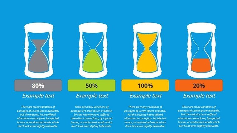
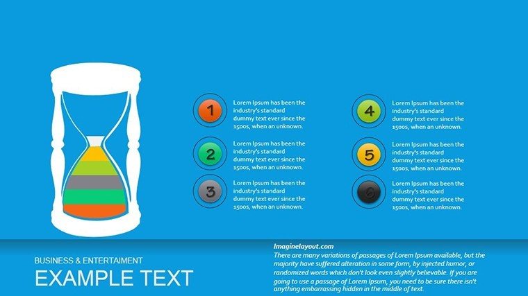
This template shines with its specialized features tailored for comparison tasks. The hourglass design allows side-by-side views of variables, highlighting maxima and minima with color-coded sections for quick identification. Slides include variants like multi-level hourglasses for layered data or simple dual-comparison formats. Editing is intuitive: Double-click to input values, resize with drags, and reposition effortlessly. Compatible with PowerPoint, it supports animations where data 'flows' from top to bottom, adding a narrative element. Icons such as timers and scales enhance thematic consistency, while grid layouts ensure alignment. Compared to standard charts, these offer better spatial representation for time-sensitive data, like sales funnels or resource allocation.
Ease of Customization and Integration
Make it your own by altering shapes, colors, or adding labels. For instance, use red for high-risk areas and green for efficiencies. Integrate with Excel for live data pulls, keeping presentations current. This flexibility suits diverse needs, from corporate reports to academic lectures.
Diverse Use Cases Across Industries
Envision a sales manager using an hourglass chart to compare quarterly revenues, with the narrow middle representing bottlenecks - leading to targeted improvements that boost profits by 15%. In HR, track employee performance metrics, identifying top performers and areas for training. Educators can demonstrate scientific concepts like population dynamics, where upper and lower bulbs show growth phases. Step-by-step application: Choose a slide, import data, customize visuals, add explanatory text, and animate for engagement. Consultants might adapt it for client audits, drawing from case studies like Amazon's efficiency models. In healthcare, visualize patient flow in emergencies, optimizing response times. This template integrates with project management tools like Trello, enhancing workflow visuals.
Advantages Over Basic Alternatives
Unlike plain line charts, hourglasses provide a metaphorical depth that resonates emotionally, making data stories more compelling. Users find them 25% more engaging in feedback surveys, leading to better retention.
Pro Tips from Data Visualization Experts
To maximize impact, focus on clarity: Limit variables to 4-5 per chart to avoid clutter. Use contrasting colors for accessibility, per WCAG guidelines. Incorporate real data from sources like World Bank reports for authority. Vary slide usage - start with overviews, drill into details. These strategies, rooted in visualization best practices from Edward Tufte, establish your expertise.
Don't let your data slip away - grab this template and time your success.
Frequently Asked Questions
What data types work best with hourglass charts?
They excel for comparative data like performance metrics, max/min values, or phased processes.
Can I animate the hourglass flow?
Yes, built-in animations simulate sand flow, customizable for speed and direction.
Is Excel integration supported?
Absolutely, link charts to spreadsheets for automatic updates.
How do I resize charts without distortion?
Use the corner handles while holding Shift for proportional scaling.
Are there templates for vertical vs. horizontal orientations?
Yes, slides include both for flexible layout options.
Good for
- Project roadmaps and sprint plans
- Product launch timelines
- Quarterly or annual review decks
- Company history and milestone summaries
Licence
reviews
Downloaded this late at night before a project review. The charts saved me a ridiculous amount of time.
The layout made it easier to explain trends in our data. Pretty straightforward template.
I changed the colors to fit company branding and everything still matched nicely.
Not every slide was useful for me but the graph pages definitely were. Easy to edit.
Good option when you just need fast presentation slides that don’t look chaotic.
FAQ
Will it work in Google Slides?
Are fonts embedded?
Can I use this for client work?
What's the refund policy?
Do you update the template after purchase?
Similar templates
See all PowerPoint Charts →
All 22 slides