 Click to zoom
General Information PowerPoint Charts Template: Versatile Tools for Clear Communication
| Format | .pptx |
| Slides | 19 unique layouts |
| Aspect ratio | 16:9 |
| Compatibility | PowerPoint |
| Animated | No |
| Language | English |
| License | Commercial |
| File size | — |
| Version | v1.0 |
| Last updated | June 2024 |
What's inside
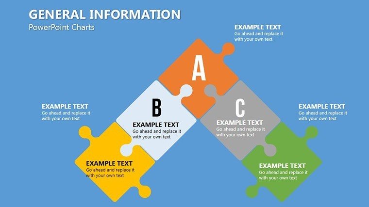
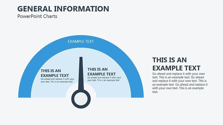
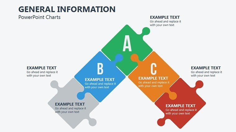
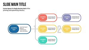
Navigating the world of data presentation requires flexibility, and our General Information PowerPoint Charts Template delivers just that with 19 editable slides. Ideal for business pros, teachers, and students, this PPTX set covers puzzles-like charts for piecing together information, from bar graphs to intricate diagrams. It's designed to make general data shine, helping you convey messages that stick and inspire action in any setting.
Unlocking the Potential of General Charts
This template's strength lies in its broad applicability, with puzzle-themed elements that symbolize interconnected data. Color schemes are neutral yet adaptable, allowing for corporate blues or educational brights. Fonts ensure legibility across screens, perfect for virtual meetings or in-person lectures.
Benefits include rapid assembly of presentations - customize a pie chart for budget breakdowns in seconds, far surpassing basic tools. For a financial analyst, it means illustrating quarterly trends with line graphs, drawing from standards like those in CFA reports for accuracy.
Essential Features for Everyday Use
- Broad Chart Selection: 19 slides with bars, pies, lines, and puzzles for diverse needs.
- Customization Freedom: Change layouts, colors, and data with ease.
- Engaging Visuals: Graphics that aid retention, based on cognitive science.
- Tool Compatibility: Smooth with major software.
- Metric Integration: Easy data insertion for real-time updates.
Subtle effects enhance flow without overkill.
Applications Across Fields
In education, use puzzle charts to connect lesson parts, like biology systems. Per STEM guidelines, visuals boost engagement, as seen in Khan Academy's success.
Business users can craft reports, e.g., market shares via pies, aligning with Gartner insights for strategy.
Students defend theses with clear graphs, impressing panels.
Workflow Enhancement Steps
- Identify Data Type: Choose chart accordingly.
- Edit Content: Input specifics, adjust style.
- Add Details: Labels for clarity.
- Review: Ensure coherence.
- Present: Deliver with confidence.
Tips: Use alt text for inclusivity.
Conclude: Elevate info sharing - start customizing.
Frequently Asked Questions
Are the charts fully customizable?
Yes, every aspect can be modified.
Compatible with Mac PowerPoint?
Absolutely, cross-platform.
Suitable for beginners?
Yes, intuitive design.
Can I add my own data?
Easily, via placeholders.
Includes tutorials?
Basic guides in file.
Refund policy?
Contact support for details.
Good for
- Project roadmaps and sprint plans
- Product launch timelines
- Quarterly or annual review decks
- Company history and milestone summaries
Licence
reviews
Needed charts for a performance review meeting and this covered most of it.
The bar graph slides looked clean after adding our company colors.
I finished my presentation faster because the layouts already made sense.
A few pages felt repetitive but there were enough useful ones.
Pretty solid option for office reporting and analytics decks.
FAQ
Will it work in Google Slides?
Are fonts embedded?
Can I use this for client work?
What's the refund policy?
Do you update the template after purchase?
Similar templates
See all PowerPoint Charts →


All 19 slides