 Click to zoom
Gasoline Fuel Pump PowerPoint Charts - Download and Editable Presentation Template
| Format | .pptx |
| Slides | 59 unique layouts |
| Aspect ratio | 16:9 |
| Compatibility | PowerPoint |
| Animated | No |
| Language | English |
| License | Commercial |
| File size | — |
| Version | v1.0 |
| Last updated | July 2023 |
What's inside
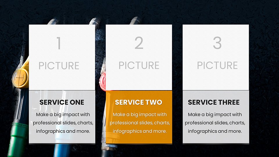
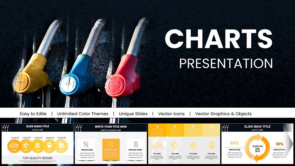
The energy sector thrives on precision and clarity, especially when dealing with intricate data like fuel distribution networks or consumption forecasts. Our Gasoline Fuel Pump PowerPoint Charts template delivers exactly that, with 59 editable slides crafted to turn raw statistics into persuasive visuals. Ideal for consultants mapping out refinery efficiencies or sales teams pitching innovative pump designs, this template captures the essence of the fuel industry through thematic graphics and intuitive layouts. Envision opening a conference with a dynamic infographic slide depicting global oil flows, followed by detailed analytics that highlight opportunities and risks - all designed to engage and inform without overwhelming.
What makes it exceptional is the balance of professionalism and adaptability: High-quality icons of gas stations and pipelines, paired with editable charts that flex to your data needs. Working seamlessly in PowerPoint or Google Slides, it's perfect for collaborative environments, enabling quick revisions during team huddles or client calls. This not only streamlines your workflow but also elevates the overall quality, ensuring your presentations reflect the innovation and reliability synonymous with the energy field.
Standout Features for Professional Slides
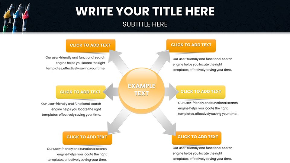
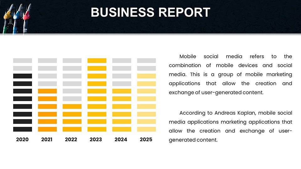
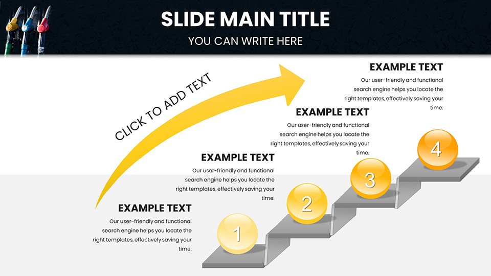
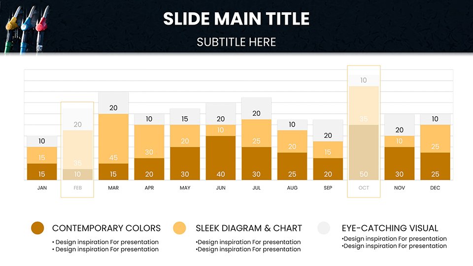
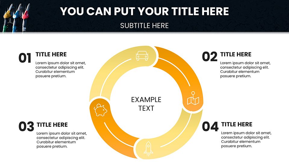
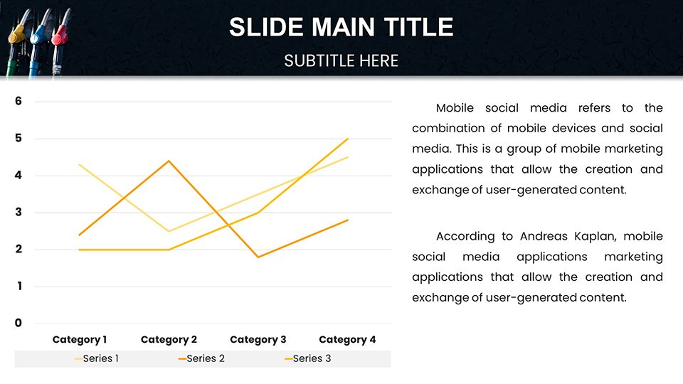
This template boasts features that cater to demanding users. From pie charts segmenting market shares in alternative fuels to timeline slides chronicling regulatory changes, the 59 options cover a broad spectrum. All elements are fully editable, with smart objects that resize intelligently and maintain aspect ratios for flawless results.
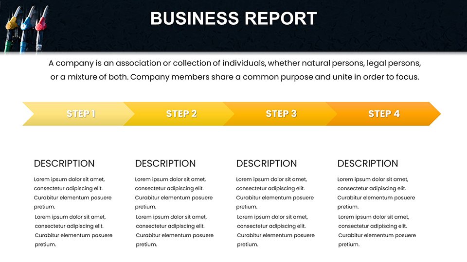
- Layout Variety: Choose from dashboards, matrices, or process flows tailored for fuel logistics.
- Graphic Enhancements: Incorporate vector icons like fuel gauges and trucks for contextual depth.
- Customization Depth: Fine-tune every aspect, from gradients in bar charts to labels in scatter plots.
- Quality Assurance: Retina-ready graphics that shine on any screen size or projector.
These attributes empower you to create presentations that not only present data but also tell compelling stories, fostering better understanding and decision-making.
Diverse Applications Across Industries
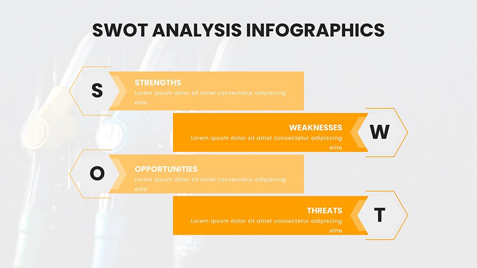
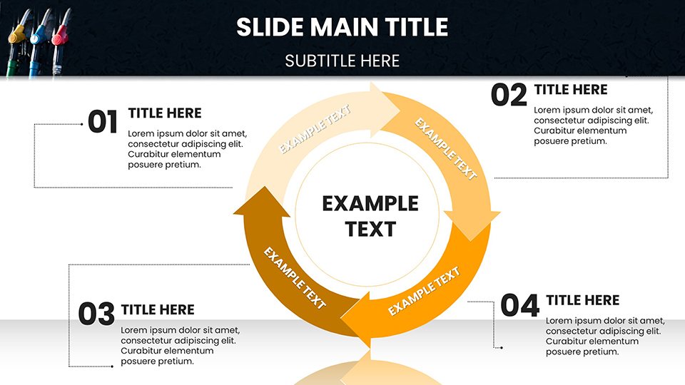
In business conferences, utilize the template for SWOT analyses on fuel market competitors, with quadrant charts that visually balance strengths and threats. Educators can adapt it for classroom sessions on energy sustainability, using cycle diagrams to explain refining processes.
For marketing and sales, it's invaluable in strategy sessions: Employ radar charts to compare pump features across brands, or area graphs to forecast demand. Consultants might use it for audit reports, integrating tree maps for hierarchical data like supply chain breakdowns. The template's flexibility even extends to non-profits advocating for green energy, where comparison slides highlight shifts from gasoline to renewables.
Effortless Customization Workflow
- Select and open a slide in your software of choice.
- Enter data via user-friendly placeholders.
- Modify designs - swap colors, add effects, or rearrange elements.
- Incorporate multimedia if needed, like embedded videos of pump demos.
- Review and deploy for immediate impact.
This efficient approach minimizes errors and maximizes creativity, suitable for tight deadlines in high-pressure sectors.
Superior to Generic Chart Tools
While default PowerPoint features suffice for basics, they lack the specialized touch this template provides, such as industry-aligned themes that resonate with energy experts. It outperforms free templates by offering premium graphics and deeper editability, reducing redesign efforts. Feedback from users indicates improved engagement rates, as tailored visuals keep audiences focused longer than standard slides.
In essence, it's an investment in your professional image, helping secure partnerships or approvals by presenting data with authority and style.
Pro Tips for Engaging Energy Talks
Build suspense by layering reveals in multi-step charts, guiding viewers through data logically. For international audiences, include multilingual labels via easy text edits. Pair with storytelling: Frame fuel data around real-world scenarios, like crisis responses. Regularly update templates with fresh data integrations, and experiment with layouts based on past performance metrics.
Drive your presentations forward - secure this template now and power up your communication in the fuel arena.
Frequently Asked Questions
How many chart variations are there? Over a dozen types across 59 slides, including pies, bars, and specialized energy diagrams.
Does it support team collaboration? Yes, via Google Slides sharing features.
Can I export to other formats? Easily convert to PDF or images post-editing.
Ideal for beginners? Absolutely, with intuitive interfaces and guides.
Any theme restrictions? Fully customizable to shift beyond fuel if desired.
What if I need more slides? Duplicate and modify existing ones effortlessly.
Good for
- Project roadmaps and sprint plans
- Product launch timelines
- Quarterly or annual review decks
- Company history and milestone summaries
Licence
reviews
Presented procurement digitalization roadmap. The capability charts showed implementation phases.
Technology enabled operations design. Clear digital journey visualization.
Solid foundation with some automation icon updates needed.
The cohesive visuals reinforced transformation narrative.
FAQ
Will it work in Google Slides?
Are fonts embedded?
Can I use this for client work?
What's the refund policy?
Do you update the template after purchase?
Similar templates
See all PowerPoint Charts →
All 59 slides