 Click to zoom
Economic Condition PowerPoint Charts Template
| Format | .pptx |
| Slides | 24 unique layouts |
| Aspect ratio | 16:9 |
| Compatibility | PowerPoint |
| Animated | No |
| Language | English |
| License | Commercial |
| File size | — |
| Version | v1.0 |
| Last updated | September 2023 |
What's inside
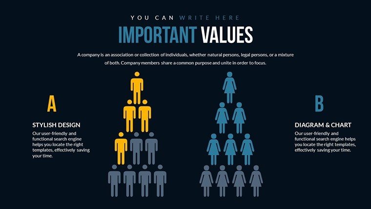
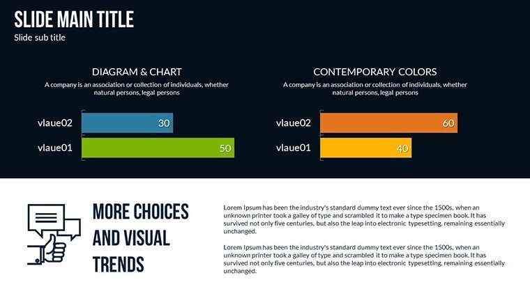
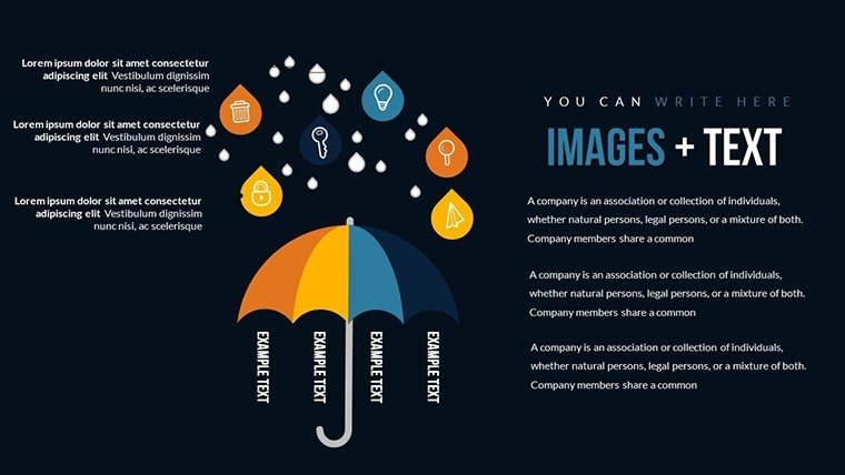
Navigating the complexities of economic landscapes requires more than just numbers; it demands visuals that tell a compelling story. Our Economic Condition PowerPoint Charts Template equips you with 24 editable slides tailored for professionals who analyze trends, forecast outcomes, and educate audiences on fiscal matters. Picture this: You're an economist presenting quarterly GDP shifts to a boardroom full of executives, using 3D pyramid charts that layer inflation rates with unemployment figures for instant comprehension. Or as an educator, simplifying global trade dynamics for students through interactive infographics that evolve with real-time data inputs. This PPTX powerhouse isn't generic - it's crafted with precision, incorporating pyramid structures for hierarchical data like economic hierarchies and 3D elements for depth in visualizations. Benefits abound: Save time on design, ensure data accuracy, and captivate viewers with designs that make abstract concepts tangible. Compatible with PowerPoint and Google Slides, it's your go-to for creating presentations that not only inform but inspire action in volatile markets.
Standout Features for Economic Insights
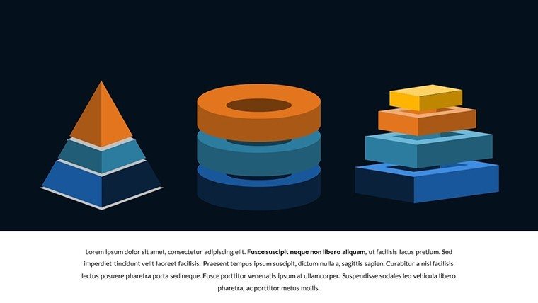
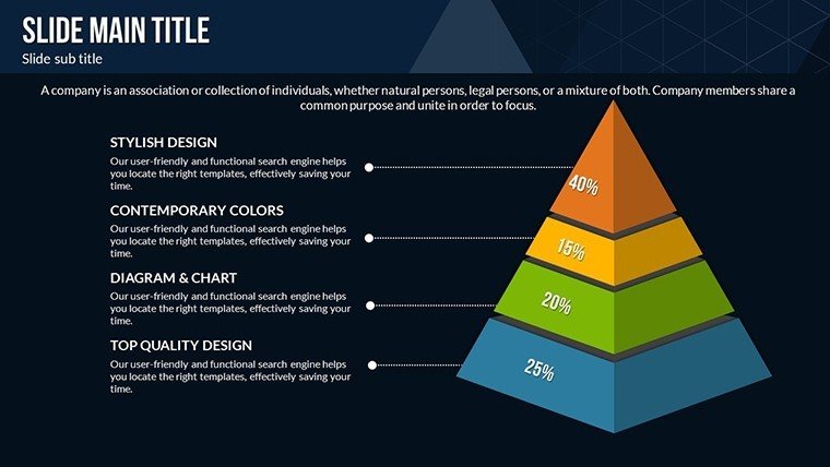
What elevates this template? Start with its diverse chart arsenal: Pyramid charts break down economic indicators into tiers, such as consumer spending layers in a recession analysis, while 3D graphs add dimensionality to volume-based metrics like market share distributions. Each of the 24 slides is fully customizable - tweak axes, legends, and color palettes to reflect current economic palettes, perhaps using blues for stability or reds for alerts. Infographics allow for embedding the latest trends from sources like World Bank data, ensuring your content stays relevant. Animations subtly reveal data points, guiding audiences through narratives like economic recovery phases post-pandemic. This setup adheres to data visualization best practices, echoing principles from experts like Edward Tufte, minimizing chartjunk while maximizing clarity.
Unlocking Benefits in Professional Settings
The advantages extend far beyond aesthetics. For business pros, these charts facilitate client pitches on market forecasts, turning raw stats into persuasive arguments that secure investments. Educators benefit by distilling complex theories - like Keynesian economics - into digestible visuals, boosting student retention rates as per educational studies. Researchers can present peer-reviewed findings with precision, using comparative bar pyramids to highlight disparities in regional growth. Government officials leverage it for policy briefings, visualizing budget allocations that sway public opinion. In one real-world example, a financial consultancy used similar tools to model inflation impacts, resulting in a 30% uptick in client engagement during webinars. The template's flexibility means you can update with fresh data effortlessly, keeping presentations evergreen in an ever-shifting economy.
Diverse Applications Across Industries
Apply this template in myriad ways. For economic analyses, deploy pyramid slides to tier fiscal policies, starting from macroeconomic overviews down to micro-level effects on households. In educational contexts, animate charts to simulate economic cycles, from boom to bust, engaging learners interactively. Researchers might compare historical data sets, like pre- and post-2008 crisis indicators, using layered 3D visuals for depth. Step-by-step usage: Import data from CSV files, select a chart type, customize visuals for emphasis (e.g., highlight anomalies), add transitions for flow, and export for sharing. Versus standard PowerPoint, this offers specialized economic-themed icons - currency symbols, growth arrows - enhancing thematic coherence. Integrate into workflows by linking to dashboards in tools like Tableau for hybrid presentations.
Expert Tips to Amplify Your Presentations
Maximize impact with pro tips: Use color theory to denote economic health - greens for growth, yellows for cautions. Overlay annotations for key insights, like noting interest rate hikes' effects on charts. For virtual meetings, embed video clips of market news within slides. Value adds include faster prep times and higher audience recall, as visuals aid memory retention by 65%, according to neuroscience. Subtle calls to action, such as "Explore these trends further with our team," can convert viewers to collaborators. In dynamic fields like economics, this template integrates seamlessly with forecasting software, allowing real-time updates during live sessions.
Ready to turn economic data into your superpower? Download this template now and craft presentations that not only explain but also predict and persuade in the world of finance.
Frequently Asked Questions
What types of charts are included?
Primarily 3D pyramids and customizable graphs suited for hierarchical economic data.
Can I incorporate real-time data?
Yes, easily import from spreadsheets and update charts dynamically.
Is it suitable for beginners?
Absolutely, with intuitive editing tools and pre-set layouts.
Does it support animations?
Yes, for engaging reveals of economic trends.
How many slides are there?
24 fully editable slides focused on economic visualizations.
Can I brand it with my colors?
Yes, full customization for brand alignment.
Good for
- Project roadmaps and sprint plans
- Product launch timelines
- Quarterly or annual review decks
- Company history and milestone summaries
Licence
reviews
The chart sections helped organize my statistics project better.
I liked the simple colors because my old projector ruins bright slides.
Pretty basic template but still useful for work meetings.
There were more slides than I needed so I deleted half of them.
The graphs looked clear when exported to PDF too.
FAQ
Will it work in Google Slides?
Are fonts embedded?
Can I use this for client work?
What's the refund policy?
Do you update the template after purchase?
Similar templates
See all PowerPoint Charts →


All 24 slides