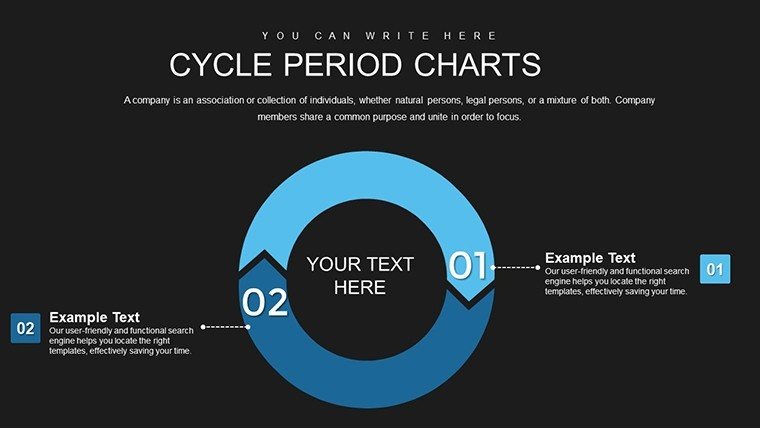
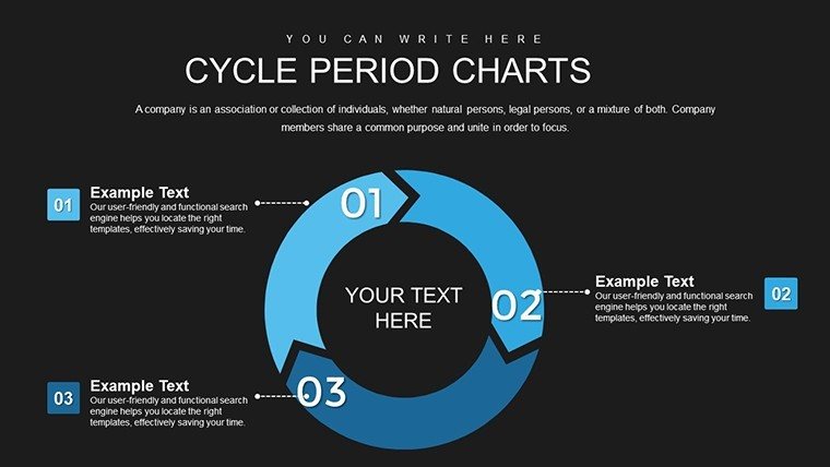
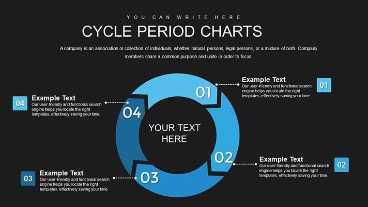
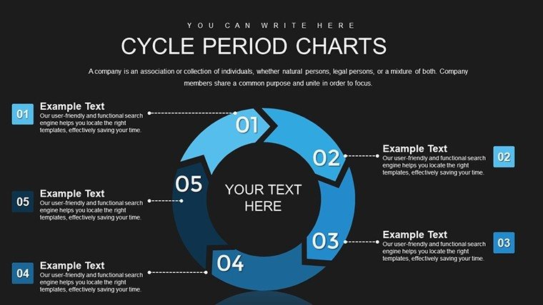
 Click to zoom
Data Comparison Chart PowerPoint Template - Fully Editable & Instant Download
| Format | .pptx |
| Slides | 24 unique layouts |
| Aspect ratio | 16:9 |
| Compatibility | PowerPoint |
| Animated | No |
| Language | English |
| License | Commercial |
| File size | — |
| Version | v1.0 |
| Last updated | February 2026 |
What's inside
Make performance gaps, competitive advantages, and strategic choices immediately visible with structured side-by-side comparison. This data comparison chart PowerPoint template provides a clean, professional framework where metrics and benchmarks align perfectly, enabling stakeholders to evaluate options quickly and confidently.
Essential for professionals conducting reviews, evaluations, or decision-support presentations where clear visual evidence is critical.
Key Features
- Structured column layout for direct side-by-side comparisons
- Clean alignment of metrics, benchmarks, and performance indicators
- Fully editable data points, labels, colors, and formatting
- Professional design that emphasizes clarity and objectivity
- Multiple layout variations for different comparison needs
Benefits of Clear Data Comparison
Effective comparison charts remove ambiguity and accelerate decision-making by presenting evidence visually. This template ensures your audience can identify strengths, weaknesses, and differences at a glance, strengthening the credibility of your analysis and recommendations.
The structured format maintains professional neutrality while highlighting key insights that support informed choices.
Professional Use Cases
Quarterly Reviews: Compare current performance against previous periods or targets to highlight progress and areas for improvement.
Vendor Evaluation: Present side-by-side analysis of supplier options based on price, quality, delivery, and service metrics.
Product Comparisons: Demonstrate feature and benefit differences between your offerings and competitors during sales presentations.
Investment Decisions: Align financial metrics and risk factors across multiple opportunities for committee review.
How to Customize Your Comparison Chart
Open the template and input your data directly into the organized columns. Adjust column widths for emphasis, modify colors to highlight superior performance, and update labels for context. All elements remain perfectly aligned during editing, ensuring professional results with minimal effort.
For maximum impact, use consistent metrics across categories and consider color-coding to guide viewer attention to key differences.
Frequently Asked Questions
How many items or categories can I compare?The template supports multiple columns for comparing 2–6 items effectively, with flexible layouts that can be adjusted for more if needed.
Can I add visual indicators like checkmarks or ratings?Yes, the template includes space for icons, ratings, or qualitative indicators alongside quantitative data for comprehensive comparisons.
Is this suitable for before-and-after comparisons?Absolutely - the clean column structure works perfectly for showing pre- and post-implementation results or improvement metrics.
Will the chart maintain alignment when I edit it?Yes, the template uses PowerPoint tables and aligned shapes that maintain professional formatting even after extensive customization.
Good for
- Project roadmaps and sprint plans
- Product launch timelines
- Quarterly or annual review decks
- Company history and milestone summaries
Licence
reviews
Downloaded this for a quick HR report and it did the job.
The layout spacing was better than I expected honestly.
Some chart labels were awkward to move around in PowerPoint.
I reused the same slide twice because the graphs were clean enough.
Good for rushed presentations where nobody wants to design from zero.
FAQ
Will it work in Google Slides?
Are fonts embedded?
Can I use this for client work?
What's the refund policy?
Do you update the template after purchase?
Similar templates
See all PowerPoint Charts →
All 24 slides