 Click to zoom
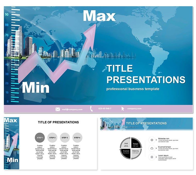
Chart Development Keynote Template: Data Mastery
| Format | .pptx |
| Slides | 3 unique layouts |
| Aspect ratio | 16:9 |
| Compatibility | PowerPoint |
| Animated | No |
| Language | English |
| License | Commercial |
| File size | — |
| Version | v1.0 |
| Last updated | September 2021 |
What's inside
Unlock the full spectrum of your data story, where peaks and valleys reveal truths at a glance, powered by the Chart Development Keynote Template. Tailored for finance analysts, accountants, and business strategists, this tool turns abstract numbers into accessible narratives, highlighting minimums and maximums with precision that informs decisions.
In data-saturated boardrooms, clarity cuts through clutter - this template delivers it, making ranges resonate. For Keynote 2016+, at $22 for life, it`s your chart navigator.
Range Revealed: Key Components
28 diagrams specialize in value spans - error bars as min-max brackets, range plots like developmental arcs. With 3 masters for framework and 3 backgrounds in neutral tones, it`s primed for professionalism. Seven color schemes differentiate extremes vividly.
Refine in Keynote: scale axes, color-code thresholds, animate growth. It`s for depth, not dazzle.
- Range-Focused Diagrams: 28, from box plots to sliding scales.
- Stable Masters: Three for data integrity.
- Subtle Backgrounds: Three clean slates.
- Contrast Schemes: Seven for highlight precision.
Streamlines analysis, amplifies accuracy.
Data Drives: Finance and Beyond
A CFO reviews budgets: min-max charts flag variances, guiding cuts. Team aligns swiftly. An accountant audits: developmental graphs track trends, spotting anomalies early.
Marketers forecast campaigns: range visuals project ROI spans, justifying spends. Consultants advise: layered charts compare scenarios, building trust. It excels in quantifying uncertainty.
Chart Tuning Tips
Choose schemes for contrast - bold for alerts. Label ranges clearly, fade non-essentials. Validate with real data previews.
Outpacing Standard Charts
Defaults lack range nuance; this adds it. Saves recalibration time, sharpens focus. Positions you as data virtuoso.
Plot your path. Download Chart Development Keynote Template today for range-ready decks.
Frequently Asked Questions
For finance specifically?
Yes, excels in min-max for budgets, audits.
Diagrams total?
28, range-centric.
Formats?
.jpg, .key, .kth; Keynote 2016+.
Color options?
Seven for differentiation.
Price details?
$22 lifetime.
Customization?
Full, for tailored ranges.
Good for
- Project roadmaps and sprint plans
- Product launch timelines
- Quarterly or annual review decks
- Company history and milestone summaries
Licence
reviews
Made my finance report less boring because of the simple graphs.
The spacing on some slides felt a little tight for longer text.
I liked that the icons were subtle and not oversized.
Used it for an internal office meeting and nobody complained.
The timeline slide was the main reason I downloaded this one.
FAQ
Will it work in Google Slides?
Are fonts embedded?
Can I use this for client work?
What's the refund policy?
Do you update the template after purchase?
Similar templates
See all Keynote templates →



All 1 slides