 Click to zoom
Analyze Two Related Indicators PowerPoint Charts Template: Dual Data Mastery
| Format | .pptx |
| Slides | 30 unique layouts |
| Aspect ratio | 16:9 |
| Compatibility | PowerPoint |
| Animated | No |
| Language | English |
| License | Commercial |
| File size | — |
| Version | v1.0 |
| Last updated | September 2023 |
What's inside
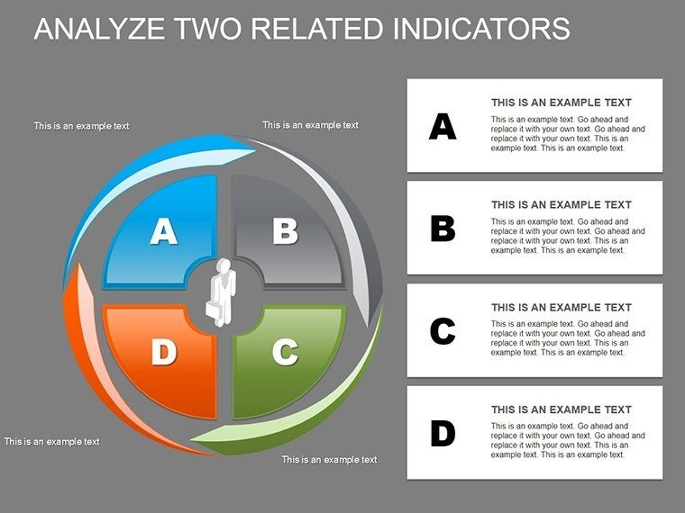
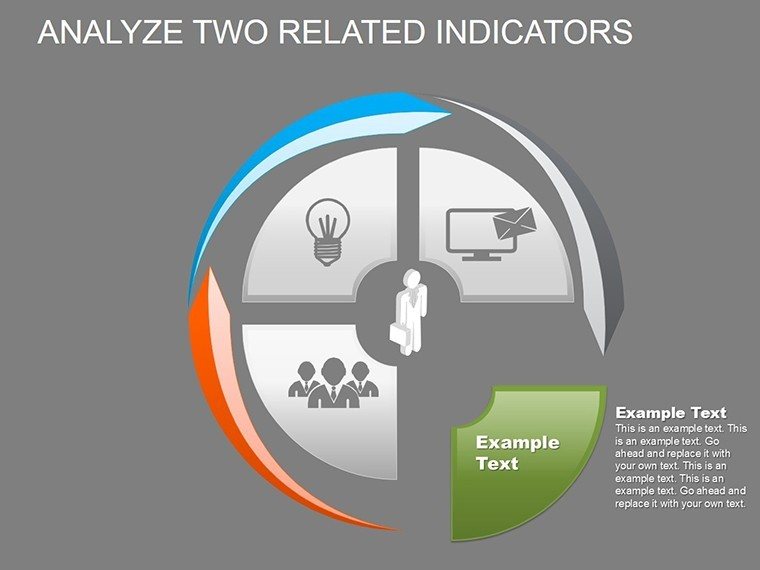
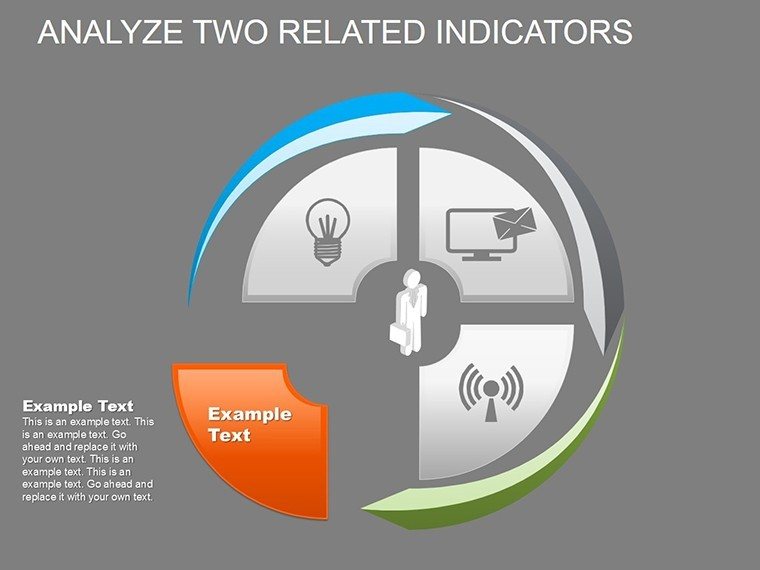
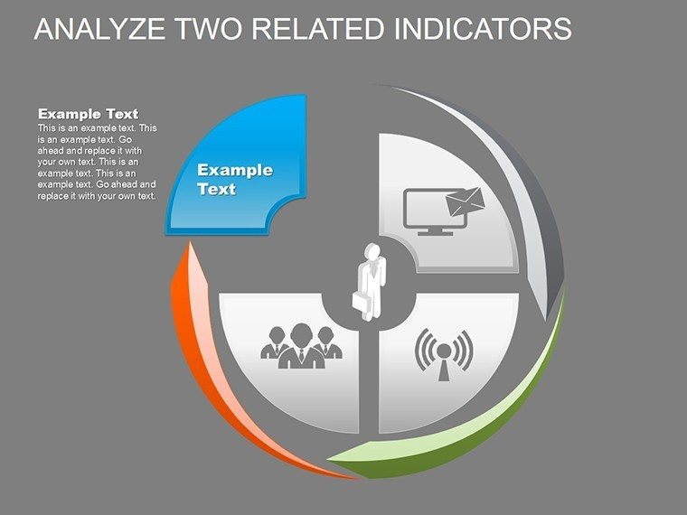
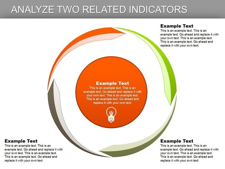
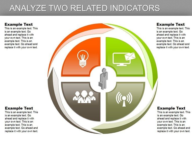
Delve into the interplay of metrics, where correlations reveal hidden opportunities. This Analyze Two Related Indicators PowerPoint Charts Template equips researchers and strategists with 30 editable slides to juxtapose variables like sales and costs, using cycles and pies for profound insights. Suited for market analysts or academic presenters, and compatible with PowerPoint/Google Slides, it resolves the puzzle of paired data by offering layered, customizable visuals. Embrace a tool that transforms comparisons into catalysts for change, making your analyses not just seen, but felt.
Exceptional Traits of Dual Indicator Visualization
Highlight relationships with overlaid pies or synchronized cycles, adjusting scales for accurate correlations. Beyond simple side-by-sides, it aligns with statistical standards from the American Statistical Association, preventing misleading interpretations. In economics, pair GDP with inflation; in health, correlate exercise with wellness, as in WHO reports, providing a foundation for evidence-based conclusions.
Vital Features for In-Depth Analysis
Features include correlation markers and trend lines within cycles. Benefits: sharper forecasts, robust arguments. Grounded in data science from sources like Kaggle, use for regression overviews or A/B testing, where dual views illuminate causations.
Comprehensive Slide Catalog: Paired Perspectives
- Slide 1-10: Basic Pairings - Simple pies for ratio comparisons.
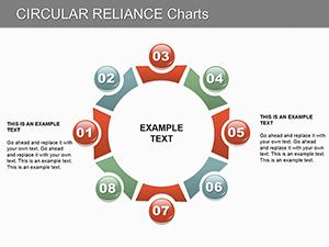
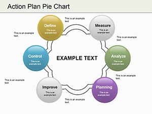
- Slide 11-20: Cycle Integrations - Looped views of interdependent indicators.
- Slide 21-25: Trend Overlays - Lines on pies for temporal relations.
- Slide 26-30: Advanced Correlations - Statistical annotations for deep dives.
Data icons enhance interpretability, facilitating swift edits.
Strategic Uses in Data-Centric Fields
An analyst examines ad spend vs. conversions: cycles show feedback loops, echoing Google Analytics case studies. Academics pair variables in theses, per JSTOR methodologies. This template supports such rigor, enhancing trustworthiness through precise, adaptable charts.
Process for Effective Indicator Analysis
- Load the PPTX.
- Select indicators and input data.
- Align visuals for synergy.
- Annotate key findings.
- Apply filters for scenarios.
- Export insights.
Integrates with stats software like R for advanced computations.
Advanced Advice for Dual Data Handling
Seek causality, not just correlation - use notes for caveats. Per IEEE visualization guidelines, balance aesthetics with accuracy. In research, these ensure replicable, impactful results.
Decode your data duos - acquire this template and analyze with confidence.
Frequently Asked Questions
How to overlay indicators?Use layering tools in PowerPoint for integrated views.Works in Google Slides?Yes, with full editing capabilities.Handle large datasets?Link to Excel for scalability.Statistical tools included?Basic correlations; extend with add-ins.Custom color schemes?Fully, for thematic consistency.Export options?To images or PDFs seamlessly.Good for
- Project roadmaps and sprint plans
- Product launch timelines
- Quarterly or annual review decks
- Company history and milestone summaries
Licence
reviews
I used this for a startup pitch and the graphs looked clear on screen.
The slides were easy to rearrange which saved me time.
Honestly I just picked it randomly and it turned out okay.
Some layouts felt repetitive after a while.
The icons and charts blended together nicely without too much effort.
FAQ
Will it work in Google Slides?
Are fonts embedded?
Can I use this for client work?
What's the refund policy?
Do you update the template after purchase?
Similar templates
See all PowerPoint Charts →
All 30 slides