 Click to zoom
Analytics in Marketing: PowerPoint Charts to Decode Customer Insights
| Format | .pptx |
| Slides | 36 unique layouts |
| Aspect ratio | 16:9 |
| Compatibility | PowerPoint |
| Animated | No |
| Language | English |
| License | Commercial |
| File size | — |
| Version | v1.0 |
| Last updated | March 2023 |
What's inside
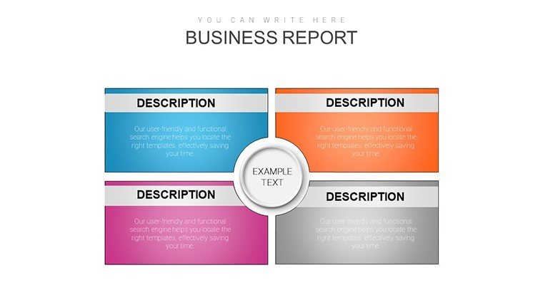
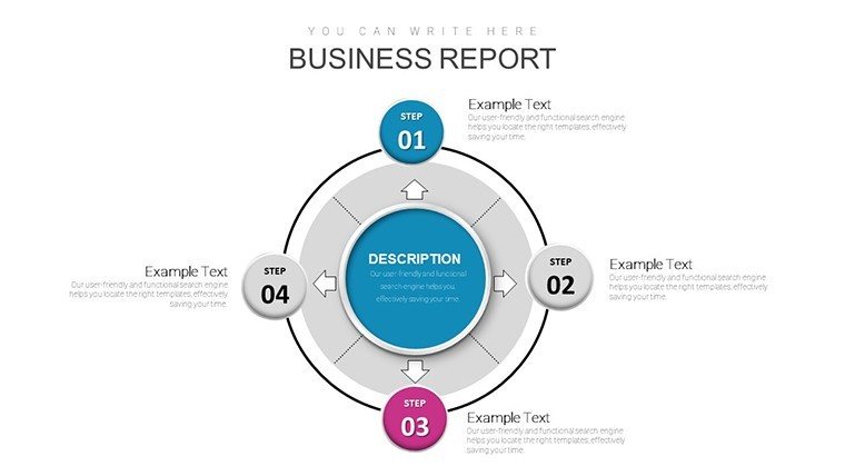
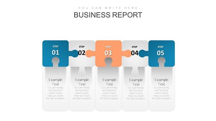
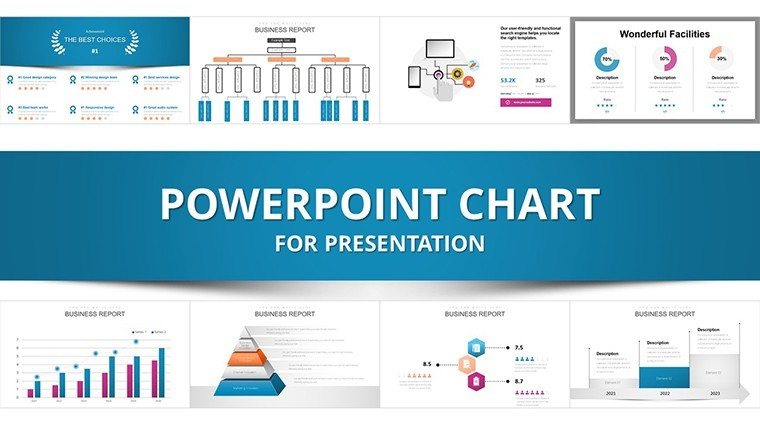
Navigating the data-driven landscape of modern marketing demands tools that cut through noise to uncover actionable truths. Our Analytics in Marketing PowerPoint Charts Template delivers exactly that, with 36 editable slides focused on transforming raw data into compelling visuals. Marketers, strategists, and executives will find value in charts that spotlight customer behaviors, trend evolutions, and campaign performances, all in .pptx format for effortless editing.
Inspired by frameworks from Google Analytics pros, this template tackles challenges like fragmented data silos, enabling cohesive storytelling. For instance, in a digital agency, use scatter plots to correlate ad spend with conversions, revealing efficiencies that boost budgets by 15%, as seen in SEMrush case studies.
Core Features for Data-Driven Narratives
The template's robust toolkit ensures precision and polish:
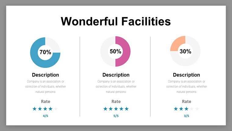
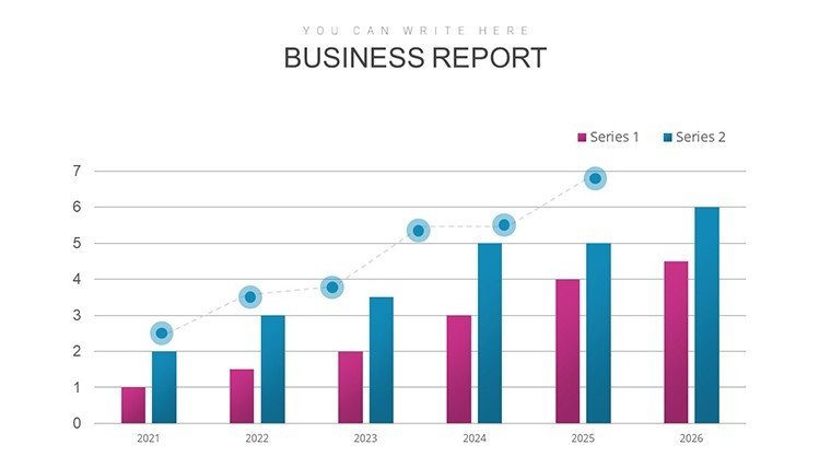
- Varied Chart Options: Line for trends, bar for comparisons, pie for shares, scatter for correlations, heat maps for distributions.
- Customization Flexibility: Alter axes, legends, and palettes to emphasize key metrics.
- Data Handling: Seamless imports from tools like Google Sheets for up-to-date visuals.
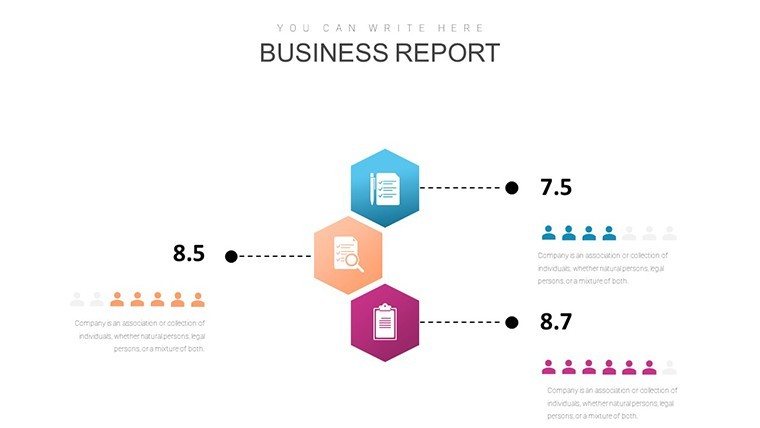
- Insightful Layouts: Dashboards combining multiple charts for holistic views.
- Quality Assurance: Vector graphics for crisp outputs in any format.
These adhere to AMA guidelines for ethical data presentation, fostering trust and authority in your reports.
Targeted Applications for Marketing Success
In campaign reviews, bar charts compare channel performances, guiding reallocations. For audience segmentation, pie charts break down demographics, informing personalized tactics that lift engagement, per HubSpot benchmarks.
Heat maps excel in geographic targeting, highlighting hot spots for localized efforts. A real example: An e-commerce brand used similar visuals to pinpoint underperforming regions, refining strategies for 30% sales uplift, as detailed in Marketing Week.
Implementing Charts: A Strategic Guide
- Define Objectives: Pinpoint metrics like ROI or churn rates.
- Choose Visuals: Match charts to data - pies for parts-of-whole, lines for time series.
- Populate Data: Input from analytics platforms for accuracy.
- Enhance with Context: Add annotations for interpretations.
- Iterate Based on Feedback: Refine for stakeholder clarity.
- Deploy in Campaigns: Use in pitches to secure approvals.
This approach surpasses simplistic tools by offering marketing-specific depth, accelerating insights.
Edges Over Generic Visuals
Basic PowerPoint lacks the nuanced setups here, like pre-configured heat maps for density analysis. Drawing from Nielsen's consumer insights, it prioritizes user-focused designs. Benefits include faster decision cycles, with LSI terms like 'customer journey mapping' integrated naturally.
Suggest alts such as "Heat map of marketing ROI by region," and link to related analysis tools. CTAs like "Visualize your data today" enhance flow.
Transform Your Marketing Data Now
This template is your ally in turning analytics into advantages. Customize to unveil hidden opportunities and drive growth. Act now - elevate your strategies with precision visuals.
Frequently Asked Questions
How do I customize heat maps?Easily adjust color gradients and data ranges for tailored insights.Ideal for which marketing roles?Perfect for analysts, managers, and CMOs focused on data strategy.Supports real-time data?Yes, via links to live sources like Google Analytics.Compatible with collaborative tools?Works in shared environments like Microsoft Teams.What sets it apart from Excel charts?More presentation-oriented with marketing-themed designs.Can it handle big data sets?Yes, optimized for large volumes without performance lags.Good for
- Project roadmaps and sprint plans
- Product launch timelines
- Quarterly or annual review decks
- Company history and milestone summaries
Licence
reviews
Needed charts quickly and this template had a few good ones.
The structure helped me explain data trends at work.
Didn’t spend much time customizing, just swapped values.
It’s okay but icons don’t always match the topic.
Good enough for a quick presentation.
FAQ
Will it work in Google Slides?
Are fonts embedded?
Can I use this for client work?
What's the refund policy?
Do you update the template after purchase?
Similar templates
See all PowerPoint Charts →
All 36 slides