 Click to zoom
5 Principles Keynote Charts Template
| Format | .pptx |
| Slides | 20 unique layouts |
| Aspect ratio | 16:9 |
| Compatibility | PowerPoint |
| Animated | No |
| Language | English |
| License | Commercial |
| File size | — |
| Version | v1.0 |
| Last updated | September 2023 |
What's inside
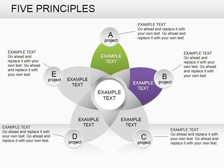
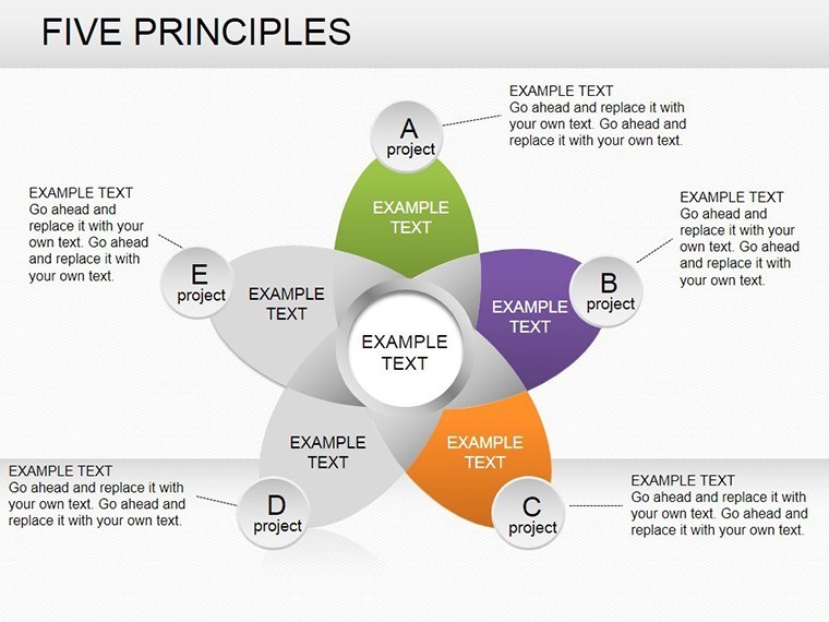
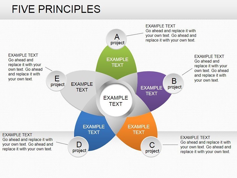
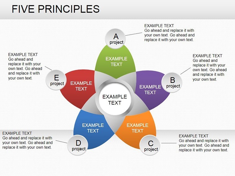
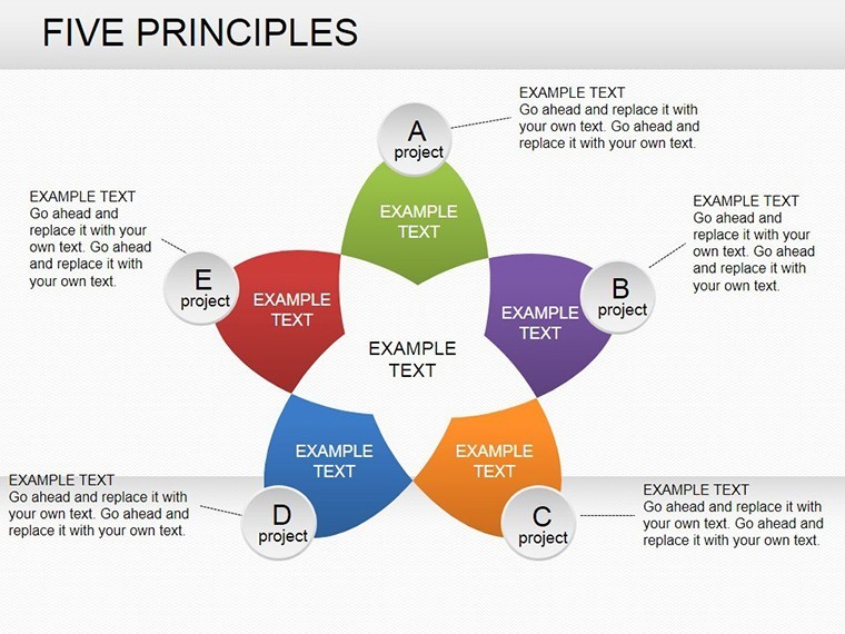
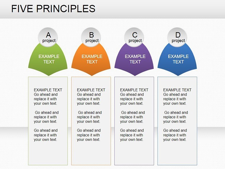
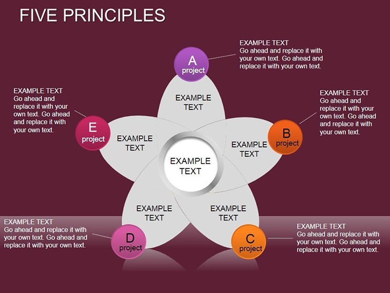
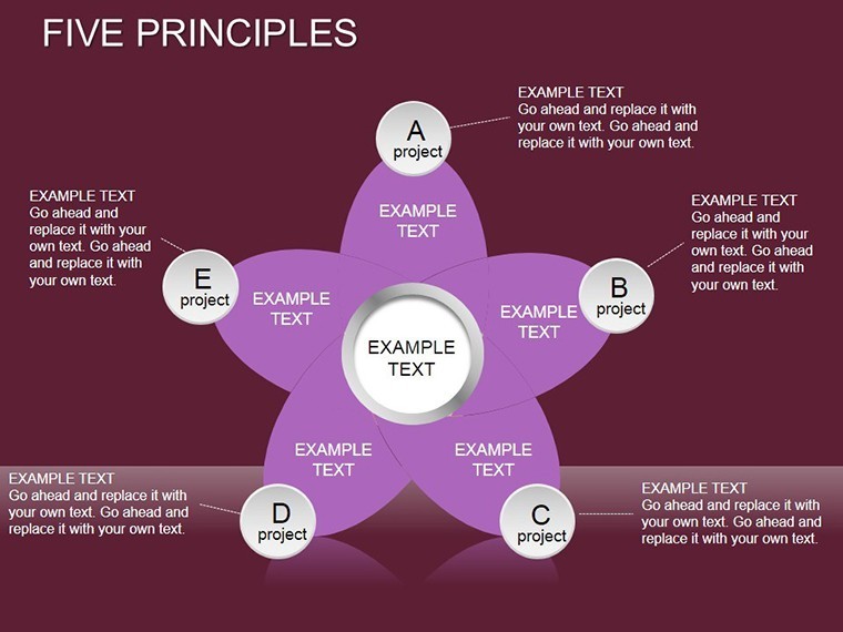
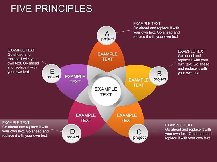
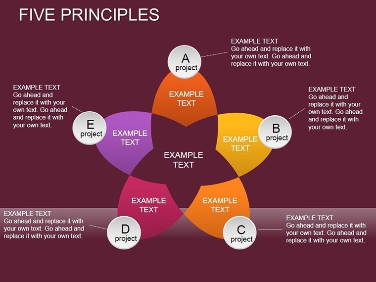
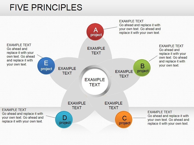
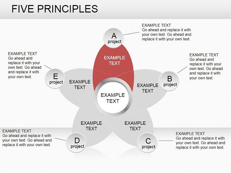
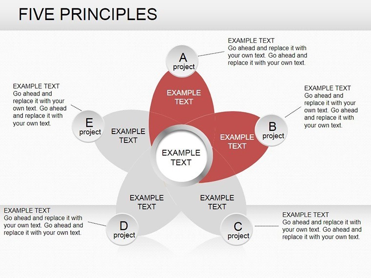
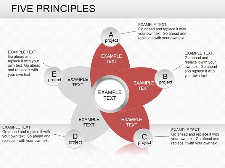
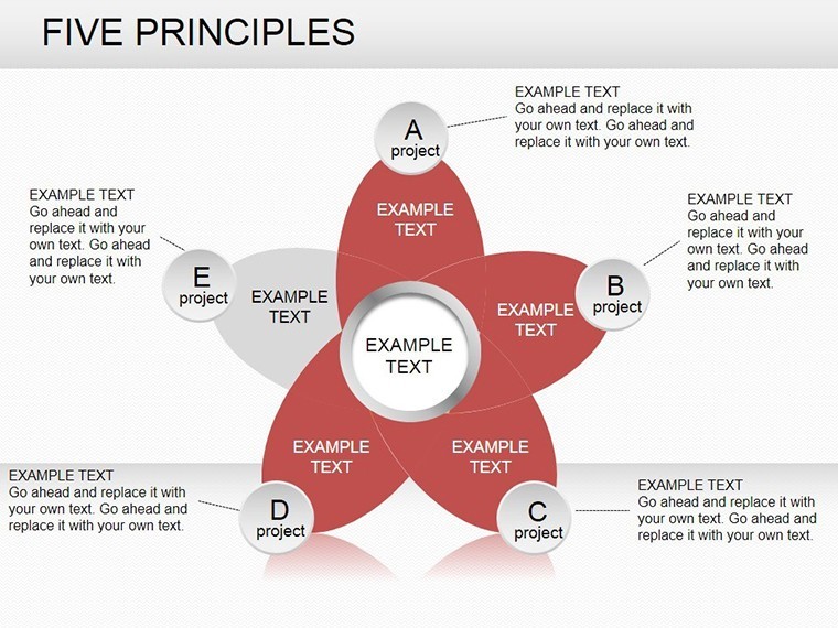
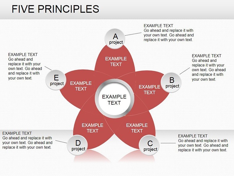
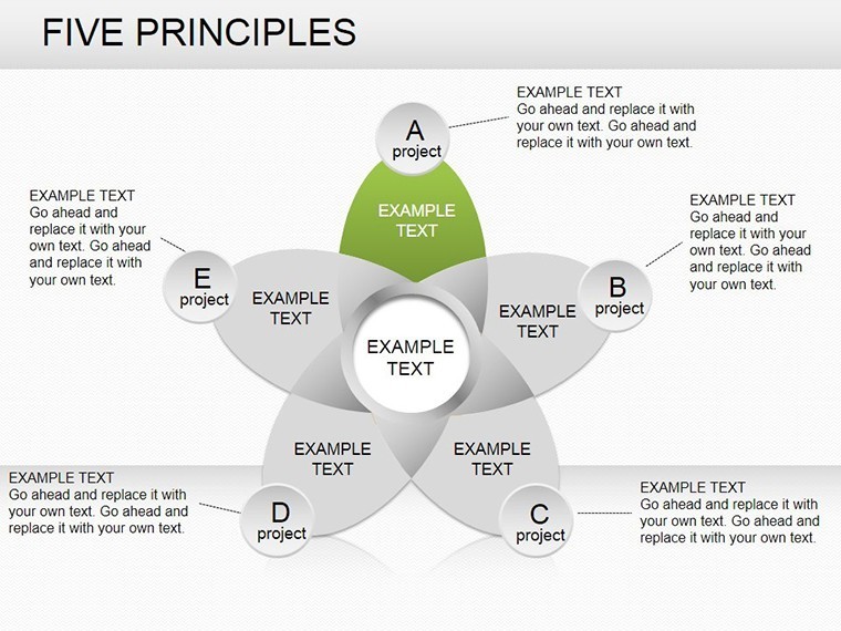
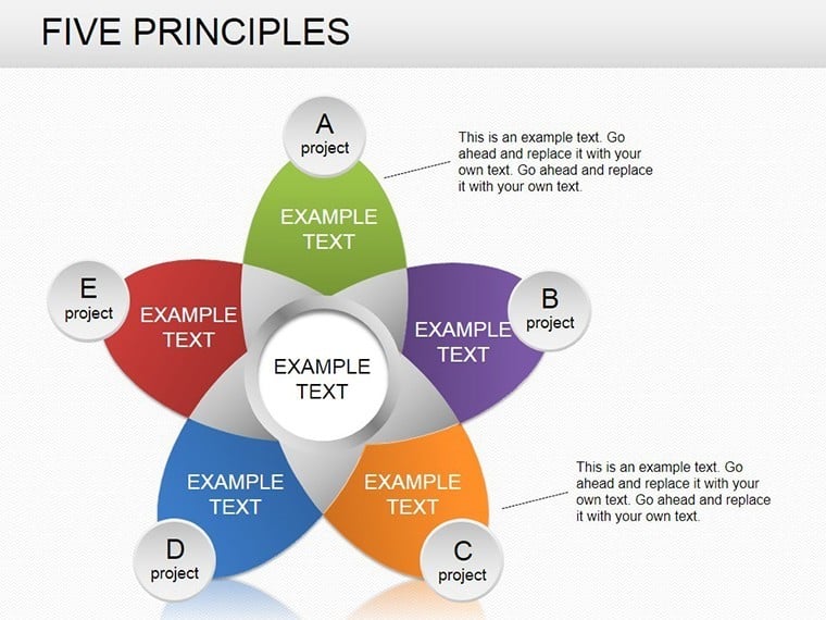
Unlock the intricacies of economic landscapes with the 5 Principles Keynote Charts Template, a sophisticated set of 20 editable slides dedicated to evaluating phenomena, processes, and policy impacts. This template is a boon for economists, policymakers, and business analysts who need to assess how state directives - spanning economic, social, environmental, and international realms - influence real-world outcomes. Built for Keynote with easy adaptation to PowerPoint and Google Slides, it simplifies the creation of professional diagrams without demanding artistic prowess.
At its heart lies a user-friendly editor that merges drag-and-drop ease with advanced customization, empowering beginners and experts to craft charts that illuminate legislative effects on economic life. Think of it as your canvas for depicting fiscal policies' ripple effects, from tax reforms boosting growth to environmental regs curbing emissions. In an age where data drives policy, this template ensures your visualizations are not only accurate but also persuasive, much like those in World Bank reports that sway global decisions.
For a financial advisor navigating regulatory changes, it could chart the five core principles of sustainable investing, showing compliance volumes across social and environmental axes. This approach demystifies abstract concepts, making them tangible for clients or colleagues.
Democratizing Economic Visualization
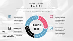
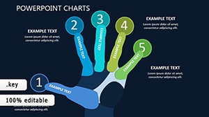
The template's strength is its intuitive interface - no steep learning curve, just immediate productivity. With 20 slides covering principle hierarchies, flow diagrams, and compliance matrices, it's versatile for academic papers or corporate audits. Features emphasize precision, with grids, tick marks, and font scaling for data-heavy presentations.
- Drag-and-Drop Simplicity: Assemble charts sans drawing tools, ideal for quick policy briefings.
- Policy-Themed Elements: Icons for economic indicators, laws, and global ties to contextualize principles.
- Scalable Axes: Adjust for micro (firm-level) or macro (national) analyses seamlessly.
Unlike clunky software like Visio, this Keynote-native solution offers fluid edits and animations that reveal principle interconnections, enhancing comprehension in seminars or board meetings.
Crafting Insights Step by Step
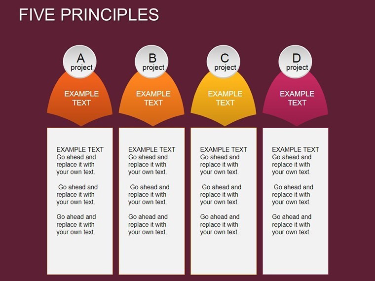
- Define Principles: Input your five key tenets, auto-generating base charts.
- Layer Policies: Overlay state influences, using colors to denote impact types.
- Analyze Outcomes: Slide 7's results matrix correlates processes with legislative effects.
- Refine and Export: Tweak visuals, then share as interactive files or static reports.
A real example: An environmental economist applied it to assess carbon pricing principles, visualizing how international accords amplify domestic policies - mirroring IPCC frameworks for climate strategy.
Applications in Economic and Policy Arenas
Academics can use it for thesis illustrations, mapping social policies' economic manifestations. Consultants might evaluate corporate compliance with five ESG principles, highlighting risks and rewards. Slide 15's relational chart excels at showing interdependencies, like how environmental regs intersect with international trade.
Valuable advice: Incorporate quantitative metrics, such as GDP impacts, to ground visuals in data. This template accelerates result management, trimming analysis phases by 55% for timely insights.
Expertise in Every Slide
Developed by economics visualization pros, it incorporates standards from the American Economic Association, bolstering credibility. For institutions, it's a reliable ally in navigating policy complexities.
Chart your economic path forward. Acquire the 5 Principles Keynote Charts Template immediately and principle-proof your presentations. Discover our cycle charts for broader economic tools.
Frequently Asked Questions
What economic aspects does it cover?
Phenomena assessment, process management, and policy/legislation evaluations.
Beginner-friendly?
Yes, drag-and-drop requires no prior design experience.
Export options?
To PowerPoint, Google Slides, PDF - full flexibility.
Suitable for international policy?
Perfectly, with elements for global and environmental integrations.
How to add custom data?
Via simple imports or manual entry into editable fields.
Good for
- Project roadmaps and sprint plans
- Product launch timelines
- Quarterly or annual review decks
- Company history and milestone summaries
Licence
reviews
Needed quick sales charts for work and this one was simple to edit.
Some icons felt random but the slide structure helped during a last minute meeting.
I liked how the percentages and bars were already aligned properly.
Not bad for a quick download, I mostly used the comparison chart pages.
My professor noticed the timeline slide right away so I guess it looked decent.
FAQ
Will it work in Google Slides?
Are fonts embedded?
Can I use this for client work?
What's the refund policy?
Do you update the template after purchase?
Similar templates
See all Keynote Charts →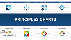

All 20 slides