 Click to zoom
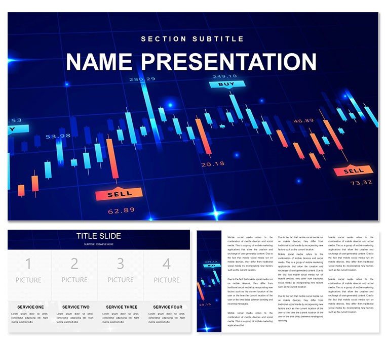
Trend Line Graph PowerPoint Template: Decode Market Movements with Clarity
| Format | .pptx |
| Slides | 3 unique layouts |
| Aspect ratio | 16:9 |
| Compatibility | PowerPoint |
| Animated | No |
| Language | English |
| License | Commercial |
| File size | — |
| Version | v1.0 |
| Last updated | December 2022 |
What's inside
Markets pulse with patterns - upward surges, sudden dips, the subtle whispers of emerging trends. For finance pros sifting through volatility or execs briefing on fiscal health, nailing those insights visually is non-negotiable. This Trend Line Graph PowerPoint Template equips you with 59 precision-tuned slides to render chaos into coherence, spotlighting trajectories that drive decisions.
Aimed at analysts, accountants, and business leaders navigating cash flows or investment portfolios, it offers three master layouts: detailed for deep dives, overview for snapshots, and narrative for story arcs. Three backgrounds - from grid-lined charts evoking trading floors to subtle monetary motifs - ground your data in relevance. Fully editable in PowerPoint 2016+, tweak lines, axes, and legends to mirror your metrics exactly.
Visualize quarterly earnings: A multi-line graph traces revenue streams, shaded areas denoting forecasts, instantly revealing growth corridors. Or, in risk reviews, overlay trend lines with volatility bands, coloring outliers for swift scrutiny. This template distills complexity, empowering presentations that persuade and predict.
Essential Features: Precision Tools for Financial Narratives
Central to this template are the 28 diagrams, each a specialist in trend depiction. Spline lines for smooth projections, stepped graphs for discrete events, all fortified with seven schemes - from bullish greens to cautionary reds. Masters ensure axis consistency, backgrounds add fiscal flair without clutter.
Adaptability reigns: Link to Excel for live feeds, or animate traces to build tension in reveals. It's designed for the data-savvy, minimizing manual alignments.
- Trend Icons: Currency symbols and arrow sets, scalable for annotations.
- Forecast Extensions: Dotted projections branching from solid historicals.
- Comparative Overlays: Dual-axis setups for juxtaposing metrics like ROI versus spend.
Versatile Use Cases: From Boardrooms to Briefings
In finance teams, deploy for portfolio analyses: Trend clusters map asset performances, hues differentiating sectors for at-a-glance insights. It echoes tools from financial modeling pros, prioritizing scannable scales.
For market reports, a sales director used layered lines to correlate campaigns with upticks, clinching budget approvals through evident correlations. In auditing, compliance overviews benefit from annotated declines, flagging anomalies early.
Step-by-Step: Forging Your Trend-Focused Deck
- Collect Data: Compile time-series - stocks, budgets - and identify key trends.
- Frame the Canvas: Choose a master for granularity; apply a background suiting monetary themes.
- Plot the Lines: Insert a trend graph, feed in values for automatic scaling.
- Refine Visuals: Select a scheme highlighting positives, add fades for sequential data entry.
- Validate Insights: Cross-check with actuals, rehearse for stakeholder questions.
This approach, battle-tested in volatile quarters, yields decks that forecast futures convincingly.
Surpass Spreadsheet Screenshots: The Professional Leap
Basic exports pale against this template's integrated legends and error bars, which auto-adjust for credibility. It signals analytical depth via uniform tick marks and extensible grids. Output to high-res prints for reports, broadening utility.
Seize market edges - acquire this Trend Line Graph template for $22 and trend toward triumph.
Frequently Asked Questions
Can trend lines handle logarithmic scales?
Yes, via PowerPoint's axis options; customize for exponential market growths seamlessly.
Suitable for stock trading apps integration?
Indirectly - import CSV data easily, though direct APIs require add-ins.
How to add confidence intervals?
Use shaded bands over lines, editable with transparency for subtle emphasis.
Multiple datasets per slide?
Up to five lines comfortably, with legends auto-positioning for clarity.
Good for
- Project roadmaps and sprint plans
- Product launch timelines
- Quarterly or annual review decks
- Company history and milestone summaries
Licence
reviews
Those circular process diagrams are good for repeating cycles.
The arrows were a bit thin but I thickened them.
Used this for a continuous improvement presentation.
Simple and gets the point across.
The center icon placeholder was useful.
FAQ
Will it work in Google Slides?
Are fonts embedded?
Can I use this for client work?
What's the refund policy?
Do you update the template after purchase?
Similar templates
See all PowerPoint Templates →

All 1 slides