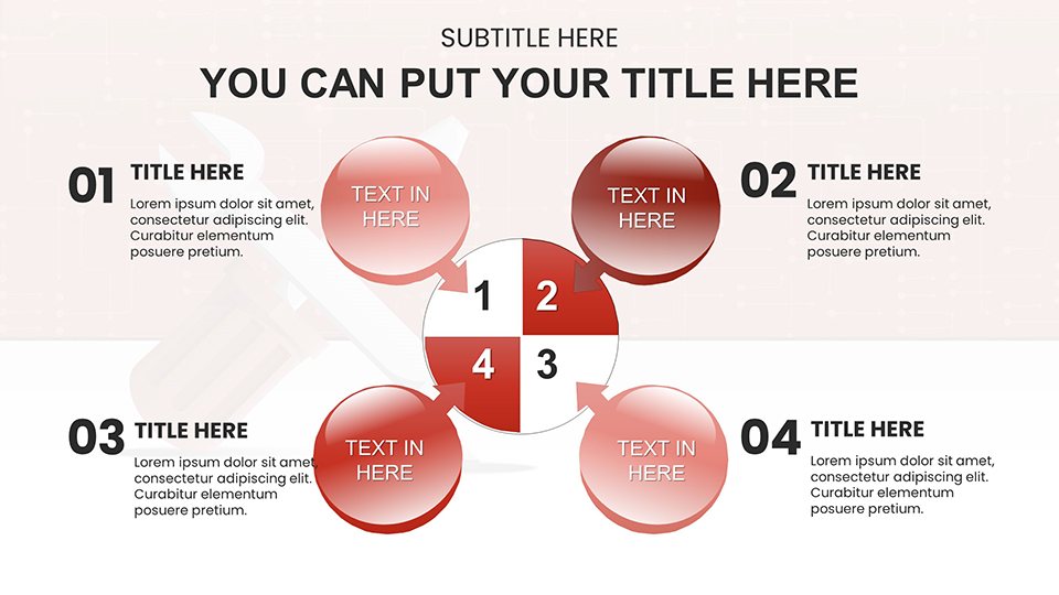
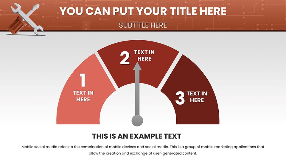
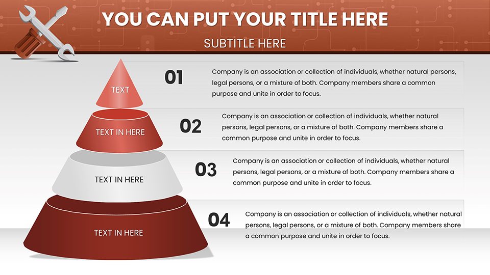
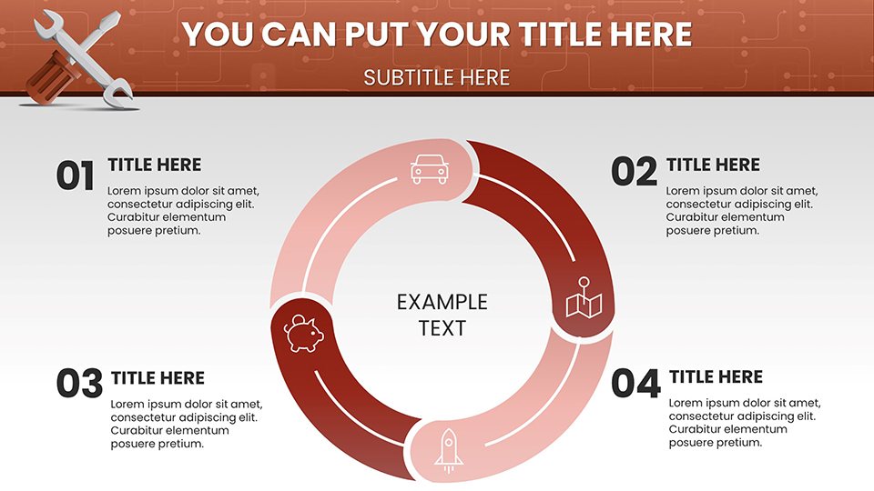
 Click to zoom
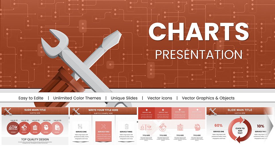
Repair Service PowerPoint Charts: Technical Diagnostic Template
| Format | .pptx |
| Slides | 58 unique layouts |
| Aspect ratio | 16:9 |
| Compatibility | PowerPoint |
| Animated | No |
| Language | English |
| License | Commercial |
| File size | — |
| Version | v1.0 |
| Last updated | January 2026 |
What's inside
Clarify Complex Repairs with Visual Precision
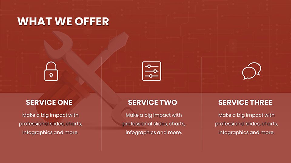
In the technical service industry, miscommunication costs money. Whether you are an automotive service manager explaining a critical engine overhaul to a customer, or an industrial maintenance lead training new technicians, verbal explanations often fall short. The Repair Service PowerPoint Charts template addresses the critical problem of technical ambiguity. It provides a structured, visual language to explain "what is broken," "how we fix it," and "why it costs this much."
This collection of 58 slides is not decorative; it is functional. It helps you answer the client's implicit questions: "How long will this take?" and "Is this part necessary?" by visually mapping the diagnostic process. For internal teams, it transforms dusty service manuals into interactive, engaging training modules.
Engineered for Service Professionals
This template is built with the logic of a workshop. It moves beyond generic shapes to include industry-relevant diagnostic flowcharts and maintenance matrices.
- Diagnostic Trees: Fishbone diagrams and decision trees specifically designed to trace symptoms (e.g., "Noise," "Leak") to root causes.
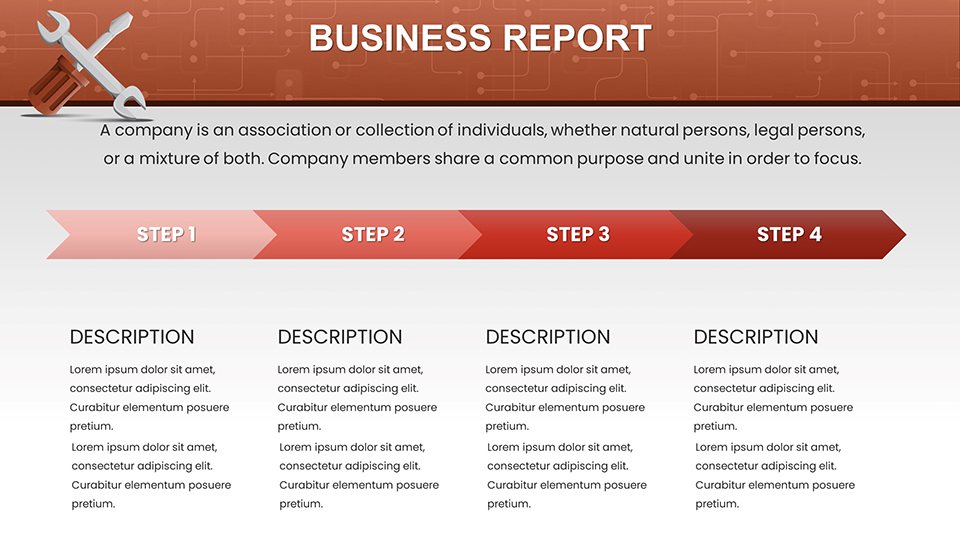
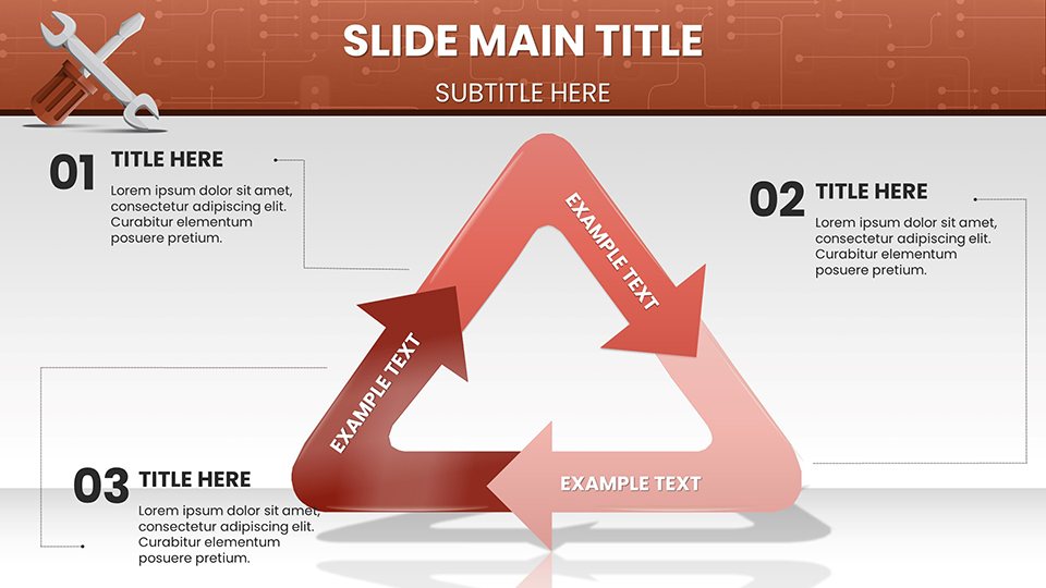
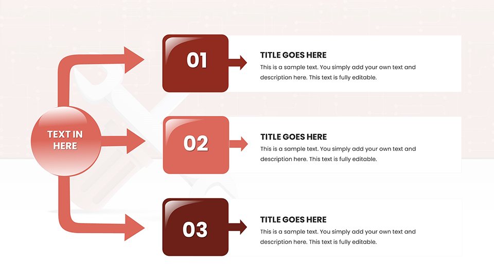
- Workflow Visualization: Step-by-step process charts that break down complex repairs into digestible phases (Diagnosis -> Parts Order -> Repair -> QC).
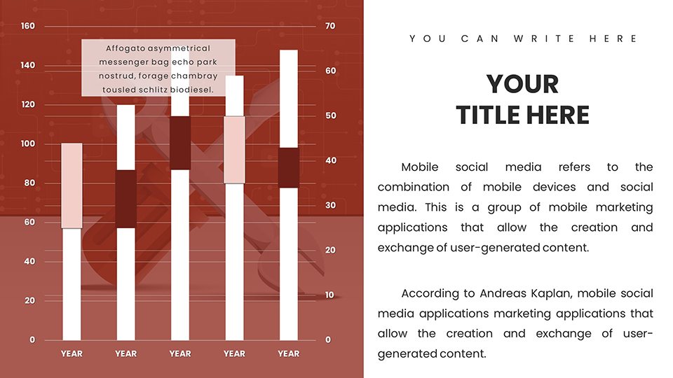
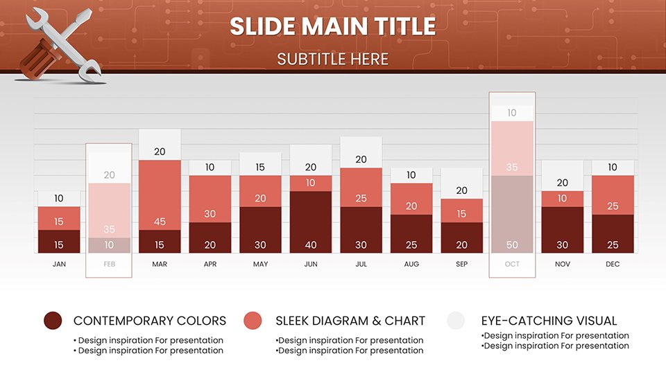
- Inventory & Metrics: Tables and matrices pre-configured for tracking parts availability, failure rates (MTBF), and technician efficiency.
Professional Use Cases
Customer Service Quotes
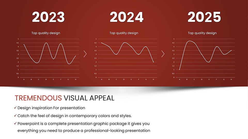
Instead of a confusing invoice, use the "Repair Timeline" slide to show a high-value client exactly where their labor hours are going. Visualizing the teardown, repair, and testing phases justifies the cost and builds trust in your expertise.
Technician Training Modules
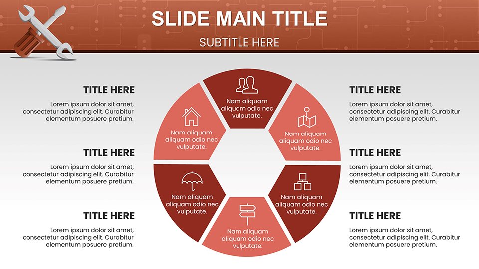
Use the tool-centric icon sets and schematic layouts to create safety briefings or "Standard Operating Procedures" (SOPs). New hires grasp visual workflows significantly faster than text-heavy manuals.
Fleet Maintenance Proposals
When pitching a maintenance contract to a logistics company, use the "Preventative vs. Reactive" comparison charts to prove how your regular service schedule reduces their long-term downtime expenses.
Workflow Integration
These charts are designed for the practical user. You can print specific slides to use as physical work orders or laminated shop floor guides. The slides are compatible with both Microsoft PowerPoint and Google Slides, meaning you can pull them up on a tablet right in the service bay. The industrial color palette (greys, blues, and alert oranges) conveys reliability and safety but is fully adjustable to match your company branding.
Real-World Example: The "Check Engine" Scenario
A customer is hesitant about a costly transmission repair. You pull up Slide #15 (Diagnostic Flow), helping them visualize the internal failure point that isn't visible from the outside. You then use the "Component Breakdown" chart to show which specific gears are damaged versus which are healthy. This visual evidence shifts the conversation from "sales pitch" to "consultative advice," significantly increasing your approval rate.
Internal Comparison: Why This Template?
RequirementRepair Service Charts (This Template)Standard FlowchartsContextIndustrial, Automotive, IT RepairOffice Admin, MarketingVisualsWrenches, Gears, Diagnostic TreesGeneric Arrows, BoxesGoalExplain Mechanics & WorkflowExplain Business HierarchyIndustry Applications
While ideal for automotive and heavy machinery, these charts are equally powerful for IT hardware repair services, HVAC contractors, and facility management teams. Any role that requires diagnosing a physical system and proposing a remedy will find these layouts essential.
Fix your presentation problems today. Download the Repair Service Charts and bring professional clarity to your technical work.
Good for
- Project roadmaps and sprint plans
- Product launch timelines
- Quarterly or annual review decks
- Company history and milestone summaries
Licence
reviews
Repair service diagnostics came alive with fishbone diagrams and decision trees. Wrench and gear icons perfectly suit auto shop training. Workflow phases from diagnosis to QC justified costs to customers visually. Industrial greys and oranges convey reliability.
Technician trainer here. Maintenance matrices and MTBF charts streamlined new hire onboarding. 58 slides cover automotive to IT repair. Printable slides as work orders are genius. Saved prep time significantly.
Fleet maintenance proposal won approval thanks to preventative vs reactive comparison charts. Schematic layouts feel workshop-authentic. Customizable for our branding. Highly practical for service pros.
As a small HVAC contractor, diagnostic flowcharts clarified issues for clients. Timeline repairs built trust. Color palette professional. A few more residential icons would help but very functional overall.
Deadline for client quote. Repair timeline slide mapped hours transparently. Component breakdown visuals shifted conversation productively. Easy data entry. Good for field tablet use.
The tool-centric icons and process charts make technical explanations accessible. Decision trees trace root causes well. Strong for industrial contexts, slightly less for consumer electronics.
FAQ
Will it work in Google Slides?
Are fonts embedded?
Can I use this for client work?
What's the refund policy?
Do you update the template after purchase?
Similar templates
See all PowerPoint Charts →
All 58 slides