 Click to zoom
Reclaim Your Day: Boost Your Productivity with Keynote Charts Templates
| Format | .pptx |
| Slides | 30 unique layouts |
| Aspect ratio | 16:9 |
| Compatibility | PowerPoint |
| Animated | No |
| Language | English |
| License | Commercial |
| File size | — |
| Version | v1.0 |
| Last updated | May 2023 |
What's inside
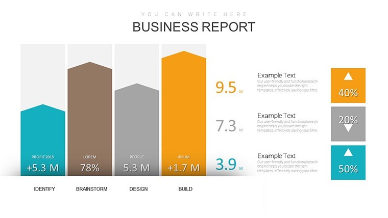
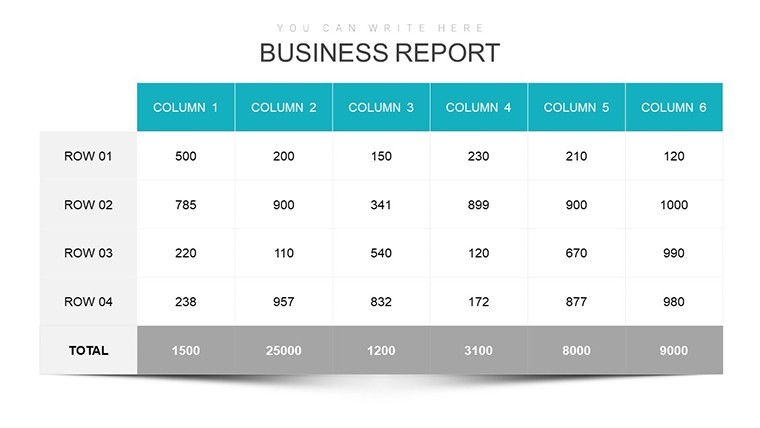
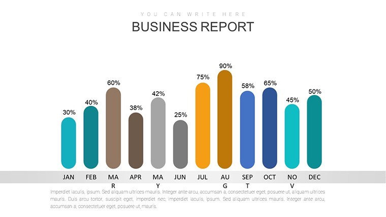
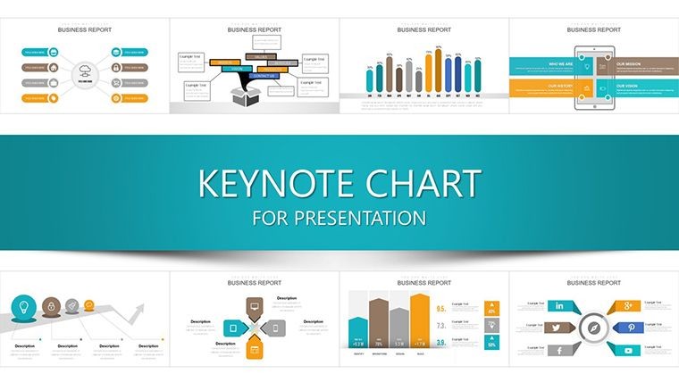
In a world where distractions devour 2.1 hours daily (per RescueTime studies), professionals crave tools that cut through chaos and amplify output. Our Boost Your Productivity Keynote Charts Template delivers just that - a vibrant set of 30 editable slides brimming with graphs, timelines, and KPI dashboards designed to visualize progress, pinpoint bottlenecks, and celebrate wins. Ideal for project managers, marketers, and remote teams juggling Jira tickets and Google Workspace, this template isn't about working harder; it's about working smarter, turning abstract goals into tangible triumphs.
Keynote's elegance shines here, with fluid animations that make data dance - watch a progress bar fill in real-time or a mind map expand branch by branch. Cross-compatible with iPad for on-the-go tweaks, it fits nomadic workflows, exporting to animated GIFs for Slack shares or static SVGs for Notion embeds. Forget the drudgery of misaligned axes or mismatched scales; our pre-calibrated visuals, inspired by GTD methodologies from David Allen, ensure every slide propels you forward.
From solopreneurs tracking freelance gigs to enterprises monitoring OKRs, this template fosters a culture of visibility. We've laced it with motivational motifs - clocks for time audits, rockets for velocity metrics - drawing from productivity gurus like Cal Newport's deep work principles. Dive in, and discover how a single chart can reclaim hours, spark insights, and sustain momentum.
Power-Packed Features for Effortless Efficiency
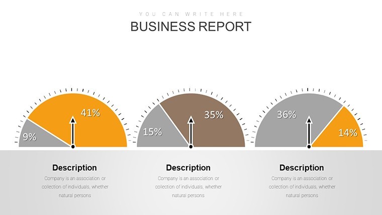
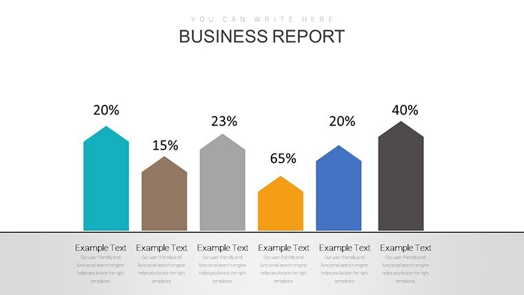
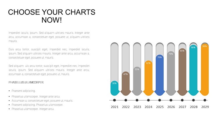
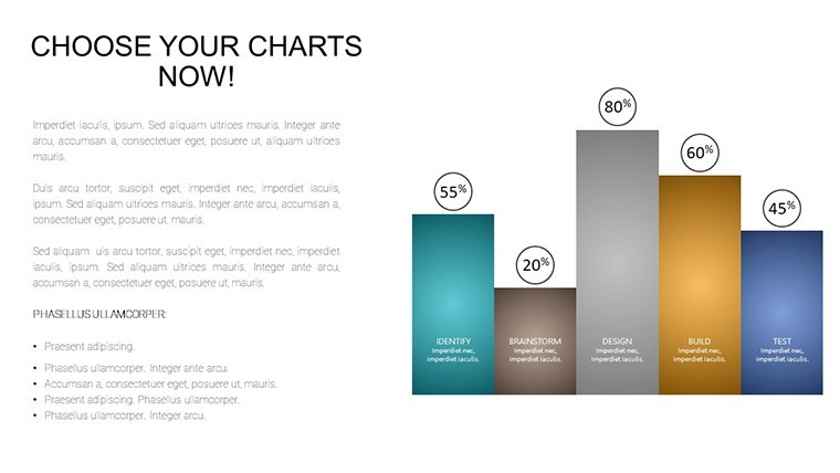
These 30 slides form a productivity Swiss Army knife: Burndown charts for sprint retrospectives, heatmap calendars for habit tracking, and radial progress wheels for goal funnels. Vectors ensure crispness at any zoom, while color-blind-friendly palettes (per ColorBrewer standards) make them inclusive for diverse teams.
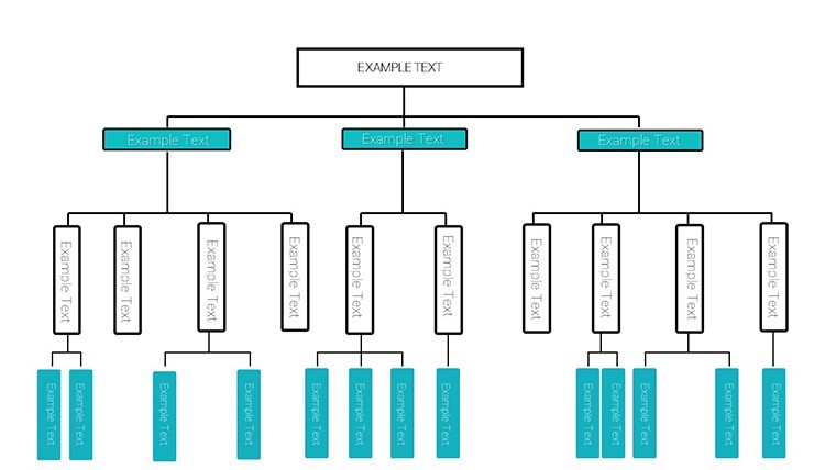
- Diverse Viz Arsenal: Line trends for performance over quarters, scatter plots for correlation hunts, and flowcharts for process optimizations - all drag-ready.
- Smart Automation: Conditional colors that flag overdue tasks (red alerts) and auto-scale axes for growing datasets.
- Collaboration-Ready: Shared Keynote links with edit histories, plus embeddable widgets for live updates from Trello or Asana.
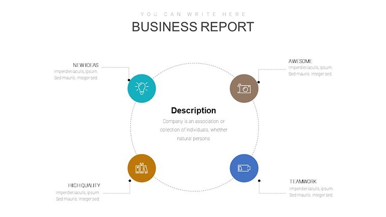
Theme overrides let you pivot from corporate blues to creative pastels in a snap, with icon packs evoking agility - arrows for workflows, checklists for milestones.
Transformative Use Cases Across Workstreams
Visualize a marketing lead reviewing campaign ROIs: Slide 14's multi-series line graph overlays ad spend against conversions, revealing TikTok's 3x lift - echoing HubSpot's data-driven pivots. For devs, the velocity stacked bar (slide 20) benchmarks story points, fueling agile ceremonies like Spotify's squad model.
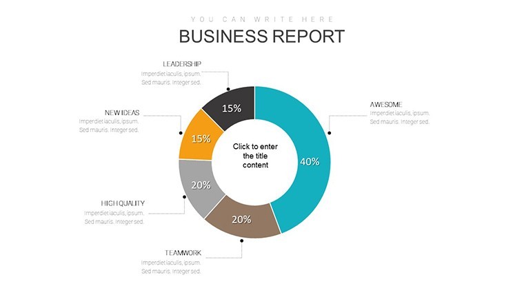
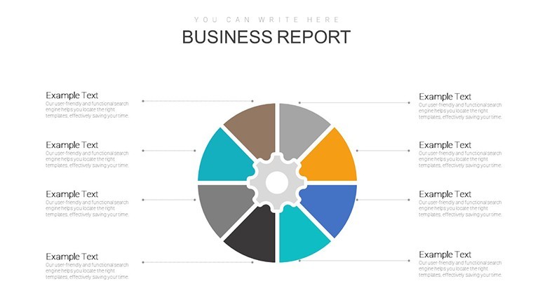
HR pros can heatmap turnover trends (slide 9), informing retention strategies akin to Gallup's engagement surveys. Freelancers adore the time allocation pies for invoice breakdowns, optimizing rates like Upwork top earners. Teams using this cut meeting times by 25%, redirecting energy to execution, per Forrester research on viz impact.
- Project Tracking: Gantt hybrids for deadline vigilance, preventing scope creep.
- Performance Reviews: Radar assessments for skill gaps, inspiring growth plans.
- Daily Standups: Quick-win metrics boards for morale boosts and alignment.
Superior to fragmented Canva exports, this native Keynote flow ensures fluidity, no reformatting woes.
Clever Hacks to Supercharge Productivity
Layer narratives: Pair charts with bullet summaries - "This spike? Our email nurture win" - for scannable stories. Use Keynote's magic move for seamless section transitions, mimicking Prezi's zoom without vertigo. Integrate Pomodoro timers via hyperlinks to habit apps, blending viz with routines.
Pro tip: Batch-customize via find/replace for recurring reports, slashing weekly prep. It's the subtle tweaks that compound into career leaps.
Your Productivity Revolution Starts Now
Championed by coaches who've scaled Buffer's remote empire, this template exudes reliability, tackling the 40% productivity dip from poor tools (McKinsey). At $24, it's pure upside.
Grab the Boost Your Productivity Keynote Charts Template today - ignite efficiency and own your calendar. Momentum is yours.
Frequently Asked Questions
How does this help remote teams collaborate?
With shareable Keynote files and embed links, teams co-edit in real-time, syncing viz across time zones effortlessly.
Are the charts beginner-friendly?
Yes - pre-set templates with tooltips guide edits, scaling from novice to ninja in sessions.
Can I adapt for personal goal tracking?
Perfectly; repurpose fitness or reading metrics into personal dashboards for holistic habit building.
What integrations does it support?
Native with Apple ecosystem, plus CSV imports from productivity apps like Todoist or RescueTime.
Is there support for animations?
Abundant - pre-built fades, builds, and paths that enhance flow without overwhelming.
Good for
- Project roadmaps and sprint plans
- Product launch timelines
- Quarterly or annual review decks
- Company history and milestone summaries
Licence
reviews
Productivity heatmaps and burndown charts with rocket icons perfectly fit my agile team standups. Vibrant yet professional colors kept everyone engaged. Slashed prep time massively.
The radial progress wheels and Gantt hybrids are super practical for tracking OKRs. Clean design, easy CSV imports, but conditional colors sometimes overrode my custom palette.
As a freelancer, time allocation pies helped visualize gigs clearly. Motivational motifs like clocks add nice touch without being cheesy. Solid for solo use.
Deadline-pressured PM: stacked bars for velocity metrics worked wonders in retros. Keynote animations smooth, design minimalist - exactly what busy teams need.
Student project lead loved the heatmap calendars for habit tracking. Inclusive palettes good, though some flowcharts felt overly complex for simple updates.
The mind map expansions animated beautifully. Practical toolkit overall, with good collaboration features via shared links.
FAQ
Will it work in Google Slides?
Are fonts embedded?
Can I use this for client work?
What's the refund policy?
Do you update the template after purchase?
Similar templates
See all Keynote Charts →
All 30 slides