 Click to zoom
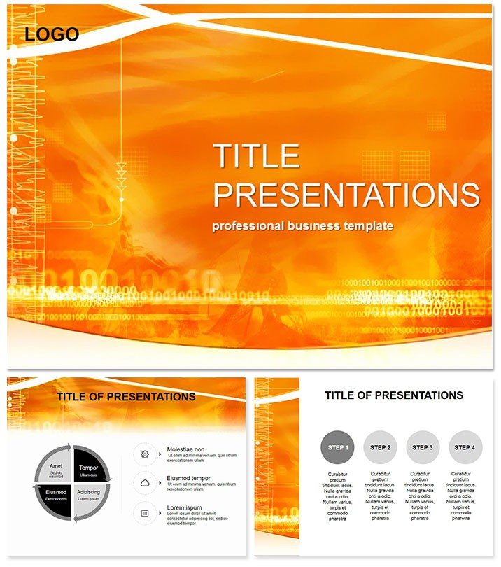
Radio Waves Pulses Science PowerPoint Template
| Format | .pptx |
| Slides | 3 unique layouts |
| Aspect ratio | 16:9 |
| Compatibility | PowerPoint |
| Animated | No |
| Language | English |
| License | Commercial |
| File size | — |
| Version | v1.0 |
| Last updated | October 2021 |
What's inside
Harness the invisible hum of innovation, where waves of data dance into discovery. This Radio Waves Pulses Science PowerPoint Template resonates with researchers, physicists, and comms experts, decoding frequencies into fascinating flows.
Synced to PowerPoint 2016+, $22 for perpetual pulses. Tune into transformative presentations that broadcast brilliance.
Frequency Features: Tuned Essentials
Oscillating with 3 masters, backgrounds, 28 diagrams in 7 spectrum schemes - violet vibes to infrared warms.
- Sinusoidal Icons: Waveforms for signal modulations.
- Spectrum Analyzers: Band graphs for bandwidth breakdowns.
- Modular Matrices: Interference patterns in grid forms.
- Signal Assets: .potx with .jpg waveforms.
Transmits clarity beyond stock static, minimizing noise in design.
Wavelength Walkthrough: Slide Signals
28 slides transmit theory to practice. Slide 1`s oscillating opener sets amplitude. Pulses 2-8: crest-trough lines plot transmissions.
Interference insights 9-15: overlap ovals model echoes. Bandwidth builds 16-22: envelope curves envelope capacities.
Application antennas 23-28: propagation paths arc futures. Phased reveals simulate transmissions.
Broadcast Beats: Dynamic Deployments
Telecom engineers demo 5G with Slide 3`s density waves, phasing arrays to stakeholders. Art profs visualize soundscapes via pulse palettes, inspiring sonic sculptures.
Science fair mentors guide hypotheses through flow fractals. Outfrequencies defaults with resonant relevance.
Amplify authority - secure this template promptly to wave hello to wow.
Frequently Asked Questions
For audio engineering too?
Resonate - adapt waveforms for frequency responses in mixes.
Mathematical equation embeds?
Equation boxes fit seamlessly beside curves.
High-res for projections?
Vector purity ensures crisp clarity at any scale.
Team sharing enabled?
Cloud-sync ready for collaborative tuning.
Custom wave generation?
Shape tools craft bespoke oscillations.
Good for
- Project roadmaps and sprint plans
- Product launch timelines
- Quarterly or annual review decks
- Company history and milestone summaries
Licence
reviews
Tried to use the waveform diagrams for a physics report on radio frequencies but the graphs were actually simpler to edit than I expected.
The spectrum analyzer band graphs are great for visualizing bandwidth breakdowns in a team meeting.
Helped me finish a last-minute poster for a science fair. The oscillating opener slide caught a lot of attention.
Its decent but the sinusoidal icons are hard to customize if you need exact values.
Good for any science or telecom presentation. I like the color schemes that range from violet to infrared.
FAQ
Will it work in Google Slides?
Are fonts embedded?
Can I use this for client work?
What's the refund policy?
Do you update the template after purchase?
Similar templates
See all PowerPoint Templates →



All 1 slides