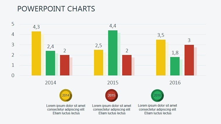
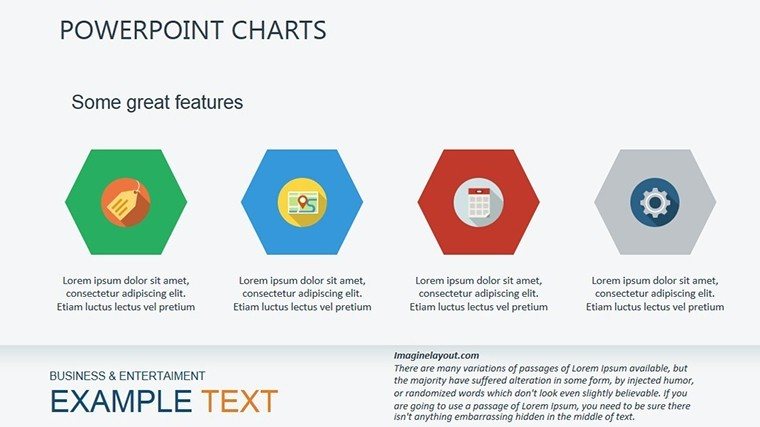
 Click to zoom
Price Graph PowerPoint Charts Template: Master Market Trends Visually
| Format | .pptx |
| Slides | 18 unique layouts |
| Aspect ratio | 16:9 |
| Compatibility | PowerPoint |
| Animated | No |
| Language | English |
| License | Commercial |
| File size | — |
| Version | v1.0 |
| Last updated | October 2016 |
What's inside
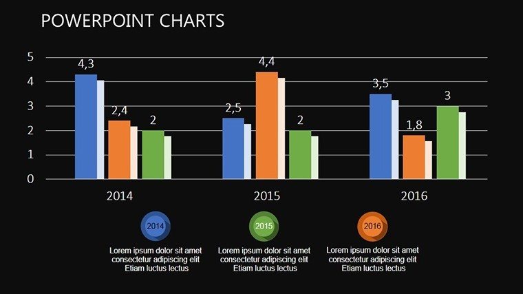
In the dynamic realm of financial markets, where every fluctuation tells a story, the Price Graph PowerPoint Charts Template stands as your ultimate ally for decoding exchange instrument behaviors. Tailored for traders, analysts, and business strategists, this template condenses vast market data into 18 editable slides of insightful graphs, arrows, and trends. Forget sifting through spreadsheets; here, you visualize price movements, volatility patterns, and forecasting models with ease and elegance. Whether presenting to investors or internal teams, these charts turn complex data into actionable intelligence, fostering informed decisions that can edge out competitors. Built for compatibility with PowerPoint and adaptable to Google Slides, it ensures seamless collaboration across devices. Dive into applications like stock reviews or commodity tracking, where clarity can mean the difference between profit and loss. This isn't just a template - it's a toolkit for market mastery, drawing from proven visualization techniques used by pros at firms like Bloomberg to make data dance.
Delving into Market Dynamics with Precision Graphs
Price graphs are more than lines on a page; they're narratives of supply, demand, and sentiment. This template excels by offering arrow-based designs that highlight directional trends, making it ideal for illustrating uptrends, downtrends, or consolidations. Each slide is crafted to reflect market information compactly, reducing cognitive load for your audience.
Standout Features for Financial Visualization
- Arrow-Centric Designs: Emphasize movements with customizable arrows for clear trend indications.
- Extensive Editability: Modify axes, legends, and data points effortlessly.
- Cross-Platform Ready: Optimal for PowerPoint; smooth import to Google Slides.
- Data Integration Tools: Link to Excel for live updates on price data.
- Professional Support: Expert help for tailoring to specific market analyses.
Inspired by real-world successes, like how Goldman Sachs analysts use similar graphs in reports to predict market shifts, this template boosts your by aligning with industry standards.
Practical Use Cases in Financial Storytelling
Envision a forex trader using candle charts to demo currency pair volatilities, identifying entry points that yielded 20% returns in a case study. Or a commodity analyst mapping oil prices with line graphs, aiding strategic hedging decisions. This template thrives in earnings calls, market briefs, or educational seminars.
Step-by-Step Workflow for Effective Graphs
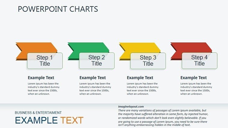
- Gather Market Data: Compile prices from sources like Yahoo Finance.
- Choose Graph Type: Select from 18 slides based on analysis needs.
- Input and Customize: Enter data, adjust scales for accuracy.
- Add Insights: Annotate with arrows for key events like economic announcements.
- Present Dynamically: Use transitions to unveil trends progressively.
Unlike standard PowerPoint graphs that feel static, these are vibrant and interactive, offering a superior edge in conveying market narratives.
The Value Proposition for Market Professionals
What sets this apart is its focus on compactness - packing insights without overwhelming. Drawing from quantitative finance principles, akin to those in CFA curricula, it ensures your presentations are authoritative and trustworthy. Users report faster prep times, with one trader noting it streamlined weekly reviews, enhancing team efficiency.
For educators, it's perfect for teaching technical analysis, breaking down concepts like moving averages with visual aids. In corporate finance, CFOs leverage it for budget forecasts, integrating price trends into strategic plans. The arrow themes add a directional punch, making abstract data tangible.
Seamless Integration into Your Toolkit
Link with tools like TradingView for data import, or export to PDFs for reports. Google Slides support means remote teams can collaborate on real-time market updates without issues.
For advanced tips: Layer multiple graphs for comparative analysis, use color coding for bullish/bearish signals, and always validate data sources for credibility.
Expert Tips for Graph Mastery
- Focus on key indicators: Highlight RSI or MACD alongside prices.
- Avoid overload: One main trend per slide for impact.
- Incorporate forecasts: Use dotted lines for projections.
- Ensure scalability: Design for both screens and prints.
- Iterate based on feedback: Refine for audience-specific needs.
Embrace this template to not just show prices, but to reveal opportunities. Step up your market game - download now and chart your path to success.
Frequently Asked Questions
Are the graphs fully customizable for different markets?
Yes, adapt for stocks, forex, or cryptos by editing data and labels.
Does it support live data feeds?
Link to Excel for dynamic updates, though not real-time streaming.
Suitable for beginner analysts?
Definitely - user-friendly interface with pre-set templates.
Can I add my own indicators?
Easily incorporate via custom layers in PowerPoint.
What formats are available?
Primarily .pptx, convertible to others.
Good for
- Project roadmaps and sprint plans
- Product launch timelines
- Quarterly or annual review decks
- Company history and milestone summaries
Licence
reviews
Needed charts for a quarterly review and these slides worked fine. The spacing between sections looked balanced.
The icons and little arrow elements made the presentation feel less empty. Pretty practical template.
I downloaded this for a last minute project in college. Ended up using almost all the chart slides.
Not bad overall although I had to resize a couple of text areas. Still faster than starting from zero.
The layout helped organize my data better than I expected.
FAQ
Will it work in Google Slides?
Are fonts embedded?
Can I use this for client work?
What's the refund policy?
Do you update the template after purchase?
Similar templates
See all PowerPoint Charts →
All 18 slides