 Click to zoom
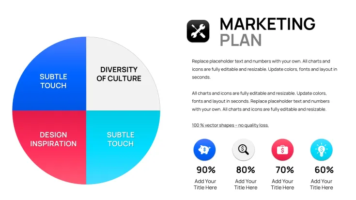
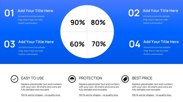
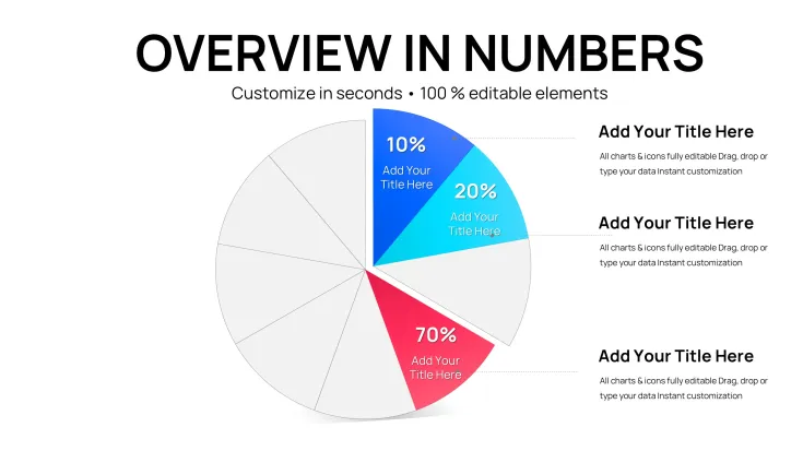
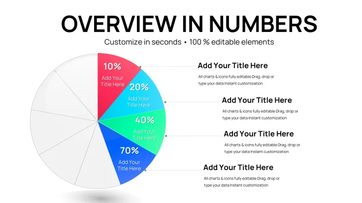
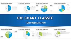
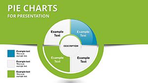
PowerPoint Pie Charts Template
| Format | .pptx |
| Slides | 26 unique layouts |
| Aspect ratio | 130/73 |
| Compatibility | PowerPoint |
| Animated | No |
| Language | English |
| License | Commercial |
| File size | — |
| Version | v1.0 |
| Last updated | December 2025 |
What's inside
Precision Data Storytelling with Pie Charts in PowerPoint
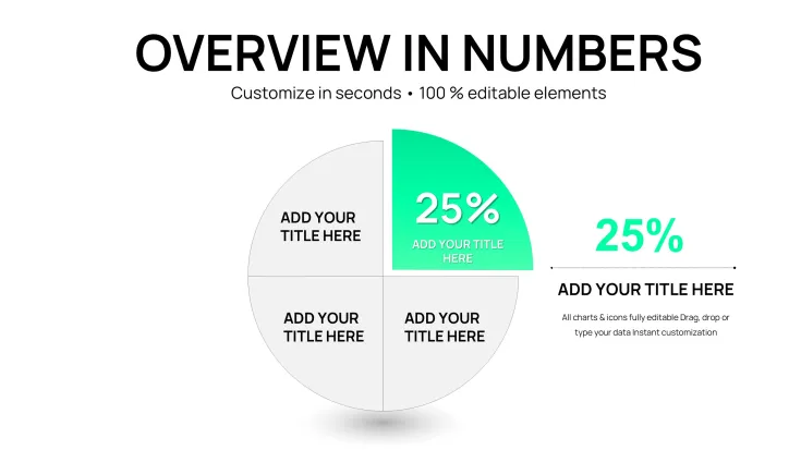
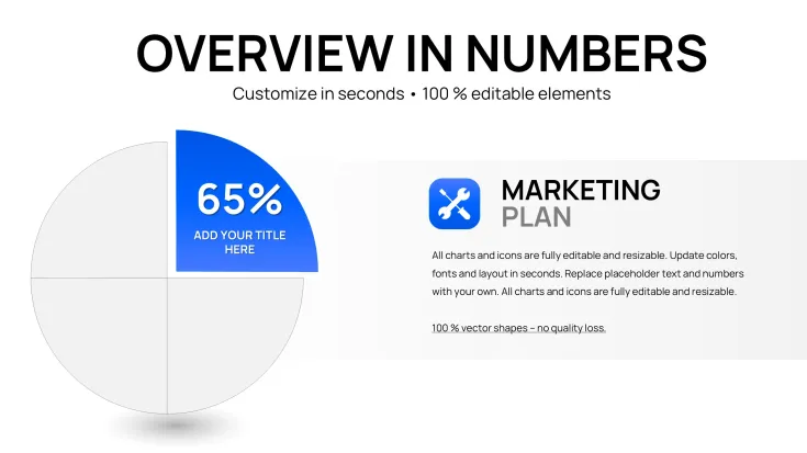
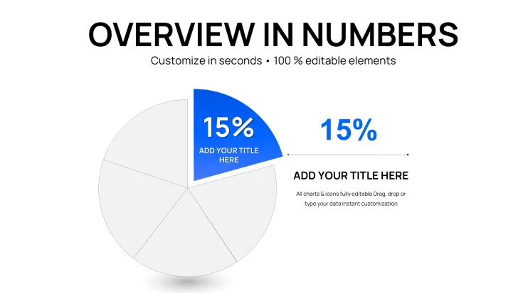
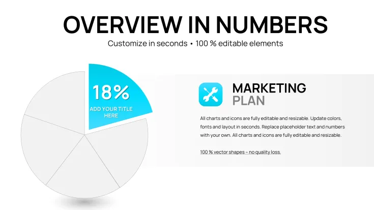
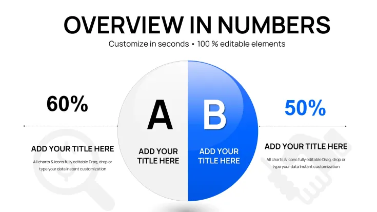
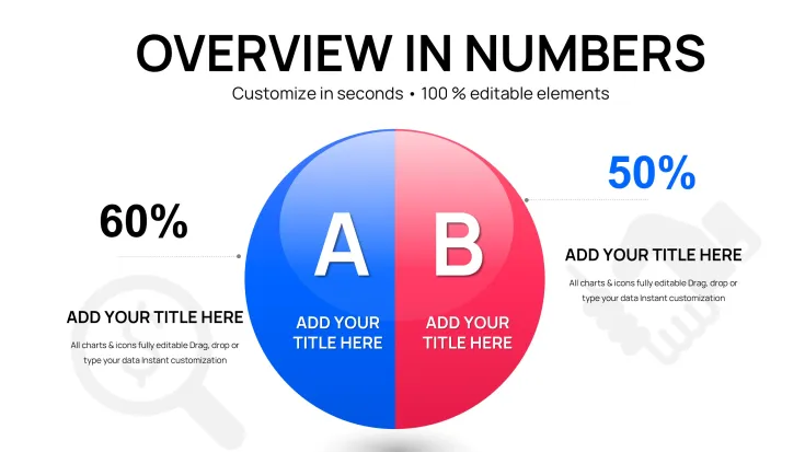
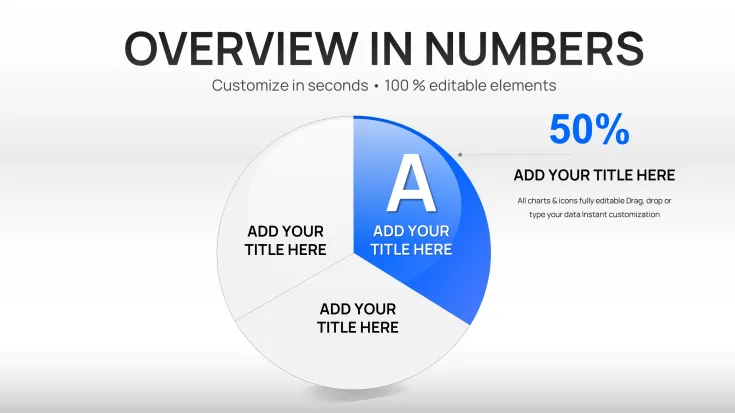
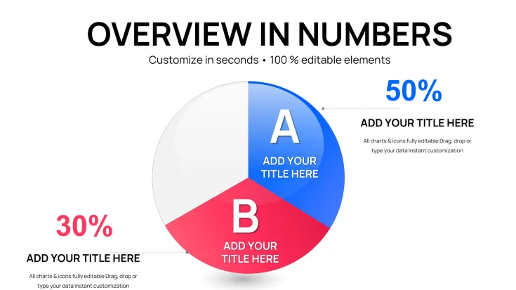
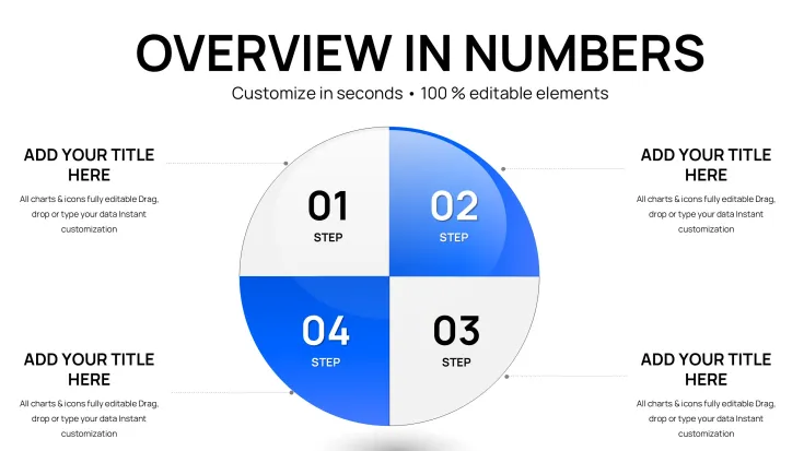
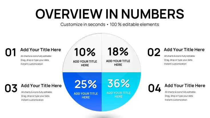
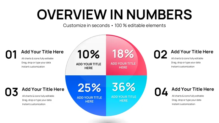
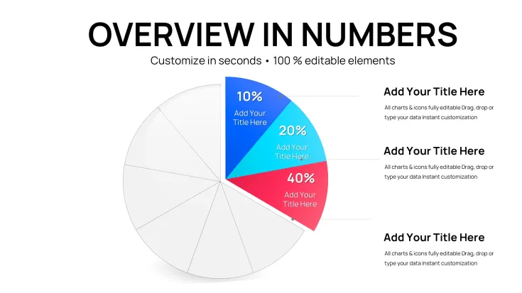
Having built countless decks for C-level executives in finance and marketing, I rely on tools that cut through noise to deliver clear insights. This PowerPoint pie chart template, with its 26 editable slides, is my go-to for visualizing proportions in high-stakes meetings. It`s designed for precision, turning raw numbers into segmented circles that highlight distributions without confusion.
Picture breaking down quarterly revenues: one slice for product lines, another for regions, all color-coded for instant comprehension. I`ve deployed it in investor updates for tech startups, where showing market share splits convinced boards to approve expansions. Fully compatible with PowerPoint 2016 onward, it offers a one-time license for unlimited refinements, fitting seamlessly into ongoing reporting cycles.
With 2024-2025 emphases on data-driven decisions, this template supports quick updates via linked sources, ensuring your visuals stay relevant in volatile markets. It`s practical expertise in action, helping you focus on strategy rather than slide tinkering.
Core Features for Data Visualization Excellence
Every element in this template is engineered for accurate, engaging data representation.
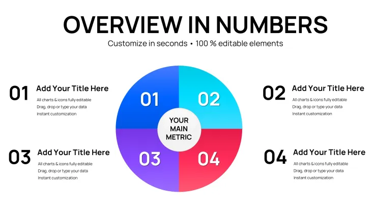
- Segmented Pie Divisions: Easily adjust slice sizes to reflect percentages, like allocation in project budgets.
- Dynamic Color Coding: Assign hues to categories for quick pattern recognition in sales breakdowns.
- Label and Legend Flexibility: Position text for readability, with options for pull-out emphasis on key segments.
- Data Connectivity: Pull from spreadsheets to auto-update figures, such as expense ratios.
- Varied Layout Designs: From standard pies to doughnut variants for comparative overviews.
These features empower you to create visuals that inform and persuade effectively.
Professional Applications of This Template
Analysts in corporate settings use it for financial reviews, while educators illustrate statistical concepts. Marketers segment audience demographics, and government officials present funding distributions in policy briefs.
Seamless Workflow Incorporation
Begin by inputting your dataset - perhaps from Google Sheets - into the template`s fields. Fine-tune segments, add animations for reveal effects, and preview on multiple screens. Share via cloud links or print for detailed discussions.
Practical Examples from Client Work
In a budget alignment session for a manufacturing client, I segmented pies to show cost distributions across operations, materials, and labor - facilitating targeted cuts that saved significant overhead. A sales director used it to pie-chart regional performances, spotlighting underperformers and driving focused incentives. For an academic seminar, it depicted survey results on consumer preferences, making abstract data relatable and discussion-worthy.
Consulting Engagements
Advisors break down client portfolios with pies showing asset classes, aiding in rebalancing strategies during reviews.
Management Overviews
Executives visualize team workloads, with slices for tasks, ensuring balanced assignments in planning meetings.
Startup Investor Pitches
Founders illustrate equity splits or revenue streams, building trust with transparent, proportional displays.
Comparison: This Template vs. Standard PowerPoint Options
FeatureThis Pie TemplateDefault PowerPoint ChartsCustomization SpeedPre-formatted slices with instant resizingTime-consuming manual adjustmentsAnimation CapabilitiesSmooth slice explosions for emphasisGeneric fades without targeted highlightsAesthetic QualityProfessional gradients and bordersBasic fills needing custom enhancementsData SyncReal-time links to external sourcesStatic entries requiring re-entryLayout VarietyMultiple styles including 3D viewsLimited to core typesOpt for this to achieve polished results efficiently.
Consider how this could streamline your data presentations - worth exploring for sharper communications.
Industry-Specific Use Cases
In healthcare, pies show patient demographics or resource allocations. Retail tracks inventory categories, while nonprofits detail donation usages for transparency in reports.
Secure Your Data Visualization Edge Now
Step up your game with this pie chart template - essential for pros who demand accuracy and impact in every slide.
Frequently Asked Questions
- How do I update slice percentages dynamically? Connect to your data source, and changes reflect instantly in the chart segments.
- Does it support 3D pie variations? Yes, toggle for depth effects to add visual interest in reports.
- Can labels be automated? Absolutely, with formulas pulling values and percentages directly.
- Is it suitable for large datasets? Handles up to 10 slices effectively; for more, use grouped categories.
- What about color accessibility? Built-in palettes ensure contrast for color-blind friendly designs.
- How to animate individual slices? Apply effects per segment for sequential reveals in storytelling.
Good for
- Project roadmaps and sprint plans
- Product launch timelines
- Quarterly or annual review decks
- Company history and milestone summaries
Licence
reviews
The graph templates helped organize my analytics dashboard presentation.
I liked the cleaner chart styles more than the decorative ones.
Some slides needed resizing before printing.
Worked fine in PowerPoint without formatting issues.
Useful when you don’t want to build charts manually.
FAQ
Will it work in Google Slides?
Are fonts embedded?
Can I use this for client work?
What's the refund policy?
Do you update the template after purchase?
Similar templates
See all PowerPoint Charts →
All 26 slides