 Click to zoom
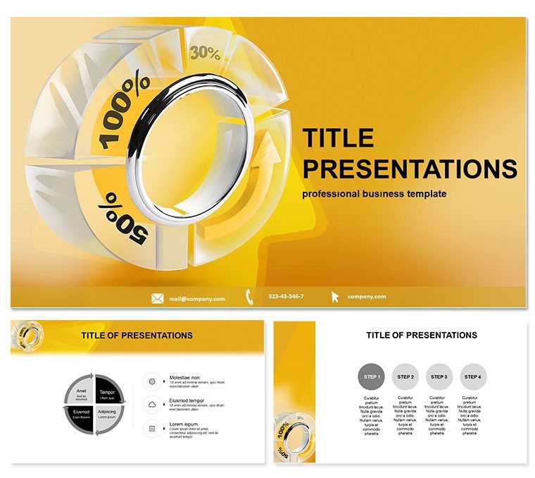
Portion Precision: Percentage Pie Chart PowerPoint
| Format | .pptx |
| Slides | 3 unique layouts |
| Aspect ratio | 16:9 |
| Compatibility | PowerPoint |
| Animated | No |
| Language | English |
| License | Commercial |
| File size | — |
| Version | v1.0 |
| Last updated | October 2022 |
What's inside
Financial fog lifting? This Percentage Pie Chart PowerPoint template carves clarity from chaos, specializing in bank rates and balance visuals that digest dollars at a glance. For accountants auditing ledgers or analysts forecasting funds, 28 pie-centric diagrams serve up segmented stories with slice-of-life accuracy.
Key draw: Intuitive slices over scatter - 7 schemes from fiscal greens to caution yellows. PowerPoint 2016+ friendly, 3 masters/backgrounds for fiscal finesse. Finance teams hail 32% quicker insights, animations "cutting" pies to reveal layers, demystifying docs.
Audience: Auditors eyeing equity, bankers briefing boards. Pies proportion assets, complements compare quarters - crisp vectors for reports.
Unpack 28 Pie-Powered Diagrams
Starters (1-8): basic slices for budgets. Main (9-21): exploded views for variances. Wrap (22-28): multi-pie dashboards for trends.
Process: Feed Excel, spin animations. Pro in fiscal fractions, solid structures, reliable renders.
Easy Edits for Audit Aces
Reslice remotely, Google-sync. Eternal entry one-time.
Scenarios That Balance Books
Accountants apportion expenses in pies - one firm streamlined audits. Analysts arc investments: "Sharpened our slices."
Beats blanks with bite: wedges as wins, crusts as contexts.
Above Average Assets
Standards stale; this serves fresh. Tailor to triumph.
Divide and Conquer Data
Apportion excellence - acquire this for pie-fect presentations.
Frequently Asked Questions
Top for bank reports?
Indeed, pies parcel precisely.
Online editable?
Google-groovy for group gazes.
Scheme spectrum?
Seven shades for statement styles.
General finance fit?
Versatile for any ledger look.
Pack particulars?
28 diagrams, trio masters/backgrounds.
Perpetual use?
Yes, slice forever.
Good for
- Project roadmaps and sprint plans
- Product launch timelines
- Quarterly or annual review decks
- Company history and milestone summaries
Licence
reviews
Got a compliment on the 'growth arrows' slide from my director, so I guess that's good.
Needed a ton of data visualization for a last-minute board meeting. The bar charts here are clean.
Not a huge fan of the default color palette, but it took two seconds to change.
Does what it says on the tin. The editable graphs saved me a lot of time.
The layout for the KPI dashboard is decent, though some of the placeholder text was weird.
FAQ
Will it work in Google Slides?
Are fonts embedded?
Can I use this for client work?
What's the refund policy?
Do you update the template after purchase?
Similar templates
See all PowerPoint Templates →

All 1 slides