 Click to zoom
Orientation Wave PowerPoint Charts: Navigate Data with Fluid Precision
| Format | .pptx |
| Slides | 8 unique layouts |
| Aspect ratio | 16:9 |
| Compatibility | PowerPoint |
| Animated | No |
| Language | English |
| License | Commercial |
| File size | — |
| Version | v1.0 |
| Last updated | August 2023 |
What's inside
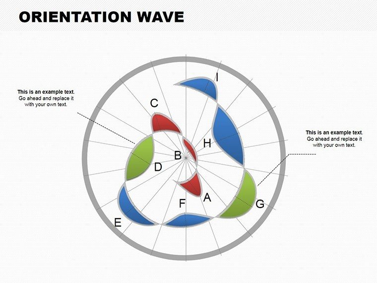
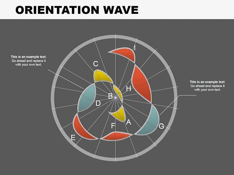
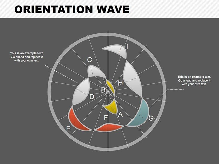
Picture this: You're an urban planner unveiling a new city layout, where orientation and flow are key to convincing stakeholders. Standard charts fall flat, but our Orientation Wave PowerPoint Charts Template changes the game. With 8 meticulously crafted editable slides, this tool uses wave-like designs to represent data trends, orientations, and progressions in a visually fluid manner. Tailored for architects, landscape designers, and project managers, it helps illustrate site orientations, wind flow patterns, or pedestrian traffic simulations with elegance and ease. No more static slides - embrace waves that guide your audience through complex spatial data, making abstract concepts tangible and memorable.
Beyond aesthetics, this template boosts your professional edge by aligning with industry best practices, such as those in landscape architecture from the ASLA. It saves time on design, letting you focus on insights, and its compatibility with PowerPoint ensures smooth integration into your toolkit. Whether for client proposals or internal reviews, experience how wave charts can orient your narrative towards success, drawing on real examples like sustainable campus designs where orientation data led to award-winning layouts.
Distinctive Features for Architectural Flow
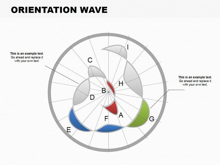
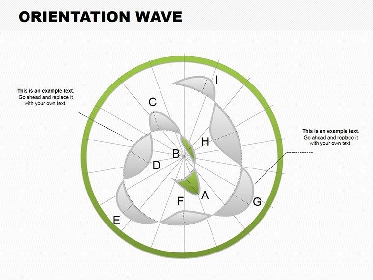
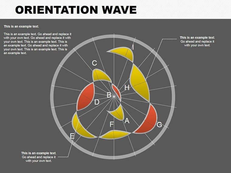
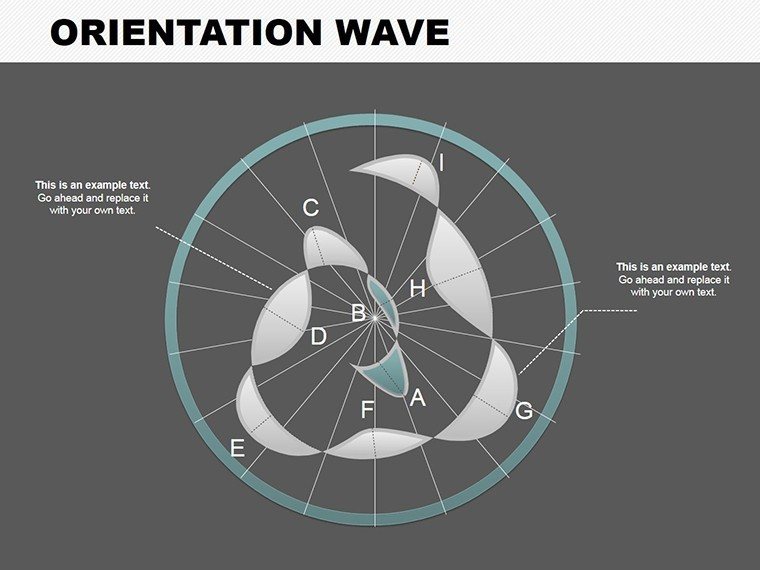
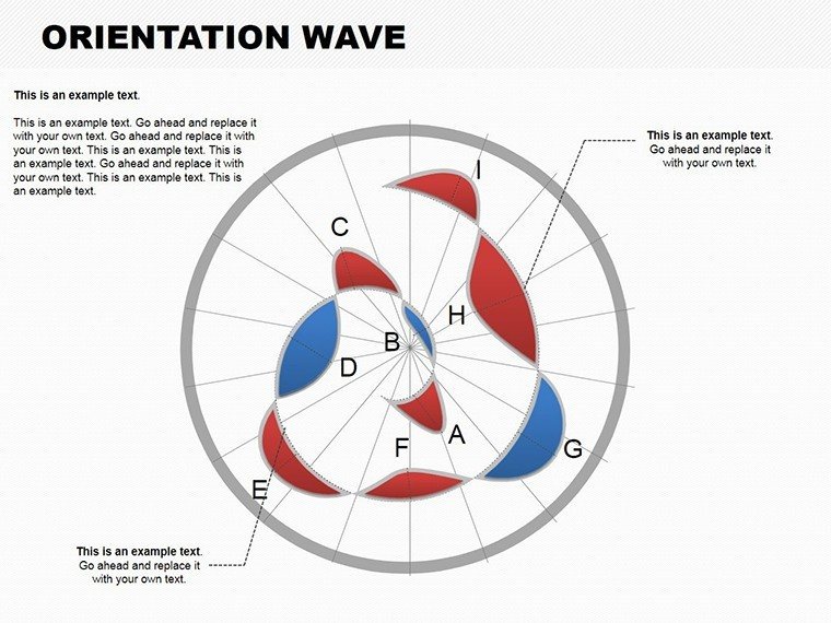
The core of this template lies in its wave-oriented designs, which mimic natural flows in architecture, from riverfront developments to building orientations for solar gain.
- Dynamic Wave Charts: Curved lines that represent orientations, ideal for showing directional data like building alignments or pathway designs.
- Customization Options: Tweak colors to match site-specific palettes, fonts for branding, and layouts for different scales.
- Versatile Applications: From sales reports on property developments to educational modules on urban design principles.
- User-Friendly Interface: Intuitive controls for quick edits, even during tight deadlines for bid submissions.
- Engagement Boosters: Waves that animate to reveal data progressively, keeping audiences hooked like in TED-style architecture talks.
These elements solve the challenge of presenting orientation data statically, offering a dynamic alternative that enhances comprehension, as seen in case studies from firms like SOM where fluid visuals secured major contracts.
In-Depth Slide Exploration
Break down the 8 slides to envision their role in your projects:
- Slide 1: Orientation Overview: Wave chart for initial site analysis, highlighting cardinal directions.
- Slide 2: Flow Dynamics: Illustrates movement patterns, great for traffic studies.
- Slide 3: Environmental Waves: Merges wind and sun data for sustainable orientations.
- Slide 4: Structural Alignment: Waves showing building placements relative to terrain.
- Slide 5: Progress Waves: Tracks project phases with undulating lines.
- Slide 6: Comparative Orientations: Side-by-side waves for before-and-after designs.
- Slide 7: Risk Wave Mapping: Visualizes potential orientation issues like shading.
- Slide 8: Final Synthesis: Comprehensive wave dashboard for summary presentations.
Each includes editable data tables, compatible with imports from GIS software for accurate architectural representations.
Step-by-Step Applications in Design Workflows
For a landscape architect designing a park, use waves to show visitor flow: Step 1: Input orientation data. Step 2: Customize wave amplitudes for emphasis. Step 3: Add animations for storytelling. Step 4: Integrate with firm branding. Step 5: Export and present, impressing municipal boards.
Unlike vanilla PowerPoint, which lacks thematic depth, this template includes icons like compass roses for orientation focus, elevating your slides to professional levels seen in ArchDaily features. Tips: Use subtle wave colors for accessibility, and pair with photos for hybrid visuals.
In marketing architectural services, waves can depict growth trends, making pitches more persuasive. For educators, they simplify teaching site orientation, with real-world ties to projects like the High Line in NYC.
Workflow Integration Tips
Open in PowerPoint, link to external tools like SketchUp for data pulls, and collaborate via Office 365. This ensures your orientations are always on point, building trust through precise, authoritative visuals.
Don't let your data drown in boredom - ride the wave of innovation. Secure this template now and orient your presentations towards excellence.
Frequently Asked Questions
What makes the wave charts unique?
They provide fluid representations of orientation data, unlike standard linear charts.
Can I customize the waves for branding?
Yes, full control over colors, shapes, and animations.
Is it suitable for educational use?
Perfect for teaching architectural concepts with engaging visuals.
How do I import data?
Use the built-in spreadsheet or copy from Excel/GIS tools.
Any limitations with animations?
Works best in PowerPoint; Google Slides may need tweaks.
Support for updates?
Included with download for ongoing improvements.
Good for
- Project roadmaps and sprint plans
- Product launch timelines
- Quarterly or annual review decks
- Company history and milestone summaries
Licence
reviews
Downloaded this for an office KPI report and it worked fine.
The charts are simple which actually made them easier to read.
A few slides looked crowded once I added my own data.
Good for people who don’t want to design from scratch.
I mostly used the pie chart pages.
FAQ
Will it work in Google Slides?
Are fonts embedded?
Can I use this for client work?
What's the refund policy?
Do you update the template after purchase?
Similar templates
See all PowerPoint Charts →

All 8 slides