 Click to zoom
Methods Analysis PowerPoint Charts Presentation Template
| Format | .pptx |
| Slides | 14 unique layouts |
| Aspect ratio | 16:9 |
| Compatibility | PowerPoint |
| Animated | No |
| Language | English |
| License | Commercial |
| File size | — |
| Version | v1.0 |
| Last updated | January 2024 |
What's inside
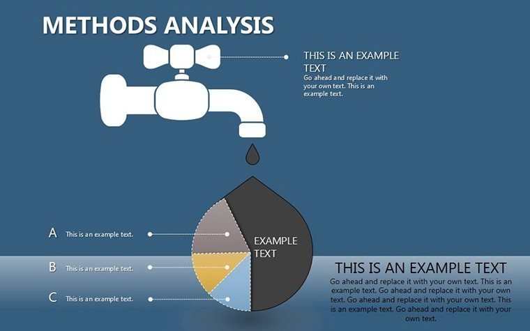
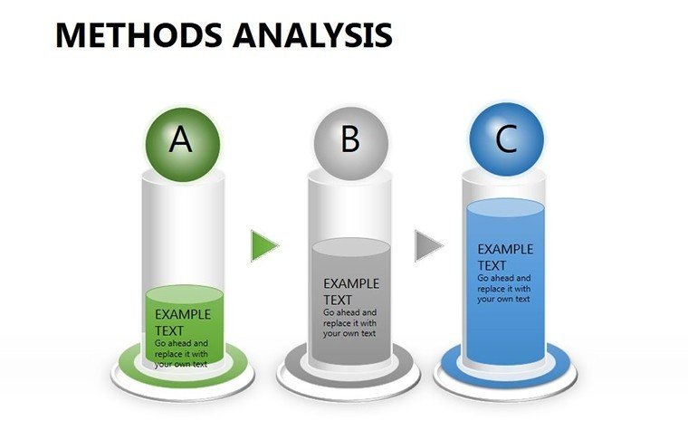
When delving into the intricacies of methods analysis, clarity is key to conveying your findings effectively. Whether you're a researcher unraveling study results, a process engineer outlining new procedures, or a consultant comparing methodologies, our Methods Analysis PowerPoint Charts Template equips you with the tools to make your data speak volumes. Featuring 14 editable slides with diverse chart types like bar, line, pie, and scatter plots, this template transforms raw information into insightful visuals. It's crafted for professionals who value precision and efficiency, helping you save time while delivering presentations that resonate with audiences in academia, business, or consulting fields.
Mastering Data Visualization for Methods Analysis
In methods analysis, where comparisons and trends form the backbone of your narrative, effective visualization can elevate your work from informative to influential. Drawing from principles in data science journals like those from IEEE, well-designed charts can increase audience understanding by over 50%. This template embodies that by offering pre-built structures that highlight variances, correlations, and distributions without the hassle of starting from scratch. For example, use scatter plots to illustrate variable relationships in experimental data, or line charts to track process improvements over time.
As a seasoned analyst who's optimized countless reports, I recommend this for its modern design that adheres to best practices in visual communication. Consider a case from a pharmaceutical research firm, as detailed in a Nature study, where similar chart templates streamlined protocol comparisons, leading to faster regulatory approvals. The template's customizable elements, including adjustable axes and legends, ensure your visuals align perfectly with your analytical story.
Standout Features for Analytical Excellence
- Varied Chart Selection: From bar charts for categorical comparisons to pie charts for proportional breakdowns, covering all essential analysis needs.
- Professional Aesthetics: Clean lines, subtle gradients, and scalable vectors for a sleek look in any resolution.
- Effortless Editing: Drag-and-drop data import from Excel, with auto-updating features for dynamic presentations.
- Cross-Platform Support: Fully functional in PowerPoint and Google Slides, ideal for collaborative environments.
- Analysis-Specific Tools: Includes gridlines for precision and annotations for highlighting key insights.
These features integrate smoothly into your workflow, allowing quick iterations during review cycles.
Practical Use Cases: Bringing Methods to Life
Apply this template in diverse scenarios to address specific challenges. In research settings, structure your presentation with an introductory pie chart showing method distribution, followed by bar graphs comparing efficacy metrics. This logical flow helps audiences follow your reasoning, much like in peer-reviewed papers from journals such as PLOS ONE.
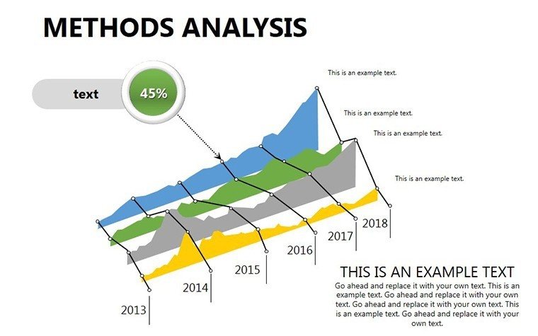
For process optimization in manufacturing, leverage line charts to depict efficiency gains pre- and post-implementation. Educators can use scatter plots to teach statistical methods, making abstract concepts tangible. A step-by-step example for a quality control team: Begin by importing defect data into a bar chart slide, customize colors to denote severity levels, add trend lines for projections, and end with a summary table slide. This method not only clarifies findings but also facilitates discussions on improvements.
Pro Tips from Analysis Experts
- Define your objectives first: Choose charts that directly answer your research questions, avoiding visual overload.
- Utilize color theory: Employ contrasting hues for emphasis, guided by accessibility standards like those from the Web Content Accessibility Guidelines.
- Incorporate real data examples: Test with sample datasets to ensure scalability, drawing from benchmarks in industry reports.
- Enhance with narratives: Pair charts with brief explanations, transforming data into stories as advised by experts like Edward Tufte.
- Review for accuracy: Double-check calculations within the template to maintain trustworthiness in your analysis.
These strategies, honed from years in data-driven fields, maximize the template's potential.
Superior to Standard Chart Tools
Unlike basic PowerPoint inserts that require manual formatting, this template provides ready-made, optimized designs that reduce errors and enhance professionalism. In competitive analysis environments, this edge can mean the difference in securing funding or approvals, as seen in case studies from McKinsey Quarterly.
Furthermore, its focus on methods-specific layouts ensures relevance, with options for multi-variable displays that standard tools lack.
Seamless Integration into Your Processes
Incorporate this into your toolkit by linking to statistical software for automated updates, or share via cloud platforms for team input. For virtual presentations, embed hyperlinks to source documents, adding depth without cluttering slides.
Elevate your methods analysis today - download this template and turn data into decisions that matter.
Frequently Asked Questions
How do I customize the charts with my data?
Simply select the chart, input your values via the data editor, and watch updates apply automatically.
Does it support advanced chart types?
Yes, including scatter for correlations and combined charts for multi-faceted analysis.
Is it suitable for academic presentations?
Absolutely, with clean designs that meet journal standards for clarity and precision.
Can I add more slides if needed?
Yes, duplicate existing ones or insert new charts while maintaining the template's style.
What file formats are compatible?
Primarily .pptx, but exportable to PDF or images for broader use.
Good for
- Project roadmaps and sprint plans
- Product launch timelines
- Quarterly or annual review decks
- Company history and milestone summaries
Licence
reviews
This template helped me finish an office report fast.
The pie charts were surprisingly easy to edit.
I mostly cared about the graphs and they worked fine.
Some text placeholders were oddly sized.
Pretty decent for basic PowerPoint presentations.
FAQ
Will it work in Google Slides?
Are fonts embedded?
Can I use this for client work?
What's the refund policy?
Do you update the template after purchase?
Similar templates
See all PowerPoint Charts →

All 14 slides