 Click to zoom
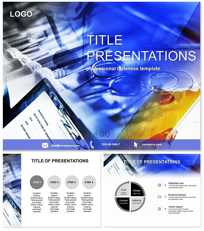
Medicine Keynote Template
| Format | .pptx |
| Slides | 3 unique layouts |
| Aspect ratio | 16:9 |
| Compatibility | PowerPoint |
| Animated | No |
| Language | English |
| License | Commercial |
| File size | — |
| Version | v1.0 |
| Last updated | September 2022 |
What's inside
Step into the vital world of healthcare communication where every slide can save time, clarify complexities, and inspire action. The Medicine Keynote Template is your ally in crafting presentations that resonate with doctors, researchers, and students alike, turning dense medical data into digestible, visually compelling narratives.
This template isn`t just a set of slides - it`s a lifeline for professionals navigating the high-stakes arena of medical discourse. With motifs drawn from stethoscopes, molecular structures, and healing icons, it infuses trust and expertise into every frame. Designed for Keynote 2016 and beyond on Mac and iOS, it supports effortless collaboration. As a lifetime license with one-time purchase, unlock endless revisions without added costs.
Core Features for Precision Delivery
What sets this template apart is its blend of scientific rigor and aesthetic appeal. Boasting three master layouts and backgrounds that evoke clinical clarity, it includes 28 diagrams optimized for health metrics. Seven color schemes - from sterile blues to vital greens - let you align with hospital branding or research themes seamlessly.
- Three Masters: Title, content, and data-focused for varied medical topics.
- Three Backgrounds: Subtle gradients mimicking lab whites or anatomical charts.
- Editable Formats: .key, .kth, and .jpg for full control and quick shares.
Move beyond Keynote`s basic charts, which lack the nuanced icons for symptoms or treatments. This template`s vector-based elements scale perfectly, and built-in transitions simulate pulse waves for dynamic reveals.
Exploring the 28 Diagrams: From Diagnosis to Discovery
Each diagram is a building block for your medical story, detailed below for targeted use.
Pages 1-5: Patient Pathways Flowcharts map diagnosis journeys, with branching nodes for differential options - crucial for case studies.
Pages 6-10: Vital Stats Bar graphs styled as heartbeats track recovery rates, color-shifting to highlight anomalies.
Pages 11-15: Research Overviews Venn diagrams overlap study findings, ideal for grant proposals or journal clubs.
Pages 16-20: Treatment Timelines Gantt-style slides sequence therapies, integrating icons for side effects and outcomes.
Pages 21-25: Epidemiology Maps Heat maps visualize outbreak spreads, with layered transparency for multi-variable analysis.
Pages 26-28: Ethical Considerations Balance scales weigh pros and cons of protocols, ending with a call-to-action radial for team buy-in.
These slides leverage Keynote`s smart guides for alignment, ensuring professional polish every time.
Practical Use Cases in Healthcare
Envision a pharma rep demoing a new drug: Use pathway diagrams to illustrate efficacy trials, animating results to show patient improvements. In academia, professors employ stat slides for lecture recaps, making abstract epidemiology tangible for undergrads.
A hospital administrator once used it to streamline board meetings, mapping budget allocations via timelines that clarified ROI on new equipment. It`s a step up from vanilla Keynote, where custom icons demand extra effort - this delivers them pre-vetted for accuracy.
Expert Advice for Med Presenters
Embed hyperlinks to PubMed abstracts on key slides for instant credibility, turning your deck into a research hub.
Don`t wait for the next conference - Secure your Medicine Keynote Template now and elevate your health narratives.
Frequently Asked Questions
Why choose this for medical presentations?
Its specialized diagrams and colors convey expertise, making complex info accessible and trustworthy.
Compatibility details?
Fully supports Keynote 2016+, Mac, and iOS for versatile use.
Customization options?
Edit colors, text, and layouts freely with seven schemes as a starting point.
Slide count and types?
28 diagrams focused on data viz, expandable with masters.
File types included?
.key for editing, .kth for themes, .jpg for previews.
Animation support?
Yes, smooth transitions like fading pulses add engagement without complexity.
Good for
- Project roadmaps and sprint plans
- Product launch timelines
- Quarterly or annual review decks
- Company history and milestone summaries
Licence
reviews
The price graph template saved me on a Friday afternoon. The red and blue colors automatically highlight good and bad quarters.
Using this for a real estate market analysis. The combo graphs allow me to show listing prices and sales volume on the same chart.
The data linking is great until you move a column. I accidentally broke a graph and had to re-link it.
It is just a chart. I could have made it in Excel and imported it
but this saved me the formatting step.
The candlestick charts look intimidating but they are actually very easy to edit.
FAQ
Will it work in Google Slides?
Are fonts embedded?
Can I use this for client work?
What's the refund policy?
Do you update the template after purchase?
Similar templates
See all Keynote templates →



All 1 slides