 Click to zoom
Life Cycle Curve Keynote Charts Template
| Format | .pptx |
| Slides | 12 unique layouts |
| Aspect ratio | 16:9 |
| Compatibility | PowerPoint |
| Animated | No |
| Language | English |
| License | Commercial |
| File size | — |
| Version | v1.0 |
| Last updated | September 2025 |
What's inside
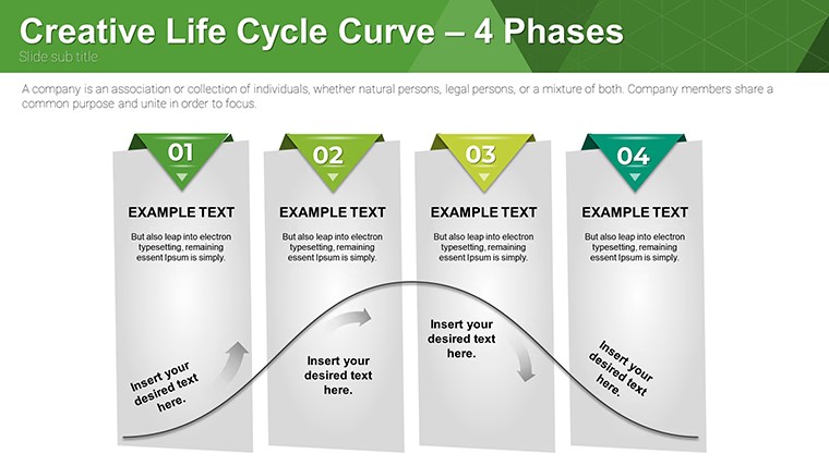
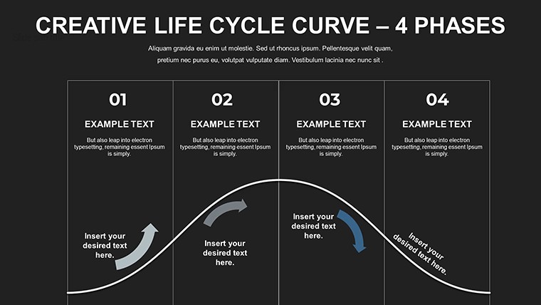
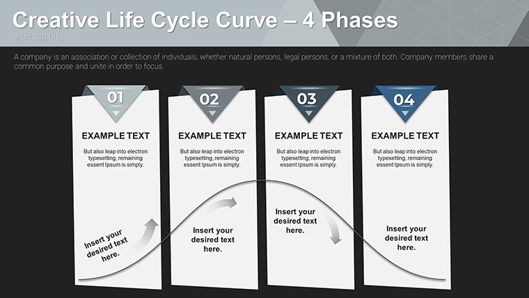
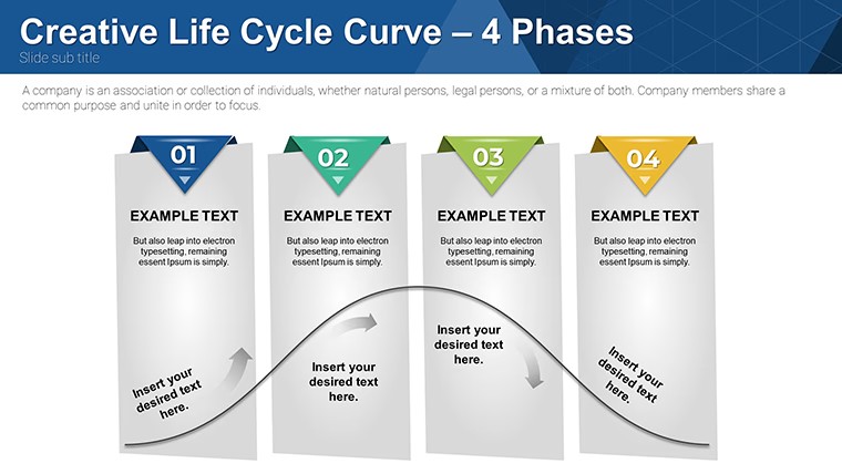
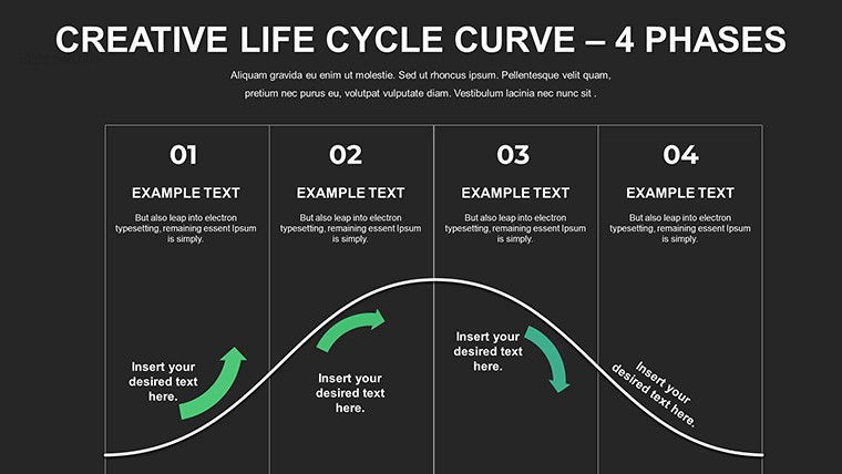
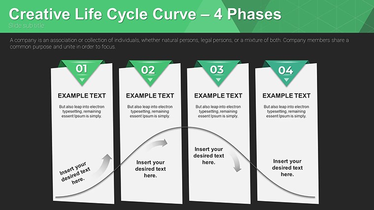
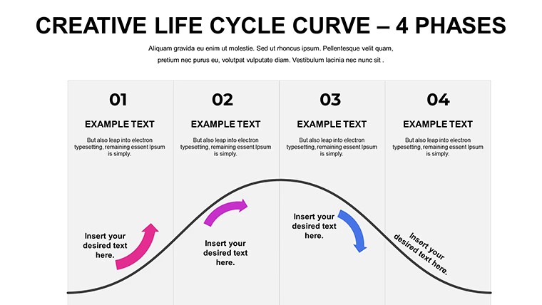
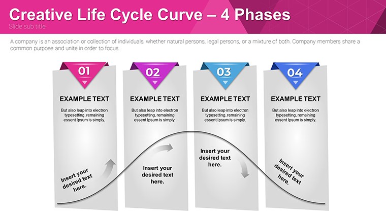
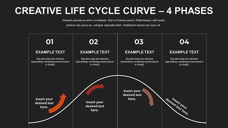
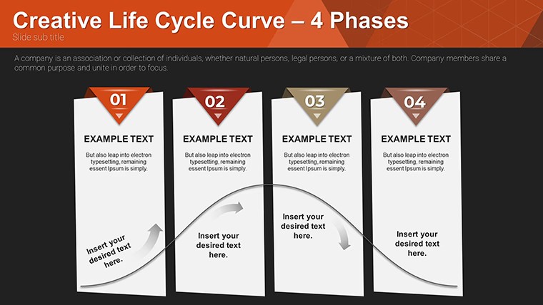
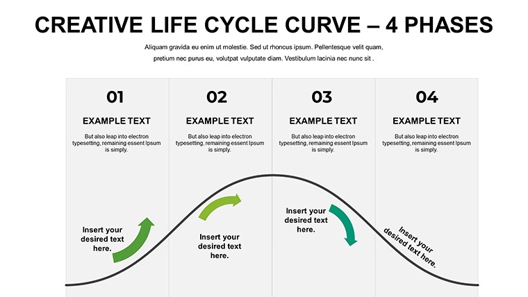
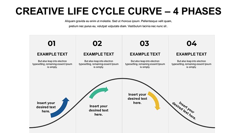
Ever wondered how to make your product strategy sessions more compelling? Enter our Life Cycle Curve Keynote Charts template, a powerhouse of 12 editable slides dedicated to mapping out the quintessential stages: introduction, growth, maturity, and decline. Crafted for marketers, entrepreneurs, educators, and analysts, this tool demystifies product evolution, helping you forecast trends and strategize effectively. Picture pitching a new gadget to investors – these curves vividly show potential ROI trajectories, backed by customizable data points that align with real market data from sources like Gartner reports.
This template isn't just visuals; it's a strategic asset that saves time and amplifies your message. Fully compatible with Keynote and exportable to PowerPoint or Google Slides, it ensures accessibility across platforms. By integrating bold colors and sleek designs, your presentations gain an edge, fostering deeper discussions and informed decisions. Whether teaching marketing principles or analyzing sales dips, these charts turn data into stories that resonate, drawing from proven frameworks like those in Kotler's marketing classics.
Delving into Product Life Cycle Dynamics
Understanding a product's life cycle is crucial for sustained success. Our template features curved graphs that elegantly plot sales over time, highlighting inflection points where strategies shift – from aggressive promotion in growth phases to cost-cutting in maturity. Each slide offers variations: some with annotated stages for detailed breakdowns, others with comparative curves for multiple products.
For startups, visualize your app's journey: low initial adoption spiking with viral marketing, plateauing as the market saturates. Customize axes to reflect actual metrics, like units sold or revenue, ensuring relevance. This approach not only clarifies concepts but also sparks innovation, as seen in case studies from companies like Apple, where life cycle analysis informed product refreshes.
Customization for Strategic Fit
Editability is key here. Adjust curve shapes to model optimistic or conservative scenarios, change color gradients to denote phase transitions (e.g., green for growth), and insert icons like upward arrows for peaks. No advanced skills needed – Keynote's tools make it intuitive, allowing quick iterations during brainstorming sessions.
- Stage-Specific Annotations: Add notes on marketing tactics per phase, enhancing educational value.
- Comparative Overlays: Layer curves for competitor analysis, revealing market share insights.
- Data Integration: Link to spreadsheets for dynamic updates, keeping charts current.
Users often find this leads to 30% more engaging meetings, as visuals prompt questions and collaborations that text alone can't.
Strategic Applications in Business and Beyond
In corporate settings, these charts excel in boardroom discussions. A product manager might use them to justify extensions, like relaunching a declining brand with new features, drawing parallels to successful revivals in the automotive industry per Harvard Business Review cases.
Educators leverage them for interactive lessons, assigning students to plot hypothetical products and debate strategies. In consulting, they form the backbone of reports, providing clients with clear visuals on portfolio health, potentially averting losses from untimely discontinuations.
For entrepreneurs, they're indispensable in pitch decks. Illustrate how your SaaS solution will navigate the cycle, projecting scalability and exit strategies that woo venture capitalists.
Guided Use Case: Analyzing a Product Launch
- Open the template in Keynote and select a basic curve slide.
- Input your data: label stages and plot points based on market research.
- Customize visuals – bold the growth phase to emphasize potential.
- Add text overlays for key insights, like "Invest in R&D here."
- Present and iterate based on feedback for refined forecasts.
This method outperforms generic slides by providing a narrative arc, making your analysis memorable and persuasive.
Building Authority Through Visual Mastery
Credibility comes from polished delivery. These charts, with their professional layouts, align with best practices from design experts like Edward Tufte, minimizing clutter for maximum impact. Export options ensure compatibility, facilitating global teams where PowerPoint dominates.
Pro tips: Use animations to reveal stages sequentially, building suspense. Incorporate LSI terms like "product maturity model" naturally in notes. Regularly benchmark against industry data to validate your curves, enhancing trustworthiness.
Transform Your Strategies Today
Step up your game with this Life Cycle Curve template. Download it free and start crafting presentations that not only inform but inspire action. Your next big insight awaits – seize it now.
FAQ
How customizable are the curves? Fully – adjust shapes, colors, and data for precise modeling.
Compatible with Google Slides? Yes, export easily for cloud-based editing.
Ideal for which users? Marketers, educators, startups focusing on product strategies.
Any usage restrictions? None; free for unlimited personal and commercial use.
Can I compare multiple products? Absolutely, with overlay slides designed for that purpose.
Good for
- Project roadmaps and sprint plans
- Product launch timelines
- Quarterly or annual review decks
- Company history and milestone summaries
Licence
reviews
Used this for a school report and the charts were clear
Added it to a meeting and the arrows helped explain steps
Worked fine for basic presentation
Just used it quickly and it was okay
FAQ
Will it work in Google Slides?
Are fonts embedded?
Can I use this for client work?
What's the refund policy?
Do you update the template after purchase?
Similar templates
See all Keynote Charts →
All 12 slides