 Click to zoom
Jobs Keynote Diagrams for Career Pros
| Format | .pptx |
| Slides | 14 unique layouts |
| Aspect ratio | 16:9 |
| Compatibility | PowerPoint |
| Animated | No |
| Language | English |
| License | Commercial |
| File size | — |
| Version | v1.0 |
| Last updated | February 2026 |
What's inside
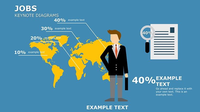
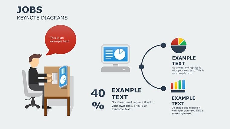
Navigating the dynamic world of jobs and careers demands visuals that cut through the noise and deliver clear messages. Our Jobs Keynote diagrams template is tailored for HR specialists, career coaches, and recruiters who want to present job market trends, growth paths, and hiring processes with flair. Boasting 14 editable slides, this collection turns data into stories, helping you engage audiences from job seekers to executives.
Inspired by real scenarios, like how LinkedIn uses similar diagrams in their annual reports to map workforce trends, this template brings authority to your decks. Fully compatible with Keynote on macOS and iOS, it supports seamless edits on the go. The user-friendly interface means no design degree needed � just plug in your content and watch it shine.
Delving into Diagram Features and Customization
Each slide is a canvas for professional expression: Slide 1 offers a career ladder diagram, perfect for visualizing promotion tracks. Themed in motivating blues and oranges, but editable to your palette, these diagrams exceed basic Keynote options by including infographics like skill matrices and timeline flows.
Benefits abound � from saving time on layout to boosting engagement, as per Forbes insights on visual communication. For a recruitment agency, Slide 7's funnel diagram can illustrate candidate pipelines, addressing bottlenecks in hiring.
Standout Diagram Elements
- Infographic Variety: Charts for trends, graphs for stats, icons for roles.
- Brand Alignment: Easy color and font swaps to match corporate identity.
- Interactive Potential: Hyperlinks and animations for clickable journeys.
- Data-Driven: Placeholders for metrics on job growth or unemployment rates.
- Versatile Layouts: From SWOT analyses to org charts for team structures.
Backed by HR expertise, these features align with SHRM standards, ensuring your presentations are not just pretty but persuasive.
Use Cases Tailored to Career Development
In workshops, use Slide 10's roadmap to guide attendees through career planning steps. For corporate training, Slide 4's pie charts break down skill demands in evolving markets.
Workflow example: Import into Keynote, edit Slide 12's network diagram with your contacts, add transitions for flow. This solves vague overviews, providing clarity that resonates. Unlike free templates, this offers premium quality, reducing rework.
Real-world win: Career centers at universities like Stanford employ similar visuals to boost student placement rates by making data accessible.
Tips from Career Presentation Experts
- Start with audience needs: Tailor diagrams to pain points like job search fatigue.
- Leverage themes: Use consistent motifs for cohesive storytelling.
- Add narratives: Pair visuals with anecdotes for relatability.
- Test interactivity: Ensure links work in presentation mode.
- Optimize for export: Share as videos for remote viewers.
These draw from successful TED Talks on careers, where diagrams amplified messages effectively.
Advance Your Career Narratives � Get It Now
Step up your game with diagrams that inspire action and growth. Download this template and craft presentations that open doors.
Frequently Asked Questions
How customizable are the job diagrams?Completely � edit every element from colors to text in Keynote.Does it work on iPad Keynote?Yes, fully optimized for iOS devices.Can I integrate data from spreadsheets?Sure, copy-paste or link for dynamic updates.Ideal for which presentations?Recruitment, career fairs, and training sessions.Are fonts included?Standard system fonts; customize as needed.Good for
- Project roadmaps and sprint plans
- Product launch timelines
- Quarterly or annual review decks
- Company history and milestone summaries
Licence
reviews
The structure helped me organize a messy presentation in under an hour.
It’s fine overall although a few icon styles don’t really match.
Used this for an office workshop and people could actually follow the process slides.
This worked better for technical reporting than I expected because the diagrams are pretty straightforward.
I mostly needed the arrow slides and ignored everything else.
FAQ
Will it work in Google Slides?
Are fonts embedded?
Can I use this for client work?
What's the refund policy?
Do you update the template after purchase?
Similar templates
See all Keynote Diagrams →
All 14 slides