 Click to zoom
International Flights Keynote Charts Template: Master Aviation Analytics
| Format | .pptx |
| Slides | 57 unique layouts |
| Aspect ratio | 16:9 |
| Compatibility | PowerPoint |
| Animated | No |
| Language | English |
| License | Commercial |
| File size | — |
| Version | v1.0 |
| Last updated | April 2025 |
What's inside
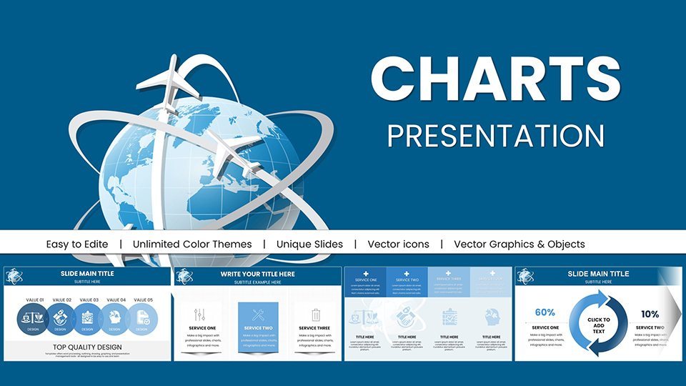
For aviation analysts, travel executives, and market researchers navigating the skies of global data, our International Flights Keynote Charts Template is your co-pilot. Boasting 57 editable slides, this powerhouse tool turns raw flight statistics into compelling narratives that soar above the competition. Picture mapping out route profitability or forecasting passenger surges with interactive visuals that make complex trends accessible. Tailored for the fast-evolving aviation industry, it aligns with insights from bodies like the International Air Transport Association (IATA), helping you present with authority and foresight.
This template addresses key pain points: overwhelming data volumes and static presentations. Instead, it offers dynamic integration, allowing real-time updates from sources like FAA databases or airline APIs. Whether analyzing seasonal booking patterns or fuel efficiency metrics, users find it transforms tedious reports into engaging stories. Let's explore how it elevates your analytical game.
Essential Features for Aviation Data Mastery
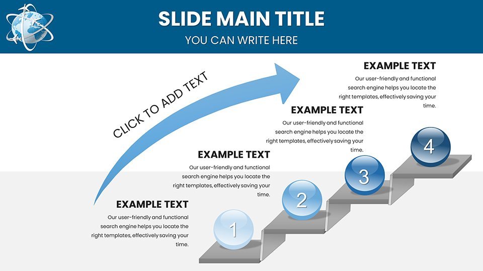
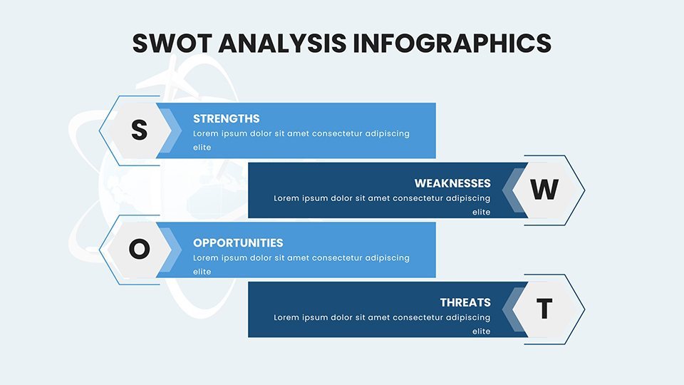
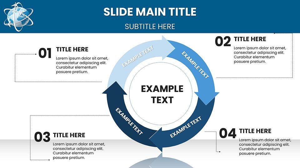
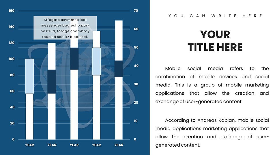
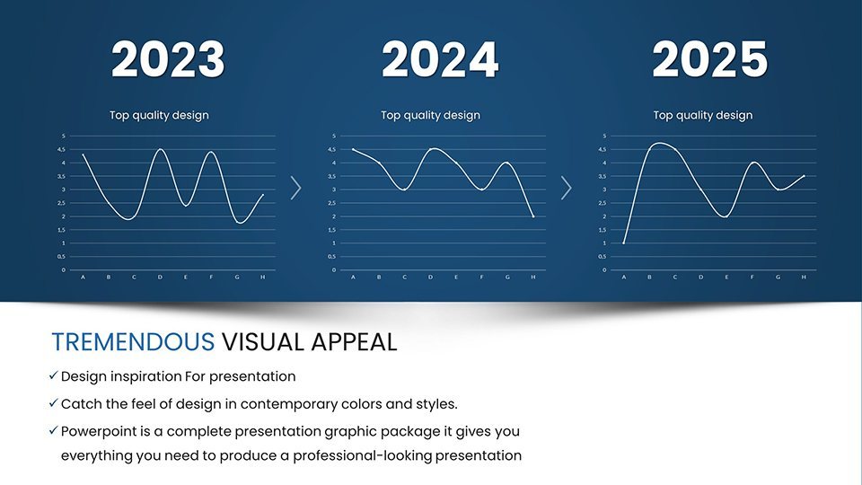
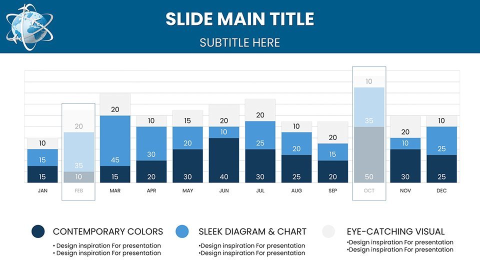
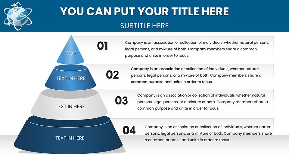
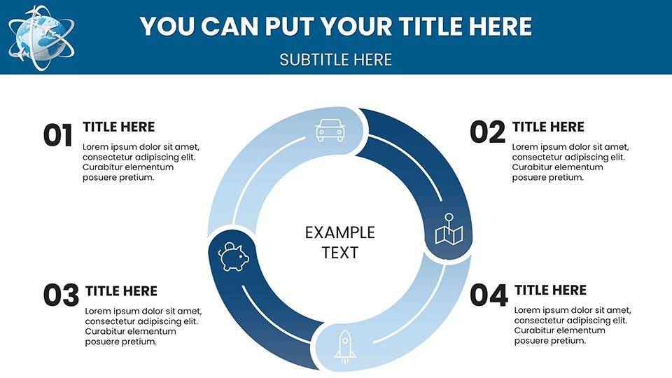
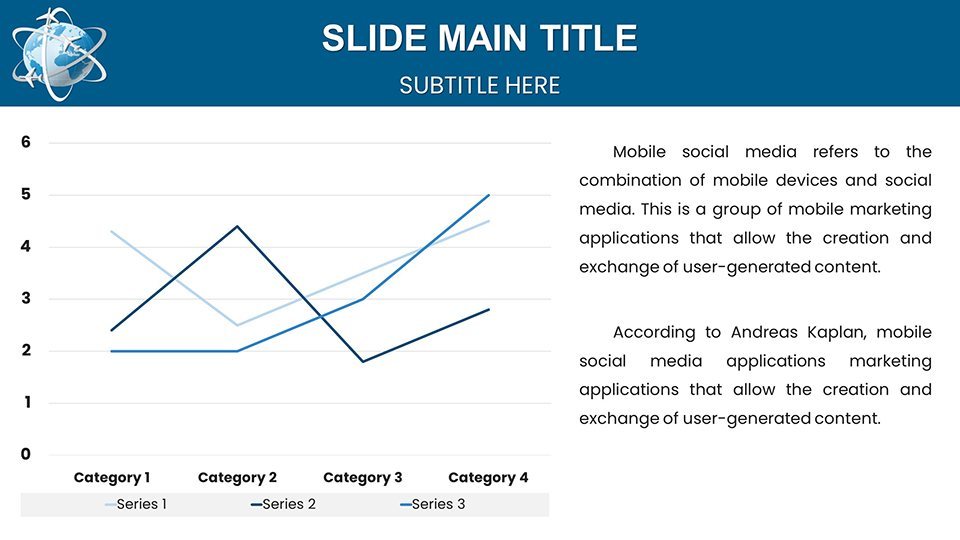
The core strength? Its interactive charts and graphs, optimized for flight-specific data. Pie charts break down passenger demographics by region, bar graphs compare on-time performances across carriers, line charts track airfare fluctuations, and heatmaps reveal high-traffic corridors. All are fully customizable - tweak colors to reflect airline branding, adjust scales for precision, and layer data for multifaceted views.
Real-time data integration sets it apart. Connect to live feeds for up-to-the-minute insights, crucial during events like global disruptions. Multi-platform compatibility ensures smooth use in Keynote, PowerPoint, or Google Slides, ideal for collaborative teams. A case study: An aviation consultant used these slides to visualize post-pandemic recovery trends for a major airline, leading to optimized route expansions and increased revenue.
In-Depth Chart Types and Customizations
Explore the library:
- Pie Charts: Segment market shares, e.g., budget vs. premium flights in emerging markets.
- Bar Graphs: Benchmark fleet utilizations, highlighting efficiencies in operations.
- Line Charts: Forecast demand curves based on historical data, aiding strategic planning.
- Heatmaps: Identify congestion hotspots at international hubs like Heathrow or JFK.
Targeted Use Cases in the Aviation Sector
Business analysts track market dynamics, flight operators report metrics, travel agencies uncover preferences, and strategists pitch expansions. For instance, in a 2024 IATA summit prep, slides illustrated sustainable aviation fuel adoption, sparking industry dialogues. Benefits include enhanced clarity, professional polish, and regular updates for new chart types, keeping you ahead.
Workflow Integration and Tips
Start by downloading the .key file, import data, customize, and present. Tips: Use heatmaps for visual impact in board meetings; integrate with tools like Tableau for advanced analytics. Versus basic software, it offers aviation-tailored templates, reducing design time by 50%.
Enhance with icons like globes or airplanes for thematic coherence. This not only solves data visualization challenges but positions you as an expert.
Soar with Confidence – Download Now
Empower your aviation insights today with this template. Customize and conquer your next presentation.
Frequently Asked Questions
How do I integrate real-time data?Connect via compatible APIs or import from live spreadsheets for instant updates.Is it compatible with PowerPoint?Yes, fully, with easy export options.What if I need more chart types?Regular updates add new features; contact support for requests.Can beginners use this?Absolutely, with step-by-step guides included.What's the file format?.key for Keynote, convertible as needed.Are visuals high-quality?Yes, optimized for HD displays.Good for
- Project roadmaps and sprint plans
- Product launch timelines
- Quarterly or annual review decks
- Company history and milestone summaries
Licence
reviews
I prepared charts for our startup investor meeting using this template and finished everything in under two hours. The data visualization slides look sharp on screen and my team received positive comments about the overall design.
The layouts for bar and line charts feel balanced with good use of whitespace. Typography is clear even when presenting from the back of the room.
Everything worked smoothly except I needed to manually adjust a couple of legend positions after adding my own numbers. Still saved me significant time.
The color palette is professional yet modern. I swapped in our company colors without any major issues and the icons complemented the charts nicely.
Used this for a quarterly performance review presentation. The process of replacing placeholder data was straightforward and the slides printed well too.
FAQ
Will it work in Google Slides?
Are fonts embedded?
Can I use this for client work?
What's the refund policy?
Do you update the template after purchase?
Similar templates
See all Keynote Charts →
All 57 slides