 Click to zoom
Incoming Cycle Charts Keynote Template - Fully Editable | Instant Download | ImagineLayout
| Format | .pptx |
| Slides | 44 unique layouts |
| Aspect ratio | 130/73 |
| Compatibility | PowerPoint |
| Animated | No |
| Language | English |
| License | Commercial |
| File size | — |
| Version | v1.0 |
| Last updated | February 2026 |
What's inside
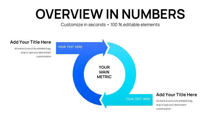
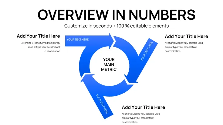
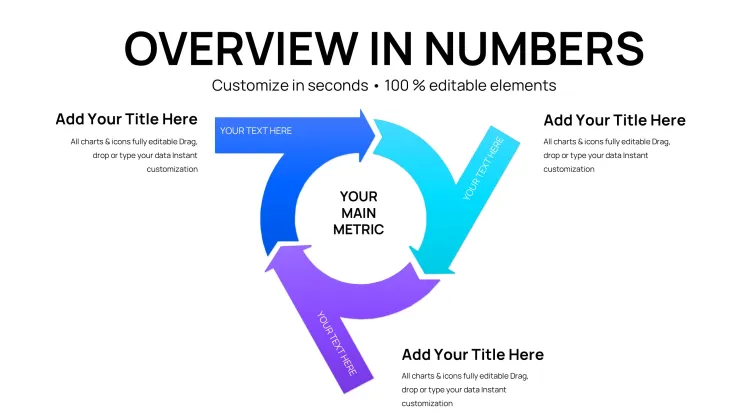
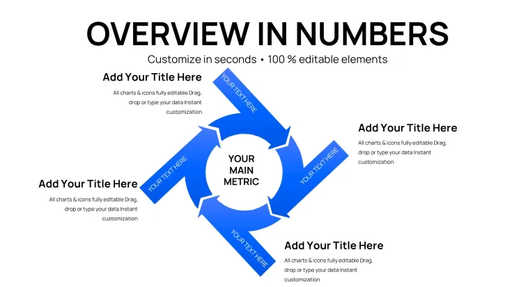
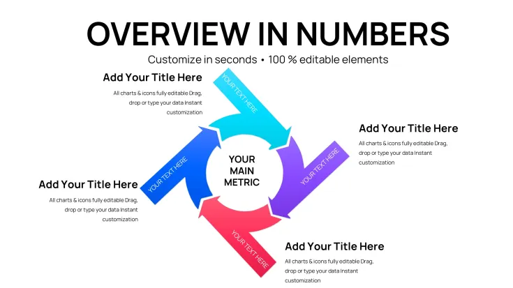
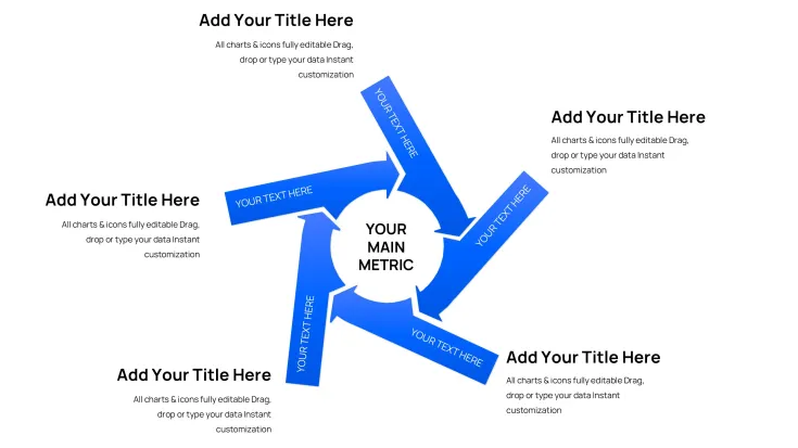
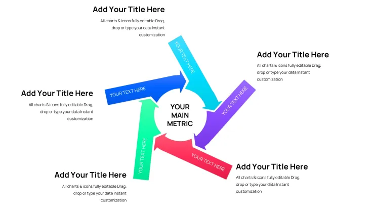
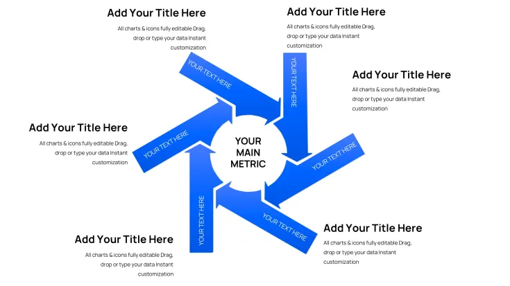
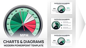
Download the Incoming Cycle Charts Keynote Template with 44 fully editable slides featuring cycle periods, pie charts and arrows for professional process visualization. Perfect for Apple Keynote users presenting business cycles and incoming data flows. Instant .key download for immediate customization and use.
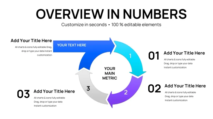
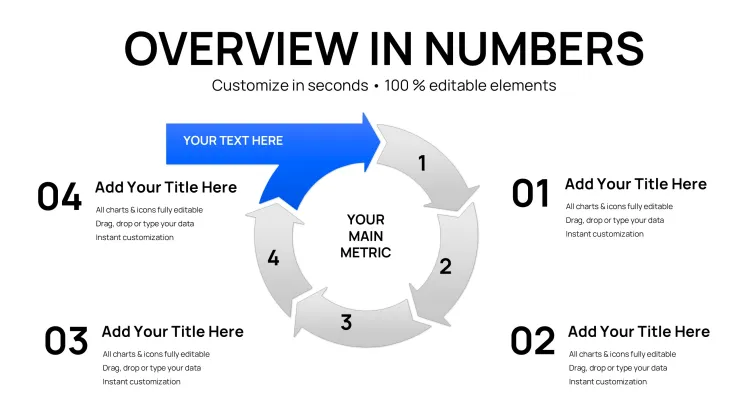
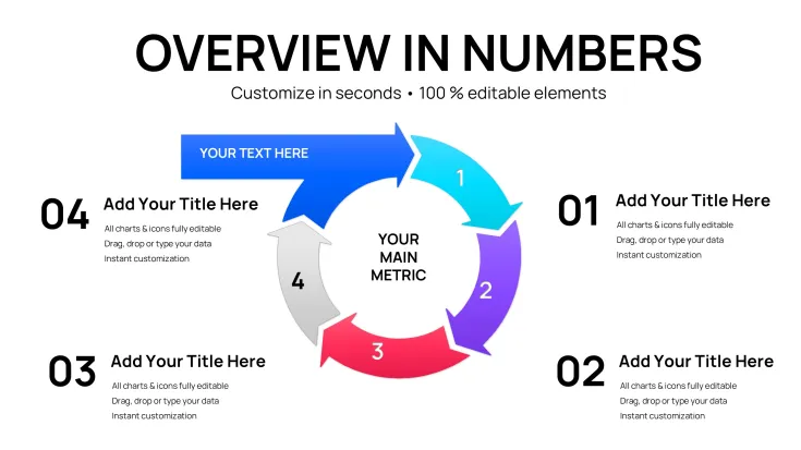
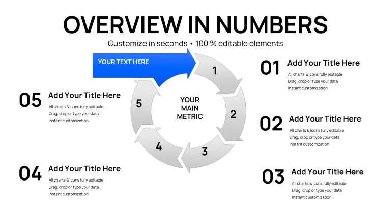
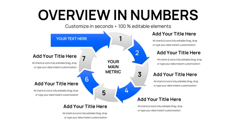
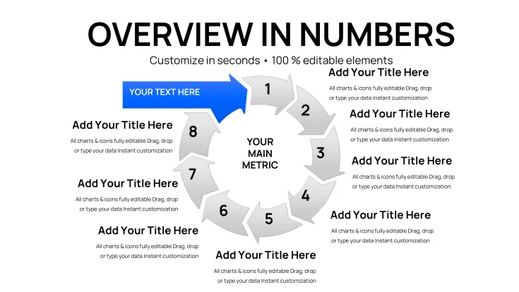
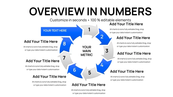
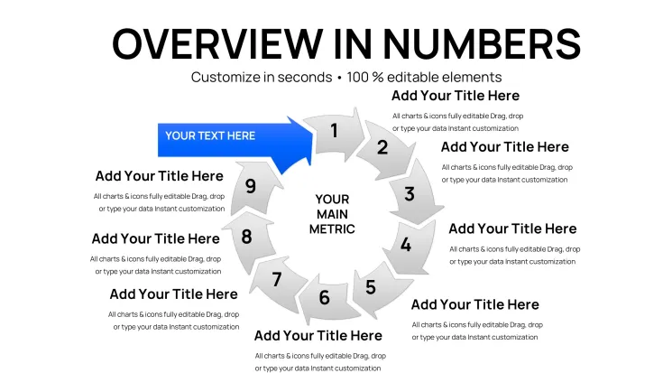
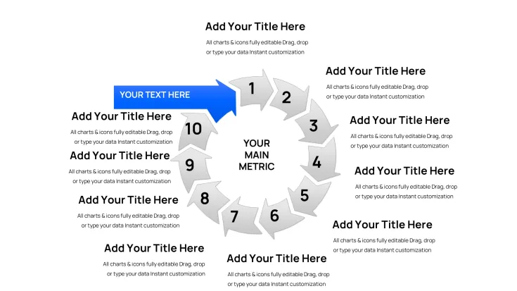
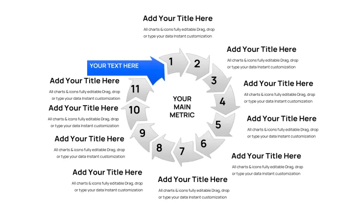
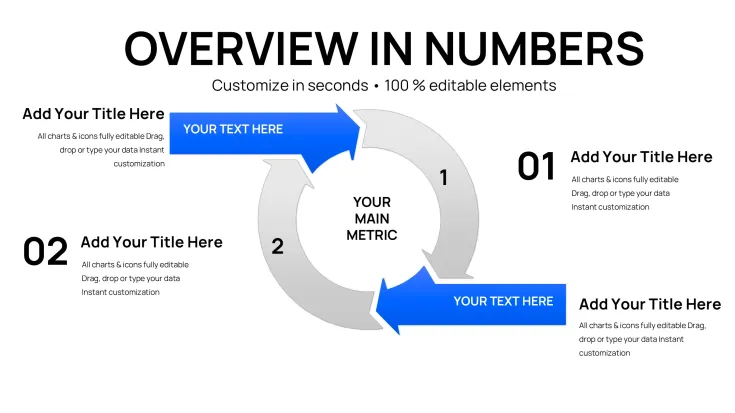
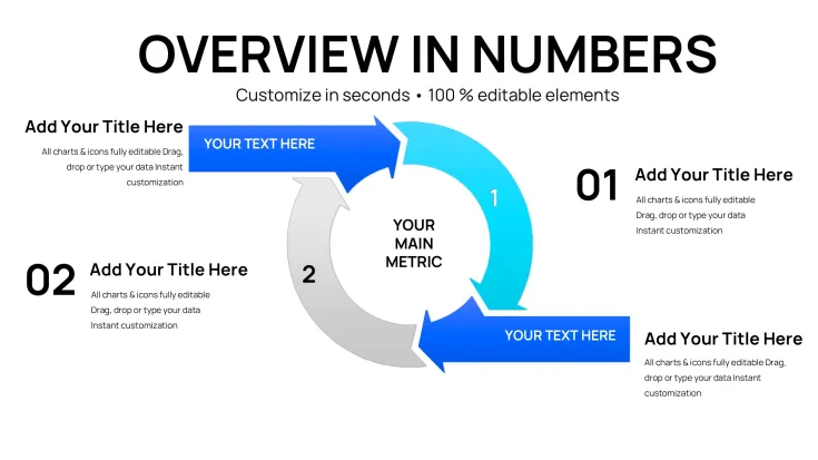
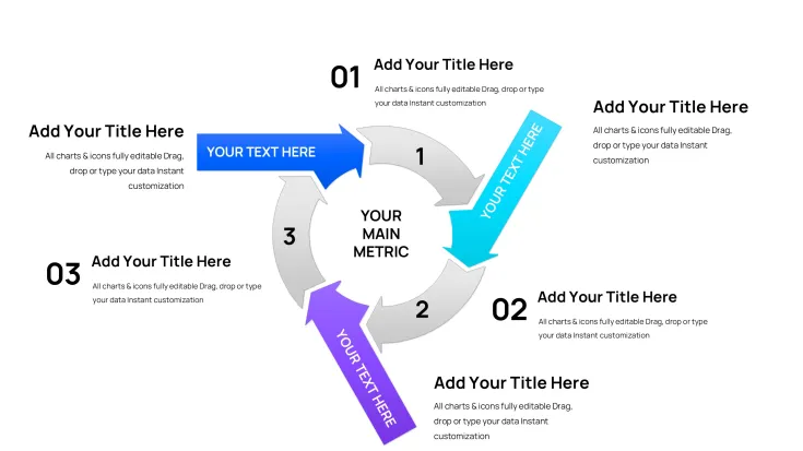
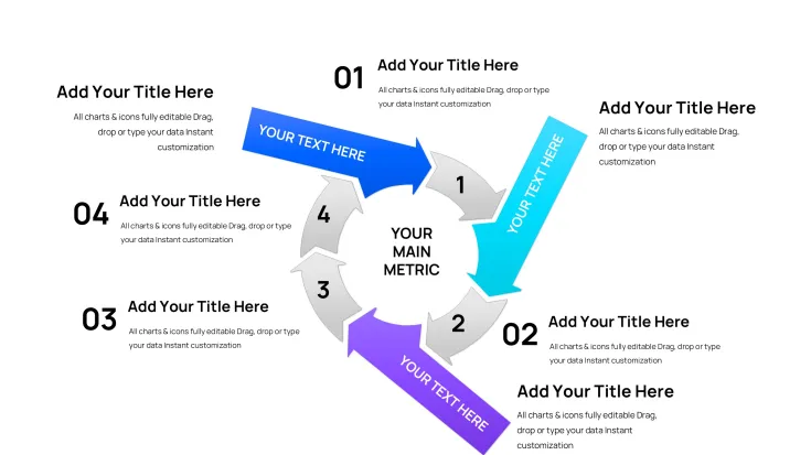
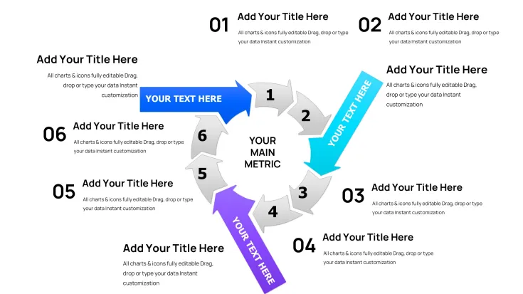
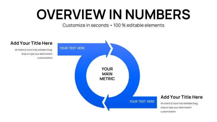
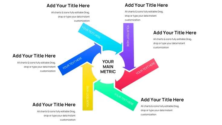
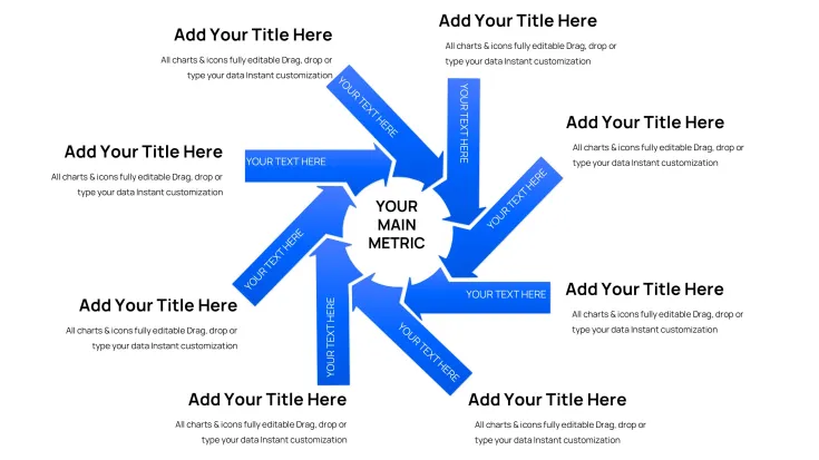
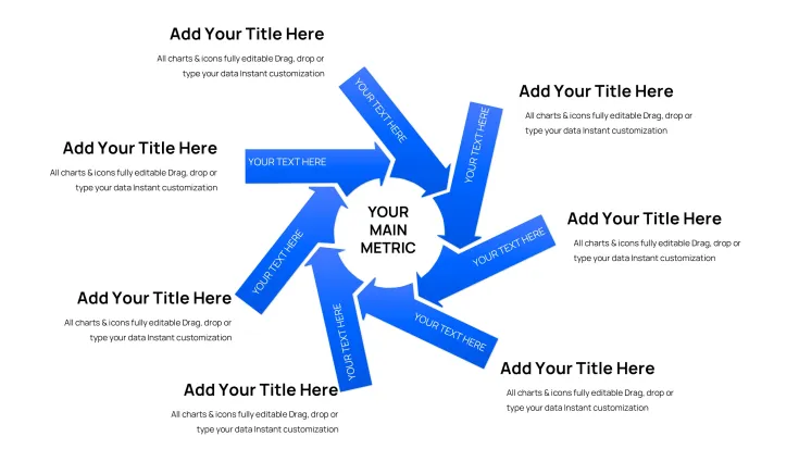
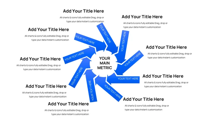
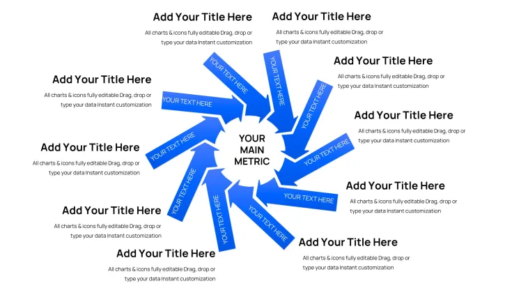
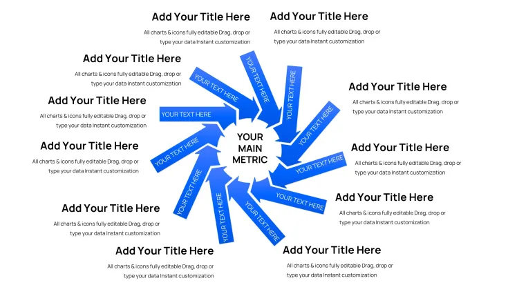
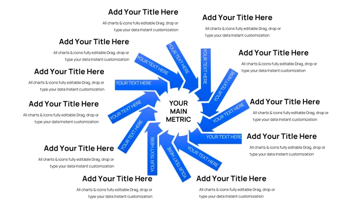
The Incoming Cycle Charts Keynote Template delivers exactly 44 editable slides built exclusively for Apple Keynote users who need to visualize cycle periods and incoming data flows using integrated cycle diagrams, pie charts and arrow elements. This specific collection focuses on period-based structures combined with directional inflows, allowing clear representation of sequential processes, seasonal trends or data accumulation without manual shape creation.
What's Included
This package contains 44 fully editable slides in native .key format. Every slide combines cycle period layouts with pie segments and arrow integrations to illustrate incoming data or process stages. The entire set is vector-based for sharp scaling at any resolution, with all text placeholders, color fills and icon layers prepared for direct modification. No additional software is required beyond Apple Keynote, and the file opens instantly after download.
Core Chart Elements
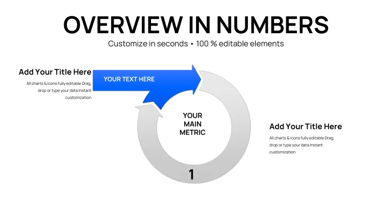
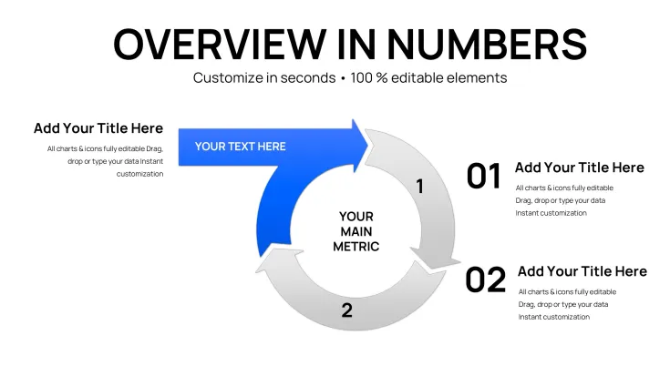
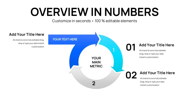
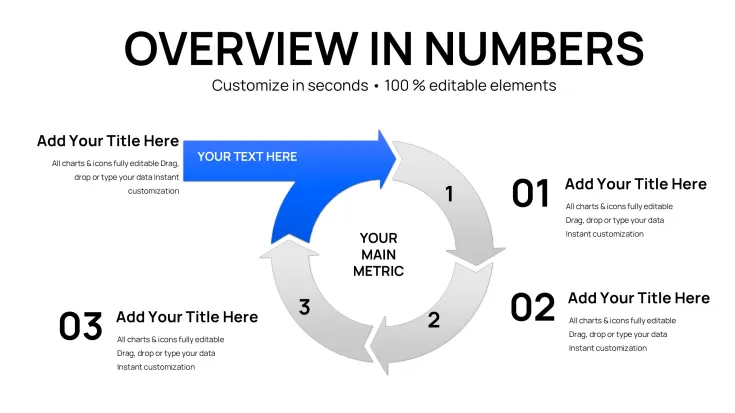
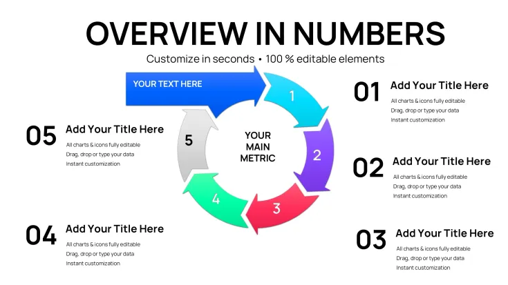
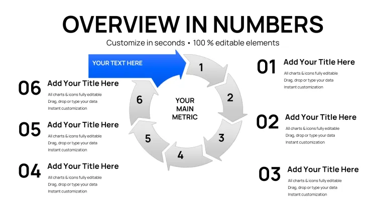
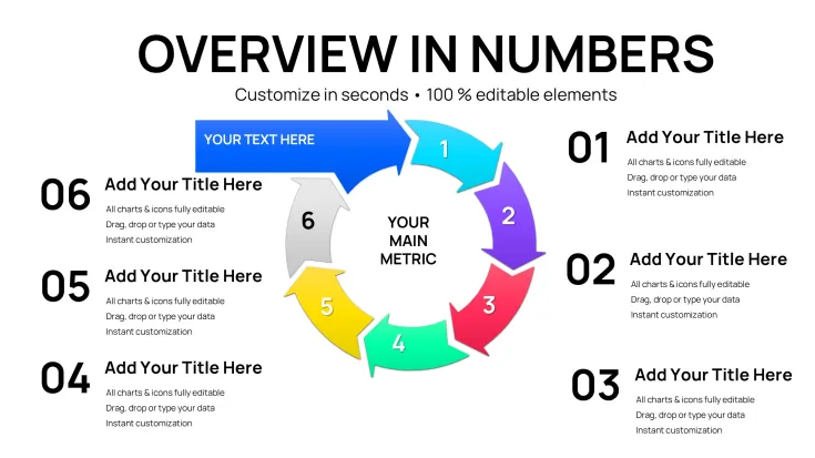
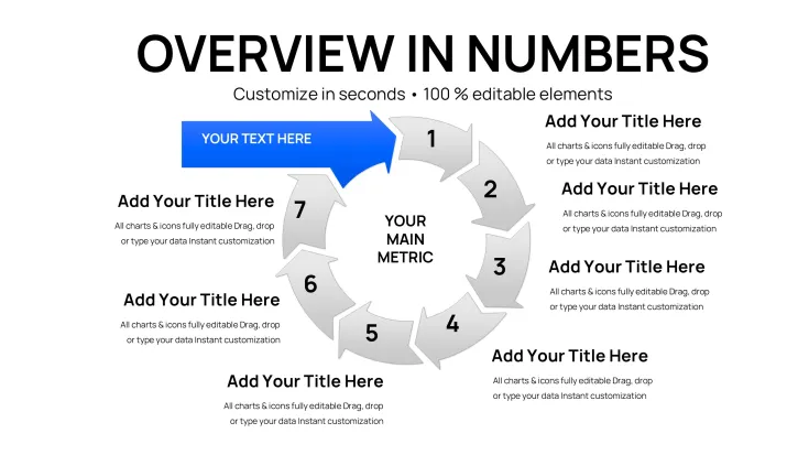
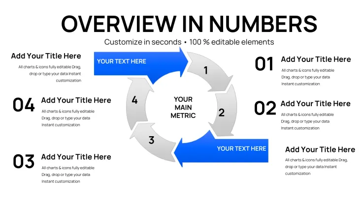
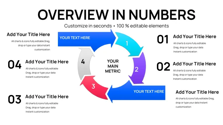
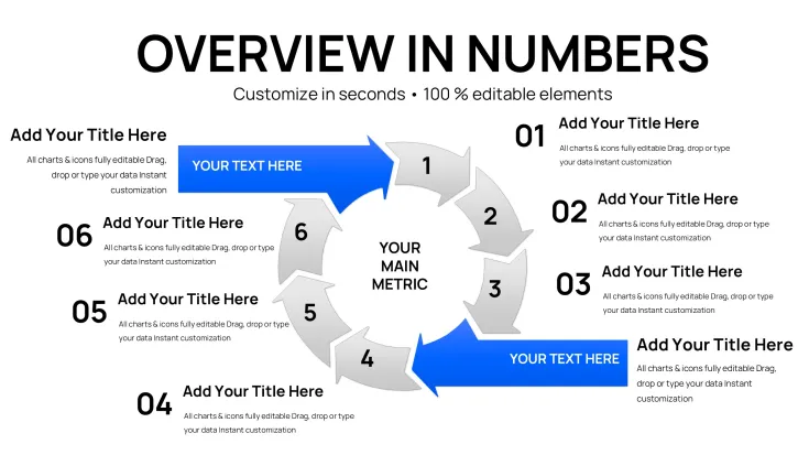
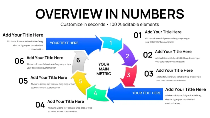
Slides feature dedicated cycle periods with incoming arrows for flow representation alongside pie charts for proportional breakdowns. The 44-slide count provides multiple layout variations within the cycle, pie and arrows categories, ensuring coverage for different data volumes and presentation lengths.
Key Features
All 44 slides use editable vector elements including cycle outlines, pie segments and arrow paths that can be resized, recolored or repositioned via drag-and-drop in Keynote. Data values update directly in the built-in chart editor while maintaining perfect alignment. The template supports full text replacement in placeholders and layer adjustments for custom icon placement.
FeatureDetailsSlide Count44 editable slidesChart TypesCycle periods, pie charts, arrowsFile Format.key for Apple KeynoteEditable ElementsText placeholders, color fills, icon layersData IntegrationChart editor updatesLayout StyleClean period-based cycles with incoming arrowsProfessional Use Cases
A logistics coordinator at a global shipping company used the cycle periods incoming slides to map seasonal inventory inflows and distribution cycles during a quarterly operations review. The arrow integrations highlighted bottlenecks in real time, enabling the team to adjust supplier schedules and reduce delays by 18 percent within the following quarter.
A financial analyst in the banking sector presented incoming revenue periods with pie and arrow combinations to the board, clearly showing cash flow cycles and seasonal peaks that informed the next fiscal budget allocation.
Additional Scenarios
Consultants regularly apply these slides when breaking down client project timelines into cycle periods, using arrows to demonstrate incoming milestone dependencies that drive project success metrics.
How to Customize
Begin by downloading the .key file and opening it directly in Apple Keynote. Select any cycle period slide, click into the chart editor to replace sample data with your own numbers, then adjust arrow directions or pie segment colors through the format panel. Text placeholders update instantly by typing new labels, and icon layers can be hidden or revealed with a single click. The entire process from download to final export as PDF takes under 15 minutes once your data is prepared.
This workflow eliminates the need to draw individual arrows or align pie segments manually, ensuring every cycle period incoming chart remains proportionally accurate across all 44 slides.
Why Choose This Template
Compared to building cycle diagrams from scratch in Keynote, this template provides 44 pre-aligned slides with exact cycle-to-arrow-to-pie proportions already locked in, saving hours of manual shape drawing, grouping and testing. The focused design on cycle periods incoming differentiates it from the related step-count arrow templates that lack dedicated period tracking layouts. Every element maintains professional consistency so your presentations appear cohesive without extra effort.
The lower price point of $20 combined with the targeted 44-slide set makes this the efficient choice for users who need incoming flow visualization rather than broad puzzle or multi-color options found in larger collections.
Add this Incoming Cycle Charts Keynote Template to your cart today to start creating clear period-based visuals immediately.
FAQ
How do I edit the cycle charts and arrows in this Keynote template?Open the downloaded .key file in Apple Keynote, navigate to any of the 44 slides, and click directly on a cycle period, pie segment or arrow element. Use the chart data editor to input your numbers while the format sidebar lets you change colors, line weights and text. All elements are grouped for easy selection yet remain individually adjustable so you can reposition incoming arrows without breaking alignments. This process requires no external plugins and works with standard Keynote tools.
Is this template compatible with current Apple Keynote versions?Yes, the 44-slide .key file is built for seamless compatibility with Apple Keynote on both Mac and iOS. All cycle periods, pie charts and arrow layers open without conversion issues and retain full editability. If you are on an older Keynote build, simple layer ungrouping restores functionality while preserving the original design intent. The vector construction ensures crisp display on any screen size or export format.
What licensing allows commercial use of these cycle charts?The license permits unlimited personal and commercial use in client presentations, internal reports and published materials. You may modify the 44 slides as needed and distribute the final exported PDF or Keynote file to audiences. The only restriction is resale of the original .key template files themselves. This covers consultants, agencies and corporations presenting cycle periods incoming data without additional fees.
How many slides and chart types are actually included?The package contains precisely 44 editable slides focused on cycle periods with pie and arrow integrations. Chart types are limited to the verified categories of cycle, pie and arrows as listed on the product page, providing multiple layout variations within each. No additional puzzle or unrelated elements are present, keeping the set targeted for period and incoming flow visualization.
What is the download process and file format after purchase?After completing checkout you receive an immediate download link for the single .key file containing all 44 slides. The process takes seconds with no registration required beyond your account. The file size is optimized for quick transfer and opens directly in Keynote. A receipt with product ID KC01087 is emailed for your records.
Secure this Incoming Cycle Charts Keynote Template now and transform your period-based data presentations with professional arrow and pie integrations.
Good for
- Project roadmaps and sprint plans
- Product launch timelines
- Quarterly or annual review decks
- Company history and milestone summaries
Licence
reviews
The incoming cycle charts with pie segments and arrow flows helped visualize seasonal inventory in my logistics review. 44 slides offer good variations. Arrows clearly showed bottlenecks; data editor updated smoothly.
Practical for revenue cycle presentations. The period-based cycles integrated well with pies for cash flow peaks. Clean Keynote file, easy color changes. A bit specialized but effective for process flows.
Needed quick period tracking slides. The incoming arrow integrations on cycle diagrams are intuitive. Some layouts felt crowded with too many elements, but vector quality is high. Saved design time.
Student project on business cycles used these. Arrow directions and pie breakdowns made data flows visual. Professional look, editable icons. Wish there were more dark mode options.
Deadline crunch before board meeting - opened the .key and customized cycle periods fast. Pie and arrow combos clarified inflows. Good variety in 44 slides, though some overlap in styles.
Used for project timelines. Cycle periods with incoming data arrows worked nicely. Text placeholders are generous. Solid Keynote compatibility, minor alignment tweaks needed on complex slides.
FAQ
Will it work in Google Slides?
Are fonts embedded?
Can I use this for client work?
What's the refund policy?
Do you update the template after purchase?
Similar templates
See all Keynote Charts →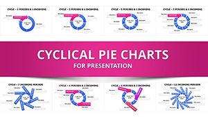


All 44 slides